The Arizona Coyotes franchise already has extensive history around its logos and jerseys, as the club has undergone multiple rebranding initiatives throughout its history.

The team, like every club in the NHL, has seen its ups and downs over the last quarter-century, but the franchise’s struggles have, more often than not, received the most attention in the news cycle.

Off-the-ice problems have earned the team a lot of detractors outside of Arizona, and it’s no secret that the Coyotes are one of the most divisive teams in the history of North American professional sports. There are very few people on the fence here – The masses seem to either love or hate the Coyotes, and the same has applied to the team’s logos over the years.
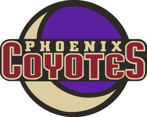
The Kachina Coyote
Everything that’s old is new again.
One of the most polarizing logos and sweaters in NHL history first appeared when the Phoenix Coyotes began play in 1996-97 after relocating from Winnipeg, and after ditching them for the Howling Coyote (see below) in the early 2000s, the now-Arizona Coyotes have gone back to their roots. The Kachina Coyote was again the primary logo for the franchise after a rebrand prior to the 2021-22 season, though it’s fair to say it was met with much more excitement the second time around.
The logo and color schemes were a significant departure from the club’s traditional blue, white, and red uniforms that were worn when the team was known as the Winnipeg Jets from 1979 to 1996. Those jerseys were all-time classics, but the Coyotes needed a new logo and color scheme that would fit in with their new location in the Southwestern United States. The colors consisted of forest green, brick red, sand, sienna and purple, and the centerpiece of that magnificent first uniform was ultimately a hockey stick-wielding coyote on skates, dressed in traditional Southwestern clothing.
Heavily influenced by Arizona’s rich Native American history and culture, the logo was different from everything that came before it. In the Original Six era, the Coyotes would have been laughed off the ice if they came out wearing the Kachinas.
In the 1990s, though, teams were pushing the boundaries and moving quickly away from what was previously considered “traditional.” Colors like teal and purple were front and center, and new teams like the Anaheim Mighty Ducks, San Jose Sharks, and Coyotes were trying to make names for themselves.
Thus, the Kachina was born, and it has been instantly recognizable as a symbol of the Coyotes franchise ever since.
The Crescent Moon
The original shoulder patches in 1996-97 consisted of the Moon in the waning crescent phase against the backdrop of a desert sky, with “Phoenix Coyotes” and “Goals for Kids” overlaid on top of the image on the right and left shoulders, respectively. Goals for Kids was the team’s charity at the time of the relocation and was a carryover from the Winnipeg days.
As far as the logo goes, the simple yet evocative image was the perfect complement to Phoenix’s creative primary crest.
The crescent Moon without the Phoenix Coyotes wordmark was also the team’s center-ice logo during the early years in Arizona, and can be seen clearly on any highlight from any home game from the ’90s.
Latest THW Headlines
The logo was absolutely striking in the arena. At center ice, most teams generally use their primary logo, or some variant thereof, so Phoenix’s design stood out when watching games on TV or at the rink.
The aesthetics of the logo were also underrated, as the Moon filled the entire center-ice faceoff circle. Needless to say, we wouldn’t complain if the team brought back the Moon at center ice, too!
The Peyote Coyote
Building on the wonderful weirdness of the original logo combination, the Coyotes introduced an alternate logo and uniform for the 1998-99 season, featuring a close-up of the Coyote’s head as the primary crest. Set against a deep green backdrop bordered by a desert landscape (including the crescent Moon rising over it all), this logo (and jersey) was a wild design.
This alternate logo was well done. Unlike some other imaginative alternate logos like the Calgary Flames’ flaming horse uniforms or the Dallas Stars’ “mooterus,” it was still readily apparent that this logo and jersey belonged to the Phoenix Coyotes, and was unique enough to become the primary logo on the team’s Reverse Retro jerseys in the 2020-21 season.

Now that pops.
The Phoenix Salamanders?
Building upon the Desert Southwest theme of the 1990s alternates, the Coyotes used some sort of desert lizard as their shoulder patch on the jerseys.
The lizard does indeed fit into the theme of the jersey, but it doesn’t really scream “Phoenix Coyotes.” It would be like the Florida Panthers using an alligator as a secondary logo – just because the animal resides in the same state as your hockey team, doesn’t mean it belongs on your jersey. Though a bit off-the-wall at the time, the salamander was also included on the Reverse Retro jersey, and does have a true southwestern feel to it.
To be fair, the Coyotes had to come up with something new – they already used the crescent Moon within the desert landscape on the jersey. It would have looked tacky to use it twice more as the shoulder patch as well.
Coyotes Classic Logos Are Unmistakably ’90s and Loved by Fans
The Coyotes’ original logos of the 1990s were original, creative, and unapologetically Southwest, and they still stand up well today.

There’s a reason why the franchise returned to the look prior to the 2021-22 season – they’re classics, they’re instantly recognizable throughout the league, and Arizonans still want to wear them and see them out on the ice.
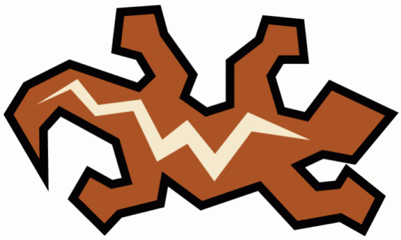
The Howling Coyote
After sharing a basketball-specific arena with the NBA’s Phoenix Suns for the first seven and a half years of their existence, the Coyotes moved into their own place in Glendale in 2003, and the club took the opportunity provided by a new building to also rebrand with a new logo, color scheme, and uniforms.
Gone were the classic Kachinas of the 1990s, and in was the Howling Coyote along with the colors of brick red, desert sand, white, and black, which were the franchise’s primary logo and color scheme until the team rebranded again prior to the 2021-22 season.
The brick red and desert sand-colored Coyote was a departure from the team’s original logo and color scheme, and it was widely considered to be a “safe” choice, and the rebrands by three of the Valley’s sports teams after the turn of the millennium were strikingly similar.
The Arizona Diamondbacks switched to Sedona Red in 2006 and ditched the original colors of purple, black, teal, and copper, which became legendary after the team’s 2001 World Series championship. The Phoenix Suns dumped the still-iconic “fireball” jerseys that were worn during the Charles Barkley years and went to a safer, more subdued look that was used throughout the Steve Nash era (though the Suns have definitely bounced back since then). And the Coyotes shunned the Kachinas and went to an unimaginative red and white color palette.
It was a modern-day tragedy.
There was nothing wrong with the Howling Coyote, but both the logo and jerseys were remarkably bland when compared with their predecessors. Still, the team hasn’t completely retired the look, and can still be seen every so often at home games.
The Arizona Flag Patch
When the Howling Coyote was introduced, so was a new shoulder patch and secondary logo. The purple crescent Moon was changed to brick red and desert sand, and was banished to the pants.
In came the new Arizona flag patch.
Shaped like the state of Arizona, and with the signature design of the state flag included, the logo screamed “Phoenix, Arizona” at anyone who saw it.
Eventually, the franchise realized that they were now playing in the suburb of Glendale, not in Phoenix proper, and the team’s name and shoulder patch changed in 2014-15. With the new “Arizona Coyotes” name came an identical patch that simply read “AZ” instead of “PHX,” as you can see a little further down the page.
The Running Coyote
Nearly 10 years after the unveiling of the Peyote Coyote, the Coyotes tried their hand at alternate jerseys once again in 2008. This time, they went in the opposite direction. In the ’90s, the franchise simply took the head from the original Kachina Coyote logo, enlarged it, and slapped it on the front of a jersey.
In 2008, though, they already had a Coyote head on their primary jerseys. A body had to be added, and, thus, the Running Coyote was born.
Although some likened this alternate logo to a dog that had been flattened in the road (the “Roadkill Coyote”), the team’s black third jerseys which sported this logo were a welcome change from the basic home reds with red pants which were worn at the time.
Many of these jerseys can still be seen in the crowd at Gila River Arena during home games, despite the fact that the Running Coyote and the alternate jerseys were discontinued following the 2013-14 season.
The Paw Print Patch
With the new alternate logo and jersey came a new shoulder patch – the standard Howling Coyote was placed on one shoulder, while the new Phoenix Coyotes pawprint patch (say that five times fast) was created and added to the other shoulder.
This is a pretty basic secondary logo and shoulder patch, but it isn’t a lizard, so the Coyotes were on the right track here.
Then came the 2015-16 “Rebrand”
Though the Howling Coyote remained the team’s primary logo after a 2015-16 “rebrand,” there were a few changes to the uniform that made them pop a little more. The team did a much better job featuring the secondary color of black in both the home and road uniforms.
From 2003 to 2015, the home jerseys consisted of red jerseys with white trim, while the road sweaters were white with red trim. Red pants with white trim were worn with both sweaters. Black was present only on the shoulder patches.

Starting in 2015-16, both the home and road jerseys featured more color in their designs and were paired with black pants, resulting in a much-improved all-around appearance.
The Paw Print Patch 2.0
When the Coyotes unveiled their new jerseys for the 2015-16 season, a revised take on the paw print logo was revealed as the team’s new shoulder patch on the home reds.
This logo honestly seemed like more of an afterthought than anything else – wasn’t really used around the rink for marketing in any capacity, and if you ask a fan if they remember it, the answer will likely be no.
The Arizona Flag Patch 2.0
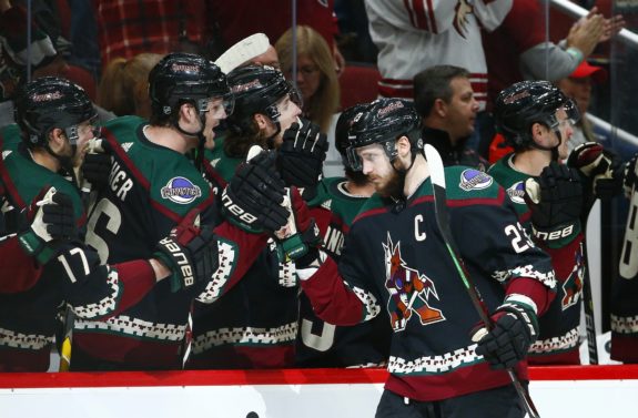
The current shoulder patch is a revamped version of the previous one, which was used from 2003 to 2015. It features sharper edges, a redder design of the Arizona state flag, and “AZ” in bold, sand-colored letters.
The patch was simply an update from the original “PHX” patch, but added enough “pop” to the team’s sweaters that it hung around until Arizona rebranded prior to the 2021-22 season. You can still see it on the players’ shoulders when the team wears its Howling Coyote jerseys on occasion.
Coyotes Kachinas Remain Iconic
Throughout their history, the Coyotes have used many primary, secondary, and alternate uniforms and logos, but the best of the bunch, was, undoubtedly, the first iteration, and that’s ultimately why they returned.
The Kachina is an iconic image within Arizona, and it’s quite a polarizing topic outside of the state. The original (and current) jerseys have been ranked as one of the best logos and jerseys in the history of hockey, but they’ve also been rated as one of the worst as well.
You can’t please everybody, but, with the Kachinas, the Coyotes hit the nail right on the head with their first attempt. So much so, in fact, that fans were clamoring for them ever since, and deep in the throes of a rebuild, the team finally obliged and brought them back prior to the 2021-22 season.
How long they’re around again is anyone’s guess, but enjoy the ride while it lasts.
(All logo images are thanks to Chris Creamer’s sportslogos.net)