The Buffalo Sabres have been a member the NHL for 53 years now, and while things haven’t been good for them in recent memory, this is a team that has iced some of the top players in history and has been a part of their fair share of amazing stories over the years.

Along with the team’s storied history on and off the ice, they have made a long list of changes, both major and minor, to their jerseys and the rest of their uniforms – some good, some bad, some representative of a particular era for the franchise. Here’s a full history of the Sabres’ jerseys, from 1970 to now.
Buffalo Sabres’ Royal Debut
The Sabres entered the NHL in the 1970-71 season, donning a sweater that can be called nothing if not an instant classic. The original Sabres jerseys were dominated by royal blue, featuring gold trimmings around the perimeter of the sweater. The away jerseys were a clean white, with blue and gold filling out the shoulders, sleeves, and waist stripes. The logo featured a charging buffalo (or a bison, if it’s accuracy you’re after), in-between a crossed pair of sabres, a single-edged sword used for centuries by cavalry units, mainly in pre-modern Europe.
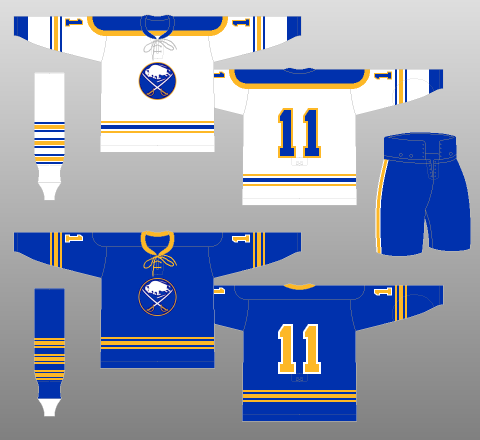
This iconic jersey and logo remained largely the same until 1996, aside from some tweaks, small changes, and additions over the years. The three-stripe design on the sleeves and the waist of the jersey were colored yellow on the dark jerseys and yellow and blue on the white jerseys, and the same pattern was applied to the socks.
Many of the NHL uniforms sported by the legendary players of the 1970s are now revered as absolute classics, much like the debut Sabres’ uniform. For an expansion team coming into the league when they did, it did the franchise a great service to fit in from the beginning. And with the success they found in the mid-1970s, they couldn’t have looked better.
Sabres Tweak With a Classic
The first changes to the original Sabres uniform came in the 1978-79 season, when the team stuck the primary logo on either shoulder, right above where the player’s numbers would be. This was the same logo as the one on the chest, so it was viewed as a little redundant, but not something to lose sleep over. Those types of designs will come later.
Also in 1978-79, the Sabres decided to ditch the traditional lace-up neckpiece at the top of the chest area of the jersey, and opted instead for a V-neck look at the neck, something that would stick for years to come. I’ve personally always been a fan of the lace-up neckpiece, since I think it’s small touch unique to hockey that differentiates the uniforms from every other sport. I’m glad more teams are starting to go back to that now.
Latest THW Headlines
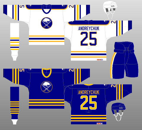
In the 1982-83 season, the Sabres changed their font to a slimmer typeface, making the nameplate and the player’s numbers appear thinner than in previous seasons. This is something that would stick around for a long time, too, and one I don’t necessarily mind. It’s certainly not the worst thing they could change about the original.
The last change the Sabres would make for more than a decade before completely overhauling the team’s look was a minor one, all things considered: thickening the striping on the sweater, socks, and pants. Oh, and they actually added more stripes, too. I wasn’t around back then, but I think if there’s anything that mid-1980s influence did to NHL jerseys, it was inspiring them to look as “busy” as possible.
Birth of the “Goat Head” Logo
The last season the Sabres would skate in their original jerseys for a long time was in 1995-96, which happened to be the franchise’s last season as the Buffalo Memorial Auditorium, or “the Aud.” Sadly, they missed the playoffs that season, so the sendoff to the fans from the Aud, where the team had played for 25 years, was not as celebratory as it might have been had they made a Stanley Cup run that year. But better times were coming, and the Sabres would be flirting with Lord Stanley in just a few short seasons – this time with a new look.
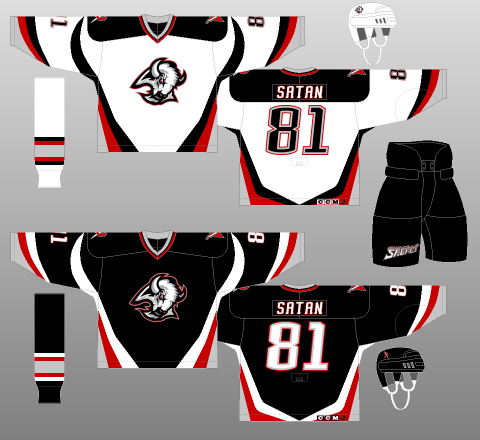
The Sabres’ first season at their new home, known then as Marine Midland Arena (now KeyBank Center), was the first season they changed their jerseys and logo to what is now a fan favorite: the “goat head.” The goat head jerseys were predominantly black, featuring some red, white, and silver striping and trimming throughout the jersey. Another of the big changes was the changing of the original Sabres logo to a new one: an angry buffalo’s head, dubbed the goat head.
This was also the first time the Sabres’ uniforms featured secondary logos on the shoulders different than the primary chest logo, which was the capital letter “B” with a sword piercing through it. This has become a popular logo for clothing and hats now, too. The font for the numbers and nameplates was also changed, to a blocky, slightly-italicized modern typeface.
You may also like:
- 3 Things the Sabres Should Focus On to Close out the Season
- Sabres News & Rumors: Thompson, Levi & Another Playoff Run
- Sabres’ 3 Best Players From the “Buffaslug” Era
- Jack Quinn Returning to Sabres’ Lineup for Stretch Run
- Which Sabres’ 2022 First Rounder Makes the Team in 2024-25?
Another first was adding logos to the pants and helmets, with the secondary logos being added to either side of the helmet, and a script logo reading “Buffalo Sabres” being slapped on the pants. Again, I wasn’t around when these uniforms were first debuted, but from what I understand, there were mixed receptions on them initially. It’s funny though, because much like almost every other retro jersey, this “throwback” is now beloved by the majority of Sabres fans, and has become a total fashion statement to rock around the City of Buffalo. The goat head logo even made its way back onto the Sabres “Reverse Retro” Adidas jerseys this past season.
Sticking to Red & Black (And Swords)
The Sabres added an alternate jersey playing off the design changes of their goat head jersey, this one with a third logo and different colors dominating the sweater. In place of black, a prominent red took over this third jersey, and black, silver, and white filled out the sleeve and waist stripes of the new alternate.
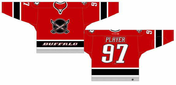
Oh, and the word “BUFFALO” was slapped across the waist, in all capital letters. You know, just in case you forgot where the Sabres are from again. As for the logo itself, the primary goat head logo was used as the secondary logo on the shoulder patches, and the chest logo on this jersey was a new one altogether: crossed cartoon swords over a black circle.
I’ve seen plenty of people wear this sweater at Sabres games and elsewhere, and it has become extremely popular, since it wasn’t used by the team for all that long. The logo itself is sometimes referred to as the “dinner plate” logo, and it’s not hard to see why. In time, though, I think this alternate jersey is slowly developing into a classic in its own right.
The “Buffaslug” Era
Let’s be honest. I bet a lot of you are here because of this jersey alone. It is both one of the boldest jersey and logo design changes in history, as well as one of the most miscalculated misfires in logo design I think I’ve ever seen. Ladies and gentlemen, I give you: “the Buffaslug.”
The Buffaslug jersey totally overhauled both the primary logo and the team’s color scheme once again, while simultaneously attempting to make some sort of nod at the team’s history and original uniforms. This was the first time we saw navy blue used as the primary jersey colors, and the silver and yellow stripes clash with each other as the secondary colors.
The font for the numbers and nameplates were again changed to a different typeface, this time taking on a more mid-2000s sporty look as opposed to the blocky typeface. The nameplates were silver, too. So much silver.
Thankfully, the slug wasn’t worn every night. The organization had a third jersey one season, which was a throwback royal blue sweater, pretty much identical to the team’s first-ever jersey. Why they removed this from the wardrobe after one short season and stuck with the slug, we’ll never know.
Ironically enough, though, the Buffaslug era proved to be the last time the Sabres ever truly contended for a Stanley Cup. Alexa, play “Better Days” by the Goo Goo Dolls.
A Touch Of Grey, But Mostly Navy
In the 2008-09 season, the Sabres did the fans a major service by adding a new alternate jersey, and switched back to their primary logo of old, the classic charging buffalo in-between two cavalry swords. Outside of the logo change, though, the color scheme stayed pretty much the same, with some stylistic changes from the Buffaslug jersey being made to mimic the team’s original uniforms.
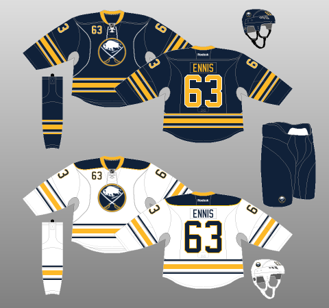
The only thing that stuck with these jerseys was the silver. That hard-to-shake, unpopular, unnecessary silver. Both the home and away sweaters featured large swaths of silver under the arms, as well as silver piping on the sleeve stripes and waist stripes. This would later become the team’s full-time uniforms, and stuck until 2017.
Sabres Test the Script Logo
In the 2010-11 season, the Sabres rejoined the NHL’s alternate jersey program, with a welcome tribute to the original royal blue and yellow color scheme. These sweaters made their best effort to look like retro throwbacks, featuring prominent stitching throughout, which ended up looking pretty nice overall. Royal blue dominated, which four yellow stripes appearing on either sleeve and at the waist, and the nameplate and numbers taking on a unique look of their own. See one of these jerseys up close, and I promise you they’re pretty darn cool.
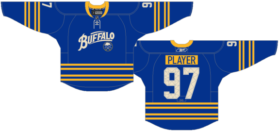
The chest logo is where this jersey draws some criticism. The Sabres’ primary logo was shrunk down to a small size, and slapped uncentered under a new script logo, which was supposed to pay homage to the American Hockey League’s Buffalo Bisons, which, like many of the changes made over the years, drew mixed reviews of both criticism and praise.
The contrasting nameplates look great, the color scheme is great, and the quilted numbers are different, but still extremely cool and unique in my opinion. In my opinion, these are some of the cooler jerseys the Sabres have rocked other than their originals.
Debut of the “Turd Burger”
If you didn’t come for the Buffaslug, then you might be here for this one. I introduce you all to the “turd burger.” What’s both sad and hilarious at the same time is that I didn’t come up with that name myself, nor was it a fan-given nickname to what is quite possibly one of the ugliest sweaters in NHL history, it was called that by then-Sabres president Ted Black when it was debuted in 2013. Now, I’m no jersey designer, but I don’t think a public acknowledgment from the team president calling your jersey a “turd burger” is the type of reaction you want when it’s revealed.
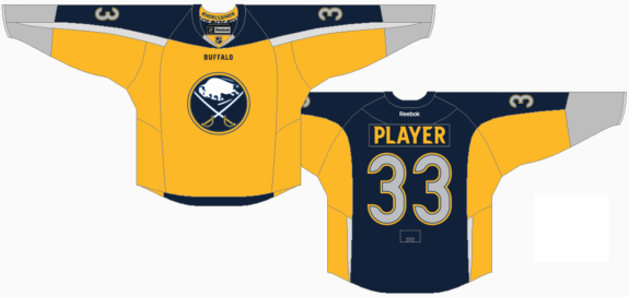
Unfortunately, a turd burger is exactly what most Sabres fans remember this jersey by and refer to it as. Fortunately, they didn’t have to stare at it for too long. For the first time in team history, a Sabres jersey featured yellow as the predominant color, and navy blue as the secondary color, more prominent on the back and sleeves than on the front. No, the front belonged to yellow. The sleeves and numbers were silver though, because why get rid of silver?
The primary chest logo stayed the same, perhaps the one redeeming quality of this jersey. Above that, though, right under the V-neck neckpiece, was the word “BUFFALO” again, just in case you forgot another time where the Sabres are from. The funniest part about this jersey is the way it was revealed, however. In true Sabres marketing fashion, they did a Twitter reveal by posting teases of the new alternate jersey throughout the week, and the final reveal was two pictures of former captain Steve Ott standing toward and away from the camera in a t-pose, wearing this jersey. There is not much good to be said about this one.
Sabres Finally Ditch the Grey
In the 2017-18 season, the NHL switched jersey manufacturers from Reebok to Adidas, and Adidas created their ADIZERO redesigns of the league’s 31 different jerseys. For the expansion Vegas Golden Knights, this would actually be their first jersey design. For the Sabres, they finally ditched the grey underarms and most of the grey piping around the jersey, although some grey was still kept on the sleeves and around the primary logo. To their credit, committing fully to the navy blue and grey actually made for a pretty good-looking uniform.
There were still a couple of downsides to this jersey. First, it felt a little crowded, with the player’s number not only on the back, but on the sleeves and the top right of the chest, too. Thankfully, they’ve since ditched that. The three-stripe design also made it feel a little too busy. And last, this jersey was never going to be good enough for one reason: it was not royal blue.
Sabres’ Golden Season
Ahead of the Sabres’ 50th anniversary season, called the “Golden Season” by the organization, many fans were hoping for a return to the team’s original jerseys. I mean, what better way to give the fans what they want than by returning to the most-beloved uniforms in franchise history? The Sabres didn’t end up doing that, but then again to their credit, what they did instead wasn’t all bad, either.
On August 16th, 2019, the Sabres officially unveiled their 50th anniversary jerseys: the “Golden Season” look. Ultimately, it was pretty well-received by the fans. The sweater features a ton of unique and special designs on it, and it looks as though a lot of thought was put into them. Inside the collar are images of each primary logo used by the Sabres since 1970, which appeared inside the brim of some hats sold during the 2019-20 season, as well.
The sweater was predominantly white, highlighted by fantastic gold and navy stripes on the sleeves, socks, and waist of the jersey, with the five stripes representing the five decades the Sabres have played in the NHL. The traditional crest of the Sabres serves as the primary logo, and is the same gold and navy blue color scheme as the rest of the jersey. Extra detail is sewn into the crest and numbers that add depth to the logos and stitching, giving it a totally unique look compared to other NHL jerseys around the league today.
The uniform is completed with white gloves and a white helmet. The helmet and front of the pants are punctuated by a golden charging buffalo logo. It really is a shame that the 2019-20 season was cut short due to the COVID-19 pandemic, because these were some beautiful threads, and it would have been great for fans to see them worn a few more times during games.
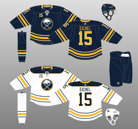
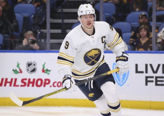
Sabres Return to Royal
And now, for the moment you’ve all been waiting for: the Sabres’ long-awaited “Return to Royal.” Shortly before the “Golden Season” sweater was unveiled, the Sabres also announced that they would be returning to royal blue full-time in the 2020-21 season, more than a full year before they would eventually sport these new jerseys resembling the 1970-71 originals. If there was anything for Sabres fans to be excited about, this was something to latch on to.
Finally, for the first time since 1996, the Sabres were back full-time in royal blue, with the same color schemes as the original jersey – no silver, no navy blue, and the only difference from the originals being the addition of shoulder yokes, which still look great. After so much time, so many seasons, and so many changes, the Sabres finally got everything right in one jersey. All they have to do is keep it the same, and they’ll be good.
The 2020-21 season was not one the Sabres want to remember or dwell on, but one thing is for sure: they looked amazing on the ice wearing these jerseys every single night.