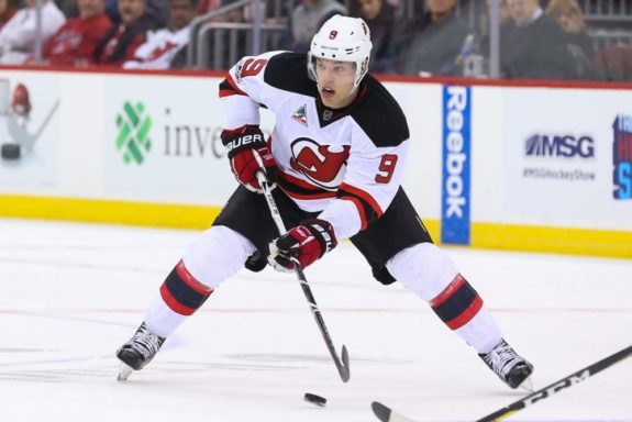
Ask a New Jersey Devils fan for their opinion on anything and one will no doubt receive a candid response. The unveiling of the new Adidas themed sweaters are hardly immune from such straightforward opinions.
Since the 1992-93 season, the Devils jersey colors and concept have essentially remained intact. The club made the shift from a red, green and white look, to a red, black and white scheme. Even when the League attempted a jersey transformation with Reebok, former general manager Lou Lamoriello kept the Devils look unchanged.
Fast forward to 2017 and the Adidas “Form The Future” campaign rollout, and the reactions, to borrow a phrase from head coach John Hynes, have been “relentless”.
Although the logo and colors remain unchanged, fans have been against the new look. Some say the design looks like a practice jersey or a Devils hoodie sans the hood. While there was sure to be backlash regardless of the design, it was bad enough to prompt a response from the club on its Twitter handle.
In my opinion, someone at the Devils and/or Adidas overthought this new sweater concept.
Breaking Down the New Look
https://twitter.com/NJDevils/status/877361414335328260
Championship Collar
Embedded within the back inside of the collar, the uniform pays homage to the organization’s three Stanley Cup titles in 1995, 2000 and 2003. This portion is also green, which plays to their look from 1982-1992 and acknowledges the Garden State. It’s a nice touch on the team’s historic triumphs.
Red Collar
The outside red collar is meant to be a tribute to the franchise’s origins from 1974 as the Kansas City Scouts. I’m as big a hockey history buff as anyone but one wonders how many New Jersey fans really know or care about paying deference to the Scouts. This would be akin to the Carolina Hurricanes placing a whale patch on their shoulder or the Arizona Coyotes adding a blue jet on their sweater.
Sleeve Stripes
The three stripes on each arm, two white with one black in the middle, are now equal in length harkening back to the franchise’s days as the Colorado Rockies. Again, I don’t believe fans, as I don’t, have a strong feeling about this either way but, like I said with the Scouts, but how many Devils fans care about the old Rockies when they think about the way their sweater looks?
Single Bottom Stripe
Perhaps the most visible alteration in the new sweater is a small single stripe at the bottom. The black stripe is meant to pay tribute to the first hockey team in New Jersey, the New Jersey Bulldogs. Again, a nice nod to history but does the design really look better than the previous one?
Better for Players
On the plus side, the uniforms are supposed to wear better for players. The “lightweight materials” coupled with “resilient fibers” are supposed to create improved “air flow.”
Speaking of the players, ultimately the most important factor will be the guys wearing the new duds and it all starts with the No. 1 selection in the 2017 NHL Entry Draft.