What is the significance of NHL jerseys? In terms of recognition, no franchise can match the level of pride a fan gets from donning a Montreal Canadiens’ sweater. In terms of economics, the blue and white of the Maple Leafs’ jersey is the colour of money in today’s NHL.
But significance is a finicky idea and it’s hard to grasp what a jersey means to the fans, to the owners and to the players. There does exist a pattern, however, that shows the significance of a sweater when it comes to winning. The amount of times a franchise changes its look usually is an indicator of the lack of success of that franchise, and, often times, the most recognizable colours in the NHL often showcase the success that franchise has had throughout its existence.
A Lot of Looks and No Cups
I am a long suffering Vancouver Canucks’ fan and have a collection of NHL jerseys that span across every reach of the colour spectrum. From the classic blue and green stick in the rink, to the V, to the flying skate, to the orca and then back to the blue and green with an orca and the Canucks franchise has seen its fair share of identity changes throughout its history.
The Arizona Coyotes moved from Winnipeg in 1996 and have featured their fare share of logo and colour changes. Their first look had the fantastic desert dog striking a hockey pose along a black, red and green backdrop, which somehow morphed into the howling coyote on a red and white backdrop. Throw in a black for the sake of having a black third jersey and a kind of slug looking dog logo thing and the Coyotes have overcompensated for their lack of an identity by creating too many.

The significance behind the Canucks’ and Coyotes’ long history of changing identities is that their all time winning percentages are .487 and .484 respectively. Both teams have also never won a cup.
Any number of reasons exists for the correlation between the constant jersey changes and the lack of success. The Coyotes may need all the new looks to generate revenue since they are a little tight for cash.
The Canucks on the other hand are the NHL’s fourth most valuable franchise so they don’t need the revenue. The reason behind the constant change of identities may be that since the franchise hasn’t had the success a Canadian market desires the club must wash away every failure and replace it with a new identity. Take this upcoming season for example. The talk around the Canucks this off-season has been dominated by reminders that now is a dawn of a new era, “change is coming” . Let’s be glad that the promised change doesn’t come with a new jersey.
NHL Jerseys as the Model of Consistency
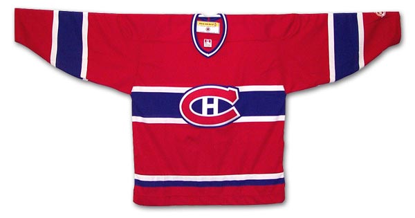 Red, white and blue with a C and an H. You already know what franchise I’m referring to and I don’t really need to explain this point any further.
But to elaborate in case you missed it, the Montreal Canadiens are the NHL’s most successful franchise with the most Stanley Cup wins and highest winning percentage at .589. They also have the most recognizable jersey and logo in the NHL.
The Habs don’t need the new revenue stream like the Coyotes or a new identity every 5 or so seasons like the Canucks because they have such a devoted fan base and a rich history of winning. If Montreal were to change their jersey, I bet plenty of fans would not be too pleased.
The Detroit Red Wings are another team that falls into the same category as Montreal. Hockey Town’s flying wheel is staple look in the NHL and Detroit has only ever had the red and white colour scheme. They’ve also never featured a black for blacks’ sake third jersey in a time where every professional sports team seems to have one.
Transformation Of The Original Six Jerseys (Gifs): http://t.co/VFt4onZ1wY
3). The Detroit Red Wings pic.twitter.com/xXgdyGfPzZ
— Tendy Celly (@tendy_celly) August 9, 2014
The Red Wings have also arguably been the most successful team in the modern era. The original six franchise has a .537 winning percentage and have captured the third most Stanley Cup championships in the NHL. I can almost guarantee that you will never see the Red Wings hit the ice in anything other than red and white or without their beautiful logo.
Blips on the Radar
Take a look at the Chicago Blackhawk’s jersey history and point out where the storied franchise recently began to struggle. Interestingly enough, the Blachawks didn’t make the playoffs for 9 out of the 10 years after they introduced their black third jersey in 1996. The black third jersey rears its ugly head and brings nothing but suffering once again.
The same goes for the Pittsburgh Penguins. The Pens’ struggles that led to Sidney Crosby, Evgeni Malkin and Marc-Andre Fleury began in 2002, the same year they ditched their fantastic white and yellow sweaters for the gold and black ones fans are accustom to now.
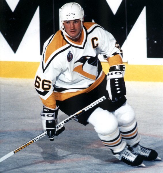
Granted, Pittsburgh changed their logo from the Penguin with the stick to a profile shot of the land bound bird in 1992 and introduced the dreaded black third jersey a few years afterwards, but the team remained relatively successful. It is worth noting, however, that the team won the cup during the 1991-1992 season, switched logos the following campaign, and never won a cup until their most recent victory.
Are the Penguin and Blackhawk examples a coincidence? Probably. Pittsburgh, at the time of their downfall, needed to garner more fan interest under threat of relocation, and Chicago was falling behind in the sports landscape of their great city. Thus the teams implemented newer, “cooler” looking jerseys.
But each does offer insight into a growing trend of the cyclical nature of teams changing jerseys and not finding success. The trend is cyclical because teams that have a history of winning don’t need to generate fan interest by throwing together new looks, and teams that aren’t as successful must compensate for their lack of success by ushering in new looks with hopes of reaching hockey’s summit through a new identity.
Hockey’s classic looks are to be marvelled at by the fans because of the rich history etched into every stitch. The new, modern looks will only ever hope to be as well regarded.