One of the more talked about aspects of the 30 teams that make up the National Hockey League has to do with what each team wears on the ice. From the all-time great jerseys like the Chicago Blackhawks and Montreal Canadiens to the not-so-great ones like the Buffalo Sabres recent “turd burger” jersey, the aesthetics of the teams is something that never goes unnoticed.
Over the years, as teams always look for ways to rebrand themselves and make more money, we’ve been given some good and bad new looks. While there are teams that have made some great strides towards improving what they wear, there are still a number of teams that could use a makeover. Here are my five picks for NHL squads that could really use a new look.
Honorable Mentions: Florida Panthers, Pittsburgh Penguins
5. Washington Capitals

The first one on the list may take some people off guard, but the Capitals are a team that have the right idea just on the wrong jersey template. Now, in a perfect world, a new red version of their current third would be developed and made a primary sweater. Unfortunately, I don’t see that happening so a complete redesign is the next best thing to do. The blue siding on the jerseys isn’t needed, and I feel they went too dark with their red and blue color scheme.
Keep the modern-day version of the classic logo, brighten the colors and get rid of the lame piping, and I think the Capitals could jump to the top-tier of NHL jerseys.
4. Columbus Blue Jackets
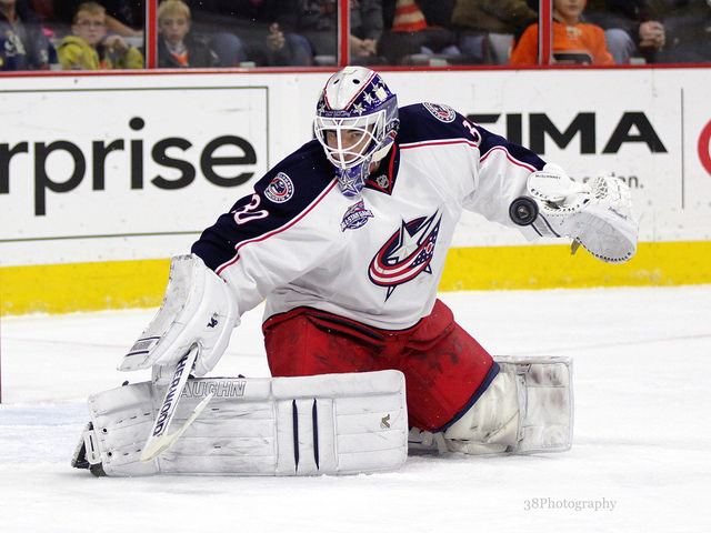
Since their inception in 2000, the Blue Jackets have been cursed with pretty terrible logos as well as poor jersey design. But what can you really do with a team called the “Blue Jackets”, the color palette is already limited, and how do you design a logo around it. Personally, I think their current third jersey is incredible. A white version with that logo, or even a newly designed logo, would be a major improvement.
Again, it’s just tough to figure out how exactly to make what Columbus is given to work out great. That being said, a designer by the name of Colin May came up with a concept back in 2012 for Icethetics that I really like. It has that soccer-style feel to it, and could work for a team like the Jackets.
3. Ottawa Senators
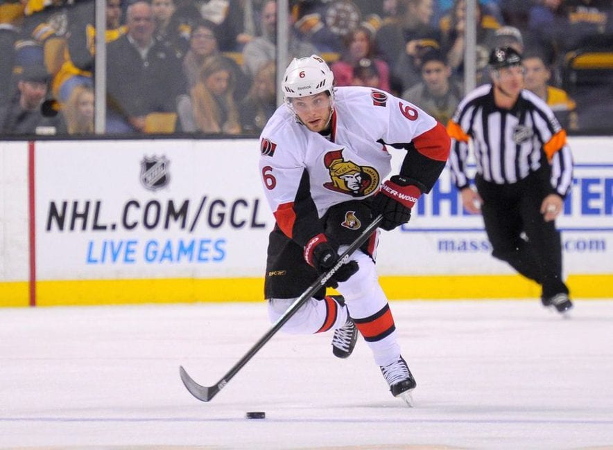
Now we’re getting to the teams that really needed something new about five years ago. From the logo to the jersey design, everything about Ottawa’s brand is just too blech. With the logo, the fake 3D look just isn’t cool, and it never really was. Sure, it was okay for a third jersey logo, but not a primary one. They had it right with the profile senator, but they went and ruined that in 2007 with what they have now. Simply put, the old logo needs to be brought back.
In terms of the jerseys, to only real accents they have are on the sleeves. They just don’t look all that sharp. In fact, they look pretty lazy. Now, I’m not going to say the jerseys of the 90s-mid 2000s were great because they weren’t. They need a completely redesigned sweater with the old 2D logo.
2. Arizona Coyotes
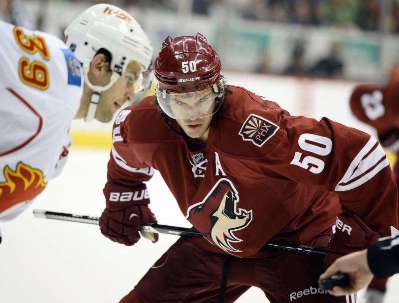
With the Arizona Coyotes, it’s more the logo and color scheme than the actual jersey design. From a template standpoint, I really enjoy the simple design that that Coyotes utilize. The logo is just boring and the shade of red they use is just terrible. Clay red has never — and will never — looked good for a sports team. Then again, the only team that I can think of to actually use that color is Arizona…point proven.
I don’t want them to go generic black because enough teams do that, but something different than clay red and tan needs to be done. For the logo, and I don’t care if you disagree because you’re just wrong, nothing will beat what they first had in the desert. Still, they need something different than just a coyote head.
1. Colorado Avalanche
![Jarome Iginla [photo: Amy Irvin]](http://s3951.pcdn.co/wp-content/uploads/2015/02/Jarome-Iginla.jpg)
The NHL’s deal with Reebok lasts only until 2016, and in addition to the NHL needing to move on from the apparel company in general, the Avalanche need to move on from the jersey produced by Massachusetts-based company. There are no issues on my part regarding the color scheme, though a change may breath some fresh air into the organization from a branding stand point. Nevertheless, a change is desperately needed for the Avalanche, and it should’ve happened at least five years ago.
Readers’ Thoughts:
@MikeStrawWrites @TheHockeyWriter Pittsburgh, Ottawa, Calgary, Arizona, Florida.
— TJ Luckman (@TJLuckman550) May 12, 2015
@MikeStrawWrites @TheHockeyWriter Flames, Blue Jackets, Devils. I’d say Isles but they’re gonna get one when they move anyway.
— Nick Tylwalk (@Nick_Tylwalk) May 12, 2015
@MikeStrawWrites @TheHockeyWriter Arizona, Sabres need a new 3rd, maybe Ottawa or St. Louis
— Adam Reeder (@AngrySchwartz) May 12, 2015