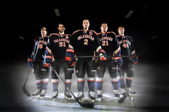
 Last Wednesday the New York Islanders kept with their tradition of debuting terrible looking jerseys by, well, debuting a terrible looking jersey.

We are all familiar, unfortunately, with the fisherman uniform debacle during the mid 90’s. There was also the all orange third jersey catastrophe in 2002. Add this new jersey to the list.
The new third jersey will be worn for the first time when the Islanders faceoff against the Philadelphia Flyers during a Thanksgiving Eve game on November 23. An unveiling event was held at the newly built Islander team store in the Nassau Coliseum.
Let’s get to the jersey. It’s bad. The dominating color here is obviously black, but why? It is not a traditional color for them. It seems the Islanders fell into the same trap many teams do when trying to come up with a newer, modern look. Just add black. Wrong.
Just because you make a jersey black doesn’t make it look sleeker or cooler looking. If anything, the use of black makes the jersey feel odd, like it is literally the black sheep of the Islanders uniform family.
Someone might say, “Hey, the traditional blue and orange colors are still in there.” Yes they are, but it looks like they were thrown in as an afterthought. The second most dominating color is gray. Why gray? Your guess is as good as mine. Using gray makes as much sense as using black. Is the gray supposed to highlight or compliment the black? Once again, who knows. I guess the next best thing to using black is just using a lighter shade of it.
Finally the designers decided to throw in the traditional blue and orange. A bit of blue on the sleeve there and some orange letters and outlining here. Throw a logo patch on the arm and that is good enough right? Wrong again.
Not only was the choice of colors bad, but their placement as well. The jersey seems unbalanced somehow. The upward spike of the sleeves opposes the rounded gray yolk of the shoulders. The shoulder yolk itself, being gray, is almost distracting and seems out-of-place. The ‘Isalnders’ wordmark even looks odd as the font is heavy and blocky.

Speaking of heavy and blocky, the captaincy designations (i.e. the ‘C’ and ‘A’) are huge. They are way out of proportion with the other lettering on the jersey. This is yet another element that makes this jersey awkward to look at.
My last gripe with these sweaters is the laces. This is a uniform feature that is usually placed on more traditional or throw-back jerseys. This is a jersey that was introduced as being sleek and modern. So why add an element that harkens back to older designs? The collar should be connected which would give the design more flow.
When all is said and done, what you are left with is a uniform that is closer in resemblance to the New York Knicks branding than the Islanders’.
The Islanders have a classic look. The blue and orange has been a great color combo. Their logo is so unique as it combines such gems as a hockey stick, an image of Long Island and the “I” in Islanders actually pointing to the exact spot on the Long Island image where the Nassau Coliseum is located.

The current home and away jerseys stay true to the Islanders’ history by being simply designed with white or blue as the primary color and the orange complimenting it beautifully on the sleeves and hem. The Islanders current home and away jerseys also feature four stripes on the shoulder to signify their four Stanley Cups. These new third jerseys have none of that charm.
“I always like to judge them during the game, when you see it in action. I think the black is a cool look and I think it definitely gives a good kind of feel. It’s got a little bit of design, but a little bit of the traditional. We’ll see how it matches, but my first impression is that I like it,” John Tavares said at the unveiling. I’m pretty sure a little bit of his soul died when he made that comment. But hey, if they paid me millions too I would say they make the Black Hawks’ jerseys look like bar rags. But they don’t, so I can’t.

“They’re simple, but sharp,” Islanders forward Matt Moulson said of the jersey. “They’re creative. I think that’s what makes them so cool.” Cool? Gee that word kept on popping up a bunch in the quotes given by the Islander players in attendance. Just look at the Tavares quote above. Wonder if they were told to say that? Nah, I bet they really believe it.
There has already been a ton of backlash from the Islander fan base, and how can there not be? Let’s not kid ourselves. The use of third jerseys is just a way to get fans to buy more merchandise. However, when executed correctly the use of a third jersey makes a team more endearing to the fans.
When it is not done correctly, well, just ask an Islander fan.
The Black sucks, plain and simple. Just one thing though. Have they moved the Colliseum? The I in Islanders is almost in Brooklyn, nowhere near the Colliseum…