Social distancing, huh? That’s a good one… and nothing new.
As a young boy and teenager, our family lost our dad and my sister. Then, in the blink of an eye, the rest of my brothers and sisters were out of the house, doing grown-up things. I also said goodbye to friends who moved away. But on the fortunate side, I developed life-long friends who I consider brothers and sisters to this day.
And here I sit in Hawaii (6,000 miles away from where I grew up in Marlboro, Mass., my very own social distancing fait accompli) with new distancing guidelines in place. Yeah, been there, if you know what I mean. Due to the COVID-19 health crisis, we all have a bit more space between us. Recently furloughed as a full-time sports reporter but doing some freelancing, I endeavored to take a poll and write an article ranking the Top 10 current NHL jerseys.
Related: Top 3 All-Time Stars Goalies
After getting a few family members and hockey teammates past and present to join in, the distance melted away a bit. I was particularly interested in how my first hockey buddy, Bob, who I’ve known since age 5 and still regard as a best friend, would cast his ballot.
One time in the early 1970s, Bob and I were bent on dressing in Minnesota North Stars colors from head to toe for our daily street hockey grind. We both had the green North Stars jersey and so we put on green corduroys. To make it seem like a hockey uniform, we looked for yellow tape. Not finding any, we put a couple of silver duct tape strips around our calves, thinking it might look like hockey socks. His dad, a plumber, got mad when he saw our careless waste of good tape.
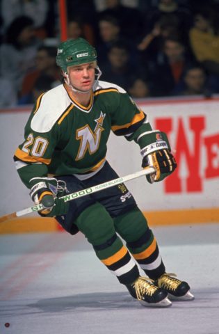
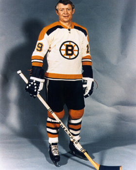
in this photo — were not eligible for this Top 10 list of current NHL jerseys.
(Photo by Bruce Bennett Studios/Getty Images)
In various degrees of agreeability, I got my wife, Vince A., and three kids, Carlyn, Elijah and Nicholas III, to participate, as well as my sister Marsha, brother Dave and niece Jackie. And many of the non-family members who I also wrangled into this are important in my life in one way or another.
After making the initial connections, it dawned on me that the exercise itself was going to be WAY more interesting than the final list. In the end, the Top 10 turned out to be a real beauty — a Top 10 like no other.
Avoiding Bias Was Utterly Impossible
There are some intrinsic biases that readers should be aware of.
Eleven of the 19 voters have some sort of tie to the Boston area, so it was going to be skewed toward the Bruins from the very beginning no matter what. One guideline (not a rule) was to not automatically pick the team you root for.

(Photo by Steve Babineau/NHLI via Getty Images)
If you think about it, would Boston be the top jersey in a poll across all of North America? Highly doubtful, so if Boston wound up on top — with such strong New England representation — this whole idea would have been a complete sham. Fortunately, most everybody played along and weren’t complete homers.
For me and Bob, not being a homer goes back to the old days of wooden sticks on the pavement and shooting tennis balls into nets made out of wood and chicken wire by his dad. The two of us didn’t typically wear Bruins jerseys. It was cooler, in our heads, to put on just about any other teams’ colors. And so we asked for and got many NHL replica jerseys as birthday and Christmas presents.
All voters were asked for their Top 10 current home and away (as a unit) jerseys, another choice as their least favorite (No. 31), and comments on their reasons for picking their best and worst. Teams were given points in descending order — with No. 1 worth 10 points, No. 2 worth 9 and so on all the way to 1 point for No. 10.
On top of that, teams were given bonus and penalty points. The four bonus categories are: No. 1 vote (25 points), No. 2 (15 points), No. 3 vote (5 points) and total votes cast (multiplied by 3) for a particular team out of a possible 19 votes. A penalty of 25 points was subtracted for a last-place vote.
And now the findings:
No. 10: Washington Capitals
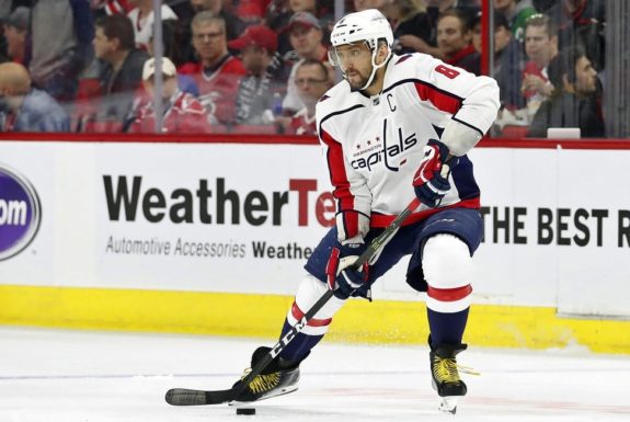
The franchise representing the nation’s capital got one first-place vote and just 5 out of a possible 19, but none of those other four voters ranked Washington lower than No. 6. So, people who liked the Caps were solidly in their corner.
(AP Photo/Karl B DeBlaker, File)
Elijah slotted Washington No. 1, and this is what he said, “You can’t go wrong with red, white and blue. Looks very slim. Reminds me of the great old U.S.A., as the team should.”
On a personal note, the first time I saw the Caps in person at the old Boston Garden, former Boston Bruins star Tommy Williams was in uniform. He once gave my dad a stick signed by Boston star Johnny Bucyk and all of the 1967-68 Bruins, and then my dad gave it to me. That is why I am a lefty.
Oh, I almost forgot. John Carlson, the star Washington defenseman and Stanley Cup champion, is the son of Dick Carlson, who is from my hometown in Massachusetts. Dick’s family ran the pro shop at the local rink and his brother Don was my Marlboro High School teammate.
My personal ranking for Washington (1 through 31): No. 11.
No. 9: Detroit Red Wings
No real ups and downs here for the Motor City, with its simple red and white design and iconic flying wheel logo. The Red Wings held steady across the board with mid-range votes, plus one No. 2 and two No. 10s.
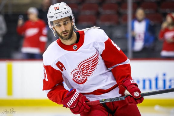
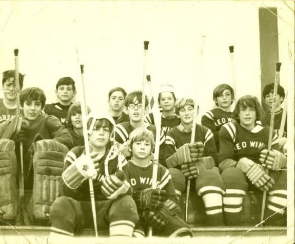
My first youth hockey team was the Red Wings. Dave, my brother, was the coach, and we added Bob to the team right before the season started. I will never forget calling Bob up and asking if he wanted to join the team. After his parents gave him the OK, he ran down the street to pick up his No. 6 Red Wings jersey, so excited. I was proud to have No. 9, Gordie Howe. I probably had first choice.
My Detroit ranking: No. 5.
No. 8: Vegas Golden Knights
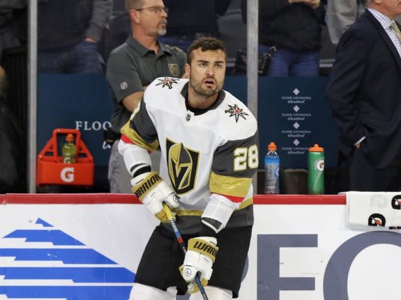
The newest NHL franchise got seven total votes, including two at No. 1 and none worse than No. 7. Like the Caps, those who like the Knights’ threads really like them.
(Amy Irvin / The Hockey Writers)
The two avant-garde voters in Vegas’ corner, Vince E. and Ryan, played against each other in a Silver/Bronze Division game at the 2019 AAU tournament in Kapolei. Vince (a shifty, speedy player) sniped Ryan (a hockey fashionista who always wants his equipment to match) a couple of times in a close win. Interestingly, Vince’s team won gold in the Silver Division, and Ryan’s team took first in the Bronze.
Related: The Worst Trades in NHL History
“I love the gold and grey with a touch of red,” Ryan said about the Vegas jerseys. “Love it.”
Added Vince A.: “A unique color combo. They look sharp.”
My Vegas ranking: No. 22.
No. 7: San Jose Sharks
I didn’t realize it until the voting was over, but me, my wife and three kids all had a vote for the Sharks somewhere in the Top 10. Carlyn and Nicholas III put them at No. 2.

Enough other people (nine total votes) joined in to make San Jose legit. Say what you want, but a Shark breaking a hockey stick is pretty solid, in my opinion. Teal is not unbelievable, but the designers kept the whole thing simple and attractive.
Sadly, living in Hawaii has kept me away from NHL rinks. I moved here in 1989 and went to my first NHL game since ’87 just a few years ago — New Jersey at San Jose — while visiting Carlyn, a USF grad who lives in San Francisco.
I do own a San Jose Sharks hat, and one of my Massachusetts hockey friends, Matt (now a youth coach in Nashville), sent me a Sharks jersey that I’ve worn a few times for pickup games. He also sent me hockey pants with a Sharks logo on it. And that’s not all. My brother in-law Ken and his wife Lisa from NorCal gave our whole family Sharks sweatshirts.
My San Jose ranking: No. 10.
No. 6: Toronto Maple Leafs
Obviously, this jersey is a classic, with a good use of blue in spite of the fact that the iconic Canadian national leaf displayed in front is most often depicted elsewhere in red.
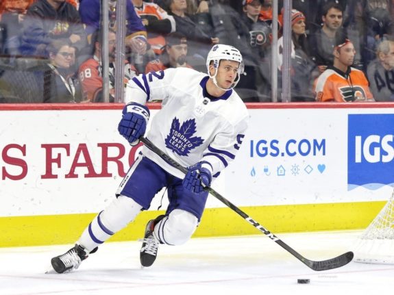
Many of the voters have a place in their hearts for this traditional-six franchise. Some, I suspect, think of it as a bit dull. The Maple Leafs didn’t net any first-place votes and received mostly middle of the road Top 10 nods.
In my Bantam years, I owned a nice, white Toronto No. 16 jersey as a member of the Maple Leafs house league team.
As a youth inline hockey coach on Kauai in the mid-1990s, I thought highly enough of this jersey to order it from the mainland for one of three intermediate school-age teams. The blue matched the color of the high school sports teams on the west side of the island. Note: I also ordered red (Blackhawks) and white/green (Stars) jerseys to match the central and east side/north shore high school color schemes.
All three sets of those jerseys read “McDonald’s” where the last name usually goes in the back because Jim Koishigawa, a manager at the golden arches, donated money so we could buy them and we wanted to give the struggling corporation the advertising they desperately (not) needed.
Related: Every Stanley Cup Winner Since 1960
Our Kauai adult inline team wore the blue Maple Leafs set en route to winning the gold medal on a huge slab of cement at Hickam Air Force Base at the 1996 Aloha State Games.
My Toronto ranking: No. 7.
No. 5 Colorado Avalanche
This was the biggest surprise in the Top 10, with the Avs getting nine total votes and two at No. 1.
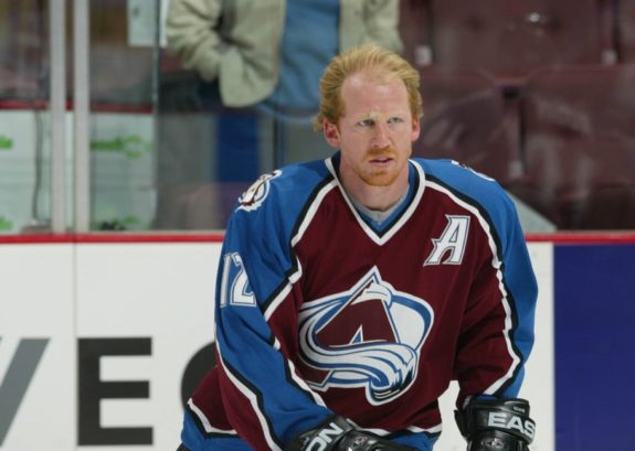
Some voters found Colorado’s colors uninteresting, but not Joe L., who is a retired Navy commander.
“Great colors and logo,” he said. “Perfect for Colorado — skiing and it (an avalanche) is a huge threat.”
Vince A., my loving other half who is a life coach, also voted the Avalanche at No. 1.
“I like the Big ‘A’ and the snow,” she said.
Personally, I loved the Avalanche uniforms when they came out in the ’90s after the Quebec Nordiques relocated to Denver, but not so much these days.
I forgot to ask Tim, a teammate and rival in the Kapolei league nowadays, for his input in this poll. Back in those Kauai inline days in the mid-’90s when I was his coach, he convinced the rest of the team to get Avalanche jerseys for a tournament and was super excited when we actually got them.
My Colorado ranking: No. 16.
No. 4: New York Rangers
Ahhh, a real contender, the Rangers, another time-tested legendary look. It has the red and white accenting the bold blue on the home set, and the classy white set uses the other two colors sparingly. Both have the word “Rangers” running diagonally down — such a simple thing, but it differentiates them from the pack.
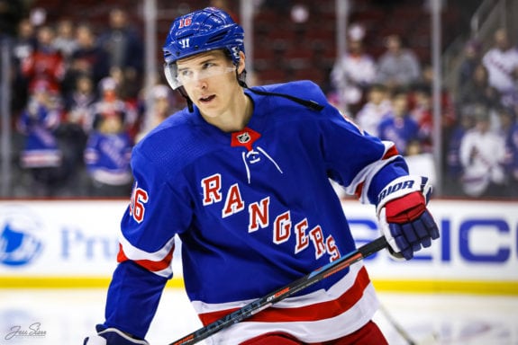
(Jess Starr/The Hockey Writers)
While playing street hockey, Bob and I pretended to be many NHL teams and players, and the Rangers were a common choice. We were Ed Giacomin, Jean Ratelle, Vic Hadfield and Rod Gilbert. Going against the grain, we were even the hated (by Bostonians) Brad Park (who eventually became a Bruin). We both owned the dark blue jerseys.
New York was the top vote-getter (before the bonus points) with 14 of the 19 possible. Yet, not one participant voted the Rangers as No. 1. Jackie, who has experience in the fashion and beauty industries, had them at No. 2. She even said pro sports jerseys were becoming a fashionable thing and sent me a photo of a girl wearing a Rangers-inspired, trend-setting top.
But Jackie put another New York team, the Islanders, on top of her list, saying, “I love the combo of the retro logo and the stripe. Plus, blue and orange are complementary colors and I like anything that says New York on it, obviously.”
She graduated from San Francisco State and lives in San Francisco now, but spent a handful of years working in Manhattan.
The Rangers received a low grade from Mike B., a construction company manager, who said, “No creativity.”
My New York Rangers ranking: No. 6.
No. 3 Montreal Canadiens
If this jersey could talk, it would say, “Winning.” And it could back it up with a list of 24 Stanley Cup championships.
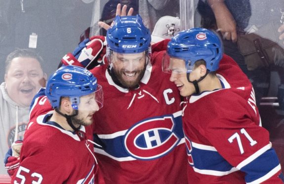
(THE CANADIAN PRESS/Graham Hughes)
It’s a pretty simple design, containing a creative logo of a ‘C’ with an ‘H’ inside — along with an interesting white and blue band across the middle on the home red version. According to a long-held belief backed by most hockey sources, the ‘H’ refers to Les Habitants, which translates to “inhabitants,” or those from Montreal. A relatively new explanation that can be found on Wikipedia postulates that the ‘H’ stands for hockey and is part of the official name of the franchise — le Club de hockey Canadien.
The Canadiens nabbed nine votes and six of those were in the top three, including two first-place nods.
“Gotta go with Rocket Richard on this one,” Marc-Andre, who is in the construction business, said about his hometown team. “Gotta go with the Montreal boys.”
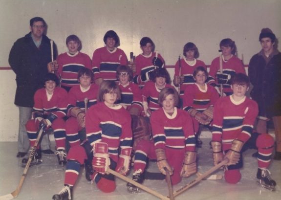
For me, the red Canadiens jersey was what my Seals team wore for our 1972 Pee Wee championship season. I wore No. 12, Yvan Cournoyer, and it was what I donned when I went to summer camp at age 13 in Aurora, Ontario. That was intense (I think we suited up 27 times in 14 days). Although a Bruins fan, I always respected the team that has played the best brand of hockey for the longest period of time (at least through their last Cup in 1993). My tip of the cap to them.
My Montreal ranking: No. 1.
No. 2 Boston Bruins
Of course, you expected my hometown connection to be high. It couldn’t be avoided. And, I’m pretty sure that the Bruins would be in my Top 10 even if I had not grown up in New England.

dislike him slightly. (AP Photo/Mark J. Terrill)
It’s a good-looking uniform. My only negative mark for the Bruins is that I think the home set of uniforms is too dark. When I was a kid, they used to use white or yellow socks with the black jersey (see the Bobby Orr flying into hockey eternity iconic poster, of which I own a tattered original). Now, the team wears black socks at home.
When Bob and I hit the pavement, we especially loved to wear the Flyers jerseys. But we did put on the black and gold occasionally. I recently came across a photo of me wearing Bruins colors (including matching winter hat with a yellow pom-pom) and green rubber boots getting ready to go play on the pond. That was age 10, most likely. And a photo of Bob wearing a dark Bruins jersey made it into the local newspaper. He brought his beat-up stick to get autographed by Derek Sanderson at a new store opening event, and the Turk — who fans were crazy about at the time — bought him a brand-new one.
Related: Hockey Documentaries to Watch Right Now
Les, who owns a farm on Kauai, Marsha, a retired IBM engineer, and Scott, a TV station general manager, voted Boston at No. 1, and here’s what they said:
Les (and his family): “We like the black and yellow ‘B’ and spokes.”
Scott: “I have always loved the varsity-style logo and spoked ‘B’. The Bruins have always stuck with the same look since the team was formed 96 years ago.”
Marsha: “Bruins games at the old Boston Garden were such a special occasion — before helmets, before loud music, so perhaps that makes me like the Bruins jerseys. I love the Bruins colors and it reminds me of a Bruin bear. I could be partial to early bonding memories.”
Hey man, Bobby Orr and the Big Bad Bruins can do that to you.
My Boston ranking: No. 4.
No. 1 Chicago Blackhawks
I thought Vince E. would seal the deal on this one, but he took Vegas first followed by the Blackhawks.
Four voters, however, did go with the Windy City and three slotted them at No. 2. Those quality votes put this mighty franchise over the top.
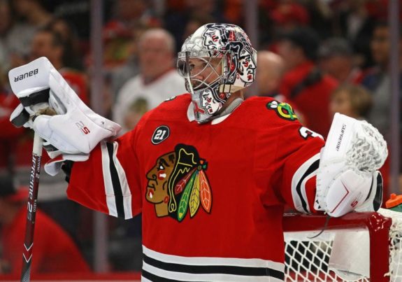
(Photo by Jonathan Daniel/Getty Images)
And the comments for the Blackhawks are dynamic.
Bob, who absolutely ate and drank hockey for much of his life en route to breaking scoring records at Marlboro High and Fitchburg State, puts them above all others.
“Chicago is the best because the colors vibrate high energy and their logo is a leader and warrior,” he said.
Added Timo, a Segway tour owner who owns a ton of NHL replica jerseys, including the St. Louis Blues, Chicago Blackhawks, Minnesota North Stars, Boston Bruins and Buffalo Sabres: “The Blackhawks have the best color combo and logos on chest and shoulders. Also, it’s one of the oldest and has stood the test of time without changes.”
From Mike K., a bar owner who also sponsors a tournament team: “It’s an older look that’s classic (and I like the) native chief logo.”
Brother Dave, who owns a car dealership, chimed in: “The Blackhawks name and logo have a tough human meaning.”
When I was about age 9, I remember seeing a neighbor wearing a Blackhawks-inspired jersey that was primarily black. He was at a store, having just played in a game. I didn’t know he played hockey, and I didn’t know I would be playing within a year or two.
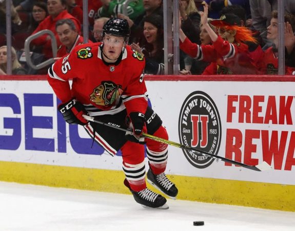
Party on. (Photo by Jonathan Daniel/Getty Images)
And then, when me and Bob were on that Red Wings team, we played against the Blackhawks for the championship. We thought for sure that we were going to win. We brought cases of soda to celebrate by pouring the liquid on our heads in the locker room afterward. The only trouble, though, is we lost 1-0. Eh, we poured soda on our heads anyway. To this day, I have the same attitude for any game. We should win. But I have learned, begrudgingly, that it doesn’t always happen.
My Chicago ranking: No. 2.
Other Interesting Tidbits
I thought for sure that Philadelphia (my No. 3 pick) would make the top 10 and the Flyers almost did. They were in it all the way up until the last few votes were tabulated.
I like the Flyers’ old-school orange and white. I never liked it when they wore black as the primary color, though. In those days of pretending to be NHLers, we were Bobby Clarke and Orest Kindrachuk, and another friend was (and enforced like) Dave Schultz.
When we traveled a few blocks away to meet another neighborhood’s team, we called ourselves the Grace Circle Flyers. Our home “rink” was a slightly downhill straightaway on Cetrina Drive in between Bob’s house and mine.
Priding myself on hustling (some call it grinding), I ALWAYS ran down the hill to get the ball and if someone else was in the mood to run down, I would try to get there first. If Bob went down, he would walk — unless challenged — to save energy. More often, if we were on the same team, he would wait until I brought the ball back up the street so I could pass it to him and he would put it in the net. He was talented in all areas, but what set him apart was his hunger to score goals, even back then. I was and have always been someone who concentrates on puck possession, playmaking and — with age and wisdom — defense.
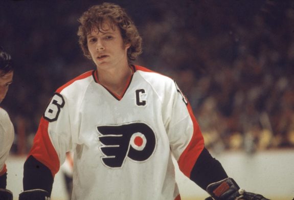
winning two Stanley Cups. The Philadelphia jerseys did not make this list, though.
(Photo by Bruce Bennett Studios via Getty Images Studios/Getty Images)
There were several iterations of our neighborhood team, and some of the regulars were Mike, Put, David, Tommy and Chris out of many, many more.
But we had to tip our caps to the Flyers. They beat the Bruins for the 1974 Cup, something we didn’t think was possible.
I would like to add that Grace and Cetrina are the names of the mother and grandmother of another best friend named Bob who we grew up with. His father built all of our houses. He didn’t play hockey too often, but could hit a baseball a country mile. He is still playing and running a men’s team in Arizona.
Ottawa was voted as the worst jersey, by far. The Senators didn’t get a single top-10 vote and were twice chosen as the worst. Anaheim was second to last, getting saddled with three last-place votes. Three voters, however, placed the Ducks in their top four and that kept Anaheim out of the cellar.
Former Marlboro High player and 2018 Olympian Bobby Butler played for the Senators a few years back. In high school, I played against his dad, John Butler, of St. John’s in Shrewsbury. With his son on the team, John coached the Panthers to a state Division III championship in 2005. Back in 1978, both John and I had our hands full when our teams played against Marlboro arch-rival Hudson. That’s the year those Hawks shocked the whole state and won the D-I title. Ahem, we beat them 4-3 during the regular season (and also lost 5-4), but that is a story for another day. I do recall us Panthers upsetting Butler’s Pioneers 8-6 after losing to them earlier in the season.
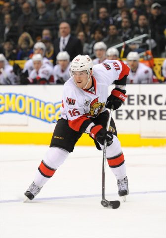
is from Marlboro, Mass. (Chris Williams/Icon SMI)
Now that I’m in the business of full-on name-dropping, I might as well add George Conway to the list. He was a freshman — with speed — on that MHS team in 1978. When George’s name comes up on social media among those from the hometown crew, someone usually brings up the fact that George was ultra-smart and skipped a grade. I knew he was Asian, but didn’t fully realize it then that he is of Filipino descent — just like my wife.
Matt (the guy who sent me some Sharks gear) works taking stats for the NHL at Nashville Predators games and he was an assistant coach under Butler at MHS for what I can only imagine was a glorious ’05 season.
Carolina, the only team to not get a vote in the Top 10 nor a vote at No. 31, ended up at No. 28.
One would-be voter, Paul, who shows up nearly every Sunday for pickup, did not get the call for his input. He, however, is the first off the bench if we need somebody else’s opinion. I do know that, unlike other Sunday Warriors like Ryan and Timo, he will continue to shine in his plain white and plain black No. 10 jerseys each and every week when we get back out there.
Bringing Us Together
Overall, this was a positive project that brought me in touch with family members and friends and cut down on the seemingly ever-expanding distance.
I reminded Marsha how she and her future husband, Bill, took me to my first NHL game on Dec. 15, 1968. The Bruins beat the Penguins, who wore ice-blue jerseys then, 5-3. I even sent her the box score from hockeyreference.com. That game was exactly 36 days after we lost our dad, who was a B-17 ball turret gunner in World War II and a prisoner of war in Nazi Germany for 14 months. It must have been their way of trying to cheer me up.
If you click that last link, you will come across a book by John Comer, who was a pilot in my dad’s crew. My dad is mentioned a bunch in the story, which was written in 1988 and which we didn’t know about until Dave sought out and found those B-17 crew members, including Comer. If you take a look, you’ll notice my mom’s artwork, which was used for the electronic version of the book that came out about 10 years ago.
And Dave reminded me of the time we ran into Bruins star Johnny McKenzie outside the Boston Garden before a game. It was odd because it was fairly close to game time. “Pie” chatted with us briefly and shook our hands.
circa 1970, he was wearing a long overcoat. In photo, he’s holding
his stick like a lefty, but I remember he was a righty playing right wing on a line
with left wing Johnny Bucyk and center Fred Stanfield.
My friends back then had a hard time believing that I was telling the truth on that story. Through the years, I’ve had to check my own memory. It was always embedded there, with a tiny thought that perhaps my brother and his friend were fooling a little kid into thinking it was McKenzie. But Dave confirmed it just the other day: It was indeed Pie, he said.
Surely, I am not the only one who can come up with a list of top NHL jerseys. It’s been done a ton by other writers. But, with a little help from my friends, I at least attempted to make this something special. And, remember, it’s not the ranking that matters. It’s about the sport and the closeness that playing and watching the game brings.
Hockey is keeping us together. Everyone could use a little social closeness-ing right now.
Other Best And Worst Comments
>> Mike B.’s best (Arizona Coyotes): “It stands out. Perhaps the red?”
>> Marc-Andre’s worst (Boston Bruins): “That’s easy!”
>> Family friend Noah’s best (Tampa Bay Lightning): “I like the colors and how clean the jersey is.”
>> Noah’s worst (Anaheim Ducks): “They have too much going on, in my opinion, and the shade of orange is not appealing to me, personally.”
>> Vince E.’s worst (Colorado Avalanche): “Ugly color combo and boring pattern.”
>> Nicholas III’s best (Minnesota Wild): “Awesome logo with great red accents.”
>> Nicholas III’s worst (Ottawa Senators): “Similar to others and has a worse logo/mascot. Underwhelming and boring.”
>> Elijah’s worst (Ottawa Senators): “Ewww, Canada. Looks like a freakin’ rec league jersey.”
>> Carlyn’s best (Los Angeles Kings): “I like black for the Kings.”
>> Carlyn’s worst (St. Louis Blues): “I don’t like blue and yellow together for the Blues.”
>> Marsha’s worst (Tampa Bay Lightning): “Too trendy. (Looks) too much like a superhero.”
>> Les’ kids’ worst (Buffalo Sabers): “Looks lopsided.”
>> Ryan’s worst (Minnesota Wild): “The home jersey looks like a tomato.”
>> Bob’s worst (Anaheim Ducks): “It’s boring and it’s a bad name for a hockey team.”
>> Mike K.’s worst (Winnipeg Jets): “Modern franchise with a basic-looking logo. No flare or substance.”
>> Scott’s worst (Montreal Canadiens): “I absolutely hate these two teams (along with the New York Rangers, who he put slightly above the Habs) and cities.”
>> Timo’s worst (Minnesota Wild): “Boring logo and awful Christmas-tree like color combo. The Devils used to wear that color combo, but got rid of it for a reason. It’s ugly.”
>> Joe L.’s worst (Los Angeles Kings/Vegas Golden Knights, tie): “Bland.”
>> Vince A.’s worst (Los Angeles Kings): “Plain.”
>> Dave’s worst (Vancouver Canucks): “Looks odd. What is it, a fish and a C?”
>> Jackie’s worst (Anaheim Ducks): “The new Anaheim logo is horrible.”
instructional league runners-up. (Photo by Joe Abramo)
>> My worst (Calgary Flames): “Red with yellow looks like throw up and the black accent doesn’t help”
Final Standings
1. Chicago Blackhawks, 257
2. Boston Bruins, 218
3. Montreal Canadiens, 130
4. New York Rangers, 129
5. Colorado Avalanche, 124
6. Toronto Maple Leafs, 122
7. San Jose Sharks, 116
8. Vegas Golden Knights, 101
9. Detroit Red Wings, 98
10. Washington Capitals, 72
11. Arizona Coyotes, 67
12. Philadelphia Flyers, 67
13. Pittsburgh Penguins, 66
14. Tampa Bay Lightning, 59
15. Edmonton Oilers, 58
16. New York Islanders, 51
17. New Jersey Devils, 47
18. St. Louis Blues, 45
19. Minnesota Wild, 44
20. Los Angeles Kings 31
21. Columbus Blue Jackets, 27
22. Dallas Stars, 25
23. Nashville Predators, 22
24. Winnipeg Jets, 18
25. Buffalo Sabres, 11
26. Florida Panthers, 8
27. Vancouver Canucks, 3
28. Carolina Hurricanes, 0
29. Calgary Flames, -3
30. Anaheim Ducks, -5
31. Ottawa Senators, -50