The Boston Bruins‘ black and gold spoked “B” has been around for a long, long time, and that iconic logo and color scheme will probably never change.
With that said, the Bruins have managed to put together a great number of uniform combinations throughout their storied history. Some have been fine, some have been outright ugly, some have been great. With recent teams rolling out a new Reverse Retro look at the 2021 Outdoor Game and sporting those Kelly green warm-ups for Irish Heritage Day before Saturday’s game, I found myself looking back on all of the uniforms the Bruins have donned over the years, and deciding which ones stood out the most.
This is largely a subjective topic, but I am confident in my picks. For my money, these are the five best uniforms the Bruins have ever worn. Be nice in the comments.
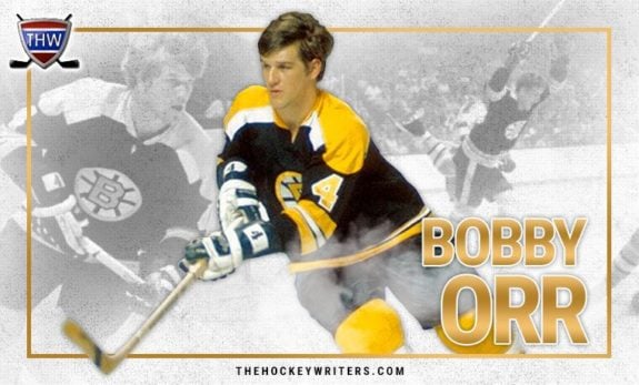
5. 1969-74 Black Jersey
The Bruins fiddled with the black jersey design for nearly 20 years before finally settling on this masterpiece in 1969. This jersey laid the foundation for all the Bruins’ black jerseys to come.

The gold stripes on the sleeves, shoulder yoke, and spoked “B” remain a part of the organization’s black jerseys today, with almost no change. Added to the fact that this was the primary uniform worn by Bobby Orr’s Stanley Cup-winning teams, it just might be the most historically significant jersey in Bruins’ history.
There are some minor qualities that are unique to this uniform, as well. The gold stripe on the side of the pants is a nice accent, and the gold socks are a classic look that the Bruins only stopped using in 2017 (more on that later). This uniform has both the past and present in its stitches and is undeniably a classic, which is why it made my top five.
4. 1991-92 NHL 75th Anniversary Jersey
Last worn for the NHL’s 75th anniversary in 1991-92, this is arguably the most unique white uniform the Bruins have ever worn. These sweaters are a callback to the Bruins’ first uniforms that featured the color black instead of brown, which were introduced all the way back in 1934. The adaptation isn’t completely accurate, though.
The Bruins still wore the ugly brown pants back in the ’30s and only sported the “B” on the sleeves, which wouldn’t have held up in the ’90s. In 1991, they made some good changes and wore black pants, plus the “B” front and center on the chest. The socks also don’t have nearly as many stripes, which was a smart move. A simple gold stripe with black outlines does the job just fine.
While white is technically the primary color here, the alternating black and gold stripes on the sweater give this jersey a color balance that we don’t often see with Bruins’ uniforms. Normally one color dominates, but with this one every color gets plenty of love. Plus the smaller details — the white collar, the nameplate overlapping with the shoulder yoke, and the 75th anniversary patch — make this uniform one of my favorites. I wish I was around to see Ray Bourque wear this one.
3. 2016 Winter Classics
These jerseys were so popular after the 2016 Winter Classic that the Bruins made them their official home alternates for the entire 2016-17 season. This is the black version of the Bruins’ first-ever brown and gold uniforms from 1924 — nothing on the shoulders, solid stripes, the original brown bear logo, and a plain white nameplate/number.
Two stripes on either sleeve plus the visible stitching gives this uniform a rugged personality, reminiscent of an old football or rugby jersey. There is no subtlety here; what you see is what you get. That’s what makes this one great, though — it absolutely screams Bruins hockey. It’s aggressively simple, yet simply aggressive.
The only thing missing with these uniforms, though, was the win. The Bruins lost to the rival Montreal Canadiens 5-1 that day in 2016 under the lights of Gillette Stadium in Foxboro, Mass. It was a rough day, but these sweaters made the loss a little less bitter.
2. 2020-21 Reverse Retros
The newest Bruins’ uniform has garnered some high praise since it made its first appearance at the 2021 Outdoor Games, and it’s easy to see why.
For starters, gold uniforms are always a welcome change (except for those horrid alternates from the late ’90s) from the blacks or whites that the Bruins typically wear. It’s a nice callback to the ’50s and ’60s when gold was the primary color, and they knocked this rendition out of the park.
This uniform has both simplicity and detail in all the right places. The Pooh Bear stands out on the shoulders and also makes an appearance on the helmet, and the old-school spoked “B” looks much better on the gold background than the crest we usually see.
The stripes at the bottom of the sweater perfectly transition into the black pants, which keeps the gold from overtaking the uniform. The gold socks keep things bright at the bottom, and the stripe locations contrast perfectly with the primary color. There really isn’t anything to complain about with these things. Everything is just right.
You may also like:
- Bruins’ Poitras Proving He Deserves NHL Promotion With AHL Point Streak
- Bruins Week Ahead: Schedule & Storylines – Playoff Push, Pastrnak, Zacha and More
- Bruins Must Carefully Consider When to Debut Hagens
- NHL Playoff Bubble Spotlight: Who Will Survive the Eastern Conference Gauntlet?
- Bruins Benefiting Greatly From Zacha’s Career Season in Final Stretch
The gleam from the sun setting over Lake Tahoe gave these retros a certain glow that we hadn’t seen before. It really made for a picturesque setting. Apparently, the players knew how good they looked, because they put up seven goals and dominated the Philadelphia Flyers from start to finish. It’s a shame they couldn’t replicate that performance on Saturday against the Rangers, though.
Call it recency bias if you want, but these uniforms are the best gold alternates the Bruins have ever made, and I hope the team wears them more often.
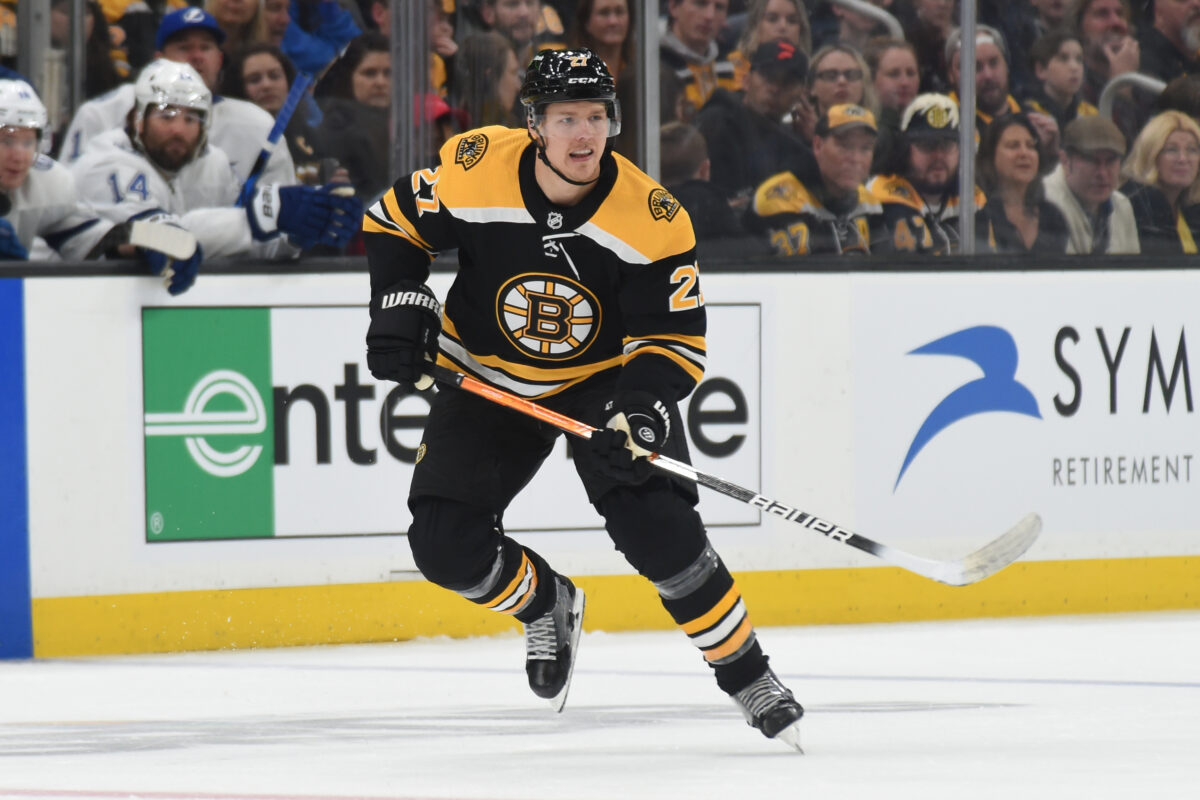
1. 2017-Present Home Jersey
I’m a sucker for all-black uniforms. Some of my favorites in the NHL include the Los Angeles Kings’ home sweaters and the Chicago Blackhawks’ black alternates. While those uniforms look great in their own right, it doesn’t get any better than the Bruins’ current home blacks.

In 2017, Adidas took over the NHL’s uniform production, and we can see it in the small details. The font is more thin and the black outline has been removed, making the nameplate and number pop a little more. The sweater’s bottom stripes curve ever so slightly, and the Pooh Bear logo on the shoulders is just a tad bit smaller. The shoulder yoke is also blockier with a more extreme slope towards the nameplate, which has a surprisingly big impact on the jersey’s overall flow.
What really sets these black uniforms apart from the others, though, is the socks. This is actually the first time in the team’s history that they have worn black socks with the primary black sweater. Some prefer the flare of the gold socks, but I am all for the new look.
The sock and sleeve stripes are also identical, which is another first. This gives the uniform a crisp, symmetrical, aggressive look from top to bottom that no other Bruins uniform can match. Add the classic spoked “B” as the centerpiece, and we have the best uniform in Bruins’ history.
Black and gold is a tough color scheme to pull off. Worst-case scenario, you can look like a bumble bee or an escaped convict (think of the Pittsburgh Steelers’ throwback jerseys). But the absolute best-case scenario for a black and gold uniform is the Bruins’ current home sweater. It is arguably the best black and gold uniform in all of sports, let alone the NHL, and it belongs nowhere else but at number one on this list.
