*This archive was originally written by Vince Reilly
With the calendar flipping to the new year, hockey fans tuned in to the annual tradition of outdoor hockey with the Winter Classic. The 2026 iteration visited South Florida and saw the New York Rangers and Florida Panthers duke it out at LoanDepot Park.
Besides seeing the players reconnect with their roots, playing the game outdoors, one of the most anticipated aspects of the Winter Classic is seeing what each team decides to do with their jerseys. With 14 games to pick from, here are my rankings of the Winter Classic jerseys from 2008 up to 2023.
34. Chicago Blackhawks – 2015
This game was played on Jan. 1, 2015, between the Chicago Blackhawks and Washington Capitals at Nationals Park in Washington, D.C. The Capitals won the game 3-2.

It is important to note, there is nothing inherently wrong with this jersey. In fact, according to some people, the Blackhawks have the best uniform in the NHL, a fact they lean into with this jersey. The issue is that it does not stray from their regular setup. There is nothing about seeing the team in this that says it is a special occasion. If you flipped through the TV channels and stopped on a clip of this game momentarily, you wouldn’t immediately know if it was just a regular Wednesday in October or the Winter Classic. This feels like a poor effort for a team that could have made such a strong statement.
33. Chicago Blackhawks – 2017
This game was played on Jan. 2, 2017, between the Chicago Blackhawks and St. Louis Blues at Busch Stadium in St. Louis, MO. The Blues won 4-1.
Everything I said above holds true here. In fact, this jersey could have been the same one the team wore in Washington two years before. It is an uninspiring piece that a team still laden with superstars deserved better than. I know the white Blackhawks jersey is iconic, but there had to have been some way to mix it up, even if it was just adding some of the colors from the crest into the striping on the jersey rather than sticking with the typical red and black.
32. Philadelphia Flyers – 2010
This game was played on Jan. 1, 2010, between the Philadelphia Flyers and Boston Bruins at Fenway Park in Boston, MA. The Bruins won 2-1 in OT.
You’re probably noticing a trend by this point. I do not like jerseys that play it conservative and look ready to be swapped out for any other regular season game. The Flyers have an interesting combination of history and whacky jersey choices that should have allowed the team to get creative with their appearance for this game. Instead, they opted for one that is strikingly similar to what they wear regularly. This is not so much an issue with the jersey, as an issue with the lack of thinking outside the box to seize the moment.
31. St. Louis Blues – 2025
This game was played on December 31, 2024, between the Chicago Blackhawks and St. Louis Blues at Wrigley Field in Chicago, IL. The Blues won 6-2.
While the Blues may have dominated this game on the ice, I can’t say that their uniform was particularly exciting. With a generic St. Louis typeface across a blue stripe on a white background, there’s not a lot happening on this jersey. I guess the positive thing I can say is that it is at least clean, and was an attempt at honoring a never-used design from a bygone era. However, it just wasn’t interesting to look at, especially for a Winter Classic uniform.
30. Detroit Red Wings – 2009
This game was played on Jan. 1, 2009, between the Detroit Red Wings and Chicago Blackhawks at Wrigley Field in Chicago, IL. The Red Wings won 6-4.
This jersey was tough for me to vote this low, as I am usually a sucker for the “Stylized D”. This time, it feels boring. I think adding one more color to break up the white and red could have helped, possibly a black band of piping above the red center stripe could have elevated this jersey for me. Also, the candy cane socks are a miss in my book, another item working against it climbing any higher.
29. Minnesota Wild – 2022
This game was played on Jan. 1, 2022, between the St. Louis Blues and Minnesota Wild at Target Field, Minneapolis, MN. The Blues won 6-4.
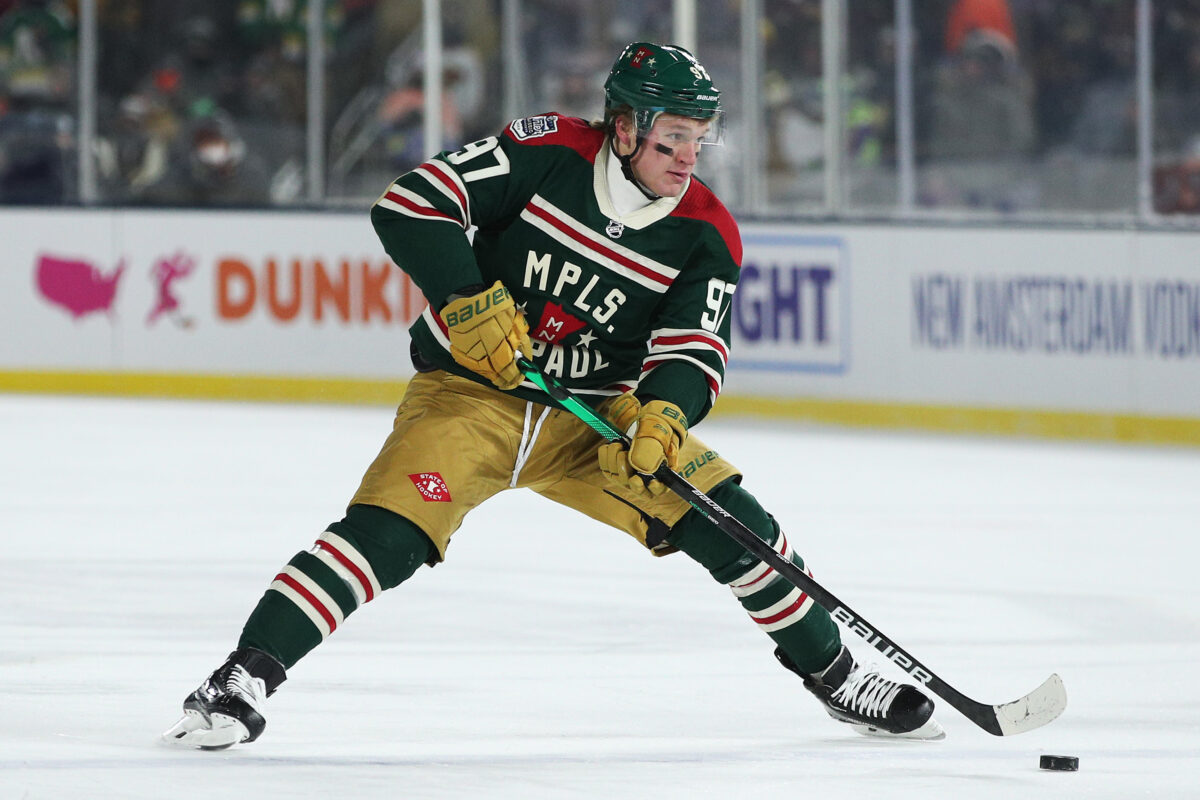
The State of Hockey’s first Winter Classic was the perfect encapsulation of Minnesota, sub-zero and setting records for the coldest outdoor game the NHL hosted. In this thread, the Wild attempted to cram as much Minnesota into their jersey as they could and ended up overdoing the situation. The basic premise, a dark green base with red and white accents works well for me, even utilizing “MPLS” and “St. Paul” on the jersey in a nod to the Twin Cities is fine in theory. The problem arises from the weird striping under the NHL shield and above the center crest alongside the writing inside the state outline. If a few ideas had been said no to, this could have been an excellent creation, instead, it is a bit Frankenstein-ish with too many competing items coming together.
28. New York Rangers – 2012
This game was played on Jan. 2, 2012, between the New York Rangers and Philadelphia Flyers at Citizens Bank Park in Philadelphia, PA. The Rangers won 3-2.
The Rangers opted away from their traditional diagonal lettering for their team crest on the front of this jersey (good!) but still managed to miss the mark in some key areas. Their biggest mistake was choosing to embrace “heritage white” aka off-white. This trend has been common in Major League Baseball for years with teams choosing a cream-colored jersey as an alternate. It works on those jerseys because the color still is so much lighter than the corresponding dirt and grass. On the ice, it fails to hit, looking especially off given the ultra-white background of the ice and boards. This color doomed what could have otherwise been an intriguing setup for an Original Six franchise.
27. St. Louis Blues – 2022
This game was played on Jan. 1, 2022, between the St. Louis Blues and Minnesota Wild at Target Field, Minneapolis, MN. The Blues won 6-4.
Heritage white round two, this time not from an Original Six team. The Blues opted for their cream jerseys just as their baseball counterparts, the St. Louis Cardinals have done. Again, cream works when it contrasts with dirt and grass, it doesn’t work nearly as well when it is compared to a white background. The blue and gold accents St. Louis incorporated helped damped some of the blow, but once again, a bad base setup hurt the overall jersey more than anything else could make up for.
26. Buffalo Sabres – 2008
This game was played on Jan. 1, 2008, between the Pittsburgh Penguins and Buffalo Sabres at Ralph Wilson Stadium in Buffalo, NY. The Penguins won 2-1 in a shootout.
At the time, this jersey would have likely been higher. It returned the Sabres to their traditional leaping Buffalo logo with the crossed swords, a marked improvement from the Buffaslug. It is a clean, standard set-up, one that was so successful it became the team’s permanent jersey following its unveiling. The problem now though is looking back and seeing what the jersey could have been. The blue and gold color combo works, but the recent turn by the Sabres to an even lighter shade of blue makes this jersey better. History has lowered what was an otherwise popular jersey in my eyes.
25. Pittsburgh Penguins – 2023
This game was played on Jan. 2, 2023, between the Pittsburgh Penguins and Boston Bruins at Fenway Park in Boston, MA. The Bruins won 2-1.
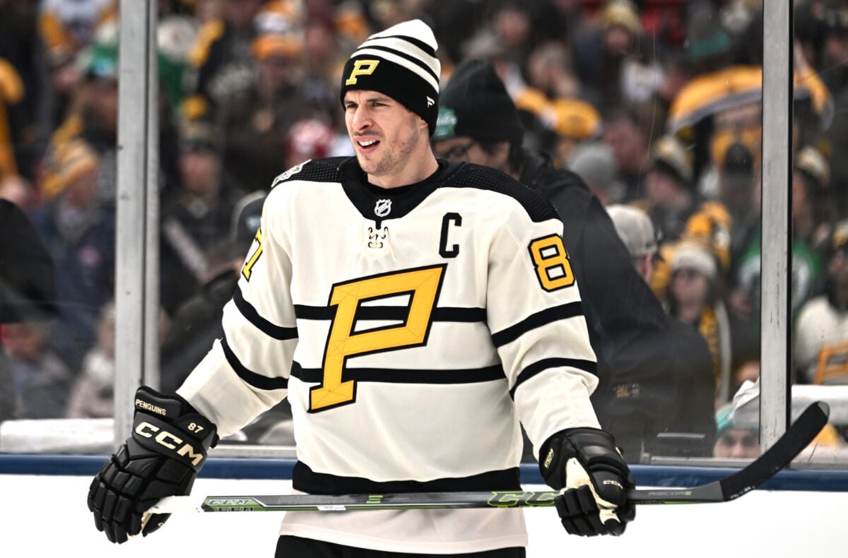
The Heritage white strikes again. When this jersey was announced, I had exceedingly low expectations for it. I will say, once I saw it on players in action, it did grow on me, but still not enough. Although the Penguins did a great job of tying in their city’s baseball roots, even adopting a uniform from their hockey era as the Pirates, it missed the mark. Given how creative some of the other Penguins jerseys have been for previous Winter Classics, this one never seemed to reach the same high bar this team has set.
24. Chicago Blackhawks – 2019
This game was played on Jan. 1, 2019, between the Boston Bruins and Chicago Blackhawks at Notre Dame Stadium in South Bend, IN. The Bruins won 4-2.
Related: 3 Bruins’ New Year’s Resolutions for 2023
Chicago certainly broke from tradition for this jersey. It was not a recreation of either of their two previous Winter Classic strips, where the team pulled out their extra road jerseys after seemingly forgetting they had a marquee event to attend. This all-black combination was an interesting nod to the team’s past but pulled away from what was one of the strengths of their uniform. Removing all color, from a logo that is associated with multiple colors, had a negative effect. I will give them credit for taking a chance, but next time, I would advise adding some color somewhere, either as an outline of numbers, striping, or anything else.
23. Toronto Maple Leafs – 2014
This game was played on Jan. 1, 2014, between the Toronto Maple Leafs and Detroit Red Wings at Michigan Stadium in Ann Arbor, MI. The Maple Leafs won 3-2 in a shootout.
The Maple Leafs had the honor of participating in what many would claim to be the most visually appealing Winter Classic. Pairing with the Red Wings, both teams opted for colored jerseys, Toronto in this blue setup, and Detroit in red. The color contrast worked incredibly well, and it is only fitting this game saw the highest attendance to ever watch an NHL game at The Big House on Michigan’s campus. While nobody would ever ask the team to stray from their traditional logos and colors, the Maple Leafs did fine to create a special jersey for the occasion, but nothing more than that. The extra stripes on the sleeves made for an interesting visual, but they also seemed too busy. This jersey is not awful, and certainly not the worst Toronto has fielded in an outdoor game, but it isn’t anything special either.
22. Boston Bruins – 2016
This game was played on Jan. 1, 2016, between the Montreal Canadiens and Boston Bruins at Gillette Stadium in Foxborough, MA. The Canadiens won 5-1.
The Bruins rode with their standard black and gold for this outdoor game. Choosing lettering and a logo from the 1925 season was their nod to the nostalgia crowd, and while the yellow bands above and below the arm sleeve numbers work incredibly well, the jersey itself is meh. Like Toronto, one spot above, this jersey is fine but doesn’t really excite me, it just sort of exists there. That same description could be used for the entirety of the Bruins’ 2015-16 season for that matter.
21. Boston Bruins – 2023
This game was played on Jan. 2, 2023, between the Pittsburgh Penguins and Boston Bruins at Fenway Park in Boston, MA. The Bruins won 2-1.
The other participant from the 2023 Winter Classic, the Bruins, decided to revive their shoulder patch from the 70s. While this decision breaks from the Spoked B and the traditional Bruins’ look, something I should be in favor of, the setup in general fell a bit short for me. Adding the “Boston” mark above the bear seemed to make the front too busy. If this wordmark was gone, and the mustard striping, equipment, and socks remained, this would have been an excellent jersey, worthy of the top ten for me.
(This ranking is for the team as a whole, this jersey on David Pastrnak, with his stick and skates paying homage to the Green Monster, and his sunglasses pushes for a top-5 spot.)
20. New York Rangers – 2026
This game was played on Jan. 2, 2026, between the Florida Panthers and New York Rangers at LoanDepot Park in Miami, FL. The Rangers won 5-1.
When an original six team takes part in the Winter Classic, you often know what to expect from their uniforms. For both good and bad, I think the Rangers’ 2026 Winter Classic jersey is exactly what you thought this jersey would look like before seeing it.
Now, this isn’t saying that the jersey is bad in any way; it just feels a bit safe for a design that could have been more interesting. The Red, White, and Blue is clean, and the detailing looks nice, but I can’t say the jersey looks that much different from any other uniform the Rangers have put on in their 100-year history. I was hoping for something that would pop a little more for the Winter Classic, instead of a standard Rangers look.
19. Nashville Predators – 2020
This game was played on Jan. 1, 2020, between the Nashville Predators and Dallas Stars at the Cotton Bowl Stadium in Dallas, TX. The Stars won 4-2.
Full disclosure, this jersey has a soft spot in my heart as it was worn during my season working for the Predators. Now, with that being said, it is also a quality jersey. The script “Nashville Predators” may be a bit busy, but I loved how it looked, especially against the navy background. The shoulder patch and matching full-bodied predator that made their way into other merchandise from the game may have been more intimidating and could have been a different direction to go, but all in all the thick center stripe is always going to be a hit with me and this jersey is no different.
18. Vegas Golden Knights – 2024
When the Vegas Golden Knights set about designing their 2024 Winter Classic jerseys, their design ethos was a fun idea: What would it look like if Las Vegas had a 100-year-old hockey history? This idea led us to a simple but clean jersey that harkens back to a bygone era of hockey that never existed but looks like it could have.
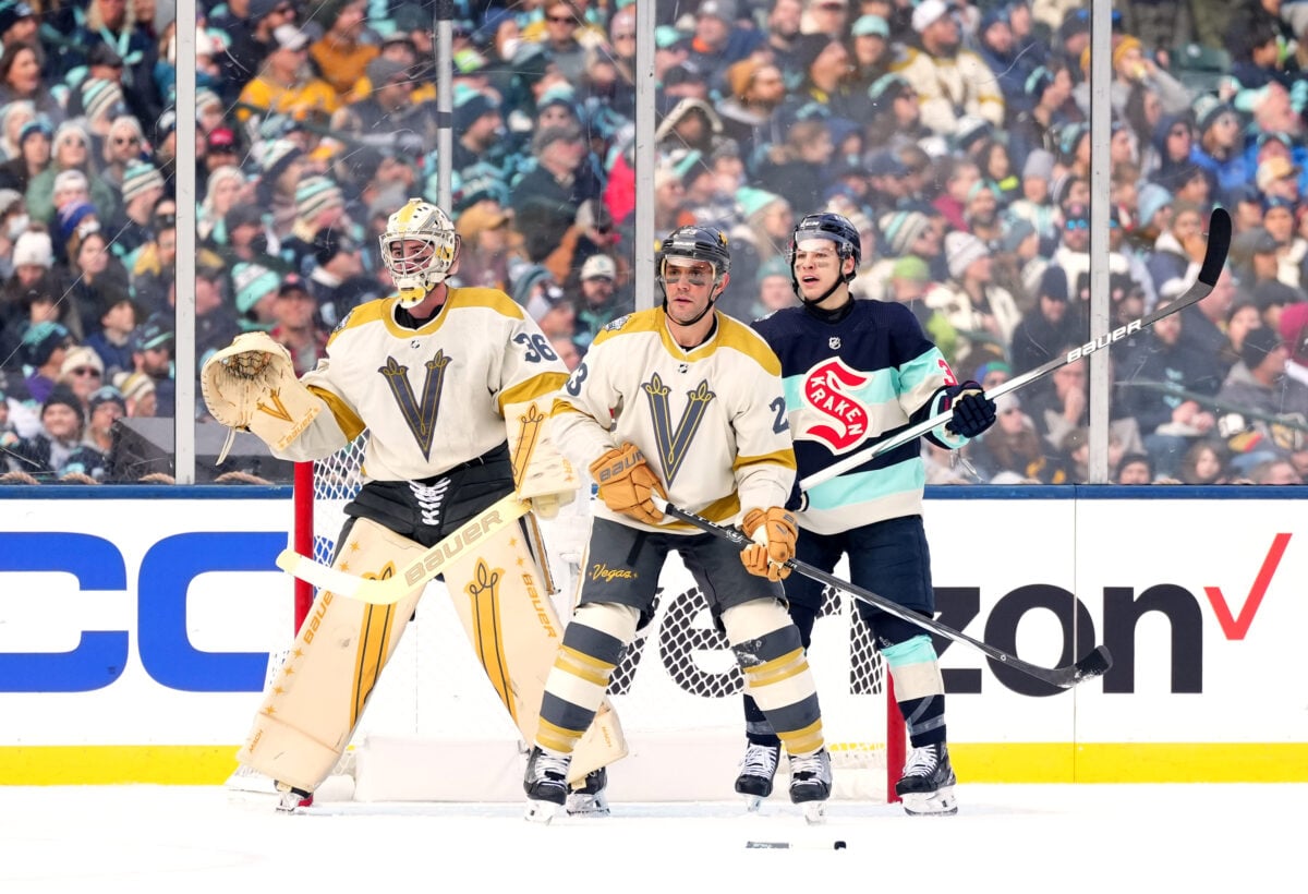
Overall, I think these kits work, with their sharp, understated design looking like they could have been pulled directly out of the 1950s. Now, they can be seen as a bit bland, which is a fair criticism, but I think this is a situation where less is more. The Golden Knights avoided muddying up their jersey by keeping things simple, which created a stronger look for an ultimately forgettable game by Vegas.
17. Florida Panthers – 2026
This game was played on Jan. 2, 2026, between the Florida Panthers and New York Rangers at LoanDepot Park in Miami, FL. The Rangers won 5-1.
This is another outdoor jersey that was good but not great. By pulling on nostalgia with the leaping panther, Florida went with a look that could have hit the ice in 1996 or 2026, which speaks to how great this logo still is. The color palette is the classic Panthers look, but I can’t say I wasn’t a little bit disappointed that they didn’t lean into the retro 1980’s vibe that was used in the promotional materials.
There is a great design in this jersey, but the detailing didn’t hit for me, and the jersey didn’t pop on the ice as I hoped. It doesn’t help that the Panthers got run off the ice by the Rangers in this game, so there wasn’t much excitement from the home team while wearing these kits. Once again, not a bad look, but it could have used a little bit of something to make it really come together.
16. Philadelphia Flyers – 2012
This game was played on Jan. 2, 2012, between the New York Rangers and Philadelphia Flyers at Citizens Bank Park in Philadelphia, PA. The Rangers won 3-2.
The Flyers did much better with this jersey. Sticking with the orange as a base helped it immensely. The decision to stick with a cream stripe rather than an entire cream jersey, like the Rangers opted for, also made this jersey pop. A minor detail that could be lost in the shuffle, but one that I love, is the Pennsylvania Keystone behind the captain’s C. It is a nice touch that really helps separate this from any other version of a Flyers’ jersey, or any other regular NHL jersey for that matter.
15. Dallas Stars – 2020
This game was played on Jan. 1, 2020, between the Nashville Predators and Dallas Stars at the Cotton Bowl Stadium in Dallas, TX. The Stars won 4-2.
The Stars have gone through a lot of jerseys for such a young team. As such, seeing what the team would choose for their Winter Classic led to plenty of speculation. The decision to adopt the old-school Stars logo and colorway, combined with the faux-leather pants and equipment gave the team an especially authentic Texas look. The green the Stars went with seemed even brighter on the ice than in the pre-game media rounds, another factor working in the team’s favor. The fans even got an extra view of this uniform getting to watch Corey Perry return to the locker room under the stadium.
14. Seattle Kraken – 2024
I recognize that the Seattle Kraken’s uniforms are not for everyone. Their base design is very modern, with bright color pops that some may find offputting. However, this has given them a unique pallet and brand that is impossible to mistake for anyone else in the league.
This made me excited to see their Winter Classic duds, as the newest NHL franchise had a chance to mix their modern look with their Metropolitans’ history, and I largely think they nailed the results. Their kits were unmistakably Kraken while paying homage to their past in a tasteful but still interesting way.
Like I said, these jerseys won’t work for everyone, but I think they looked great on the ice, in pictures, and in person. That can be a difficult balance to pull off, especially when you’re working with a bright color palette like the Kraken. Overall, this was great work by Seattle, and I think they can be very happy with their first Winter Classic from top to bottom.
13. Chicago Blackhawks – 2025
This game was played on December 31, 2024, between the Chicago Blackhawks and St. Louis Blues at Wrigley Field in Chicago, IL. The Blues won 6-2.
The Blackhawks have played in, arguably, too many Winter Classic games. They have participated in this event enough times that you could make a ranking based on their jerseys alone and have a fairly robust list. Their 2025 entry into this category is good, maybe even great, but it starts to lose some impact when you look at them next to the other Blackhawks entries on this list. However, even if the team struggled to put on a show on the ice, this jersey was a solid enough entry to their evergrowing wardrobe of Winter Classic options.
12. Washington Capitals – 2015
This game was played on Jan. 1, 2015, between the Chicago Blackhawks and Washington Capitals at Nationals Park in Washington, D.C. The Capitals won the game 3-2.
This Capitals jersey was a perfect unveiling for the District, as the team broke out the “W” with the Washington Monument outline created by the letter’s silhouette. The darker shade of red with the navy blue was another touch that really stood out for this jersey. The white striping could have been distracting, but I think it was a strong addition to the set. The three stars above the W were another nice touch to the District’s flag. This jersey was just busy enough and just wacky enough to stand out as a perfect one-off, just right for the Winter Classic.
11. Chicago Blackhawks – 2009
This game was played on Jan. 1, 2009, between the Detroit Red Wings and Chicago Blackhawks at Wrigley Field in Chicago, IL. The Red Wings won 6-4.
The best of the Blackhawks Winter Classic jerseys, this Blackhawks strip is the perfect blend of throwback with modern touches. Moving to a black base from their typical home red was also a brilliant move. The decision to use a circular logo with “Chicago Blackhawks” written out, provided enough of a wrinkle to make the jersey unique, while not being too different that it was almost unrecognizable. Pairing that with the tan center stripe, a move I am always in favor of, felt like the perfect blend for a team on the verge of starting a dynasty.
10. Detroit Red Wings – 2014
This game was played on Jan. 1, 2014, between the Toronto Maple Leafs and Detroit Red Wings at Michigan Stadium in Ann Arbor, MI. The Maple Leafs won 3-2 in a shootout.
The other half of the color game, the Detroit Red Wings kept their traditional Winged Wheel logo but accented it with subtle cream striping. The team’s decision to ditch the candy cane striping on the socks was a major improvement. That, coupled with the all-red, save for the few dashes of cream, made for a very appealing uniform as a viewer. Adding in the weather conditions with snow flurries really helped the red pop on TV, making these an easy choice for a top-ten pick.
9. Buffalo Sabres – 2018
This game was played on Jan. 1, 2018, between the New York Rangers and Buffalo Sabres at Citi Field in New York, NY. The Rangers won 3-2 in OT.
This jersey follows similar trends to the 2008 set but swaps the navy blue for the richer royal blue. That blue, combined with more yellow in the striping, specifically on the socks, really makes this jersey pop for me. While some people have not liked the “NY” at the bottom of the Sabres crest, I like the extra addition, again as a piece that works for a Winter Classic jersey, but probably wouldn’t work on a full-time piece. Socks should not make or break a uniform, but the yellow in this really pops and are the item that set this over the top for me. If I have one gripe, it is that the shoulders don’t have a single yellow stripe to break up the white and blue. Otherwise, I am a fan.
8. St. Louis Blues – 2017
This game was played on Jan. 2, 2017, between the Chicago Blackhawks and St. Louis Blues at Busch Stadium in St. Louis, MO. The Blues won 4-1.
The Blues’ first foray into the Winter Classic saw the revival of their expansion era lighter blue shade with the team’s typical gold accents. These colors were a huge hit and the jersey itself was so popular it returned to the rotation as an alternate setup for the team, a strong indication of the quality of the jersey. This ultimately nails the outdoor game jersey requirements and could even make the case for a full-time setup.
7. Washington Capitals – 2011
This game was played on Jan. 1, 2011, between the Washington Capitals and Pittsburgh Penguins at Heinz Field in Pittsburgh, PA. The Capitals won 3-1.
Another classic jersey reincarnated for the Winter Classic, the Capitals’ white base with red and royal blue stars across the chest just screams Washington D.C. These jerseys, just like the Blues jerseys above, were so popular they made a rotation as an alternate option for the Capitals in their regular use. These are my favorite Capitals’ uniforms and are a huge improvement over the team’s current road jersey. These are primed to take over full-time duty and will justify the decision.
6. Boston Bruins – 2010
This game was played on Jan. 1, 2010, between the Philadelphia Flyers and Boston Bruins at Fenway Park in Boston, MA. The Bruins won 2-1 in OT.
The Bruins’ first Winter Classic matched the same venue as this year’s, Fenway Park. For this game, Boston went to yellow jerseys, a break from tradition that was a massive success. Switching to an old-school font for the B and flipping the colors, everything about this jersey screams outdoor game. It is another jersey that perfectly captures the history and tradition of the Bruins, while also allowing for a unique spin to appeal to a new generation.
5. New York Rangers – 2018
This game was played on Jan. 1, 2018, between the New York Rangers and Buffalo Sabres at Citi Field in New York, NY. The Rangers won 3-2 in OT.
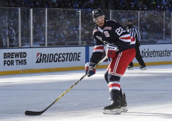
The Rangers swung and missed on their first outdoor game but crushed their second chance. Going for the navy blue was enough of a change for the Blueshirts that it would make you stop and scope it out, but not different enough to take away from the team’s history. Keeping the diagonal lettering and the striping across the top the same as their home kit was another successful tie-in without the jersey feeling like a carbon copy. Like the Flyers jersey, my favorite part of this setup is the badge on the left chest. On players with a C or an A, that is all you would see, on everyone else, the white background would hold an NY on it. This jersey provided the perfect wrinkle for the Rangers and would have made a perfect alternate jersey if the team had chosen to utilize it.
4. Boston Bruins – 2019
This game was played on Jan. 1, 2019, between the Boston Bruins and Chicago Blackhawks at Notre Dame Stadium in South Bend, IN. The Bruins won 4-2.
The Bruins’ most recent Winter Classic setup, prior to 2023, was this road white piece. The thick striping and use of black and gold somehow made this feel like the perfect outdoor hockey sweater to be played at a college campus. It is bold and bright enough to stand out, and ties in a nod to history, ditching the Spoked B for a simple Block B in a way that stands out. This Bruins jersey is great on its own but is certainly helped by the black-and-white set the Blackhawks wore opposite them. Given the lack of color elsewhere on the ice, the gold had an even more prominent role and looked even better.
3. Pittsburgh Penguins – 2011
This game was played on Jan. 1, 2011, between the Washington Capitals and Pittsburgh Penguins at Heinz Field in Pittsburgh, PA. The Capitals won 3-1.
It is increasingly difficult to separate any team from Pittsburgh from the black and gold colorway shared across the city. The Penguins’ decision to trade in their black tops for a navy piece worked brilliantly. As you’ll read soon, the first version of a Penguins Winter Classic jersey chose a light blue base, which was referenced in the stripes, a nice nod to tradition without falling into a pattern of recycling what already worked. If this were not a city committed to keeping the color symmetry among each of its professional teams, the Penguins should absolutely consider switching to this kit full-time. Who doesn’t love a penguin prepared for the elements in a scarf?
2. Montreal Canadiens – 2016
This game was played on Jan. 1, 2016, between the Montreal Canadiens and Boston Bruins at Gillette Stadium in Foxborough, MA. The Canadiens won 5-1.
The Montreal Canadiens have one of the most iconic jerseys in all of hockey, arguably in all of sports. The fact there has been so little change in this historic franchise, could have been cause for concern that they would fall into a problem similar to the 2010s Blackhawks, utilizing a jersey nearly indistinguishable from their regular threads. Instead, they took a chance, utilizing the center stripe, with a brighter shade of blue that made the white seem like it almost glowed. Another accent item that stole the show for me was the globe on the sleeve. Representing the Habs logo from the 1920s, when they sought to remind the world that they were champions, it is an excellent addition, one that works to remind the world today that at one point the Canadiens had in fact hoisted the Stanley Cup.
1. Pittsburgh Penguins – 2008
This game was played on Jan. 1, 2008, between the Pittsburgh Penguins and Buffalo Sabres at Ralph Wilson Stadium in Buffalo, NY. The Penguins won 2-1 in a shootout.
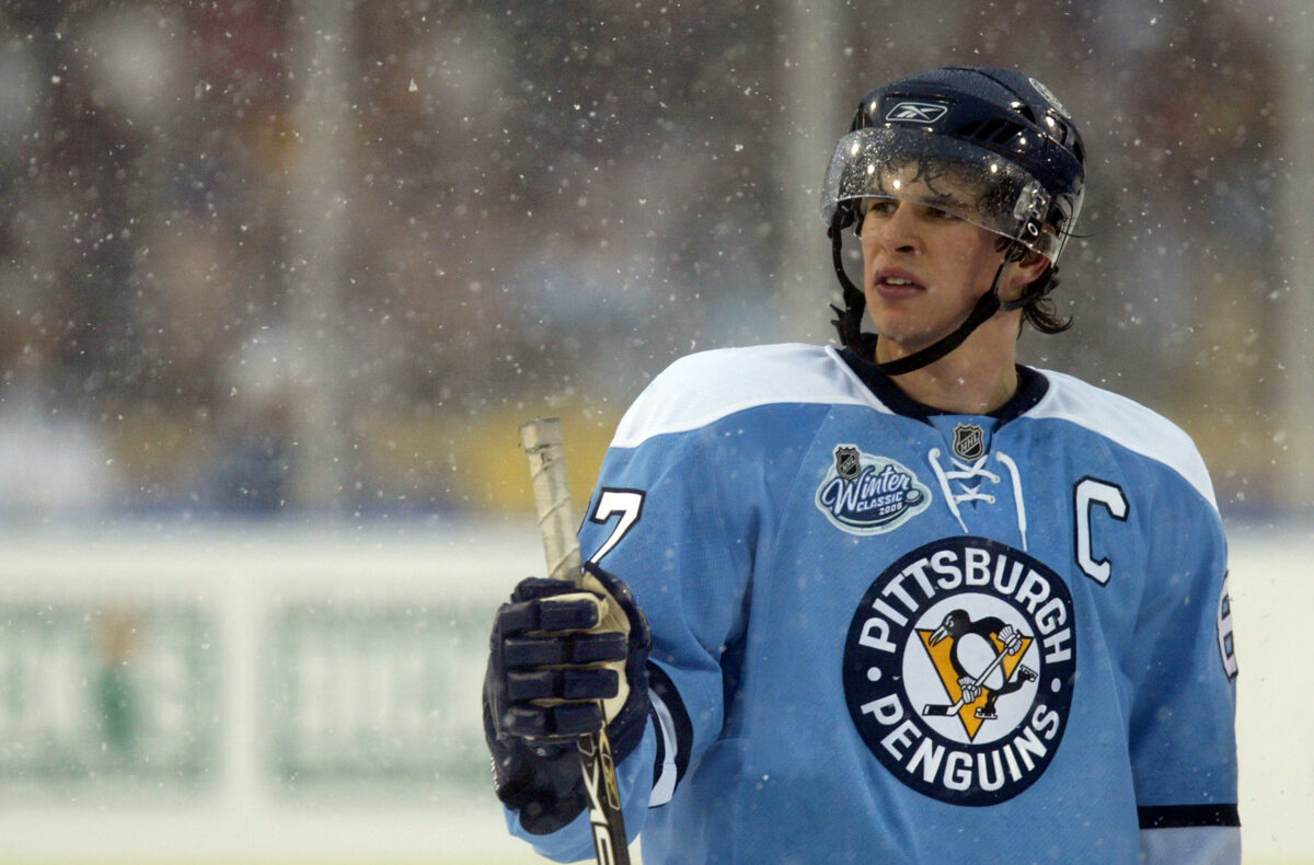
These jerseys were designed for the inaugural event, and every team since has been seeking to emulate its success. The light blue works perfectly on its own, when paired with the snow globe atmosphere in Buffalo, nothing could beat it. Everything about this jersey is perfect, not a tweak to be made. Add in the drama of a shootout victory courtesy of the face of the NHL, Sidney Crosby, and this jersey is the undisputed winner.
Winter Classic 2024
It will be interesting to see what next year’s participants, the Vegas Golden Knights and Seattle Kraken, will choose given their brief histories. Hopefully, without decades of jerseys to pull from, the design team will get creative and add a splash of flair, rather than roll out a set with only minor tweaks (looking at you Chicago). The bright colors and distinct patterns are two key features in the jerseys I feel stand out the most. Given that the Pacific Northwest may not be under piles of snow, these uniforms will play an extra role in creating the atmosphere that follows a Winter Classic.
Related: Winter Classic in Vegas? YES PLEASE
So, what did I miss? Who did I overlook? Was any team overvalued? Share your thoughts and comments below. If you feel so inclined, share your own ranking system and share this with your friends to spark up a conversation.
