The St. Louis Blues have been in the National Hockey League for 52 seasons now, and over the years, they have come up with some very interesting jersey designs. The blue note has been a mainstay every year, but the way it is presented with some of these designs is odd.
It really isn’t that difficult to measure a top five list of jerseys in Blues history, because some of them are just that much better than the others.
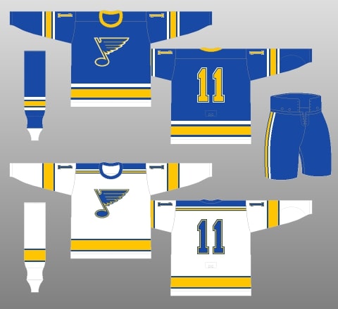
5) Stripe-filled Classic Look (1979-84)
This design is excellent, while the stripes may be a bit overdone, the colors blend together very well. The stripes done at the bottom of both the home and away jerseys look fantastic, the touch of blue between the white and gold on the dark jersey is excellent. The striping on the arms are perfectly done as well.
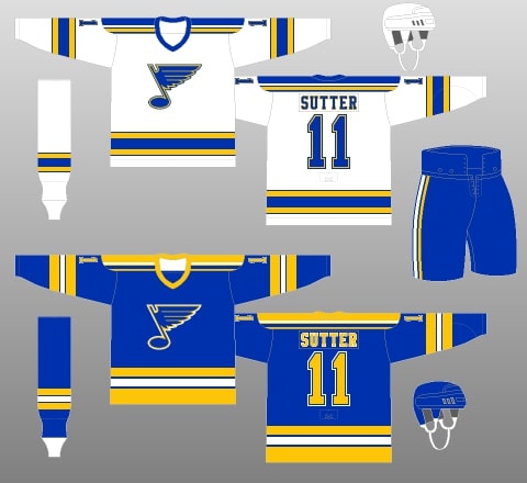
However, I do find the shoulder stripes to be a bit much and that is the main reason why this isn’t in the top three.
As far as the collars go, they both look good. I also like the fact that they didn’t overdo the collars, the one color just fits well. In terms of the numbers, they are done well. The light jersey with the blue and gold numbering is perfect, and they make it work with the three colors on the dark jersey.
Finally, on a scale of 1-10, I would rate this look as a solid 7.4. The big points come from the striping at the bottom, the logo blend, and how well the colors go together. Just a great overall look.
4) The Arch Logo Navy Blue Look (2008-16)
This design lasted up until the NHL switched over to the Adidas branding after utilizing Reebok for a while. I really liked this design and feel like if Adidas would’ve done their own version of it, it could have been taken to another level.
We will start off with the logos on this jersey – the front logo is excellent, the arch logo just looks great. It is a little odd that they have the blue note as two shoulder patches, but I can’t really complain too much about that.
The white striping is a little too thick overall, but the gold accents help that fix itself a little. The collar is one of the best parts of this look, the gold and white just looks perfect.
The numbers look great too, every part of this jersey that has a gold accent or stripe really makes it look better as a whole. I would rate this jersey as a 7.7, just ahead of the fifth-ranked jersey. The logo on the front is the best part and helps keep it ahead of the other one.
3) The Originals (1967-68)
Yes, the first jersey in franchise history is the third-best the Blues have ever had. Usually, I’d prefer that the player names are on the back of jerseys, but in this case it doesn’t matter as much to me.
Just about every part of these two jerseys is fantastic, the striping is done so well. The thinner blue note is beautiful.
The light jersey presents some very slick gold and blue striping and a tremendous blue collar. The dark jersey presents a little too much white at the bottom for me, but other than that, just fantastic. I really like the gold collar, and the gold numbers are good too.
This may remind some people of the early years of the Blues – the first season to be exact. But this design would work pretty well in a modern jersey, if they did it now, people would love them. This design plays pretty well, just 53 years later.
I would rate this jersey as a very respectable 8.3. There aren’t really any problems with this jersey, it is fantastic.
2) The Legendary ’90s Red (1995-97)
I know a lot (I mean a lot) of Blues fans don’t care much for this design. Even though these jerseys were in and out before I was born, I just love this design. Wayne Gretzky, Brett Hull, Al MacInnis, and others wore this – some hockey legends wore this jersey.
The Blues brought this design back this season as a “retro alternate,” and I have to say, it made my opinion of this design even better.
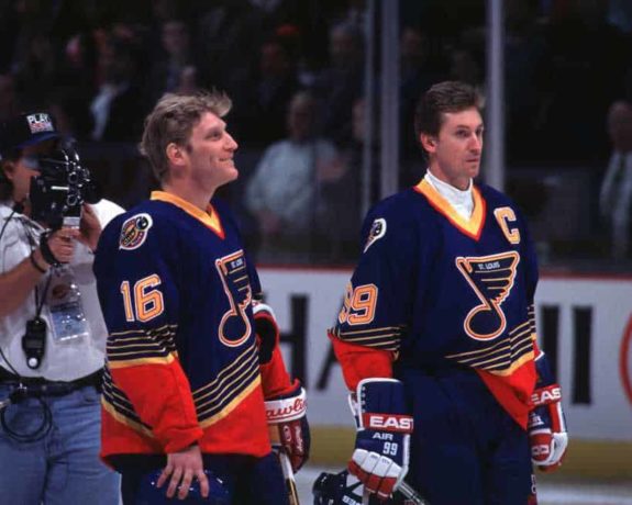
I like this jersey so much that the only problem I have with it is minor. The problem is the fact that the logo says “St. Louis” in it, I really don’t see the point in that. Other than that, this jersey is flawless.
The white one is just tremendous, the diagonal red stripes, the gold accents, and the beautiful shoulder patches. This is one heck of a jersey. The numbers being diagonal just adds to the beauty.
The dark jersey is one that the Blues are wearing three times this year, they have already worn it once and will do so once again two more times this season. The gold and red collar is great, as well as the large section of red at the bottom of the jersey and the sleeves.
And one of the absolute best parts of this jersey, is the gold, red, and white numbers. The way that those colors blend together makes this a great and fun design.
This jersey deserves a 10, but I have to be more critical and strict than that. I am giving this a 9.2 out of 10. It is very hard to beat out this jersey in my view, but one jersey has.
1) The Adidas Version of the Winter Classic Jerseys (2018-present)
This jersey is one of the best going in the NHL right now. It is so, so good, and just designed perfectly. I have been a huge advocate of the looks and work done by Adidas for hockey jerseys. I like the home and away jerseys that the Blues sport now, but this design is just unbelievably good.

Let’s start off with the logo and numbers. The logo is a classic look that the Blues had in their early days as a franchise. The light blue with the gold and cream color is blended very well. The numbers are the same way, perfect color blending.
The stripes on the bottom and arms are flawless, the cream color really puts this whole thing together. It’s hard to describe how great this looks. The neckline is great, it’s just like the neckline of the home and away Blues jerseys, the St. Louis feel and look. Perfectly done.
Finally, I give this jersey a perfect 10 out of 10, simply for the fact that I see absolutely nothing wrong with it.
Free Newsletter
Get Blues History coverage delivered to your inbox
In-depth analysis, breaking news, and insider takes - free.
Subscribe Free →