In the NHL, teams are forced to work exclusively with Reebok in designing and manufacturing their jerseys. Most teams do not vary their jersey design with any great frequency. Some are timeless classics like the Blackhawks or Red Wings, others are more average that just don’t change.
In the CHL, teams also work alongside Reebok in designing jerseys. However, teams are much more active in redesigning new jerseys for their team. Maybe the CHL is easier to work with in that regard, or teams do it to capitalize on the new demand created by new sweaters.
Whatever the reason, the result is that some of the coolest looking jerseys in all of hockey reside in the WHL, OHL, and QMJHL. They’re bolder than NHL jerseys, and in many cases, much cooler looking. For my money, WHL jerseys as a whole are the best, but each league has some incredible sweaters.
Here are the best each league has to offer, with a special bonus at the end:
Blainville-Boisbriand Armada, QMJHL, White
London Knights, OHL, Green
Red Deer Rebels, WHL, Tan
Next Year you will be mine #Rebelshockey #rebels #reddeer pic.twitter.com/dZYJD3VV6m
— Drew Hall (@DrewHall4) April 12, 2013
Chicoutimi Sagueneens, QMJHL, Blue
[tweetthis]The 20 Coolest Jerseys You’ve Never Seen[/tweetthis]
Sarnia Sting, OHL, Yellow
Medicine Hat Tigers, WHL, Black
Rimouski Oceanic, QMJHL, White
Oshawa Generals, OHL, Red
Brandon Wheat Kings, WHL, Black
Rouyn Noranda Huskies, QMJHL, White
Kitchener Rangers, OHL, Red
Seattle Thunderbirds, WHL, Navy
Sherbrooke Phoenix, QMJHL, Tan
Soo Greyhounds, OHL, White
Victoria Royals, WHL, Blue
Kingston Frontenacs, OHL, White
Calgary Hitmen, WHL, Black
Kamloops Blazers, WHL, Blue
Everett Silvertips, WHL, Green
Bonus: Dubuque Fighting Saints, USHL, Red
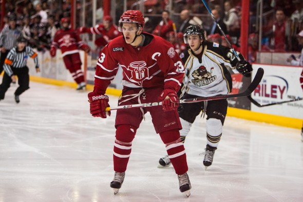
What are your favorite QMJHL, OHL, or WHL jerseys? Did I miss anyone (don’t say Edmonton Oil Kings! They’re hideous!)? Let me know in the comments below.
The CHL being referred to is the Canadian Hockey League, which incorporates the QMJHL, OHL, and WHL. This is different than the Central Hockey League that merged with the ECHL. The Halifax Mooseheads have nice sweaters as well.
Here’s an awesome university jersey!
https://puckchk.files.wordpress.com/2012/08/img_5221.jpg
With this patch on the shoulders: https://puckchk.files.wordpress.com/2012/08/ou-hockey-10-logo.jpg
This is the University of Oklahoma’s third jersey they debuted during our 10th Anniversary season of 2012-2013 (they wore it for home games that season.) I love the Sooner Schooner on the front and that it is truly a Crimson and Cream jersey, and not red and white. By far this is one of my favorite hockey sweaters I own.
Nice work, Bill – I also like the Prince Albert Raider’s jerseys: http://assets4.sportsnet.ca/wp-content/uploads/2014/06/leon_draisaitl.jpg
a few of these are patterns that NHL teams use, just in different colors. The Medicine Hat jerseys are the same as the Philadelphia Flyers jerseys.
The CHL no longer exists, they merged with the ECHL. But, the ECHL has some pretty decent jerseys too.
Check out the Dubai Mighty Camels in the Emirates Hockey League!
I’ve always been partial to the Plymouth Whalers white sweaters.
I would have prefered these jerseys for Dubuque : https://scontent-b-iad.xx.fbcdn.net/hphotos-xpf1/v/t1.0-9/p480x480/10805782_10152830458239570_6440200661727566783_n.jpg?oh=17de4ff3e9dd8f482a52b2afd2813005&oe=556929BC
You missed a couple classic sweaters:
* Oklahoma City Blazers – maroon and off white barber poles with an Old English B.
* Ottawa 67s – red, black, and white barber poles
* I prefer the off-white Rangers sweater with the poppy crest (although I think those may have been a one-off for the Memorial Cup)
Spot on with the Sags, though; I think they’re even better since they truncated the three color stripes to just the shoulder yoke. But I have to disagree with a couple of your selections; the T-Birds are just recycled Whalers jerseys, and I none of the jerseys with the Edge piping and striping, like the Blazers example, qualify as best of anything.
Everyone in Detroit has wanted the Red Wings logo to be replaced because it’s unimaginative and outdated. Besides, the all Red with no other colors mixed in is an eyesore. I speak for all hockey fans in Detroit
No, sorry, you apparently speak for nobody in Detroit, let alone Red Wing fans. Clearly, you didn’t read the title of the post. The Wings will give up red and white when the rest of the Original Six give up their colors, which is to say, never.
Nice plagiarizing on your screen name, though…
Agreed, you really do speak for nobody in Detroit. Change the Winged Wheel and the iconic red & white? I think you may want to find a new team to follow, Colorado perhaps.
Some kind of a hockey fan you are if you’ve never seen these jerseys before…
Fairly arrogant statement
If you’re an NFL fan and not a college fan does that make you a shitty football fan?
Or MLB baseball v AA
Should a NASCAR fan know what the truck series drivers look like?
Some of those jerseys need to be marketed
Last year on two occasions, the Univ of Wisconsin omen’s team wore ‘alternate’ jerseys that I just love. If they ever were to sell them, I’d get one is a second.
http://images.scribblelive.com/2013/11/12/a76314e0-ee62-4098-8be6-dee5a886a4dc_500.jpg
I wish more university teams would use their seals, either as a shoulder patch or as a crest.
No Ottawa 67’s away? The barber pole is legend
I was thinking the same thing!!!!!!
http://cdn3.volusion.com/aqxkx.dxzyp/v/vspfiles/photos/RB7-2T.jpg?1410613395
Lets not forget about those