For the past decade, the American Hockey League’s Tucson Roadrunners have called southern Arizona their home. Numerous things have changed throughout that time. Multiple franchise records have been broken again and again, top prospects like Josh Doan and Dylan Guenther have spent time in the desert before moving up to the big leagues, and their own NHL affiliate moved from Tempe to Salt Lake City to become the Utah Mammoth. Of course, that’s on top of the Roadrunners’ own relocation rumors that have circled around the franchise ever since the sale of the Arizona Coyotes.
Despite all the ups and downs and changes, one thing has remained a constant. The team’s branding. Over the past decade, the Roadrunners have introduced numerous specialty jerseys and alternates; however, the maroon and white jerseys featuring the iconic “Dusty” logo have remained a constant. That is, until now.
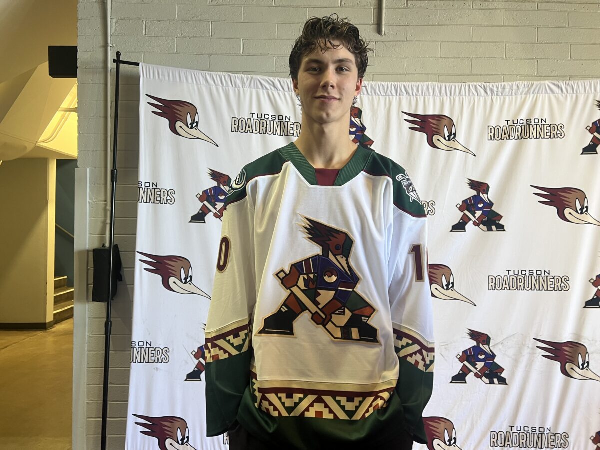
With their 10th anniversary season coming up, the Roadrunners have changed their home and away jerseys for the first time in franchise history. Complete with a brand-new logo, the team has adopted a new identity, featuring a subtle nod to their old NHL affiliate.
The Kachina Is Here To Stay
When Alex Meruelo bought the Coyotes, one of the first things he did was adopt the Kachina look full-time. Debuting in the ’90s when the team first arrived from Winnipeg, the Kachina jerseys lasted until 2003 when the team took on a more realistic adaptation of a coyote with a complete color change to maroon.
It was clear that Meruelo liked the Kachina more, and it was a look that was beloved by most hockey fans. The Roadrunners, also owned by Meruelo, adopted a Kachina design to match their NHL affiliate. While the white version of the jersey didn’t stay for too long, the black jersey lasted until last season, making more and more appearances on the ice.
Over the summer, those who paid close attention noticed that the Roadrunners were switching a lot of their branding over to the Kachina logo full-time. Another first in franchise history.
With the reveal of the jerseys came the news that the Kachina logo would be the team’s primary logo for the 2025-26 season, along with the main crest for the new home and away jerseys.
A look at the brand new jerseys for the Tucson Roadrunners for their 10th anniversary season. #TusksUp #LetsGoTucson pic.twitter.com/CX4rZfKrc4
— Chase Beardsley (@ChaseBeardsley_) October 2, 2025
The Roadrunners didn’t bring back the same Kachina jerseys that they had worn before. With the dark jersey, the primary color is now dark green, the same green the Coyotes had on their first alternate jersey. There’s Native American-inspired striping near the shoulders and the waist and dark maroon coloring underneath it, eerily similar to the Coyotes’ old uniforms.
The white jersey is the same design but reversed. Both jerseys have the 10th anniversary and Mammoth logos on the shoulders.
“This season marks an important milestone for our franchise, and we wanted to celebrate it in a way that reflects both our history and our future,” said Roadrunners President Bob Hoffman. “The Kachina look has always connected strongly with our fans across Arizona, and we’re excited to make it the centerpiece of our identity in this anniversary year.”
Related: Home Sweet Home: Inside the Utah Mammoth’s Brand-New Practice Facility
The Roadrunners’ color palette has changed with the rebrand, with forest green as the primary color for the team. Brick red, black, sand, purple, and sienna will accompany the green.
Aside from celebrating 10 years in Tucson, the goal of the rebrand was to continue to connect the Roadrunners with their market. The Kachina, of course, is a widely known logo in Arizona. The similarities to the Coyotes’ Kachina logo will certainly draw in some of those fans, but the new spin on it is what the Roadrunners are hoping to make their own.
“Our new uniforms are bold and unmistakably Tucson,” said Roadrunners Vice President of Marketing Rob Mattina. “They pay tribute to the colors and traditions that make hockey in the desert unique, while giving our players and fans something fresh to rally around as we celebrate 10 years in Southern Arizona.”
Opinions From the Players and Staff
During the Roadrunners’ media day, players got the opportunity to see the jersey in person for the first time. The team got to wear the new uniforms during their headshots and other promo activities. After spending a little bit of time around them, some finalized their opinions on what they’ll wear for the next season.
“They’re sweet,” Sammy Walker said. “I actually like them. I like the logo. I like the roadrunner, but these are pretty sweet, too.”
The weirdest part for players is that their main jerseys won’t be maroon for the first time in franchise history, meaning they’ll have to adjust to playing among green jerseys. It’s something that Owen Allard pointed out despite his positive opinion on them.
“I love them,” Allard said. “I think they’re really nice. I think they did a great job. I’m definitely not used to the green. I’m used to the red and white, but it’s great. I really like it.”
When Maveric Lamoureux came out of the locker room and saw the jerseys for the first time, a massive smile appeared on his face as he rushed to find his jersey. The Coyotes’ Kachina jersey was the first NHL jersey he ever put on after being drafted in the first round back in 2022, so to have a jersey close to that was a sentimental feeling for him.
“Holy, they’re nice,” Lamoureux said. “It’s like the old Coyotes jersey. I like the green, all the trims. I’m pretty sure we’re gonna have one of the best jerseys in the league this year.”
Lamoureux said his favorite part of the jersey was the green and how unique it is to the new Roadrunners’ identity. He also mentioned that he absolutely loves the logo.
Head coach Steve Potvin has been in the Roadrunners’ organization for eight seasons. He’s seen nearly every single jersey that the team has ever worn. He calls the Kachina a powerful logo and one that has been a long time coming, thanks to the players and fans.
“We love them,” Potvin said. “When you have a pretty cool logo that’s across your chest, you feel pretty powerful. It’s been coming. I think guys have dripped in Bob (Hoffman)’s pot a little bit, that they want to wear the Kachina. We’re proud of the roadrunner. He’s a pretty feisty bird, too. We’re going to be proud wearing both, but wearing the Kachina is a lot of fun.”
As Potvin mentioned, the original logo isn’t going anywhere. The Roadrunners will be debuting a black alternate jersey later this season with that logo.
On top of that, the change to the Kachina isn’t permanent. The original jerseys will return for the 2026-27 season, along with the original logo as the primary logo.
Despite it being a one-season thing, the Roadrunners’ new branding pays respect to some of the old Kachina jerseys from the Coyotes and Tucson while creating a unique identity that the players, staff, and fans can rally behind. As the Roadrunners continue to build out their brand in Southern Arizona, they’re not forgetting the history they’ve made in the past decade. These new jerseys are a representation of the past, present, and future of the team as they look forward to what’s shaping out to be a big and eventful 2025-26 season on and off the ice with the goal of making the playoffs for the fourth straight season.
