- 10. What Were They Thinking? (2007-2012)
- 9. Reverse Fail (2020-Present)
- 8. Mooterus (2003-2006)
- 7. OG North Stars (1967-1985)
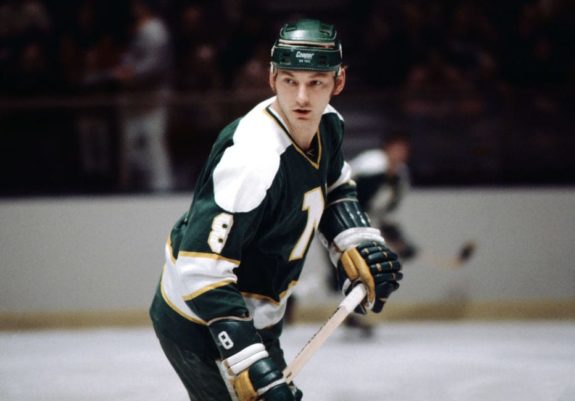
- 6. Modano Era in Minnesota (1985-1992)
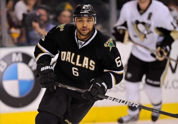
- 5. Deep in the Heart of Texas (1992-1998)
- 4. Stanley Cup Years (1998-2007)
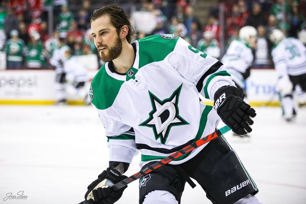
- 3. Victory Rising (2012-Present)
- 2. The Highlighter (2020-Present)
- 1. Making History (2020)
- What is Your List?
The franchise was known as the Minnesota North Stars from 1967-1992 before they moved to Dallas. There are ten distinct uniforms that they had along the way from Minnesota to Dallas.
Since sweaters are a hot topic in the NHL, let’s see where each jersey falls in the rankings.
10. What Were They Thinking? (2007-2012)
This Dallas uniform looks like the result of having no better ideas. There is very little to it, which was probably the plan, but I think they went too far. The home and away were virtually the same, with just the simple ‘Dallas’ across the front and the number underneath.
Besides looking bad, these jerseys were also poor performers on the ice, as many Dallas goaltenders complained about having trouble finding the puck through the head-to-toe black uniforms.
9. Reverse Fail (2020-Present)
What a disappointment this reveal was. Every NHL team came out with a new ‘Reverse Retro’ uniform for the 2020-2021 season. Most of these came out really well, but Dallas’ was not one of them. The jersey alone is not that bad, as they tried a bright white version of the 1999 Stanley Cup jerseys, but they went a little overboard with the white eliminating some of the cooler parts of that jersey.
The real issue, though, is that they are wearing white gloves and pants as well. That is way too much white for one uniform, and these fall towards the bottom of all the ‘Reverse Retro’ uniforms.
8. Mooterus (2003-2006)
This is one of the funniest jerseys in NHL history. Dallas introduced this red and yellow alternate citing the ‘Taurus’ constellation as their inspiration. The jersey did not look great on the ice, as the colors seemed to clash, but the real problem came after just a few appearances.
People made the startling discovery that this logo held an awfully close resemblance to a female reproductive organ. This not only killed any chance of this jersey’s success, but it was removed completely after only two seasons and forever nicknamed ‘The Mooterus.’
7. OG North Stars (1967-1985)
When Minnesota joined the league, they had a very classic look, like most clubs. When I think back to the ’60s and ’70s, I picture uniforms like Boston and Minnesota first. The very simple jersey with the centered logo, numbers on the sleeves, and name on the back is a clean look that matched the way the game was played back then.
Seeing this jersey immediately brings images of missing teeth, mullets, and team brawls on the ice.
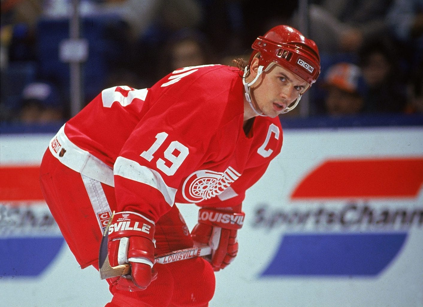
6. Modano Era in Minnesota (1985-1992)
For most, as soon as they see this jersey, one name comes to mind. Mike Modano brought the Minnesota/Dallas franchise from the basement of the standings for years to an eventual Stanley Cup in 1999.
This was the only big change in the uniforms during their time in Minnesota. Adding the yellow and black to the stripes and outlines made this a much flashier look. Many Stars fans still wear this jersey to games today, and it has aged well.
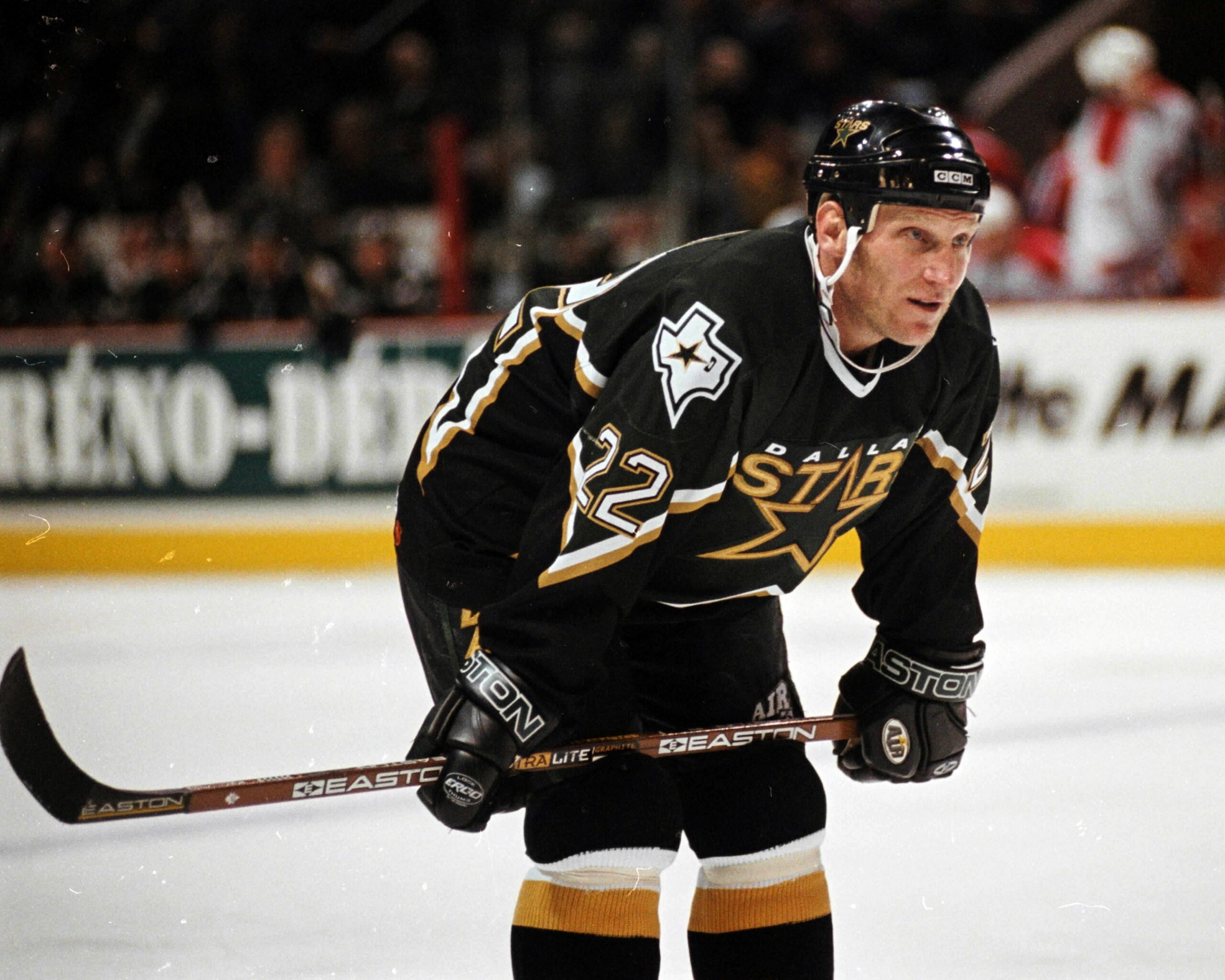
5. Deep in the Heart of Texas (1992-1998)
The move to Dallas brought a new look into the mix. The colors were shifted to the green, black, and gold on this uniform with a brand new logo.
After a couple of seasons, they added the word ‘Dallas’ above the logo, which improved these jerseys greatly. The shoulder patch reaching all the way to the wrist is a very clean look that held the new Texas state logo perfectly.
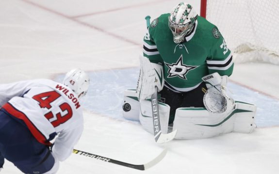
4. Stanley Cup Years (1998-2007)
The glory days. These uniforms started as alternates for a few seasons before becoming the new primary look. The Stars were a powerhouse for most of the seasons in these sweaters, missing the playoffs once in nine years.
The most prominent season was 1998-1999, when they defeated the Buffalo Sabres in six games to win their first and only Stanley Cup.
3. Victory Rising (2012-Present)
The Stars were in desperate need of a new look after multiple years of having arguably the worst jersey in the league. The team also needed a rebranding at that time after many poor seasons, including five straight missing the playoffs. Mike Modano and Jamie Benn stood on a stage in Dallas during the reveal event for this rebranding.
The Stars revealed these jerseys along with the new ‘Victory’ green colors and brand for this team going forward: “Victory Rising.” This stands as one of the nicest uniforms every season and has a color that pops in any NHL arena.
2. The Highlighter (2020-Present)
Another new look for the team in 2020-2021. For all of the mistakes made with the ‘Reverse Retro’ jersey, they made up for it with these. Fans were worried, as the jerseys looked to be a little too bright and overdone when the original images came out in the fall. However, once these debuted on the ice vs. the Detroit Red Wings, it was clear that they were incredible.
The neon look is so unique across the league, and the logo is something that Stars fans have been wanting to see for years. I think the stripes on the sleeves, waist, and socks really make this jersey one of the best in the league. Hopefully, they continue to wear them on a regular basis.
1. Making History (2020)
Outdoor hockey in Texas? Yes, please. When the NHL announced the Stars as the hosts of the 2020 Bridgestone Winter Classic, it was met with expected doubt. This would be the most southern outdoor hockey game in history. Not only was the game a huge success in front of over 83,000 fans at the Cotton Bowl, but the Stars’ uniforms were one of the best in the history of this outdoor game.
The jersey alone is very clean with a throwback to the first professional hockey team in Dallas, the Dallas Texans (USHL 1945-1949). The logo stands out, and the added felt Texas logo on one sleeve with the Winter Classic patch on the other really gives it a throwback feel. What really brought these to life were the gloves and pants. They took a big risk using the gold/brown color, but it paid off big time. Stars fans certainly hope to see these brought back at some point in the future, and I believe they are the best in franchise history.
What is Your List?
Agree with my rankings? Disagree? Let me know what your favorite sweaters are!
Free Newsletter
Get Stars History coverage delivered to your inbox
In-depth analysis, breaking news, and insider takes - free.
Subscribe Free →