Originally published in 2018
The Florida Panthers are, and pretty much always have been, one of the most colorful teams in the National Hockey League.
On the figurative side of things, whether it’s arena shenanigans, overbearing ownership, or former general manager Dale Tallon’s twisted revenge plot, the Panthers are never, ever boring.
And on the literal side of things, the Cats debuted in 1993 with a thoroughly loud, vibrant color palette of red, gold and navy, perfect for a Floridian team making inroads in a new market.
That said, in both cases, things have gone slightly sideways of late.
Panthers’ Debut Colourful and Courageous
The Panthers burst flamboyantly onto the scene in 1993-94, entering the league with the Anaheim Mighty Ducks, who boasted some pretty flashy duds themselves – duds pined for to this very day.
For all the hand-wringing and consternation surrounding the NHL’s expansion into the Sun Belt (some things don’t change, eh?), there must have been tremendous pressure on expansion teams to be as traditional and inoffensive as possible with their branding. While the Mighty Ducks, who entered the league at the same time, gave a giant middle finger to the rest of the league with diagonal striping atop a jade-and-eggplant color scheme, the Panthers’ debut duds were the best of both worlds.
Aside from playing around with the typeface and design of the font (the player names went from horizontal to arched and back again, for instance), the Panthers’ uniforms stayed pretty much the same from their debut in 1993 until the implementation of the Reebok Edge uniform system ahead of the 2007-08 campaign.

The Cats wore white at home and red on the road, adding a navy alternate jersey for 1998-99. In 2003, when the NHL moved back to having home teams wearing their dark kits, the Panthers began using the navy uniform on a full-time basis, relegating the red kit to alternate duty.
Panthers’ Debut Design Best of Both Worlds
As nice as those original Mighty Ducks uniforms are, I think those of the Cats, resplendent in red, gold and navy, have ‘em beat.
Starting with the white jerseys, a slim-thick-slim tri-stripe pattern, red trimmed with gold, is perched atop a thick, strong-looking navy-blue base, creating a seamless transition into the navy of the pants. The sleeve striping is diagonal, but follows the exact same pattern as that of the jersey tail. Pleasingly, for those who appreciate symmetry and continuity at least, the socks on all three kits made use of the same striping setup as the tail.
My only real complaint is the gapped trim of the names and numbers on the white jerseys. It’s not necessary, and it makes the jerseys look busy and messy. The font trim on the other kits is flush with the characters, making them look much crisper and cleaner.
The jaunty angle of the sleeve striping certainly spices up the jersey, but what really sets it aflame is the shoulder yoke. Normally straight and then either blocky or rounded at the ends, this yoke cuts sharply down one side of the jersey front and up the other, meeting up with its counterpart from the rear in a point. The triangular shoulder yoke is a brilliant – and unique – piece of design, and are a big reason these Cats’ kits hold up extraordinarily well, even today.
Smack in the middle of these masterpieces is the Leaping Panther logo, which depicts a ferocious-looking panther launching itself at its prey – the viewer. Its dark tinting and red eyes lend an eerie, almost supernatural effect to the image. Assuming you have time to consider that before you’re mauled to death.
And what did the team roll out alongside this spine-tingling, horror-inducing beast as a secondary logo? Why, a hockey stick crossed with a palm tree atop the Sun, of course. Again, Florida made the best of both worlds: a terrifying primary logo sure to garner praise and respect, and a secondary crest acknowledging the (then-)novelty and kitschiness of hockey in the Sun Belt. Brilliant.
The red away-and-later-alternate uniform had the same general design, with some slight tweaks to the striping. As you can see, the slim-thick-slim pattern on the tail and sleeves has been replaced by a thick yellow stripe directly above the navy base, topped by two slimmer stripes, one navy and one white. The shoulder yoke is exactly the same, save for alterations in the colour (navy trimmed with white, rather than red trimmed with gold).
The navy alternate-and-later-home kit is a near-faithful replica of the white, right down to the white stripe just below the tri-stripe pattern. On the white kits, this stripe just looks like a gap between the striping and the jersey’s navy base, giving the pattern the appearance of floating. On the navy uniforms, instead of just getting rid of it and letting the navy background envelop the tri-stripe pattern in a cocoon of awesomeness, the designers left that white bit in, breaking up the kit’s flow and dampening its appeal.
Regardless, considering some of the horrendous dark jerseys being rolled out at the time, these navy entries, with their liberal dollops of exquisitely balanced color (choosing white for the font instead of red, for instance), were a beacon of light and goodness in the world.
Interestingly, the alternate jersey, whether it was the navy or, later, the red, featured a slightly different rendition of the Leaping Panther logo, with the cat snapping a hockey stick whilst in flight. No word on what the San Jose Sharks, who entered the league two years before the Cats, thought of this motif.
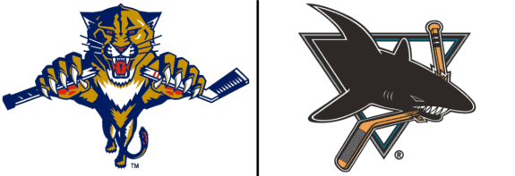
Also of note: the collar on these early jerseys is navy blue for each of the three kits. That seems a weird choice – lazy, even – until one considers the alternatives. Navy is the only collar color that works on each of these uniforms. Kudos to Florida for not making changes for change’s sake.
Panthers Fall Off Reebok Edge
Speaking of change for change’s sake, Reebok Edge!
Like many teams, the Panthers fell victim to the siren song of Reebok Edge, a uniform system that promised to revolutionize the performance of the league’s apparel. Unfortunately, not only did Reebok Edge do everything but what it intended, it also proved the point that, no matter how technologically brilliant engineers might be, they are utterly incapable of designing anything people actually like to look at.
You may also like:
- NHL Rumors: Maple Leafs Hire Firm, Panthers Offseason Moves, Oilers Signing
- 3 Surprising GM Candidates for the Maple Leafs
- Canucks: Revisiting the Luongo Trade
- Every NHL Team’s Longest-Tenured Player
- Panthers’ Recent Slump Shows They are Waving the White Flag on the Season
The vile, deformed spawn that Reebok Edge wrought churned the stomach of even the hardiest of aesthetic observers. And, you know, anyone else with eyes.
The Panthers did not escape the peril.
Panthers Over-Styled, Underwhelming
For the 2007-08 season, the Panthers, like all teams, were made to drop their alternate jerseys. In Florida’s case, they chose to do away with their reds, keeping navy blue as their home color.
Starting with the home kits, they also possessed a unique shoulder yoke, although its swoopy design never comes to a point, instead just waving about all the way down the arms. Full-length yokes aren’t necessarily a bad thing, but the lack of any sort of discernible pattern is deeply irritating.
Even more irritating is that the yoke breaks in the back to go around the Reebok logo. What on Earth was the point of this? Whatever flow this bizarre shoulder treatment might have had is utterly ruined by this gaping hole. The sides of the yoke where it breaks aren’t even trimmed with the gold that surrounds the rest of the yoke. That’s either incompetent, lazy or all of the above.
But wait: it gets better.
The whole point of a sleeve-long shoulder yoke is that sleeve striping isn’t necessary. However, Florida’s designers again ignored common sense and slapped a striping package on there, regardless. Well, half of one, anyway.
The tri-stripe pattern is a carryover from the original navy jerseys. Like the yoke, it features a red body trimmed by gold. And it wouldn’t look half bad if it didn’t intersect at a 90-degree angle with the yoke. The gold stripes aren’t even the same size as the yoke’s gold trim! Utterly horrendous.
One interesting note is that the striping is gapped on the navy jerseys, but not on the accompanying socks. No such inconsistencies appeared on their white equivalents.
But perhaps the worst feature of this jersey is the idiotic gold piping that snakes its way up and down both sides of the jersey body. Such piping was common in Reebok Edge designs, but its implementation here makes the jersey look like something out of Tron.
Another complaint is the absence of tail striping, which makes the kit, with a navy jersey, navy pants and navy socks, look drab and washed out, removed of all energy and vitality. The font, small and straight-laced, isn’t exactly inspiring, either.
The only thing likeable about this jersey, besides the logos, is the two-tone collar. The addition of gold works as a really nice accent, making the collar pop.
But when one has to resort to a neckpiece to find a redeeming feature of a product that was, let’s not forgot, put on sale for hundreds of dollars, there is something seriously, seriously wrong.
The white road jerseys are nearly identical, save for a five-stripe package on the sleeves and socks (rather than three) and a plain, boring collar. The piping has changed from the obnoxious, sci-fi gold to a more muted navy, though they still look terrible.
The lack of tail striping is less noticeable on the whites, due to the base color contrasting nicely with the pants. However, contrast or not, more color is still needed to make these things worth looking at.
One thing the Cats did get right was the white jersey’s font: instead of gapping the navy trim, they put it flush up against the body of the names and numbers, making for a much more modern and clean look though, as mentioned, the typeface and sizing is inadequate, at best.
Powder Blue Ill-Fitting Part of Panthers’ Palette
The navy and powder blue alternates were introduced in 2009.
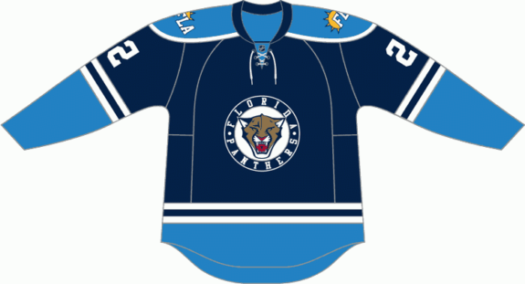
Let’s first delve into the theory of alternate jerseys. First and foremost, their purpose is to make money. Sure, there are arguments for nostalgia and variety and the like. But the reality is that NHL teams only need two uniforms, one for home games and one for the road.
Don’t get me wrong, I love, LOVE jerseys; the more the better. …when they’re good, that is. This one’s a spectacular flop.
What makes the Cats’ ill-fated third uniform all the more tragic is that it has all the makings of a classic. The rounded shoulder yoke. The lace-up neck. The simple striping. It’s all there. There isn’t even a chunk cut out of the yoke for the Reebok logo!
It was just spectacularly poorly executed. The powder blue on the sleeves, tail and socks isn’t enough to balance out the darkness of the kit’s navy-blue base. The navy pants don’t help matters; if anywhere, that’s where one would expect to see more powder blue to even things out.
While we’re on the topic of powder blue, why is it even here?
Obviously, it wasn’t part of the Panthers’ standard color palette. And obviously, it wasn’t properly balanced against the darkness of the rest of the kit. But this delicate, retro shade was popular decades ago; there’s a reason it’s no longer a thing. Sure, teams like the Pittsburgh Penguins and Major League Baseball’s Toronto Blue Jays, both of whom wore the shade in its heyday, can roll out a powder blue ensemble as a throwback.
But you’re the Florida Panthers; it ‘aint gonna fly (even if the rumours are true these jerseys were designed to attract a certain airline as a sponsor).
And what’s with the weird logo? The primary crest is a cartoonish panther head inside a navy-blue roundel – which is placed atop a navy-blue jersey. The animal itself looks about as threatening as a tin of cat food, but making the roundel the same color as the background is just staggeringly stupid.
Oh, and then there’s the new – and wholly unnecessary – secondary emblem, found on the shoulders and pants. “FLA” in front of the Sun. About as inspirational as Wonder Bread.
I’ll bet more people bought a Zune than one of these.
Panthers Resurrect Red in Sunrise
Florida revamped their wardrobe in 2011, retiring their dreary navy home jerseys and replacing them with a red version of the Reebok Edge design. Mercifully, the navy and powder blue monstrosities were disposed of the very next year. The Panthers were left with two passable, though still deeply disappointing, uniform kits.
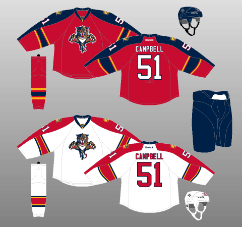
As you can see, both jerseys stay largely faithful to the original hairballs Reebok Edge vomited up for the Cats, though a few welcome changes were made.
The biggest difference is the lack of piping, a massive aesthetic improvement. Look how much cleaner these look in comparison to their predecessors.
The aren’t any more changes to speak of on the white jerseys but, credit where credit’s due, I actually quite like the reds. Yes, the swooping shoulder yoke still looks ridiculous. And yes, the sleeve striping is still truncated.
However, the lack of tail striping isn’t as much of an issue on the red jerseys, thanks to the contrast the red base of the uniform has with the navy pants and helmet. The navy and red work well together on the jersey, too, where the yoke meets the body; the navy yoke has no trim, unlike in the Cats’ original red kit, allowing it to blend seamlessly into the red body of the jersey, again producing pleasing contrast.
Don’t get me wrong, it’s all still based on a blindingly stupid design, but this iteration of said design is salvaged by the superb use of one of the league’s best color palettes (now blessedly free of powder blue).
Interestingly, the red kit’s socks don’t have the incongruity the old navy ones had, of gapped striping on the sleeves but not on the socks. On the red uniforms, both sets of stripes are gapped.
Panthers Sent to Boot Camp
Midway through the Cats’ improbable (and, as it turns out, unsustainable) run to the Atlantic Division title in 2015-16, the team announced there would be a branding overhaul – a military-themed branding overhaul – that would completely revamp the logos and uniforms. The new kits debuted in 2016-17 and carried over largely unchanged into the ADIZERO era.
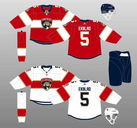
Let’s start with the most military-esque parts of the uniform. The primary logo is “a more mature and stoic panther.” Right, because what strikes fear into the hearts of opponents more than a panther staring thoughtfully off into the distance. It might be a good logo for a debate club, sure. But not a professional hockey team.
Some context: the complexity of the original Leaping Panther logo made it “difficult to embroider,” particularly when it needed to be scaled down for hats and other such apparel. However, completed in the branding overhaul was a simplified version of the Leaping Panther, which is now used on the Panthers’ helmets. It’s a far better logo to look at, and it evokes not only tradition, but also a legitimate emotional response. It’s just great. I don’t know why it needed to be replaced in the first place, and I especially don’t know how anyone could possibly think the Pensive Panther is a viable alternative.
Panthers’ Shoulders Singular, Surprising
Some other military-ish bits are the insignia-like patches in the shoulder ensemble, just above the secondary logo. Every jersey has one that says either “Florida” (on the home jerseys) or “Panthers” (on the away jerseys). Making things even more unnecessarily complicated is that these wordmarks are the opposite of those which appear just above the aforementioned Pensive Panther primary crest.
Captains have an extra insignia, “Captain” for the team captain and “Alternate” for each of the alternates, in addition to the letters on their chests. It’s an interesting feature, to be sure. But, though I understand the thought behind a military-themed branding campaign, I think this detail might be pushing things a bit far. Especially when you consider they’re trying to, quite literally, make players earn their stripes.

Now on to the jersey itself and, on the topic of the shoulder patches, the first thing that stands out is that the sleeve numbers are on the shoulders and the shoulder patches are on the sleeves. Putting the sleeve numbers on the shoulders was an idiotic idea when the Edmonton Oilers did it a year before the Cats, and it’s an idiotic idea now. You’re not a football team. This just reeks of trying to be different for the sake of being different. See also: The Buffalo Sabres stubbornly clinging to chest numbers.
As for the shoulder (sleeve?) logo, it actually looks pretty sharp. The Prowling Panther depicts a panther stalking its prey, just about to go in for the kill. The patch is reversed depending on which side of the jersey one is looking at, such that the panther is always facing forward.
Of course, a logical progression from the panther stalking its prey on the arm of the jersey would be the front of the jersey featuring said panther in full flight. But hey, that’s just me.
As for the fact the Prowling Panther is set atop the state flag of Florida? I gave the Calgary Flames hell for their inclusion of flags on their shoulders but, unlike the Flames, the Panthers not only have the same flag on each shoulder, but also play in a jurisdiction whose flag fits perfectly into their color scheme. Supporting the flag patches is the lace-up neckpiece on each jersey; the crossing of the lace looks very much like the Florida flag, particularly on the away jerseys, where the lace is red. Not only is that super cool, it shows phenomenal attention to detail.
The lack of clashing colors and very nice blending with the Prowling Panther make this secondary logo a winner. Very nicely done.
Panthers’ Pattern Puzzling, Problematic
Another nice touch is how both jerseys are neatly framed in navy blue, via the collars and a thin border along the bottom of the body. I feel this feature helps pull things together rather nicely, though I do wish they would also incorporate it on the end of the sleeves.
The jersey pattern for both the home and away uniforms is made up of a solid base color (red for home, white for away) with a slim-thick-thin tri-stripe pattern (replicated on the socks) midway down the sleeves and body, creating an uninterrupted horizontal stripe – on the front, at least; the pattern does not continue around the back of the body (though the sleeve stripes go all the way around).
It looks absolutely ridiculous. The rear of the kits are far too plain, and there is no real flow going from front to back.
However, I will partially defend the Cats for this decision. In general, teams that utilise mid-chest striping patterns run into problems making jersey numbers show up properly around the back.
The Panthers’ road jersey would have been fine, with navy numbers atop a red stripe, all trimmed in gold. Where it would have been a problem is on the home kits, where white numbers would have been set atop a white stripe.
That said, the Montreal Canadiens have been using such a setup for years, having simply found a color layout that ensures their jersey numbers stand out. Florida should either have adjusted their color scheme to compensate for their design choice, or just chosen a new design altogether. This compromise just seems as lazy as it is unappealing.
The Minnesota Wild, who debuted new threads this season, followed the Panthers’ lead and limited their chest striping to the front of their jerseys. Thus, unfortunately, this may be a trend we’ll just have to get used to, as lazy and uninspired as it may be.
Panthers Colour Me Disappointed
But the biggest disappointment, by a country mile (kilometre?) is the colour palette. Previously, Florida had one of the most exciting palettes in the league: red, navy and a bright, vibrant gold – Sunrise Gold, if you will.
And now? The red and navy are still fine, but the Sunrise Gold is now “Panthers Flat Gold” (I’m dead serious; that’s the actual name). And really, a color with “Flat” in the name tells you all you need to know. The dull, dreary nature of this color, even if it is only used as an accent, drags the entire uniform set down, making everything look like it’s been through the wash one too many times.
The utilisation of this current colour palette is all wrong; there’s not enough color on the road uniforms to make them remotely appealing, while the home kits are hard on the eyes thanks to all the white.
As a result, the centerpiece of the Cats’ branding overhaul, their on-ice look, falls flat, with the team having been utterly ignorant of not only basic visual pleasure, but also current artistic trends; the Pittsburgh Penguins won a Stanley Cup in jerseys trimmed in a similar color, but changed things the very next year due to the popularity of their brighter, livelier throwbacks.
These Panthers kits have some really nice design features, but their basic principles are flawed. The military theme is clumsily implemented, while ignoring viable alternatives. The color palette is fundamentally flawed and poorly utilized – a dangerous combination.
But perhaps the most disappointing part of these monstrosities? We’ve seen Florida do so much better.
Reverse Retro Jersey Brings Back a Classic with a Modern Touch
In November of 2020, Adidas dropped their line of Reverse Retro jerseys, and Florida’s rendition gave fans what they’ve been craving for so long, the return of the leaping panther since the team ditched it at the end of the 2015-16 season.
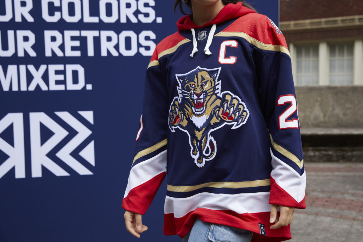
The concept of the jersey pays tribute to the original jersey from 1993 but with the main colors swapped. The jersey looks like their mid-2000s home jersey with their navy base color with white numbers, which may have also received massive inspiration.
The jersey makes some noise for sure with its sleek design and its return of the iconic Panther crest. In addition, it brings back the classic palm tree and stick shoulder patches, a personal favorite of mine. Adidas really outdid themselves this time around with this beautiful jersey.
With the amount of positive response from the fans, it may be in the future plans that the Panthers decide to keep this as a permanent alternative. Or at the very least, go in a similar direction and create a new jersey using heavy inspiration from their glory years.
Panthers Need to Generate Interest, on and off the Ice
Given this is only the second year of their new uniform set, I can’t see the Panthers changing things in a significant way anytime soon.
However, help may soon be at hand as, after a year’s absence (thanks to Adidas, one of the world’s largest apparel manufacturers, somehow being unable to muster up the resources), alternate jerseys are returning to the NHL next season, with new designs for most, if not all 31 teams.
What will the Panthers do? Will they bring back an old classic from their early days? Will they make use of the revised Leaping Panther logo to make something new and exciting? Or maybe, just maybe, they’ll resurrect this cult classic that never made its way into a game.
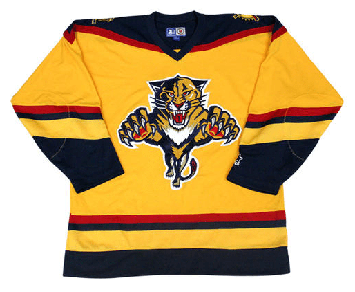
I mean, yes, it’s loud. It’s burning my retinas, if I’m honest. But it’s vibrant, exciting and a damn sight better than what they’ve got now.
Best of all, it’s interesting. The Panthers are an interesting team; maybe not for the right reasons at the moment, but they’re interesting nonetheless. Their jerseys used to reflect that. But their latest attempt is bland, tasteless and devoid of emotion.
The Panthers are starting to become a great team – and South Florida is starting to become an established hockey market. They cannot go too conservative in uniform design. The sooner they realize that and get back to being kooky and fun, the better.
