Ah yes, the Calgary Flames. My hometown team. My boys! How could I ever be upset with them?
Except, you know, when they win only four playoff rounds since 1989, missing the playoffs altogether 14 times. And also their penchant for grossly misjudging and or mistreating organisational talent (Doug Gilmour, Al MacInnis, Michael Nylander, Jean-Sebastien Giguere, Martin St. Louis, Marc Savard…).
But hey, at least they don’t consistently trade my favourite players, right?! I’m so happy Theoren Fleury spent his entire caree–…I mean, isn’t it wonderful Valeri Bure got to retire a Fl–…you’ve gotta be kidding me, what about Freddy Brathwaite? …well, SURELY Jarome Iginla won’t be trad–OH COME ON.
*Sigh* Well at least they have nice jerseys. OH WAIT.
Calgary Flames Burning Bright
But let’s look back to happier times, where it all began: the 1980s. Fresh off a move from Atlanta, the now-Calgary Flames were kicking ass and taking names. Or, rather, providing a mild divisional annoyance to the Edmonton Oilers during their march to 64 Stanley Cups.
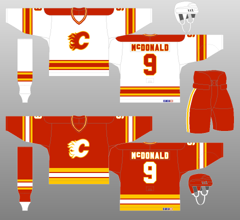
Nevertheless, at least the Flames looked good, with a three-colour, five-stripe design bright enough to be at home in the ‘80s, yet timeless enough to be used as a throwback in 2009. The centrepiece, the “Flaming C” logo, is simply spectacular. The outline of the typeface is flush with the bodies of the characters. Even the V-neck works; the Flames of the time were not a team with the requisite history to be rocking a lace-up neckpiece. Every bit of this jersey just fits together so nicely.
Though the two jerseys are somewhat dissimilar – the white (home) sweater having red shoulder yokes and the red (away) sweater having larger, more pronounced striping, the differences are functional and work to balance the primary (red) and secondary (yellow, white) colours. For instance, if the red kits retained the five-stripe pattern of the whites, there would be an overabundance of white on the jersey. Or, if the tail and sleeve striping on the red uniforms were not to have been gapped, the pattern would lose its pleasing balance and complexity.
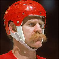
Of particular note, during a decade in which the average car was the size of an ocean liner and the amount of hairspray used single-handedly destroyed the ozone layer, the Flames instead chose to move towards environmental sustainability, with 25 percent of each jersey composed of Lanny McDonald moustache hair.
However, after four first-round postseason exits in five years – the other year being one in which they failed to qualify at all – it was clear something needed to be done.
Calgary Flames Put on a Pedestal
Of course, what shakes a team up more than new jerseys, amirite?!
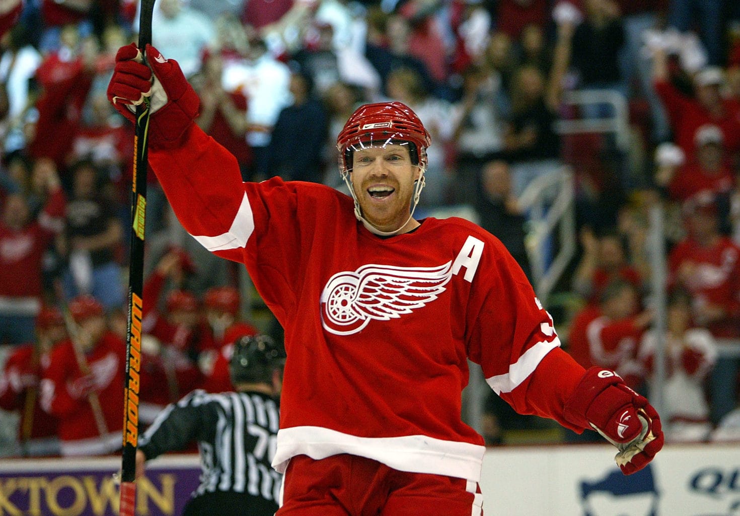
To be brutally honest, it didn’t work, though I feel trading away superstar – and Stanley Cup winning goal-scorer – Doug Gilmour for…well, not Doug Gilmour, also might have had something to do with it. The Flames would not win a playoff round until 2004 – wearing an entirely different kit, I might add.
However, despite a lack of success on the ice, the Flames’ 1994 redesign of their home and away uniforms, which were joined by a black alternate in 1998, really wasn’t too shabby, especially considering some of the garbage spewed out by other teams of the era. It’s all angles and, well, I just like it.
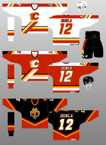
Note the switch to an extended-yoke design for the sleeve striping, a bold design choice most often seen in the ‘70s and ‘80s. The diagonal platform the logo rests upon manages to be interesting, rather that obtrusive, mostly due to the complementary diagonal trim on the sleeves and pants, along with the italicised font. The pointed, punchy nature of these design features, along with the tasteful addition of black, makes the jerseys look just that much more aggressive. The black also helps offset an overreliance on white in the road uniforms.
The black, “Flaming Horse” jersey took a lot of heat, especially when it became Calgary’s full-time away uniform, but I actually quite like it. Calgary is the “Stampede City,” after all, and this kit cleaned up the messier bits of its batterymates (most notably, the weird, distracting gaps in the sleeve pattern) and switched to a more traditional, banded striping design. They even managed to get the typeface colouring right – not an easy feat on a black jersey, toning down the white base with red and yellow trim.
One final point on this era in Flames jersey history is that, in one of the best uniform-related decisions of all time – and one which endures to this day, the Flames’ alternate captains, rather than the traditional “A,” wore the stylised A of the Atlanta Flames on their chests. How cool is that?! They even tried their primary logo as the captain’s patch, but that change did not last.

Calgary Flames Return to Championship Form
The Flames made the Flaming Horse their full-time road uniform for 2000-01. It was joined that same season by a white counterpart, and three seasons later by a red entry, both featuring the traditional Flaming C.
The white jersey was worn at home full-time, until the 2003-04 season when the new red jersey would take over, in accordance with the National Hockey League switching back to wearing dark jerseys at home. The white Flames kit became their away uniform, while the Flaming Horse was again assigned alternate duty, disappearing entirely after 2005-06.

Both the red and the white jerseys follow the diagonal, banded striping template of the black kit, with the Flaming Horse crest relegated to secondary status on the shoulder, swapping places with the Flaming C. As neat as the Flaming Horse is, the Flaming C is simply outstanding – one of the best logos in professional sports. I feel much of the animosity towards the black jerseys was due not so much to the design or colour scheme, but to the marginalisation of the dearly beloved, much-admired Flaming C. If the Flames had used their primary logo in place of the Flaming Horse, I feel the black sweaters would have been much better received.
A black crest on the red jersey is a first for the team and looks phenomenal. Not that the white Flaming C of the previous generation was bad, but the black just looks a little more menacing – and more subtly complements the red backdrop, in contrast to the previous iteration’s blinding amount of white. Plus, they went all the way to the Stanley Cup Final with this jersey, losing in Game 7 (although they probably should have been awarded the Cup at home in Game Six. Not that I’m bitter or anything. Nope, not at all. Not one bit.). They even added a lace-up neck! Ticks all my boxes, this one.
Reebok Edge Extinguishes Calgary Flames
Rolled out for the 2007-08 season, the Reebok Edge uniform system, with its incomplete sleeve striping, emphasis on vertical patterns, and weird fixation on figure-hugging vertical piping, made a mockery of many an NHL jersey. Not to mention the scandal where Reebok flat-out forgot to design the Toronto Maple Leafs a uniform at all, leaving them with only practice jerseys to wear.
Which brings us to the Flames duds of the present day. Oh…oh dear.

Perhaps no team was so dearly affected by the mass redesign than the Calgary Flames. Weird, incomplete sleeve stripes. Weird, incomplete underarm stripes. Weird, incomplete piping leading to nowhere. A weird, horizontal tail stripe that intersects with the vertical underarm striping with all the smoothness of something designed in Microsoft Paint. It looks like one of those grade school crafts you made by sticking together bits of recycling.
Et la pièce de résistance? The flag of Alberta on one shoulder, with the flag of Canada on the other. Just in case you forgot where Calgary was. Or Alberta, for that matter.
Oh, and, by the way: when I say, “the flag of Alberta,” I mean, quite literally, the entire flag of Alberta. Not the crest, which might have looked half-decent, but the whole thing. At least the Canadian flag blends in; the Alberta flag’s blue background contrasts completely with the team’s colour scheme, sticking out like a sore, oxygen-deprived thumb.
Mercifully, a throwback alternate kit was introduced for 2009-10, paying homage to the team’s golden era – and lone Stanley Cup (1989). So why not just bring back the white one as well, and call it a day?
Calgary Flames Cowtown Pride
Of course, this fantastic piece of Flames history didn’t last long. In 2013, the team replaced it with a new alternate jersey, this one bursting with pride for Cowtown. A cowboy-esque shoulder pattern frames overly chunky neck striping. A collegiate-like script, meant to be the primary crest, reads “Calgary,” overshadowing a tiny Flaming C. Did the Flames not learn their lesson after denigrating the Flaming C the first time? And why, oh why did they choose a collegiate wordmark to replace it? Nobody thinks those are cool (sorry, Minnesota). That’s just lazy design.
In contrast to the laziness of the primary logo, the new secondary logo, while indeed representative of the city, is far too complicated for its own good, not to mention the fact the “F” of the “CF” mark points directly into the ground. Logos are supposed to be something kids can draw in school, not something that has to be explained to them by their parents.
This uniform is a mess. I mean, if you’re gonna market a money-grab, at least make sure it can actually, you know, grab money. Perhaps most bizarrely, the round secondary logo and curvy wordmark contrast completely with the abruptly squared-off shoulder yokes and squared-off, incomplete striping. Unsurprisingly, this kit was retired after 2015-16, replaced with the aforementioned throwbacks, back for a second tour of duty.
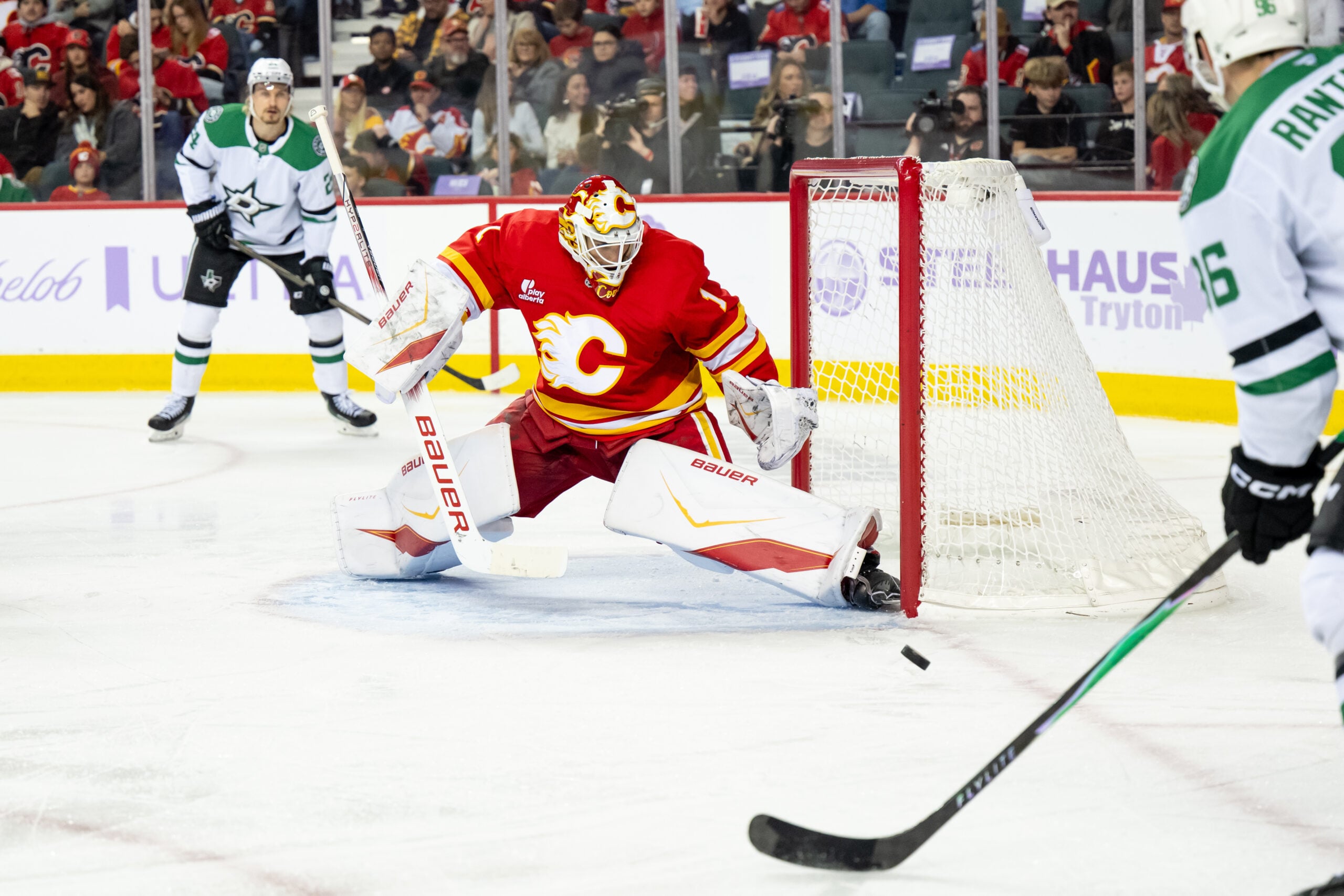
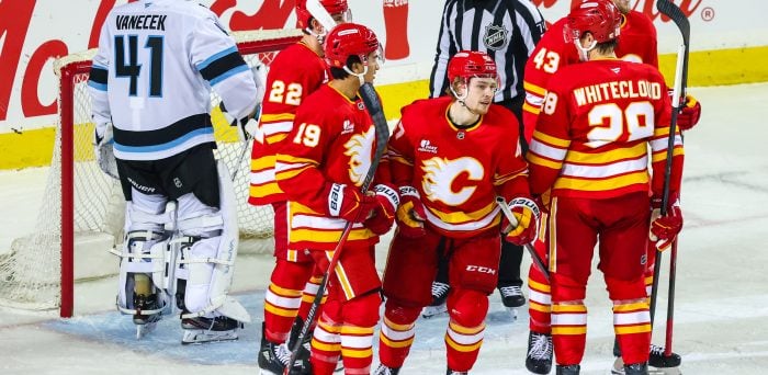
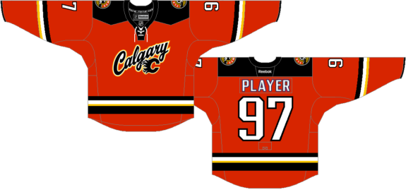
Calgary Flames Current Jerseys
The Flames made some minor modifications to their Edge kits with the switch to the ADIZERO programme, but did not change their uniforms nearly enough to warrant buying one.
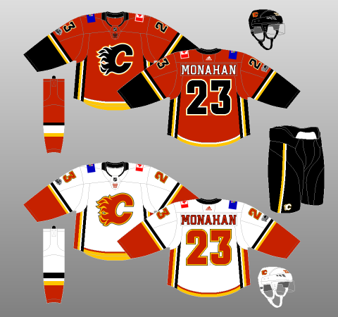
Interestingly, for the first time since the 1994 redesign (with the exception of the short-lived alternates of 2013-16), the name and number font is not italicised.
The sleeve stripes now go all the way around, which is nice. The vertical underarm striping, while still stupid, at least goes all the way up. The lace-up neck, present since the Edge redesign, has been retained. Even the piping has been removed. So it’s not all bad.
But it’s mostly bad. The tail and underarm stripes still intersect with all the grace of a car accident. The flags are still loud and proud on the shoulders. And both the home and away kits are still horrendously unbalanced, skewed far too heavily towards their primary colours.
Even the throwback alternates can’t help, as the relief they provided Flames fans has been scuttled with Adidas’ decision to forego third jerseys this season.
Calgary Flames’ Future Bright, Even If Designers Aren’t
Other than the brief blip in 2004, this team has been one disappointment after another. Yes, there was the spring of 2015. But, in our heart of hearts, we Flames fans knew our team was playing way above its heads – not to mention way above the Law of Averages. They promptly missed the playoffs the following year.
That said, after many years in the wilderness, the Flames appear to finally be on the rise. Now we can only hope they get a jersey I can wear in public without being arrested for indecent exposure.
Free Newsletter
Get Calgary Flames coverage delivered to your inbox
In-depth analysis, breaking news, and insider takes - free.
Subscribe Free →