All 31 NHL teams released their Adidas Reverse Retro jerseys on Monday after teasing them over the weekend. Some teams knocked it out of the park with gorgeous sweaters and a few produced pretty ugly ones. The Philadelphia Flyers fall somewhere in the middle, but on the whole they did quite well.
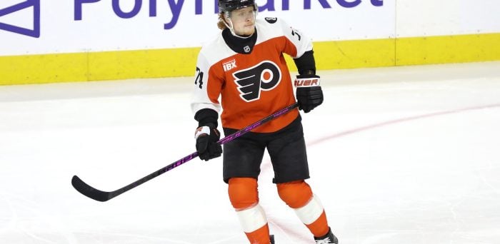
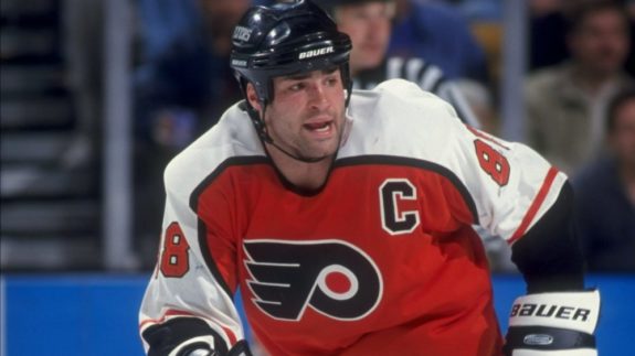
The curved shoulders bring back Philadelphia’s look from 1982 through 2007. That was a highly successful era for the Flyers, with trips to the Stanley Cup final in 1985, 1987 and 1997. According to Adidas and the NHL, the jersey specifically pays tribute to the Flyers of 1995, a year that saw Eric Lindros win the Hart Trophy and the team capture a division title.
And let’s not forget about the other members of the dominant “Legion of Doom” line, John LeClair and Mikael Renberg. As Philadelphia looks to be heading into a contending era, perhaps this new look will help usher in the kind of deep playoff run they haven’t had in the salary cap era.
The big departure from the sweaters of the late 20th century is the use of black shoulders, rather than white. Personally, I think that would have looked a little better. But this is still a great look, with well-done trim to help the colors stand out. They’ve kept the black waist stripe and the thin orange stripe on the sleeves.
It’s also a darker shade of orange than the Flyers of today have been using, which gets a big thumbs up from me. Vivid is always better than bland. (Speaking of bland, what were the Detroit Red Wings thinking? And why did the New York Islanders trot out almost exactly their current jerseys when the league specifically had “remixed for the future” in their marketing tagline?)
Flyers Resist the Temptation to Go Black
Another reason I approve of the Reverse Retro jersey is they stayed away from making black the primary color, like their third jerseys from the ’90s. Black is certainly a big part of the Flyers’ identity as a secondary color, but I always like to see teams showcase brighter, more unique colors. Orange is who the Flyers are. The decision to make a recolored black version their full-time road jersey from 2001-07 was a mistake. That was a time when many teams were emphasizing the black in their color scheme. The Chicago Blackhawks made the same mistake.
Philadelphia has also kept the same font, color and outline from the jerseys worn by Lindros, Hextall, et al. The numbers have a white outline rather than black, but that’s because the shoulders are black. The name and number on the back should be easily readable on TV, even though the white nameplate from the current jersey was ditched. The name could perhaps use a black outline to be more visible, but probably not necessary. The coloring on the cuffs covers a longer area than the current sweaters, but then part of a jersey’s cuffs are covered by the player’s gloves, so that’s reasonable.
The NHL says the Reverse Retro jerseys will be worn multiple times during the 2020-21 season, with games “featuring exciting and renewed rivalries — both old and new” that will be announced at a later date. Philly’s new digs would look good against the Pittsburgh Penguins’ white jersey, which is also a callback to the ’90s with the diagonal letters.
A Classic Logo Needs No Changes
As fellow Flyers writer Max Nason notes, evaluating a new Flyers jersey is usually about the color scheme and striping, because they don’t seem to be interested in producing a different logo for their alternates or special jerseys. In fact, they have never worn a logo other than the winged P.
Oh, sure, they’ve made minor adjustments, such as the all-black version on the 2019 Stadium Series sweater, but it’s a logo that has stood the test of time and improves any jersey that features it. They’ve also never used colors other than orange and black, unless you count the gold trim for their 50th anniversary. Some teams remixed old colors with a current logo, or vice-versa, but Philadelphia didn’t have that option.
I give this look a B-plus. It’s not terribly creative, but it’s clean and no real mistakes were made, which is more than I can say for some teams.
Free Newsletter
Get Philadelphia Flyers coverage delivered to your inbox
In-depth analysis, breaking news, and insider takes - free.
Subscribe Free →