As the famous philosopher Kermit T. Frog once opined, “It’s not easy being green.” That can be especially true if you’re an NHL team attempting to “go green” for St. Patrick’s Day. For example, just this past fall, on a trip to the Reebok store I spotted a green and white New York Islanders hat. It wasn’t quite on the level of the Gorton’s Fisherman guy but it was definitely different.
So what teams can and or have pulled off the “green look?” We’ll find out if you can “Erin Go Bragh” about your team’s look or if you’re going to need a few more shots of Jameson’s to tolerate it.
Well that was an obvious enough choice to start with huh? From 1919 to 1927, the St. Pats played in Toronto. In that time they won the Stanley Cup in 1922. Eventually they would become the present day Toronto Maple Leafs. Their uniforms were green with white lettering and had the words “Toronto St. Pats” on the front. When the Maple Leafs wore their uniforms a few years back, they also had brown helmets, gloves and pants. Of course the original St. Pats didn’t wear helmets. But really, how can one go wrong with a green sweater and a team named the St. Pats?
Anaheim Ducks:
![]()
When the Anaheim Ducks were known as “The Mighty Ducks of Anaheim,” they sported some jade green in their uniforms from 1993 to 2006. Their uniforms also featured a predominant eggplant color as well. Then of course there was the signature duck goalie mask with crossing hockey sticks. After the team changed their name and uniform colors and logo, they won the Stanley Cup. So I guess that change worked out for the best.
Boston Bruins:

Between the Bruins, Boston Celtics and Boston Red Sox, it is practically a requirement to wear green on St. Patrick’s Day. Mind you the Celtics already do. While the black, gold and white is “Boston Bruins hockey,” I’m sure they get a pass from the Boston faithful for looking like their fellow Boston Garden tenants for one day.
Chicago Blackhawks:
Personally, I wouldn’t mess with the red, black and white of the classic Blackhawks uniform. That being said, given the logo, the team could get away with the old North Dakota look I suppose. Plus they do have a twinge of green in the feathers of the logo as well.
California Golden Seals/Oakland Seals/California Golden Seals:
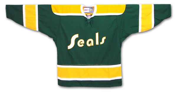
From 1967 to 1976, the Seals skated in California. Initially the club had a green jersey with blue trimming and a seal leaping out of a “C” on the crest. Think Vancouver Canucks meets Hartford Whalers. The team also had a uniform to match their baseball counterpart, the Oakland A’s. It was a green and gold jersey with the word “Seals” across the front.
Minnesota North Stars/Dallas Stars:
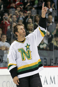
Two cities, two predominant colors. Green and gold. Up in Minnesota it was the green sweater with yellow trimming, along with an “N” and a star. In Dallas the franchise has used mostly the same color scheme, with a little more black added in. Their uniforms have mostly had a green star with gold trimming and the words “Dallas” or “Dallas Stars” at the top of the crest.
From 1979 to 1992, the Whalers wore predominately green and white jerseys with some blue trimming. They had either an all white “HW” crest or a green “W” with the “whale tail” colored blue at the top. From 1992 to 1997, Hartford added a lot more blue to the uniform and added some gray trimming.
Minnesota Wild:
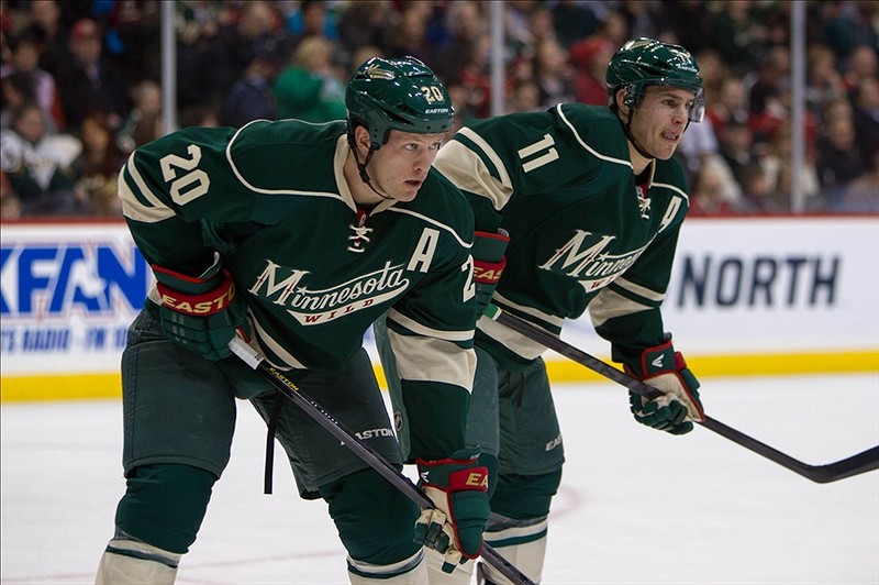
Much like the North Stars, the Wild have a lot of green in their uniforms. Since their inception in 2000, the Wild have worn green uniforms with red and white.
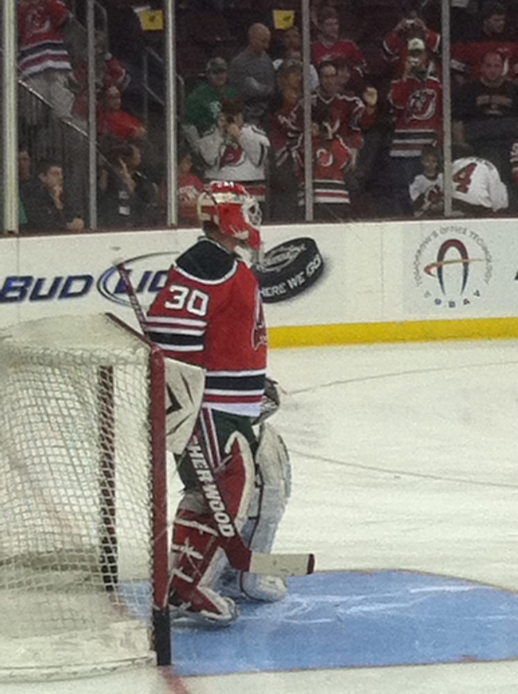
New Jersey Devils:
While they don’t be wearing their throwbacks this year, from 1982 to 1992, the Devils had green trimming in their jerseys and and on their pants. Some have a bit of a soft spot for the old Christmas colored duds but I think their current sweaters are classic.
From 1995 to 1998 the Isles had some aqua green trimming in their uniforms. I think the wavy look was unique. Nothing like an original though.
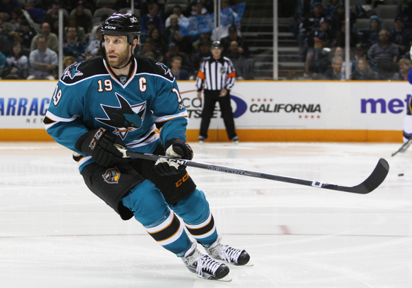
San Jose Sharks:
Since 1991 the Sharks have had one of the newer and more popular logos. Going with a green-teal and black look with a shark snapping a hockey stick. Brilliant design.

From 1970 to 1978 the Canucks donned blue and white jerseys with green trimming. After quite a few different looks along the way, since 2006 the Canucks have gone back to the original look. Added to the hockey stick crest is the orca killer whale in the shape of a “C.”
Free Newsletter
Get Hockey History coverage delivered to your inbox
In-depth analysis, breaking news, and insider takes - free.
Subscribe Free →