- Here Come the Logos…
- 20. Guelph Storm
- 19. Owen Sound Attack
- 18. Sarnia Sting
- 17. Mississauga Steelheads
- 16. Niagara IceDogs
- 15. Erie Otters
- 14. London Knights
- 13. Barrie Colts
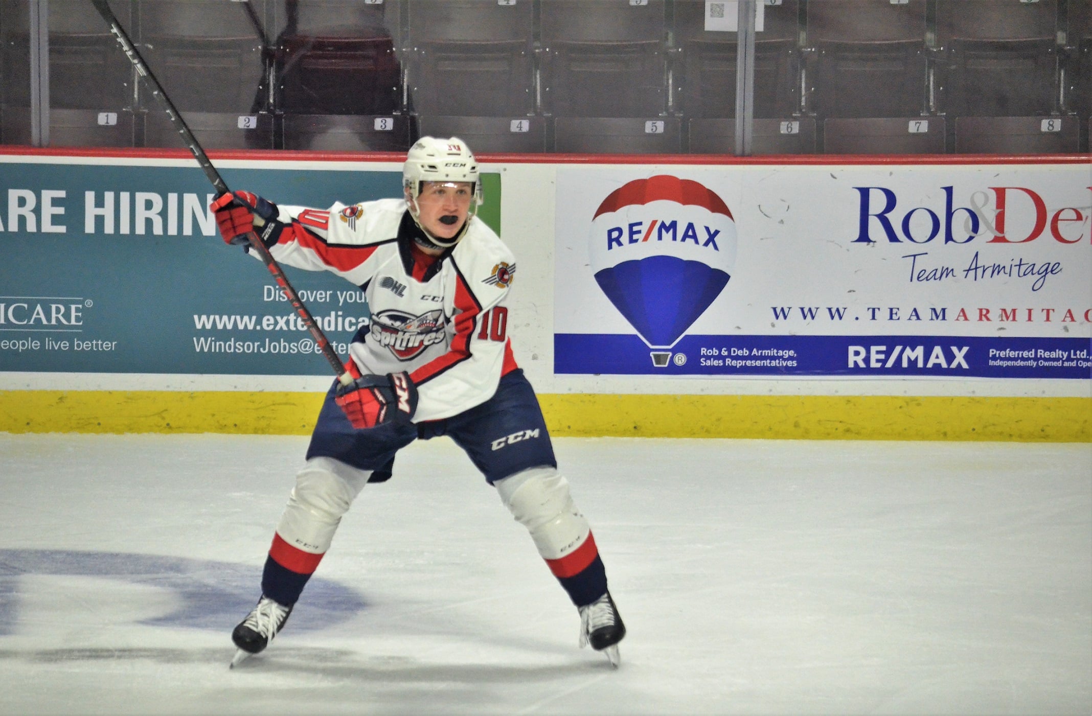
- 12. Windsor Spitfires
- 11. Saginaw Spirit
- 10. Flint Firebirds
- 9. Hamilton Bulldogs
- 8. North Bay Battalion
- 7. Kingston Frontenacs
- 6. Kitchener Rangers
- 5. Oshawa Generals
- 4. Peterborough Petes
- 3. Ottawa 67’s
- 2. Sudbury Wolves
- … and at 1. Sault Ste. Marie Greyhounds
- A League of Outstanding Logos
When OHL fans compare and rank teams, they tend to look at everything from goals to defenses, coaches to history. There’s very little that’s not analyzed through a microscope. However, there is one area that seems to slip through the cracks and rarely gets talked about or ranked – the team logos!
For decades, OHL teams have come out with designs that have some kind of meaning to the club. They’re colorful, creative, and represent their region. While none of them are bad, some could use a bit of work. Which ones have risen to the top? It’s time to make that decision! As a lifelong OHL supporter, I will rank the logos from all 20 organizations from worst to first. Since there are numerous special occasion and/or third logos, it’s easier to just go with everyday home-and-away. It makes for an even playing field.
Sit back and let’s start the rankings!
Here Come the Logos…
20. Guelph Storm
In 1991, the Dukes of Hamilton packed their bags and headed up Highway 6 into Guelph for a new lease on life. The organization held a “name that team” contest and the winner was “Storm.” A new era was underway.
Their first logo was a unique design that featured an ice-cold “STORM” with a blustery tornado below it. Something about it just worked. However, the organization has changed the logo twice since with their latest design introduced in 2018-19. The new logo features a tornado a creature that looks like angry Lorax eyes just above it, all in crimson, white, grey, and black.
It has a very mysterious feel to it and is by no means “bad”, but it definitely feels like a downgrade from the original. You can see the idea behind the design however it really leaves you with questions and wanting something more. For that reason, it’s ranked 20th.
19. Owen Sound Attack
The story behind the Owen Sound Attack is well-known throughout junior hockey circles.
Originally named the Guelph Platers, they moved to Owen Sound in 1989-90. That lasted for 10 years when the owners (Holody family) decided it was time to sell. The community realized that selling to out-of-town buyers meant their club was gone. It’s such an integral part of this small community that they wouldn’t let that happen. A group banded together to save the club from relocation, and the “Attack” was born.
The original logo featured a brown bear holding a hockey stick in one hand and the word “Attack” in the other. However, in 2011-12, the team redesigned it, removing the word “Attack” and the hockey stick, while adding the name “Owen Sound” at the top.
Like the Storm, it’s a decent logo but the original was had a better feel and flow to it. The bear is still menacing but could use some adjustments. For that reason, the Attack will slide into 19.
18. Sarnia Sting
The Sarnia Sting relocated from Newmarket (formerly the Royals) when they were purchased by the Ciccarelli brothers in 1994. They’ve become a staple in the Bluewater area.
Their original logo was a black, yellow, and white bee facing you while holding a hockey stick. Since then, they’ve gone through three different logos, including their current one which was revealed in 2019-20.
The current logo is an angry bee facing the right while holding a hockey stick and preparing his stinger. It’s similar to the one they used up until 2013-14, but that one had the words “Sarnia Sting” at the bottom. The new one has a larger stinger and no words attached.
While it’s tough to find a definitive reason for the name “Sting”, the bee with a large stinger and hockey stick isn’t too bad. They’ll finish this one at 18.
17. Mississauga Steelheads
In order to talk about the Mississauga Steelheads’ logo, it requires the backstory.
The OHL started in Mississauga in 1997 and was named the “IceDogs” after part-owner Don Cherry’s dog “Blue.” In 2006, Eugene Melnyk, who owned the Toronto St. Michael’s Majors (OHL) and currently owns the Ottawa Senators, wanted to move his OHL team from St. Michael’s College Arena in downtown Toronto into the Hershey Center in Mississauga. However, that’s tough to do when the IceDogs were already there.
Problem solved – Melnyk purchased the IceDogs in 2006 and then sold them in 2007 to a group from Niagara. Part of that agreement was moving the IceDogs to Niagara (St. Catharine’s) while the Majors moved to the Hershey Center (from ‘Majors move to Mississauga’s Hershey Centre’, Toronto Star – 6/7/2007).
Following the 2011-12 season, Melynk sold the Majors to local businessman Elliott Kerr. As a result, the “Majors” name returned to St. Michael’s College while the Mississauga franchise held a “name the team” contest. The name “Steelheads” was born; the Steelhead Trout is an important part of the Credit River, which runs through the city.
The original logo included the “Steelhead” name with a fish leaping out of the word. Now, it’s blue-and-white, featuring a large fish coming at you with “Mississauga” and a small Canadian flag at the top.
The blue-and-white aspect of the logo is similar to the nearby Toronto Maple Leafs and the fish is as menacing as you could get it without being too cheesy. When they were at St. Michael’s College, the jersey had a large “M” on it. Had they redesigned that “M” and just included the fish, this could have finished higher. Overall, though, it’s a respectable design and will finish at 17.
16. Niagara IceDogs
When the Mississauga franchise moved to Niagara/St. Catharine’s following Melnyk’s sale, they kept the IceDogs name and it has remained.
Unlike the previous franchises, the IceDogs haven’t changed their logo since their relocation. The logo features a Blue Terrier similar to “Blue” that’s holding a hockey stick while giving the opponents a snarl. It also has two crossbones on its right shoulder. The words “Niagara” and “IceDogs” are neatly spelled out below.
The IceDogs franchise originally had a robotic dog with glowing red eyes in front of a metallic-looking “M.” It was an impressive logo but changed once Melynk bought the club.
That said, while the dog is a bit cartoon-ish, the overall look and determined vibe are synonymous with the organization. It grows on you pretty quick and it’s become unmistakable around the league. It’ll slide into the 16th spot.
15. Erie Otters
Known as the Niagara Falls Thunder prior to 1996, the organization moved to Erie, PA for the 1996-97 season. They were named “Otters” after the North American River Otter, which is a common creature in nearby Lake Erie.
At their inception, the Otters designed a logo with a menacing otter wearing a helmet and holding a hockey stick. Behind his head was the name “Erie” while “Otters” was written in front. That lasted until 2016-17 when they removed the creature and went solely with the team name. It gave the team some good luck as they won the OHL title that season.
However, that logo lasted just two seasons before they re-designed the original log to what we see today.
Their current logo was introduced at the start of the 2019-20 season and, once again, features the otter holding a hockey stick. However, this one has the word “Erie” incorporated into his helmet and the word “Otters” in front; both are also yellow. It’s a much brighter logo that stands out on their jersey.
While it’s cartoonish, the incorporation of “Erie” into the helmet is creative and you would miss it if you weren’t looking. It kind of reminds you of the “Mom” in Wendy’s logo. It’ll earn a spot at 15.
14. London Knights
When you think of OHL hockey, the London Knights almost immediately come to mind. For over 50-years, they’ve been a mainstay in the mid-west Ontario city, churning out NHL prospects like a well-oiled machine.
While their product hasn’t changed a whole lot over the years, the same can’t be said for their logo. From 1968 until the present time, the organization has had eight different “main” logos. While one was a blue-and-green creature with a helmet that was nicknamed “Spider Knight” by their fans (for resembling Spider-Man), most have been some variation of a knights’ helmet attached to a skate.
Their current logo is a dark yellow (almost orange), green, and black knights helmet on skates. It also incorporates the London “L” at the front of the helmet, which is a nice touch.
It’s very similar to the classic green-and-white logo they used after “Spider Knight”, which lasted from 2002-09. However, the current logo feels like they threw the green-and-white logo in the wash too many times and the colors changed. It simply doesn’t feel right.
The Knights could have one of the better logos in the league if they went back to the green-and-white look. Without it, though, it’s a decent logo but they will finish at 14.
13. Barrie Colts
It’s rare for a team to be in the league for 20-plus seasons and keep the same logo, but that’s what the Barrie Colts have done.
The organization has been a fixture in the City of Barrie for over 100-years, but they didn’t join the OHL until 1995-96. Their original logo featured an angry gold horse wearing a red jersey, holding a hockey stick, surrounded by a grey horseshoe and it has stuck to this day.
It’s a clean, simple, and recognized look that doesn’t need changing. While the team has had various third-jersey logos throughout the years, their main logo does the job well. It comes in at 13.
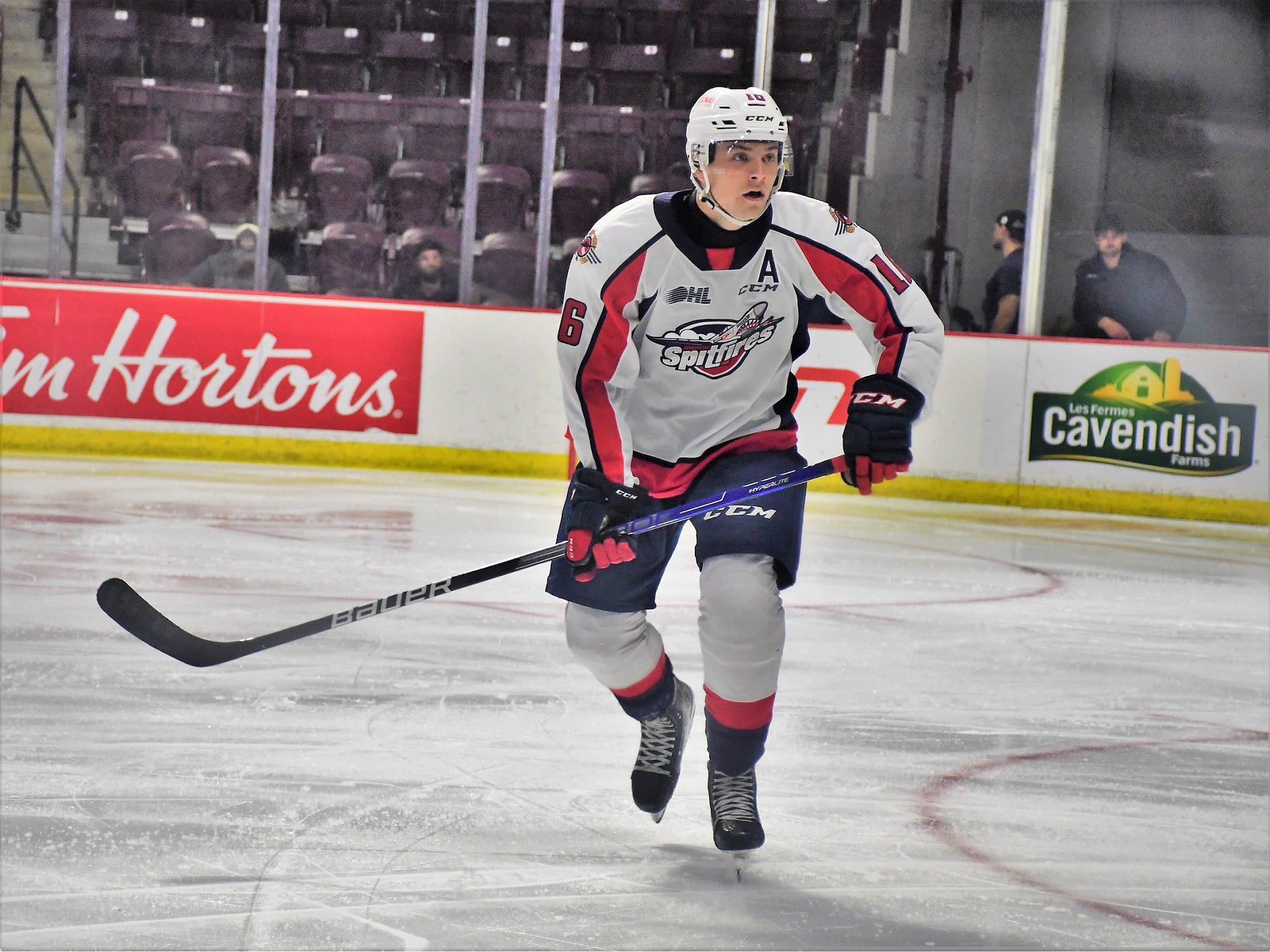
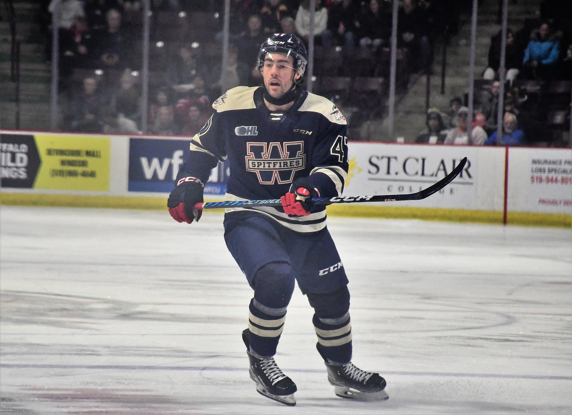
12. Windsor Spitfires
Since their inception into the OHL in 1974-75, the Windsor Spitfires have become another well-known junior hockey club.
Over their 40-plus seasons in the league, they’ve gone through a few changes with their logo. While the original was just the words “Windsor Spitfires” over a maple leaf, they involved the Spitfire aircraft in 1984-85 and didn’t look back. The Supermarine Spitfire fighter aircraft was used by a Royal Canadian Air Force squadron nicknamed “The City of Windsor” during WWII in England.
During the 90s and early 2000s, the organization created a logo featuring a Spitfire silhouette that appeared to be flying at you. It had the words “Windsor Spitfires” written below it and the entire logo was a rectangle-ish shape. It became somewhat iconic around the OHL.
However, when Waren Rychel, Bob Boughner, and Pete Dobrich bought the club in 2006, they redesigned the logo and introduced it at the start of the 2007-08 season. It features a snarling cartoon Spitfire coming through the clouds, firing its machine guns. A small “Windsor” and large “Spitfire” sit below it.
The WWII Spitfire plane is prominent in City of Windsor history so everything about the logos makes sense. It’s a nice, eye-catching logo but it’s not the best one they’ve had. As a lifelong Windsor-resident, I would have preferred they kept the 90’s logo or just modernized it. Since that didn’t happen, though, the Spitfires will wind up 12th.
11. Saginaw Spirit
In 2001, Saginaw, MI businessman Dick Garber (owner of multiple local car dealerships), along with Wren Blair, purchased the North Bay Centennials and moved them into the mid-Michigan city. Soon after purchasing, the club held a “Name the Team” contest. That was won by an elementary school student who chose the name “Spirit.”
Similar to the Team USA logo, the Spirit logo features a grimacing bald eagle with the body of a US flag and large “Saginaw Spirit” words below. The colors red, white, and blue are synonymous with USA hockey.
Save for special occasion logos, this has been the sole primary logo for the club. It makes complete sense and why fix it if it’s not broken? For these reasons, the Spirit will finish at a very respectable 11th.
10. Flint Firebirds
Breaking into the Top 10 is a newer franchise to the league, the Flint Firebirds.
Originally the Plymouth Whalers (who had a great logo of their own), the organization has been in the OHL since 1990-91. They went through various name changes before owner Peter Karmanos sold them to IMS USA in January 2015. The relocation about an hour north was approved a month later.
Several names were discussed for the club, including Generals, Tropics, Stones, Firebirds, Force, and Vikings. In the end, they went with the Firebirds. The logo features a grey and blue Firebird rising out of the fire, looking behind itself with fire coming out of the mouth. The words “Flint Firebirds” are below in unique text while the tail wraps around an orange puck.
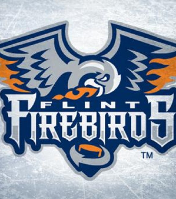
The Firebirds are an organization with plenty of promise and that includes their logo. While the words aren’t the easiest to read, the bird, the fire, and the colours really stand out and are easily recognizable. For those reasons, they’ll finish tenth.
9. Hamilton Bulldogs
Coming in at ninth is the Hamilton Bulldogs, a franchise relatively new to the OHL, but well respected in the hockey circles.
The original Bulldogs’ franchise started in the AHL in 1996 after relocating from Cape Breton, NS. They were given the “Bulldogs” name as it suited them and the City of Hamilton.
In 2015, the Belleville Bulls (OHL) were purchased by businessman Michael Andlauer and he moved them to Hamilton, while the AHL team moved to St. John’s, NFLD as part of a larger AHL team shuffle. However, Hamilton kept the “Bulldogs” name and gave it to their new OHL team. It just made life easier.
While the name remained, the logo changed a bit. It was originally a bulldog head featuring a spiked collar and large bone in his mouth, but the colors were brown, dark blue, and red. After the move, they changed the red to yellow and the dark blue to black, giving it a brighter (but still intimidating) look.
This is another case of “if it’s not broke, don’t fix it.” The logo is clean, bright, and fits the junkyard dog mentality of The Steel City. It all just works well and deserves the ninth spot.
8. North Bay Battalion
Just like the Bulldogs, the North Bay Battalion are a franchise that saw something that worked and left it alone.
In 1998-99, the Brampton Battalion dropped the puck on their inaugural season on the western outskirts of the Greater Toronto Area. The roster was often competitive, if not a contender, but attendance never reached the desired level. As a result, after their lease ended, owner Scott Abbott relocated the team to North Bay.
Throughout their time in Brampton, the Battalion logo featured an angry “Sarge” with crossed hockey sticks on his hat and the bolded word “Battalion” in the front designed to look three-dimensional. When they moved to North Bay, the majority of the design stayed the same. However, they brightened most of the colors a little bit and made the “Battalion” larger.
The City of North Bay has a strong military background so it makes sense that they’ve not only kept the logo but the colors as well. It’s well-recognized and well-respected throughout the hockey circles. When you see it, you know what team is involved. The Battalion will finish in eighth.
7. Kingston Frontenacs
Hockey has been in Kingston’s blood for generations. It’s a part of the fabric of the eastern Ontario city.
In 1989, they joined the OHL and chose a name they had used on multiple occasions in the past – “Frontenacs.” It comes from Louis de Buade de Frontenac, the Governor of New France who settled Fort Frontenac where the current-day Kingston is located.
When they joined the league, they brought back a previously-used logo that is reminiscent of the Boston Bruins; a yellow circle with “Kingston Frontenacs” in black, black spokes, and a capitalized yellow “K” in the middle.
Over the last 20 seasons, they’ve changed it multiple times, often just with the colours (though, from 2001-09, Count Frontenac was the logo). In 2012-13, they went to a black “K” with white and yellow trim.
It’s simple, it’s classic, and it doesn’t really need anything else. You don’t see many clubs taking this bold step but, for the Frontenacs, it completely works. They will slide into seventh.
6. Kitchener Rangers
The story of the Kitchener Rangers dates back to 1947-48 when they were the Guelph Biltmore Mad Hatters. The “Biltmore Mad Hatters” was a farm club for the New York Rangers. They were also nicknamed the Guelph Royals for a period but struggled financially. In 1963, the NHL team approached Kitchener businessman Eugene George about moving the club to Kitchener. He joined other local businessmen and moved the club, renaming them the Kitchener Rangers.
In 1979-80, they created a logo that’s almost identical to the NHL Rangers, only with “Major Jr. A” included. From 1991-01, they redesigned the logo to include a cowboy holding a hockey stick with the words “Kitchener Rangers” surrounding him.
However, in 2001-02, the Rangers went back to the trusted NHL-style logo. This time, featuring the word “Kitchener” across the top, a diagonal “Rangers”, and the OHL symbol in the bottom left corner.
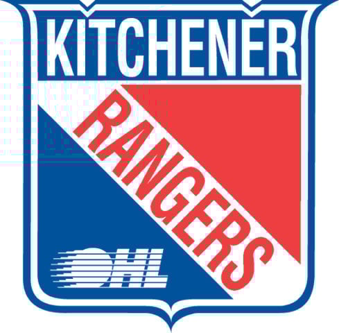
It’s a simple, eye-catching logo that, despite a slight lack of creativity, is a nice gesture to their history. The logo is popular in the OHL and will finish sixth.
5. Oshawa Generals
The City of Oshawa is another Ontario town with rich hockey history. While they had various names and owners prior to the early 20th century, the “Generals” came to life in 1937.
Named after their original sponsor, General Motors of Canada, the club has seen nearly a dozen different logos grace their jerseys through the decades. While different designs have come-and-go, the last two have stuck around for over 35 seasons.
In 1984-85, the club designed a simple, flowing logo that featured a handwritten “Oshawa” in red and a capitalized white “Generals” below on top of a blue stripe background. It has a bit of a Microsoft Paint feel to it. That logo lasted until 2006-07 when they modernized it.
The current logo remains a red handwritten “Oshawa” on top of a capitalized white “Generals” below with the blue stripe. However, now the “Oshawa” has blue trim and is slightly squished together and “Generals” has been stylized. Both words also have a bit of in-word shading, adding a nice depth.
It’s still a very slick, clean look and represents the city well. The Generals will finish fifth in these rankings.
4. Peterborough Petes
The Peterborough Petes are another great example of classic designs that stood the test of time.
The Petes joined the OHL in 1956-57 and created their simple, effective logo of the word “Petes” in white, with the “T” dragged out at the bottom for a hockey stick, and a circular maroon background. That stuck around until 2014-15 when they modernized it, turning the word “Petes” into either maroon or white (depending on the jersey) and removing the circular background.
During its long and storied history, the club has come out with numerous logos for third jerseys or special occasions. However, the regular home-and-away logos have remained a constant. Why? There’s no need to change something that’s done so well. For this, they will finish fourth.
3. Ottawa 67’s
Like the Petes, the Ottawa 67’s have kept to the “KISS” rule – Keep It Seriously Simple.
Established in 1967, they created a square “O” logo with a written “Ottawa”, a white diagonal hockey stick, a puck, and white “67s” written in it. This lasted until 1987 when they released the current logo which features a red square “O” with a black “67’s” in the middle. Nothing more and nothing less.
While the club used an animated angry puck logo from 1998-12, they’ve rightfully used the original ever since. It’s become one of the most respected logos in the league, and maybe even in hockey, and for that reason, it’s ranked third.
2. Sudbury Wolves
Coming in second is a logo that has always epitomized hard work and grit – the Sudbury Wolves.
The organization has played at various levels of junior hockey in Sudbury for nearly 100 years. In 1972, they joined the OHL and haven’t looked back.
Originally, their logo was an angry green and white wolf with glowing red eyes and red blood spouting from his mouth. They updated that in 1981 and then added the words “Sudbury Wolves” in 1987. In 1989, they turned the wolf grey and white, keeping the blood, and turning the “Sudbury Wolves” to blue.
In 2009, the organization updated its logo, changing the blood drops and adding blood to the wolf’s teeth. They also removed the words “Sudbury Wolves.”
How popular is the wolf? A stuffed wolf (with a recorded howl) goes along a wire high above the ice after each home goal. Everything about the logo and the team is fantastic. It doesn’t look too cartoonish, the blood on the teeth is a great little detail, and it’s a straightforward, well-designed look. They’ll finish a very respectable second place.
… and at 1. Sault Ste. Marie Greyhounds
This is another team with a rich hockey history in northern Ontario. The name started in the early 20th century by former coach and manager George McNamara who argued “a Greyhound is much faster than a Wolf”, referring to Sudbury. They’ve kept it ever since.
Save for a rather odd, cartoon-like snarling greyhound that was used from 1995-99 (removed due to fan backlash), their logo has remained virtually the same. It features a white greyhound running left-to-right, capitalized “Soo” above it, capitalized “Greyhounds” below (both in white), and two white stars next to “Soo.” All of this inside a red circle.
The club added black-and-grey trim from 1999-13, but have been using the original logo ever since (with slightly darker red background).
The logo is smooth, clean, bright, and beautiful. The original design hit the nail on the head and there’s no reason to change anything. While the OHL has some fantastic logos, the Greyhounds deserve to proudly sit at the top of the list.
A League of Outstanding Logos
The OHL is rich with creative and intriguing logo designs. With no truly “bad” logos, ranking them isn’t an easy task. I gave it my best shot, though, and would love to hear how you would rank them if given the chance. We hope you enjoyed it!
Free Newsletter
Get OHL coverage delivered to your inbox
In-depth analysis, breaking news, and insider takes - free.
Subscribe Free →