When the NHL announced that each team would be releasing a reverse retro-style jersey back in 2020, Detroit Red Wings fans were hopeful. As an Original Six franchise, there were many ways to pay homage to the storied history of the organization. Unfortunately, this did not happen and it is still a running joke that even a child could come up with a more creative jersey concept.
The reverse retros are returning with the 2022-23 season and it is redemption time for the Red Wings. After all, they have the resources available to make them great, so here are a few ways that they could do just that.
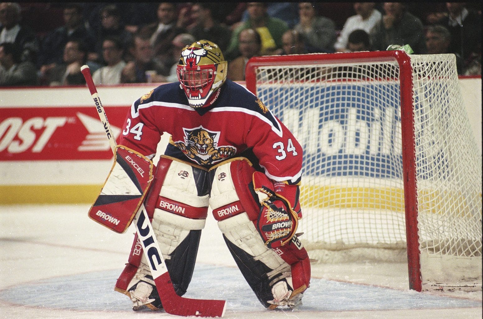
The 2020-21 Reverse Retro Uniforms
Much to the disappointment of most Red Wings fans, Detroit’s reverse retro jerseys missed the mark completely. They were nothing special especially compared to other teams such as the New York Islanders who brought back their famed Fisherman logo in a retro color palette. The jerseys themselves were all white with the winged wheel being red along with a single silver stripe across the bottom and the mid sleeves of the jersey. The one-stripe concept works for the normal jerseys and has for years but for a special alternate jersey, it left a lot more to be desired.
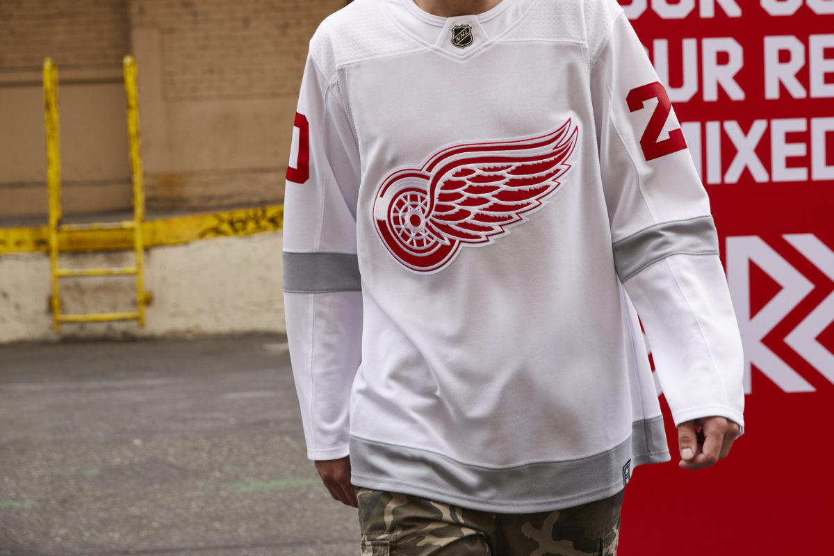
It might be a reach to say that the jerseys were playing off of the Centennial Classic uniforms since these ones fell short in comparison. The addition of the silver stripe to their typical white jersey brought a third color to the franchise once again as the silver had only previously been used for the Centennial Classic in 2017.
How to Make the Reverse Retros Better
The reverse retro jerseys are being brought back for the 2022-23 NHL season and I for one am dying to see the Red Wings hopefully have a more creative approach. One major way to go about improving these jerseys would be to revisit some of the fan favorites throughout franchise history.
2009 Winter Classic Jerseys
These uniforms were replicas of the original Detroit Cougars uniforms from 1926-27 down to the candy cane striped socks. The jerseys were primarily white with a bold red stripe across the body and sleeves and the old English “D” in the middle – a clean and timeless look with a direct tie to the franchise’s history. The old English “D” was the first logo for the franchise and is still worn on hats, shirts, and everything in between, so bringing it back would not be opposed.
The winged wheel is great of course but having a different logo for an alternate jersey would be awesome. Plus, using the old English “D” is a huge nod to the roots of the modern-day Red Wings while still fitting the definition of a reverse retro. There is a lot of room to be creative with this concept but possibly combining this logo with the stripes of the barber pole jerseys could be a winner. In a way, the 2016 Stadium Series uniforms were already a spin-off of these but I think the idea is still workable for a reverse retro.
2014 Winter Classic Jerseys
At least, in my opinion, these are some of the best hockey jerseys of all time. Between the retro font, the darker red and cream color scheme, and the stripes, it is hard to find something about these not to love. Dare I say that these Winter Classic jerseys are nearly the perfect retro hockey jersey? The winged wheel used for these was similar to the one used in the 1930s while the lettering was from the 1980s – a great homage to the long history of the team (from ‘Winter Classic 2014 going retro with Maple Leafs, Red Wings jerseys’, The Los Angeles Times, 4/7/13).
To put a reverse retro spin on the 2014 Winter Classic jerseys, invert the red and cream colors on the entire uniform. A predominantly cream-colored jersey would be a first for the franchise and would put a twist on a beloved uniform. It’s simple yet still fun and plays along with the reverse retro theme, unlike the 2020 edition which was just simple and boring. Ultimately, going with this concept would make Detroit have some of the best reverse retros in the league compared to having the worst last time around.
The Barber Pole Jerseys
Worn originally by the Detroit Cougars back in 1927-28 and 1929-30, and then again by the Red Wings in 1991-92 for the 75th anniversary of the NHL, these striped jerseys are flat-out iconic. Lovingly called the barber pole or even candy cane jerseys, the bold stripe across the front that just says “Detroit” is timeless.
Similar to the 2014 Winter Classic jersey, just inverting the white and red colors to make a reverse retro would be great. The NHL was founded in 1917 so maybe bringing back the barber pole for the 105th anniversary of the league would be a good direction to take. Another way to spin these would be to work in the winged wheel amongst the stripes or possibly even put “Hockeytown” in the center.
People all over social media have had various takes on what the Red Wings could do for a reverse retro jersey, but the general consensus was that they could’ve done anything other than what they did. Other ideas included incorporating an octopus or tentacles, revisiting the cougar head logo from 1928 – nodding to the Detroit Falcons – and even combining aspects of old special jerseys. Ultimately, a ton of people wanted to see something more even if it was in the form of adding a second stripe.
The new Red Wings reverse retro has yet to be leaked or announced, so it is still a complete mystery. As long as it is different from the 2020 edition, it will be a step in the right direction unless they somehow manage to make it worse. My personal favorite would be the cream version of the 2014 Winter Classic jersey but any nod to a former jersey would be phenomenal as well.
Free Newsletter
Get Red Wings History coverage delivered to your inbox
In-depth analysis, breaking news, and insider takes - free.
Subscribe Free →