Other than the logo, there is nothing more marketable to a sports franchise than its uniforms. Some are iconic and will never be altered, then there are others constantly changing their look to find the one meant for them. The NHL is not a victim to jersey altering as much as college football, thankfully, because it is lame and over-saturated.
For the Nashville Predators, their main color scheme has been dark navy and yellow (gold) since their entrance into the League as an expansion team in 1998. The logo on the crest has essentially remained the same, with minor adjustments here and there. It is symbolic to the city of Nashville because in May of 1971, construction workers building the First American Center downtown discovered bones of a saber-toothed tiger that has been extinct for approximately 10,000 years old.
1998-2004
Eight months before their inaugural season, on February 12, 1998, head coach Barry Trotz and assistant coach Paul Gardner revealed the team’s uniforms at Cool Springs Galleria, a local mall twenty minutes south from Nashville. The home (white) jersey had a navy triangle behind the franchise logo, while the away (navy) did not have a triangle behind the crest.
The Predators essentially kept these two uniforms until the NHL and Reebok agreed to a deal to supply all teams with new Edge jerseys.
Nashville’s first alternate jersey appeared in a 4-3 win against the Chicago Blackhawks on November 21, 2001. It may be categorized in the ugly jersey department with its mustard color, but it was awesome and original. The main logo was a cartoon-ish saber-toothed tiger, and the shoulders had a tiger skull. It was the Predators’ third jersey until retired in the 2006-7 season.
2005-2007
Nashville decided to replace the shoulder logo featuring their arena, and instead replaced it with the tiger skull seen on the third jersey. A minor change, yes, but the organization began to see a lot of success in the altered jersey. During this time, Peter Forsberg and Paul Kariya donned the Predators’ jerseys.
2007-2011
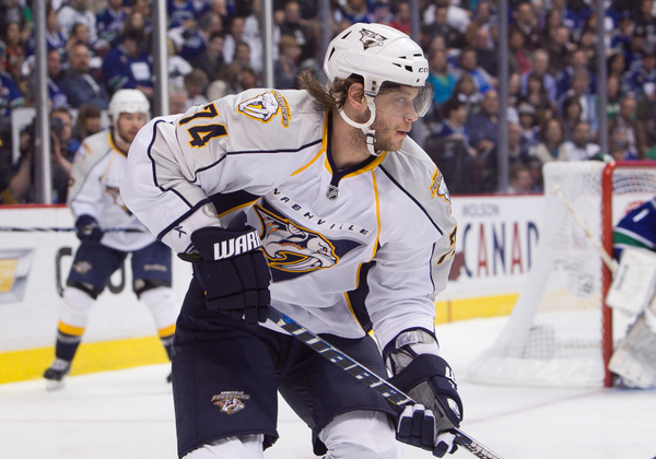
This was the beginning of the new Reebok Edge uniform system. The Predators saw their uniforms change slightly, with a gold trim lining on the chest and down the side. On the away jersey, “Nashville” was added to the crest with the team logo and navy triangle in the background.
The Predators may have swung and missed on their first alternate jersey, but they got it right on their second attempt. The third jersey debuted on November 27, 2009 against the St. Louis Blues. It was navy and contained a navy version of the main logo, a black and navy checkerboard along the waist, and a circular shoulder logo with the tiger skull in the middle. The best part about it was the classic feel it brought on the ice, even though the franchise had a shallow history.
I bought all three jerseys because of their comfortable feel.
2011-Present
Looking to distinguish themselves from the rest of the League, the Predators introduced a gold color to brand the franchise. This did not come as a major shock because in the 2011 playoffs, fans wore gold shirts to gold-out Bridgestone Arena. That made them unique. so they ran with it. For the 2011-12 season, the Predators wore new gold jerseys with a gold edit to the crest logo. Meanwhile, the alternate logo on the shoulder symbolizes Nashville, Tennessee. In the shape of a guitar pick, it contains the three stars of Tennessee’s three grand divisions — West, Middle and East — as shown in the state flag. In addition to the new uniforms, the Predators adopted a new set of numbers with guitar strings running across each number. On the back of the collar shows piano keys. These jerseys are filled with symbolism unique to the Music City.
The change was criticized early on, but as people adjusted, the goal of differentiating themselves was a success.
Free Newsletter
Get Nashville Predators coverage delivered to your inbox
In-depth analysis, breaking news, and insider takes - free.
Subscribe Free →