Jerseys are what give a team an identity. Individuals wear them and become united as one. They wear them to try and bring glory to their fans who adorn them in the stands. They have history, past players who have worn them, championships that were won. Over the course of the history of hockey, equipment has been added and modified, but the jersey remains the central article with the rest being designed to match. The Hockey Writers staff has chosen what we believe to be the top 10 NHL jerseys of all time.
10. Toronto Maple Leafs/New York Rangers
It is impossible to pick between the two original six jerseys for the final spot in the countdown. With so much history in both of them, they are both truly classic jerseys. The Rangers are the only team that simply has the team name written on their jersey and it has been that way since they were first founded in 1926. The simplicity of the Leafs jersey and the blue with white trim is the same one that Bill Barilko wore when they last one the Cup. They have tried various styles of stripes, but the logo and colour pattern has been the same since 1927.
9. Boston Bruins

The spoked B. It was introduced as the Bruins’ logo in 1948 commemorating the team’s 25th anniversary, and is still used as their logo today. It is the only primarily black jersey to make our list, but unlike other black jerseys they are still full of colour. The reason for this: the socks. According to former coach Don Cherry, they enable the goalie to better track the puck. Originally, the jersey was worn with white socks and switched to the unique yellow-on-black in 1969. The Bruins’ logo has also been a model for Canadian junior hockey teams (Kingston Frontenacs and former Chilliwack Bruins). They have tried various third jerseys, but none are as good as the original.
8. Dallas Stars/Minnesota North Stars

Although they have strayed from it in the recent past, the green featured by the Stars franchise is a favourite among The Hockey Writers. The green with yellow trim worn by the North Stars worn through the 1980’s was fantastic, but unfortunately did not follow the team to Dallas. However, when the Stars switched their jerseys to the green with gold and black trim in the outline of a star it looked great. Now, everyone is anxious to see if their return to green will look as good on the ice as it did in 1999.
7. Colorado Rockies
The colour scheme followed the team when they moved from Kansas City to Denver, but it is the logo that truly makes these jerseys wonderful. The simple, yet effective jersey was worn through the Rockies’ entire six year existence and the team adopted new jerseys when they moved to New Jersey. No other team has made the blue with red and yellow colour scheme work as well as the Rockies did, even though a few have tried (Florida Panthers, St. Louis Blues). The Rockies only made the playoffs once making their jerseys the only really good thing about the team.
6. Chicago Blackhawks

The Chicago Blackhawks feature unarguably one of the two best logos in hockey. Their jerseys don’t have the most exciting colour scheme, but the crest on the front and shoulders makes them legendary. Introduced in 1955, the native American head on the front and the C with crossed tomahawks on the shoulders has been their identity ever since. They tried reversing the colour scheme, but the red looks much better than the black. The Portland Winterhawks of the Western Hockey League wear jerseys incredibly close to Chicago’s.
5. Calgary Flames

We are not talking about the current Calgary Flames, but the Stanley Cup winning Flames. When Lanny’s moustache was as much a symbol of the team as the red and yellow jerseys. Technically, it is also the Atlanta Flames colours as well, but the flaming C makes the difference. Another simple, yet effective jersey that the Flames wore for their first 14 years before they changed for the worse. Don’t even think about the flaming horse they used as their logo through the early 2000s.
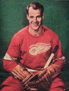
4. Detroit Red Wings
Just like the Blackhawks, it is the Wings’ logo that really sets the bar here. The details in the winged wheel are phenomenal, especially considering it has been with the team since they changed their name from the Detroit Falcons in 1932. The Red Wings have barely modified their jersey since day one and they don’t wear a third jersey. The league around it may change, but Detroit continues to keep their classic look.
3. Quebec Nordiques
Le Fleur-de-lys, a homage to the French history of Quebec City. Even though they moved, their jersey remains one of the most popular amongst hockey fans (and THW staff). The Nordiques wore the same jersey throughout their 16 year NHL tenure. The greatest part was when the bleu, blanc et rouge faced off against the fleur-de-lys in an all Quebec rivalry. Here is to hoping the NHL returns and that the Nordiques jersey will be worn once more.
2. Montreal Canadiens

An original six team, the most Stanley Cup championships ever, and they’ve had the same jersey since 1917 the history alone makes these jerseys one of the best ever. The amount of superstars that sported these colours over the years far surpasses any other team. Just like all the other original six teams, the history that goes with the jersey is what makes it truly fantastic. Le bleu, blanc et rouge colour scheme pays tribute to their French heritage and the C-H combination on the jersey simply stands for club de hockey Canadien, which translates to Canadian hockey club.
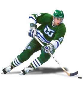
1. Hartford Whalers
Simplicity is the word to best define the jersey selected as the best NHL jersey ever worn in the league. The logo is great, the W with a tail that is made out to look like a swimming Whale. The solid green with blue and white stripes also look fantastic. Not to mention that green is a colour that has been disappearing in the NHL recently. The only team to wear green since 2007 has been the Minnesota Wild’s third jersey. With the Whalers ranked as number one, it is certain that among The Hockey Writers, classic is best.

