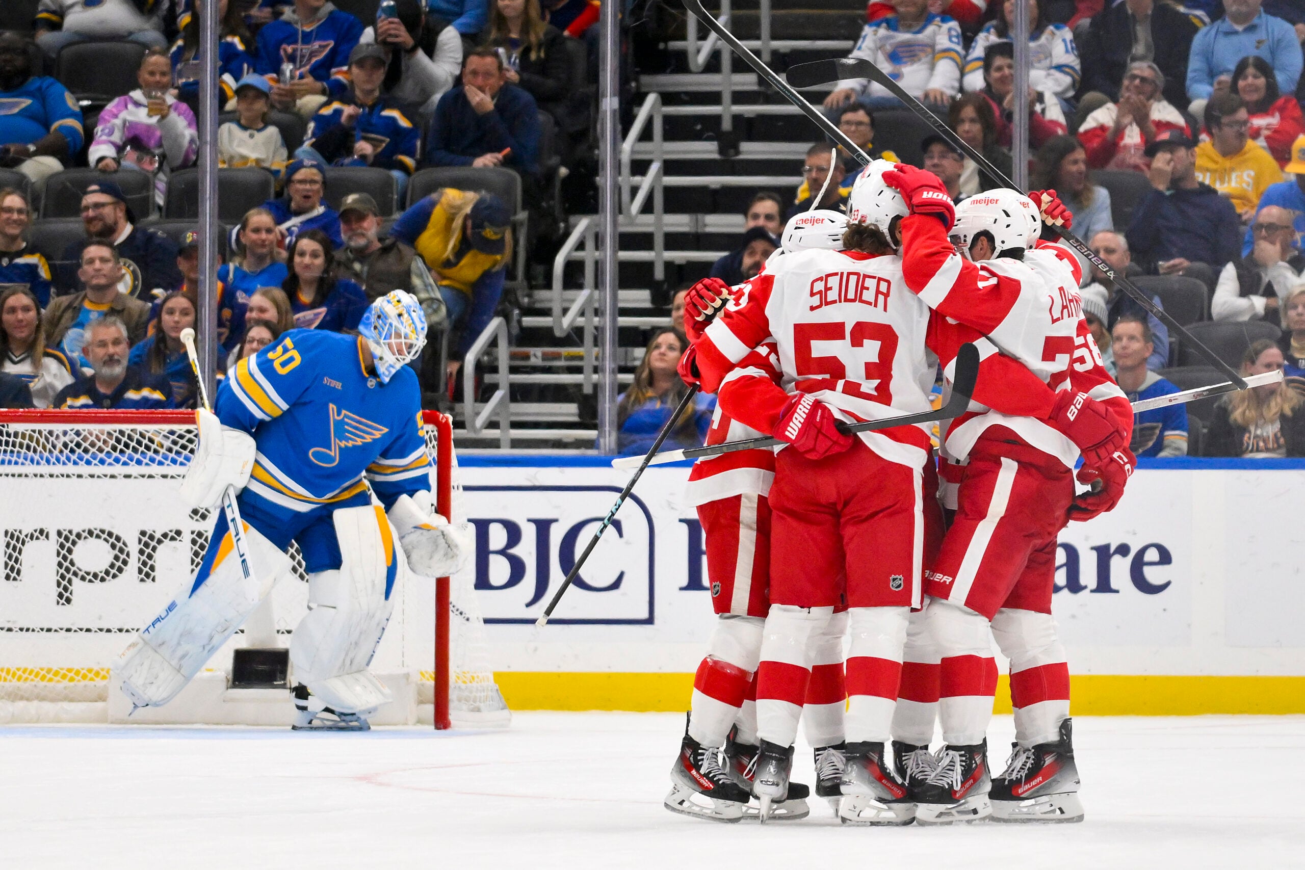
The Detroit Red Wings have one of the most iconic sets of jerseys in the National Hockey League – in all of sports, really. Constantly at or near the top of best-dressed lists, the Red Wings take to the ice in kits that really haven’t changed all that much since 1934 – and not at all since 1987, save for template updates to the NHL’s uniform system.
Don’t get me wrong, there’s no real reason to make drastic alterations. One of the most intricate, well-designed logos in sports sits atop one of the simplest, yet best-executed jersey designs ever seen. The single, contrasting thick stripe on the jersey, pants and socks provide just the right amount of balance, while making optimal use of a simple, classic colour scheme.
And yet, after more than three decades, the current iteration of the Red Wings’ uniforms is looking a little tired.
The Wings have missed the playoffs the past two seasons, after making the postseason in each of the 25 previous campaigns. With their dynastic glory days firmly behind them, the Red Wings are rebuilding for the future, and what better way to usher in a new era for one of the NHL’s most storied franchises than with a uniform refresh.
Red Wings Current Home and Away Jerseys
As mentioned, the Red Wings haven’t touched their jerseys at all since 1987, save for template updates. Here’s the current ADIZERO uniform system version of what they’ve been working with:

My main concerns have to do with the collar and lettering.
Red Wings’ Collar Problems Contrast
Both jerseys feature the ludicrously thick collar of the ADIZERO template, though only the white road jersey has it in a contrasting colour. The Red Wings elected to colour both sections within the collar red, unbalancing the jersey as a whole and making the neckpiece in particular look rather ridiculous.

Meanwhile, the red home jerseys suffer a polar-opposite problem, that of not enough contrast in the neck area. A red helmet flows downwards into a red sweater, which continues into red pants and red socks. On every piece but the jersey, the primacy of red is broken up nicely by white trim. There are white stripes on the sweater’s sleeves and tail, yes, but in between these and the helmets, it’s just a solid block of red. A contrasting collar would go a long way towards addressing this imbalance.
Red Wings’ Lettering Showing Its Age
As for the lettering, I just feel it looks a little dated.
It was first introduced to the Red Wings’ uniforms in 1982 – and it certainly looks like it. The typeface comes off as something intended to be very futuristic at the time and, though it aged decently through the 1980s, 1990s and even the early 2000s, it’s now very much showing its age.
Another point of note is that, for the player names, the arched designs are quite complex to make, as each individual letter has to be individually angled, such that it perfectly fits the arch. So, no matter how many of the same letter are in a player’s name, the patch required for each and every one will be slightly different, based on positioning.
Thus, to make life easier, and to probably save a bit of money along the way, the Red Wings use a horizontal font for their preseason jerseys, along with a markedly different typeface.
As usual, Red Wings using block nameplate font in preseason. They'll restore the familiar vertical arching when the regular season starts. pic.twitter.com/skdOp07V1r
— Paul Lukas (@UniWatch) September 26, 2017
Obviously, with modern techniques, the aforementioned difficulties and costs are likely of little practical concern. Perhaps the adherence to the practice has something to do with prospective Red Wings having to earn a “real” jersey, which can only be had if they play with the team during the regular season.
Regardless, I really think the design of the player names could do with an update. That preseason typeface does look rather good…
Red Wings Must Look Back to Move Forward
I think there’s a compelling case for a uniform refresh in Detroit. Nothing drastic, obviously; there’s not a whole lot wrong with the current product, to be honest.
But it can certainly be better.
Red Wings Red Home Jersey Concept
My proposed red home jersey for the Red Wings is only slightly modified from the present edition.
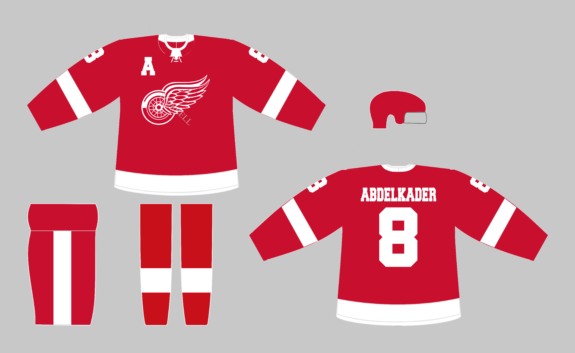
As you can see, I’ve changed the collar colour to white on the home jerseys, providing some needed separation and contrast between the red helmet and red background of the sweater. Note that, for the front part of the collar, I only elected to fill in the inner section, making the neck area look a little more natural than the contrasting collar on the white uniforms.
On the topic of looking natural, I thought it only appropriate to pop in a lace-up neckpiece (coloured white, for another splash of contrast). Though only decorative on ADIZERO jerseys, a storied franchise like the Red Wings could really benefit from the vintage, old-school feel this design feature provides.
It doesn’t work for every team, but Detroit is a perfect fit. It’s worth pointing out four of the five other Original Six teams (the Boston Bruins, Montréal Canadiens, New York Rangers and Toronto Maple Leafs) all use a lace-up collar, with the Chicago Blackhawks the lone holdout.
Finally, I’ve used a horizontal font similar to that utilised on the Red Wings’ preseason jerseys for both the names and the captaincy letters. I just feel that a heavily-seriffed typeface would add even more nostalgic flavour to the Red Wings’ uniforms, while still looking crisp and modern, given the increasing value placed on artisanal pursuits.
Red Wings White Away Jersey Concept
My proposed white away jersey for the Red Wings shakes things up quite a bit more.
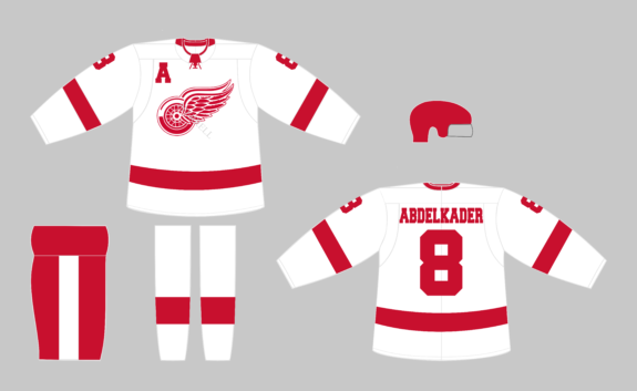
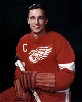
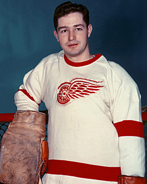
By far the most significant change in this entire proposed uniform overhaul is that of the sleeves on the Red Wings’ white jerseys. The pattern above – simply the reverse of the red kits – was actually used up until the end of 1960-61. Ahead of 1961-62, the Wings switched to their present sleeve, which is literally identical to that of their red jerseys, white numbers and all.
I’m not sure why the change was implemented in the first place, but I can theorise it might have had something to do with the cost and or time savings of only having to produce one type of sleeve. Whatever the reasoning, the red sleeves on the Red Wings’ current white jerseys don’t conform to the ADIZERO template’s seams, as they did with other uniform systems, meaning if there was indeed an issue, said issue is likely no longer relevant.
The cleanliness and consistency provided by this reversion to the Red Wings’ past pattern would, in my opinion, be a marked improvement for Detroit.
As for other alterations to the white kits, the change to the lettering is the same as that of the home uniforms, and I’ve carried over the contrasting lace-up neckpiece, as well. I’ve also altered the red collar such that only the inner channel on the jerseyfront is coloured, which would ensure players look much less like they’re wearing a horse collar.
Finally, why shouldn’t the Wings use red helmets with their white uniforms? Assuming it would be permitted by the NHL, the splash of colour provided would really sharpen this Red Wings’ kit by ensuring it’s not washed out in white, and would help offset some of the red lost with the renovations to the sleeves. That all said, this is the change I’m least attached to, and this proposed kit would look very nearly as good if topped with a traditional white bucket.
Red Wings Spinning Wheels
Any proposed alterations to the jerseys of historical franchises are generally met with some scepticism – quite rightly, too.
One should be even more wary of changing up the look of a team like the Red Wings, whose uniforms have remained largely the same for nearly a century.
However, I think the above proposals are thoroughly well-intentioned, and minor enough to satisfy traditionalists while addressing some of the concerns of aesthetics-obsessed fans such as myself.
The Winged Wheel logo is an unimpeachable staple. The jerseys that surround it need not be.
(Logos, colours and typefaces sourced from Chris Creamer’s SportsLogos.Net, Team Color Codes and DaFont, respectively.)
Free Newsletter
Get Detroit Red Wings coverage delivered to your inbox
In-depth analysis, breaking news, and insider takes - free.
Subscribe Free →