Have you been seeing these charts posted all over Twitter to value how much a free agent should really be paid? Or perhaps, it has been used as a way to compare two players involved in a trade. Either way, HERO charts have found a permanent place in the hockey world. However, many fans may not completely understand them yet.
HERO stands for Horizontal Evaluative Rankings Optic. Using five-on-five ice time, it determines whether a forward fits on the first line, all the way down to the fourth line, or a defenceman should be on the first through third pairing by using Individual Production, Impact on Linemates Corsi, and Impact on Linemates Goals.
Provided by Domenic Galamini (@MimicoHero on Twitter), a Statistics student attending McMaster University as the Class of 2019, these charts provide an excellent opportunity to reflect on where a player should fit in his respective team’s depth chart, if the player is over or underpaid, or to determine a winner in a trade. The best thing about it is that it is extremely easy to understand, even for fans who don’t know much about analytics at all. The charts can be found at OwnThePuck.ca
Stats Involved:
Even Strength Ice Time per Game
The first aspect of the chart is the player’s five-on-five ice time per game, which explains itself.
Individual Production
The player’s production is based on his goals scored per 60 minutes. Next, is the number of primary assists per 60 minutes, which excludes second assists, followed by the number of primary points per 60 minutes, which is simply their goals per 60 plus their primary assists per 60.
Impact on Linemates Corsi
As provided by ownthepuck.blogspot.ca, the following three components give an Impact on Linemates Corsi.
CF60 +/-: Represents a player’s impact on his linemates shot generation. Calculated by subtracting a player’s average teammate CF60 (calculated by weighting a player’s teammates’ CF60 without him by their TOI spent with him) from his observable CF60.
CA60 +/-: Represents a player’s impact on his linemates shot suppression. Calculated by subtracting a player’s average teammate CA60 (calculated by weighting a player’s teammates’ CA60 without him by their TOI spent with him) from his observable CA60.
CF% +/-: Represents a player’s impact on his linemates possession. Calculated by subtracting a player’s average teammate CF% (calculated by weighting a player’s teammates’ CF% without him by their TOI spent with him) from his observable CF%.
Impact on Linemates Goals
As provided by ownthepuck.blogspot.ca, the following three components give an Impact on Linemates Goals.
GF60 +/-: Represents a player’s impact on his linemates goals for. Calculated by subtracting a player’s average teammate GF60 (calculated by weighting a player’s teammates’ CF60 without him by their TOI spent with him) from his observable GF60.
GA60 +/-: Represents a player’s impact on his linemates goal against. Calculated by subtracting a player’s average teammate GA60 (calculated by weighting a player’s teammates’ GA60 without him by their TOI spent with him) from his observable GA60.
GF% +/-: Represents a player’s impact on his linemates goals for percentage of total. Calculated by subtracting a player’s average teammate GF% (calculated by weighting a player’s teammates’ CF% without him by their TOI spent with him) from his observable GF%.
What’s In the Future of HERO Charts?
With the HERO charts becoming increasingly popular this offseason, it’s undeniable that you’ll be seeing more and more during the season. How can they help in the future? Well, perhaps year by year charts could show the progression or regression of a player. Maybe we’ll be able to analyze the impact of too much ice time on a player’s production and Corsi. As for now, they will serve as a tool to read the value of free agents and traded players.
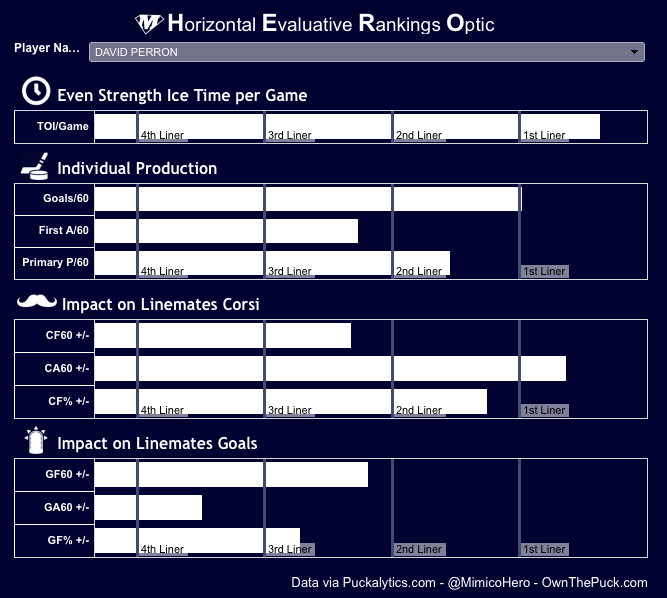
As an example, David Perron’s HERO chart shows that although he plays 1st line minutes at five-on-five, his production is only that of a 2nd liner. In fact, he has a fairly negative impact of his line mates scoring. As for Corsi, Perron generates shot attempts at the rate of a 3rd liner, but allows attempts like a 1st liner. Altogether, Perron’s HERO chart shows that he should probably only be playing 2nd line minutes, instead of the 1st line minutes he is currently receiving. With Phil Kessel now a teammate of Perron, he will likely be deployed as a 2nd liner, as he should.
Again, the best thing about HERO charts is the simplicity of them, showing you exactly what you want to know, without having to understand what goes into it. For that reason alone, I truly believe these charts will be around for a long time to come. You don’t even have to know what Corsi is to be able to visualize Phil Kessel’s value during his time as a Maple Leaf.
For any questions about HERO charts, contact me on Twitter @SlawsonTHW or Domenic Galamini @MimicoHero
Free Newsletter
Get Advanced Stats coverage delivered to your inbox
In-depth analysis, breaking news, and insider takes - free.
Subscribe Free →