A few weeks ago I wrote an article that displayed four potential concept jerseys for NHL expansion teams. The response was overwhelmingly positive. Many of you thoroughly enjoyed what each jersey brought to the table, but there was one request that was continually asked about and that was to see a concept jersey for the rumored Las Vegas franchise.
The fans spoke and sparky chewbarky of sportslogos.net listened. I now present to you the newly created concepts for the Las Vegas Aces.
Sparky chewbarky: “A lot of talk lately about an NHL franchise in Vegas, and, although the prospective new owner apparently likes ‘Black Knights’ as a team name, I think that ‘Aces’ with an ‘air force’ spin would be the way to go.
Nevada has a rich aviation history with several airfields situated in the state.
The largest (Nellis Air Base) is home to the USAF Thunderbirds Team.
The Winnipeg Jets gave a nod to the Canadian Air Force with their theme, so why not have Vegas do the same with the USAF.
(Imagine the promotional possibilities when these two teams hook up).
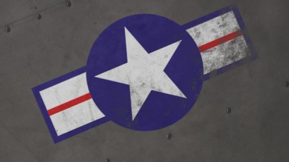
So I’ve done up a concept with a logo inspired by this famous American warplane insignia…
Primary Logo
![]()
![]()
Secondary Logo
![]()
![]()
While the primary logo fixture is more in line with the aviation side of things, the secondary Aces logo hints at Vegas’ gambling culture. The logo is simplistic, yet sophisticated and would look great on an NHL sweater.
Las Vegas Aces Jersey Set
Sparky: “I could have gone brown, olive, or gold, and the unis would look fine, but the steel-grey-blue option got the most support, and I do think it does suit the aviation theme, a little more than the others. To keep it unique, I think it’s important to keep the colour a bit on the grey side. (There’s a whack of blue teams in the NHL!)”
![Las Vegas Aces jersey set [photo: sparky chewbarky]](https://thehockeywriters.com/wp-content/uploads/2015/02/LVA-set.jpg)
Sparky decided to use a bluish-silver color that resembles the color of fighter jets and airplanes in the Air Force. It makes for a slick NHL jersey as evidenced by this Home/Away/Alternate set. There isn’t an NHL jersey that incorporates stripes on the sleeves, which further pays homage to the stripes you’d see on various planes. Overall, they’d look like something you want to purchase immediately.
Here is an action shots of the jersey.
![Las Vegas Aces concept jersey action shot [photo: sparky chewbarky]](https://thehockeywriters.com/wp-content/uploads/2015/02/Score-tally-LVA-image-536x650.jpg)
Score Tally
Sparky: “Fighter Aces and bomber crews will sometimes put ‘score tallies’ on their planes. Usually each image represents an enemy plane downed, or a successful mission. (see below)

“A lot of teams designate a ‘player of the game’. (Washington’s POTG must wear an Abe Lincoln hat and beard).
The Aces could utilize that concept by putting a POTG symbol on a “scorecard” somewhere on the uni…Just a little something else to further the identity.”
We’ve seen many college football teams put stickers on their helmets similar to the ‘score tally idea’. So why not try to use it in hockey? Given the Las Vegas team name and aviation background the city encompasses, this would be a neat idea for the franchise. Sparky already took care of making some ‘score tallies’.
![Tally Symbols for the Las Vegas Aces [photo: sparky chewbarky]](https://thehockeywriters.com/wp-content/uploads/2015/02/Tally-Symbols-540x650.jpg)
![Tally Symbols for the Las Vegas Aces [photo: sparky chewbarky]](https://thehockeywriters.com/wp-content/uploads/2015/02/Tally-Symbols-2-540x650.jpg)
Military Night Theme Jersey
As with many NHL teams today, some hockey games will have certain themes. There is bound to be a Military Night delving into aviation history and inviting members of the Armed Forces to attend the game. Sparky has got the team covered with these awesome camo jerseys:
![Las Vegas Aces Camo Concept Jersey [photo: sparky chewbarky]](https://thehockeywriters.com/wp-content/uploads/2015/02/LVA-Camo-Jersey-575x323.jpg)
Winter Classic Concept Jersey
If the Las Vegas Aces take off (no pun intended) there is a good chance they get national media buzz. Being a great team can lead to fantastic opportunities for the club such as being named to play in the Winter Classic. Believe it or not, Sparky took the time to create a Winter Classic jersey that could rival some jerseys that have been showcased in the outdoor spectacle already.
Sparky: “I liked the brown colour option as well, so I thought I’d try to find a use for that sweater. If Vegas ever appeared in a Winter Classic game, perhaps this could be the uni. I put some metallic gold piping in the logo, numbers, and striping to class it up a bit.”
![Las Vegas Aces Winter Classic Concept Jersey [photo: sparky chewbarky]](https://thehockeywriters.com/wp-content/uploads/2015/02/LVA-Winter-Classic-Jersey.jpg)
What are your thoughts on the jersey?
********************************
Link to the original forum can be found here.
Free Newsletter
Get NHL News coverage delivered to your inbox
In-depth analysis, breaking news, and insider takes - free.
Subscribe Free →