School is out for summer, or should we say hockey season is over. The Florida Panthers were crowned champions. Young players got to live out their dreams of hearing their names called on draft day. The chaos which is the free agency frenzy came and went faster than the speed of light. Also, organizations got a glimpse of the young players in development camps. The fun is over and vacation time has set in.
At this given point in the offseason, there is very little news or rumblings. However, that doesn’t mean that the fun stops. For the Boston Bruins, the organization and fans got to celebrate 100 years of hockey. The amount of legendary players that stepped foot in the city is enormous. Also, the types of jerseys the team wore over the last 100 years is quite the list.
This past week, NESN put out a tweet that was great for the fans to engage with. The Bruins celebrating 100 years of hockey saw a lot of great jerseys take the ice. The question was asked as to which jersey should be revived. It is very tough to pick just one, so here are five that should make a revival and be worn again.
Men in Black Jerseys (2008-16)
After taking a year off for teams having alternate jerseys, the league went on to reinstate that. With that being said, the Bruins added a new alternate and gave it a new modern twist. The previous alternate they used during the 2007-08 season was a vintage jersey that paid tribute to the 1967-74 black jerseys that the team wore. Needless to say, these were an instant hit and were worn for several seasons.

From 2008-16, the Bruins donned the “Men In Black” jerseys. It was a plain black jersey with yellow and white stripes on the sleeve. However, the crest was different. The Bruins took the logo that is currently on the shoulders and put it on the front. The current logo is on the shoulders. It was a modern twist that created one of the best alternate jerseys in the organization.
The organization decided to step away from the norm of things and wore black socks. This was the first time in team history that they wore black socks with any jersey. Typically the Bruins wore yellow socks, but this truly embodied the “Men In Black” mantra. The jersey was worn during the club’s more successful era in recent memory and this would be a great jersey to be revived.
2023 Reverse Retro (2022-23)
How do you like your Pooh bear? Do you prefer the golden yellow like the color of the bear itself? Or would you rather have it in white? With the second go-round of the reverse retro concept, the NHL stuck to the 1990s era for a large part of the concepts. For the Bruins, they brought back the “Pooh Bear” jersey, which can rile up the bear den.
The iconic jersey was brought into the fold during the 1994-95 season when the Bruins moved into the Fleet Center. It was the first time since 1965 that the Bruins had a golden-based jersey. It was a bold concept that featured a new-looking bear for the crest. The shoulder had the team name on it as the patch and the bottom had a unique striping pattern to it. There are plenty of mixed feelings on the originals. However, the reverse retro concept was an instant hit.
Same jersey and style, but different colors. The Bruins kept the original Bear head for the crest and made the base of the jersey white. Instead of white at the bottom, it became golden yellow. It was a great jersey to have during the club’s historic 2022-23 season. The jersey was an instant hit and if worn again would bring excitement to the fan base.
2021 Reverse Retro (2020-21)
If you thought the second round of the Reverse Retro was a major hit, the first round was just as good and maybe even better. During the first-ever implemented Reverse Retro program, the Bruins went for a major throwback. The organization went back to the 1980s and early 1990s to come up with the concept.
Related: Bruins’ Defensive Pairs After Initial Free Agency Moves
The Bruins threw it back to the “Meth Bear” jersey days, but with a golden twist. Straying away from the typical black and white, they made the base color gold. The last special event jersey they had that was golden-based was during the 2010 Winter Classic at Fenway Park. These were great and were amazing on the ice.
There were no changes made to the jersey other than the base color. The shoulders still had the iconic bear face as the shoulder patch. These jerseys were worn throughout the season, but iconically took the ice when the team played the outdoor game at Lake Tahoe. These were certainly special and were appreciated when worn. When it comes to specialty jerseys, the Bruins delivered and the Reverse Retros were a success.
The “Meth Bear” Jerseys (1981-95)
If not a Reverse Retro why not the original? These jerseys would be great for a revival. Not just a revival, but even a rebrand. Teams around the league have undergone rebrands, such as the Anaheim Ducks and Los Angeles Kings. The two respective teams took a blast from the past and put a modern twist on things. Safe to say, the jerseys look immaculate and the merchandise would fly off the shelves. For the Bruins, reviving these jerseys with a modern twist would be amazing.
For the centennial season, many wondered if they would bring these back. These jerseys were worn from 1981-95 and saw Bruins legends Ray Bourque and Cam Neely wear them. Truthfully, this was a look that the Bruins had going prior (1976), but they made minor tweaks over time.
The jerseys are simple but effective and would bring back the nostalgia factor. Also, it would coincide with taking an older uniform and putting a new twist on it. The logo that was painted at center ice during the 2023-24 season is the crest and it was a great logo. Whether it would be road white or home black, seeing Charlie McAvoy or David Pastrnak skating in these would be amazing.
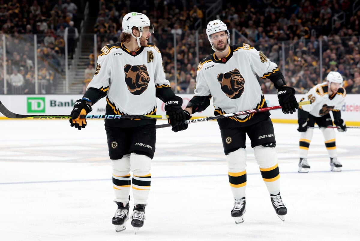
Centennial Alternate Jersey (2023-24)
Every time a team has an anniversary, there is a special jersey to pair with it. When the Buffalo Sabres had their 50th anniversary, they had a special jersey that featured gold in it. It was a special jersey for a special occasion. The Bruins, entering their 100th year of hockey, called for an entire kit. Prior to the season, the team had a reveal of the jerseys, and captain Brad Marchand had high praise for the event and the organization.
“It speaks volumes to how incredible of an organization we have here, and I think we see it through all the guys that have a tremendous amount of pride to be part of this,” Marchand said. “This is very special.”
It was a special year and a special time to be a Bruin. These jerseys will be missed. There wasn’t a single jersey that was poorly designed and they looked better on the ice than when the team first revealed them. The home jersey was a black base jersey with gold and white stripes and the shoulder patch was a commemorative 100th anniversary patch. Although, the home jerseys were better than the away jerseys. The coolest part about the entire kit is the alternate jersey because three jerseys are better than two.
The alternate jersey was different than the home and road jerseys. It was a cream color based jersey with the Spoked B logo as the crest. However, the year 1924 was inside the logo and gave it a special touch. To go with the cream was yellow and brown to help with the striping and lettering. The only knock on these jerseys is they were worn against Original Six opponents and for the era nights they did throughout the 2023-24 season.
These jerseys were a huge hit on the ice and the brown helmets gave it a nice old-school touch. Reviving these would be great and wearing them more often would be too. It’s a bummer that they were only worn just during the 2023-24 season because they were amazing and you can argue better than the current set.
The Jersey Revival Tour
If you are a jersey collector, you have a love and appreciation for what the teams wear. For the Bruins, there has been no shortage of options and so many good jerseys over the years. It’s a fun experiment to dive into the team’s uniform history and bring back memories. NESN did a great job asking the question and now here are five choices that help answer it.
