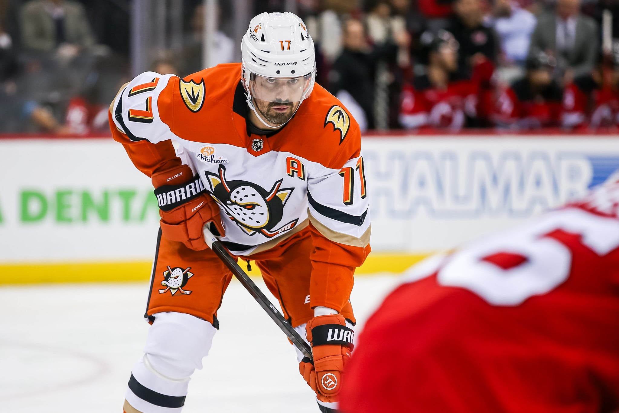
- Anaheim Ducks
- Grade: B
- Arizona Coyotes
- Grade: A+
- Boston Bruins
- Grade: A-
- Buffalo Sabres
- Grade: C-
- Calgary Flames
- Grade: A
- Carolina Hurricanes
- Grade: B-
- Chicago Blackhawks
- Grade: B
- Colorado Avalanche
- Grade: A+
- Columbus Blue Jackets
- Grade: D+
- Dallas Stars
- Grade: B
- Detroit Red Wings
- Grade: F
- Edmonton Oilers
- Grade: A
- Florida Panthers
- Grade: A
- Los Angeles Kings
- Grade: A+
- Minnesota Wild
- Grade: A+
- Montreal Canadiens
- Grade: A
- Nashville Predators
- Grade: B-
- New Jersey Devils
- Grade: B
- New York Islanders
- Grade: F
- New York Rangers
- Grade: A
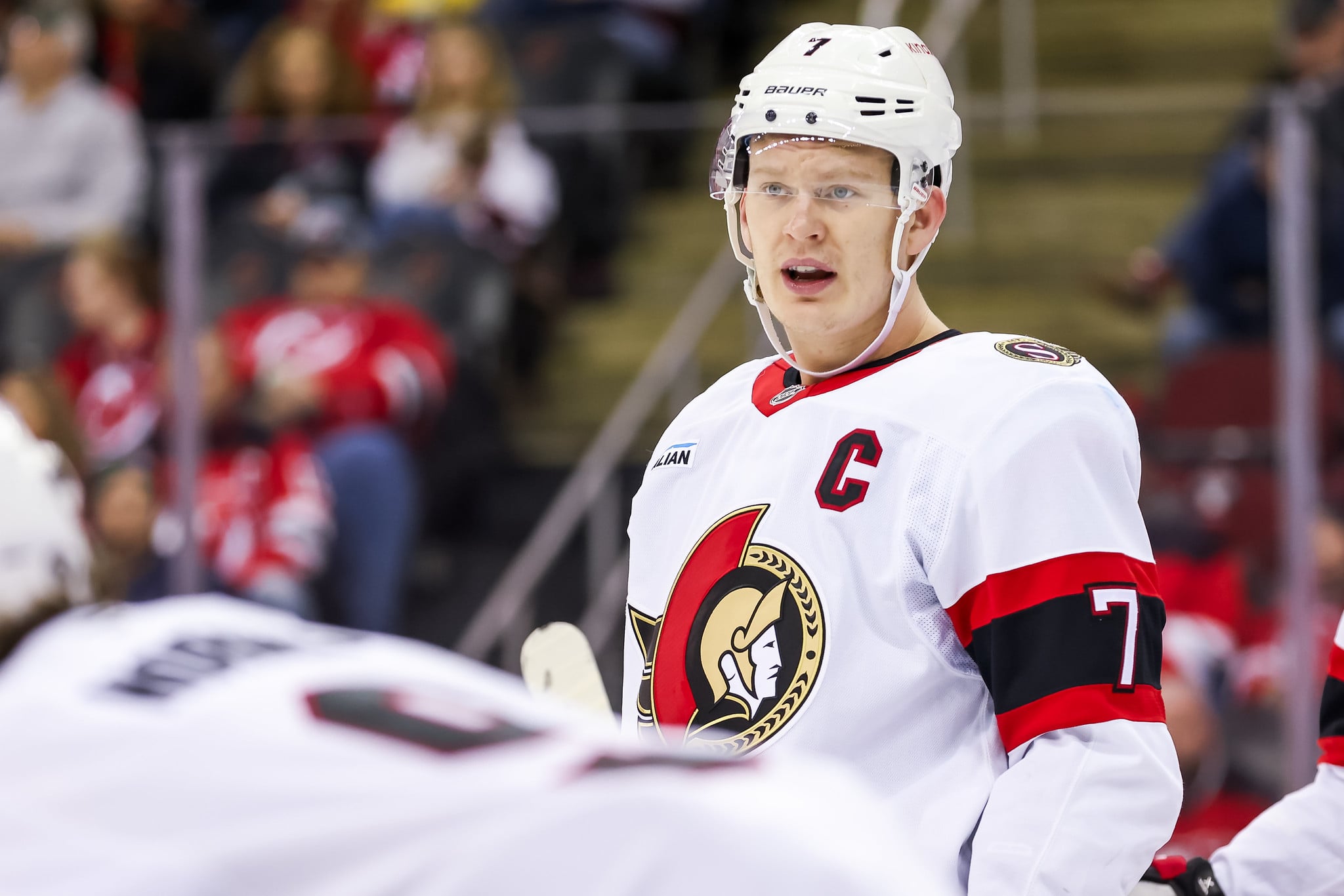
- Ottawa Senators
- Grade: B
- Philadelphia Flyers
- Grade: B-
- Pittsburgh Penguins
- Grade: B+
- San Jose Sharks
- Grade: C+
- St. Louis Blues
- Grade: A+
- Tampa Bay Lightning
- Grade: A-
- Toronto Maple Leafs
- Grade: F
- Vancouver Canucks
- Grade: B+
- Vegas Golden Knights
- Grade: C+
- Washington Capitals
- Grade: A+
- Winnipeg Jets
- Grade: F
- An Exciting Week for Hockey Fans
Monday afternoon saw the unveiling of a new set of jerseys rolled out by Adidas and the NHL, comprising the Reverse Retro series that is set to debut this upcoming season. With this being the first time that all 31 teams were included in an alternate jersey design, it’s safe to say that fans were ecstatic when the new threads hit social media.
Now, it’s important to note that the age of a fan greatly dictates their liking to a specific jersey, as some teams truly embraced the “retro” aspect of their city’s franchise. A large crop of teams simply put modern spins on historic emblems and managed to do a good job. The remainder tried and failed.
Whether you’re a fan of what your team designed, or you took to Twitter to rebel immediately, it was undoubtedly a thrill seeing these jerseys for the first time. It’ll be even more exciting to see these jerseys displayed live, whenever the next NHL season decides to commence.
With that being said, let’s take a deeper look at each team’s jersey and pass out some letter grades. For simplicity purposes, this is based off of visual appeal only.
Anaheim Ducks
Grade: B
Regardless of how you feel about this jersey (or Wild Wing for that matter), you have to admire the courage of the Ducks front office. To bring back a jersey this bold is no easy task, and to market it to a fan base that has voiced a strong disliking to your current logo is even harder.
Ironically enough, the jersey that first comes to mind when I think “retro Anaheim” is the jersey that Wild Wing is wearing in this one. Still, I have a soft spot for this uniform simply because of how unique it is. There’s no doubt that this one stands out from a crowd, and to me, it’s for all the right reasons.
It’s evident the goal here was to execute a cartoonish design, and this jersey certainly accomplishes that. Better yet, paying homage to the commercial success of the Mighty Ducks franchise is an even better way to look at a jersey like this. It may be “out there,” but I highly doubt any other team could accomplish a look this adventurous.
Arizona Coyotes
Grade: A+
You don’t need to scroll very far on this list to find the first “A+” since the Coyotes always seem to knock it out of the park when it comes to jerseys. I didn’t think this was going to be as good as their Kachina ones, and it isn’t, but, boy, is it close.
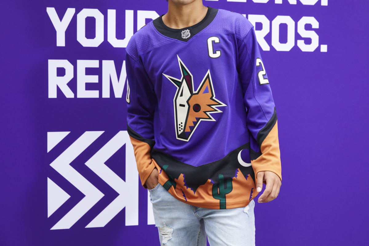
I’ve never really imagined a theme running along the bottom of a jersey, but after seeing this one, I’m a fan. The abstract patterns of the desert landscape appeal directly to the Kachina aesthetic, and the orange accents perfectly complement the primary purple hue. If I were in Arizona, I would go to a game just to see this jersey.
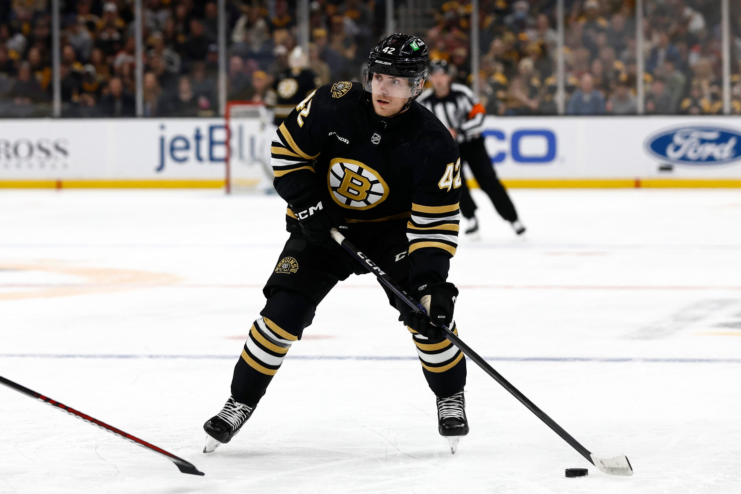
Boston Bruins
Grade: A-
Boston truly embraced the “retro” aspect with this one and I’m all for it. It may be simple, but looking back at their jersey history, they don’t really have anywhere to go in terms of big changes.
Yes, yes, I know people want the bear that appeared on their primary alternates for the past few seasons, but this jersey speaks to Boston’s history way more than anything else. The subtle change in the shade of yellow is also a nice touch, and in all honesty, I really don’t think the Bruins could’ve done anything else.
I should note that my grade is subject to change depending on the colour of their helmets. As Pittsburgh and Nashville have shown us, gold on gold isn’t exactly a good look so Boston is going to have to get creative when it comes to the rest of the equipment.
Buffalo Sabres
Grade: C-
Alright, this is the first one I genuinely dislike. Similar to Anaheim, the Sabres also picked the wrong retro jersey to bring back to life, except this time, it resonates a lot more for one simple reason: Buffalo already has an amazing retro jersey, one that Sabres fans thoroughly enjoy.
Can you guess which one it is? Spoiler alert, it’s not this one.
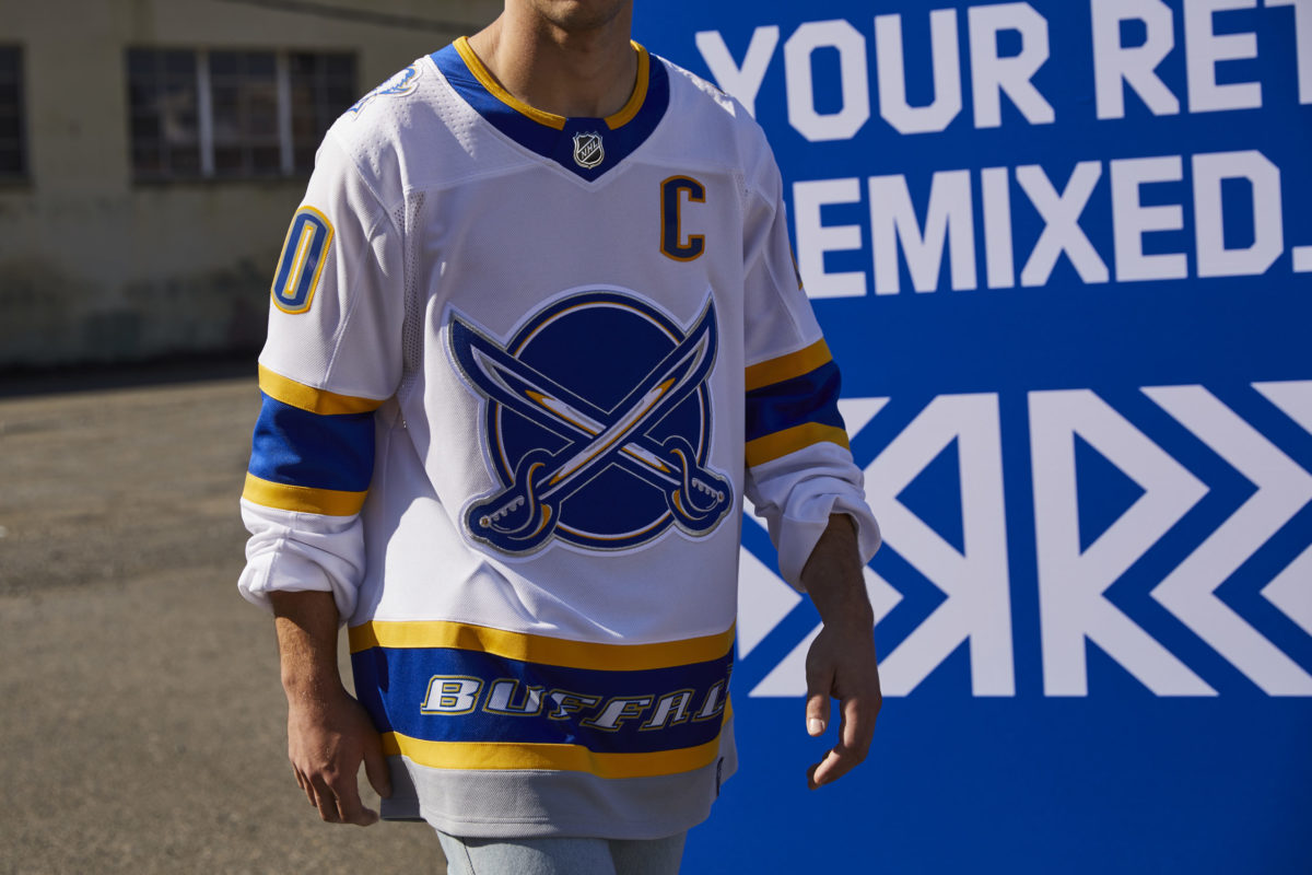
Everyone knows the red buffalo head from the mid-1990s is a lot better than this. And what makes matters worse is that the same logo is the shoulder patch of this jersey. Talk about being so close, yet so far.
As soon as I saw the preview for this uniform, I knew it was going to be underwhelming. The only other thing saving this from a “D” is the somewhat sharp etching of “Buffalo” at the bottom.
Calgary Flames
Grade: A
The Flames were trying to be different here and they delivered. They already have one of the nicest colour schemes in the league and some already stellar threads to boot, so going out and deliberately trying to bring something different to the table gets my seal of approval.
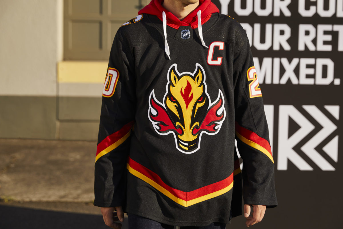
Plus, the return of Blasty establishes an amazingly unique primary logo, and introducing an entirely different colour scheme that still manages to work beautifully with the Flames’ franchise is impressive in itself.
Carolina Hurricanes
Grade: B-
I’m on the fence with this one. One of the greatest logos of all time… and it doesn’t look that great here. I get that the Whalers are the only part of Carolina’s history, but at some point they need to come up with something new. I’m not sure this is the “refreshed” look they were going for.
Pucky the Whale is a nice touch, but let’s just all agree the eccentric green shades of Hartford’s regular jerseys suit the Reverse Retro theme a lot better than this.
Chicago Blackhawks
Grade: B
Aside from the controversial name, I genuinely like this jersey. Another Original Six team that put a simplistic yet classic spin on a historic logo, the Blackhawks delivered nicely and put their heritage on full display.
Another important note about this jersey is that there doesn’t seem to be any shoulder patches which is a) even more historic and b) a lot less offensive to First Nations who continue to fight for the eradication of controversial team names and logos, as they should.
Colorado Avalanche
Grade: A+
Colorado truly hit it out of the park with this Nordiques throwback and that should be unanimous. Not only does the Avalanche colour scheme work perfectly with the Nordiques logo, a jersey featuring a nod to Quebec City was long overdue. The Avalanche’s 25th anniversary is also right around the corner, which is just the cherry on top.
Another team that implemented logos or a banner at the bottom of the uniform, the Fleur de Lis adds an even more dynamic punch to an already stellar jersey. No complaints about this one.
Columbus Blue Jackets
Grade: D+
Oh, this is bad. Very bad. My main question is why is there so much red? In what can only be an attempt at a Washington Capitals remake, I’m not sure how an entire franchise can switch from navy blue to bright red in the span of a week. I do like the logo, but this jersey is mediocre.
The Blue Jackets definitely went more Reverse than Retro with this one, and it did not pan out. In situations like these, I think it’s best to introduce a completely new design because thinking big and risking failure is a lot better than introducing something as underwhelming as this.
Dallas Stars
Grade: B
Contrary to popular opinion, I don’t mind these at all. This is definitely a different take on a classic jersey and I think the incorporation of a new colour scheme provides a very unique concept. Dallas managed to stay within it’s branding and, while silver isn’t normally a primary colour, these definitely make the case that it should be.
Detroit Red Wings
Grade: F
These just might be the worst jerseys out of this whole series and I think I could find more than a few people to back me up on that. Detroit is in a bit of a pickle here since they’ve had only one primary logo pretty much over the course of their whole existence, but this just flops. Plain and simple.
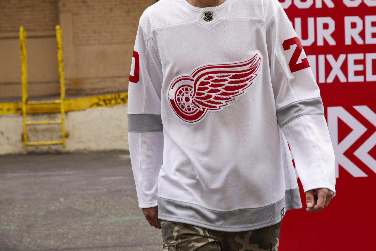
This seems like the result of someone completely forgetting Detroit was included in the Reverse Retro series. Where is the effort? Where is the creativity? How did they manage to make last season’s All-Star jerseys even worse?
Edmonton Oilers
Grade: A
This is a classic and it works to perfection. I never really understood why the Oilers went for an Orange Crush theme in the first place, so to see a modern spin on a historic jersey is definitely refreshing. Edmonton definitely checks all the boxes when it comes to paying tribute to their history, and one can only hope that these uniforms are used frequently.
It may not be the sharpest one out there, but the colours match perfectly. And even though I hoped Edmonton would bring back their boldly unique oil drop logo, these aren’t a bad substitute.
Florida Panthers
Grade: A
Coming from someone who has despised both the Panthers logo and colour scheme, this was a pleasant surprise. It’s the perfect throwback to the 2000s era, and it definitely contrasts their newly designed logo in a fun and creative way. Kudos to whoever re-imagined this design.
Los Angeles Kings
Grade: A+
Stunning. Absolutely stunning. The Kings managed to combine their most storied jersey with their most extravagant colour scheme and I’m all for it. Enough with the basic home blacks and road whites. Bring these back full time!
Minnesota Wild
Grade: A+
This is an “A+” jersey for a variety of reasons. The Wild were one of the few teams that did a masterful job in incorporating their history into their modern-day logo, and because Dallas refused to pay homage to the Minnesota North Stars, it seems only fitting that the State of Hockey delivered on that promise.
This is by far the most interesting thing the Wild franchise has ever done so to lead fans away from the mundane shades of forest green, maroon, and off-white into a design this bold? A round of applause is well deserved. Plus all the “Subway, Eat Fresh” memes are hilarious.
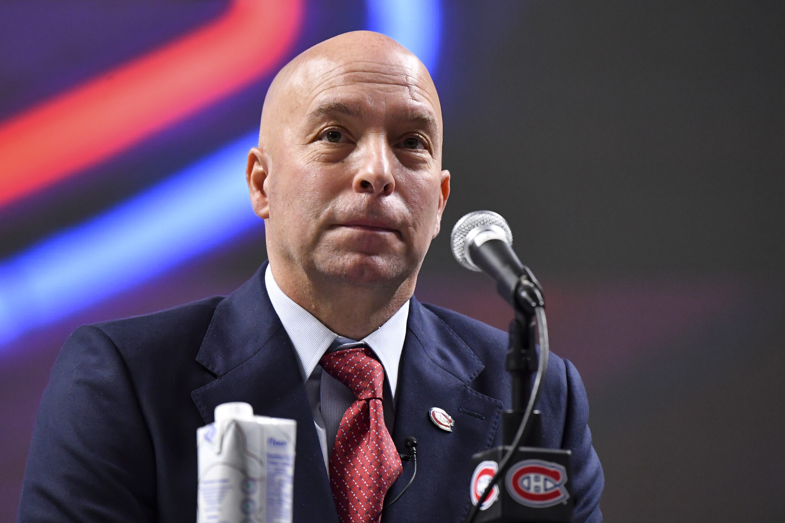
Montreal Canadiens
Grade: A
In all honesty, I was nervous about this one. Montreal’s options were limited to begin with, and they could’ve very well messed this one up. However, the team truly embraced the Reverse theme and I don’t think they could’ve done a better job. It’s about time the league’s most historic franchise had an alternate, and this needs to be implemented regularly.
Nashville Predators
Grade: B-
I don’t hate it, but I definitely don’t like it. I would’ve preferred a nod to their mustard-coloured ones or even their navy and grey threads that remind me of Jason Arnott whenever I see them. This? This is “meh” at its finest. At least it’s better than the ones they have now.
New Jersey Devils
Grade: B
This was a perfect opportunity for the Devils to bring back the bold palettes of the Kansas City Scouts or Colorado Rockies. But, no. They elected to go for a Christmas theme and, once again, I find myself disappointed. Yes, green as a primary colour works fine in the grand scheme of things, but this just seems a tad repetitive at this point.
New York Islanders
Grade: F
Seriously, what is this? In one fell swoop, the Islanders managed to incorporate a different, albeit worse, colour scheme to an already questionable jersey. In another installment of a team trolling it’s fan base, I, like so many other Islander fans out there, have four simple words for the organization: bring back the fisherman.
New York Rangers
Grade: A
Unlike their Metropolitan Division rivals, the Rangers actually did what their fans asked them to. Bringing back Lady Liberty was a great idea, and replicating the iconic ’90s uniform was even better.
It may be a simplistic option compared to the rest of the jerseys on this list, but considering that New York hasn’t really had an alternate in its history, this is a nice touch and contrasts their current set of threads quite well.
Ottawa Senators
Grade: B
If you thoroughly like these or completely hate them, I wouldn’t argue with you. I’m not entirely sure how I feel about them, either. The fact that the Senators just returned to this exact logo doesn’t make it feel retro at all, but since they already have a black and white version of this, it would only make sense to incorporate a red edition.
I mean, they definitely look nice and suit the direction the franchise is going in, they’re just a little basic. I would’ve liked to see a return of the striped “O” jersey since having the same logo in three different colours doesn’t make much sense to me.
Philadelphia Flyers
Grade: B-
This is somewhat disappointing because I’m getting tired of seeing orange. Yes, it’s Philly’s primary colour, but when you already have your home jersey looking like this, why make another one that’s similar? Switching the shoulders from white to black isn’t nearly enough of a change to make these unique in any way, shape, or form.
And it’s not like the Flyers didn’t have options here. Their black uniforms with white shoulders would have checked all the boxes when it comes to being both retro and unique.
Pittsburgh Penguins
Grade: B+
These were so close to being an “A.” Don’t get me wrong, I don’t mind the diagonal lettering because the Penguins were one of the only teams that could actually pull this off, I just wish they brought back the “Robo-Penguin” emblem.
San Jose Sharks
Grade: C+
Brownie points for bringing back the old school Sharks logo, but I genuinely dislike the gray base. Incorporating a brighter shade of blue/teal would compliment their existing jerseys perfectly and I’m fairly certain everyone thoroughly liked that jersey when it first came into existence.
St. Louis Blues
Grade: A+
This is exactly what I envision when I think of a retro jersey. The Blues could’ve easily gone with something a lot more simple (i.e. tinting the gold on their existing threads) but no, they decided to bring back one of the most outrageous jerseys in their history and run with it. Despite some criticism, this is extremely bold and I love it.
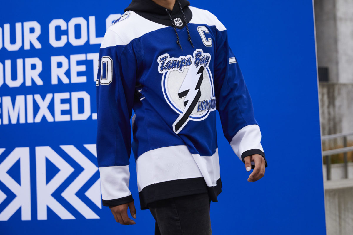
Tampa Bay Lightning
Grade: A-
Another re-imagined classic, the Lightning made the right choice in bringing this one back. Not only is this an actual retro jersey from Tampa Bay’s history, this is also unlike anything the modern-day Lightning have worn before. Taking inspiration from their 2004 design makes this jersey stand out from the rest, and I hope this edition is here to stay.
Toronto Maple Leafs
Grade: F
I have yet to talk to someone who actually likes this thing. Personally, I don’t even know what it is. It reminds me of something you would see at a jersey design brainstorming session mixed with a $25 knockoff. From the weird gray accents to the lowercase looking “n” in the word “Toronto,” this jersey flat out sucks.
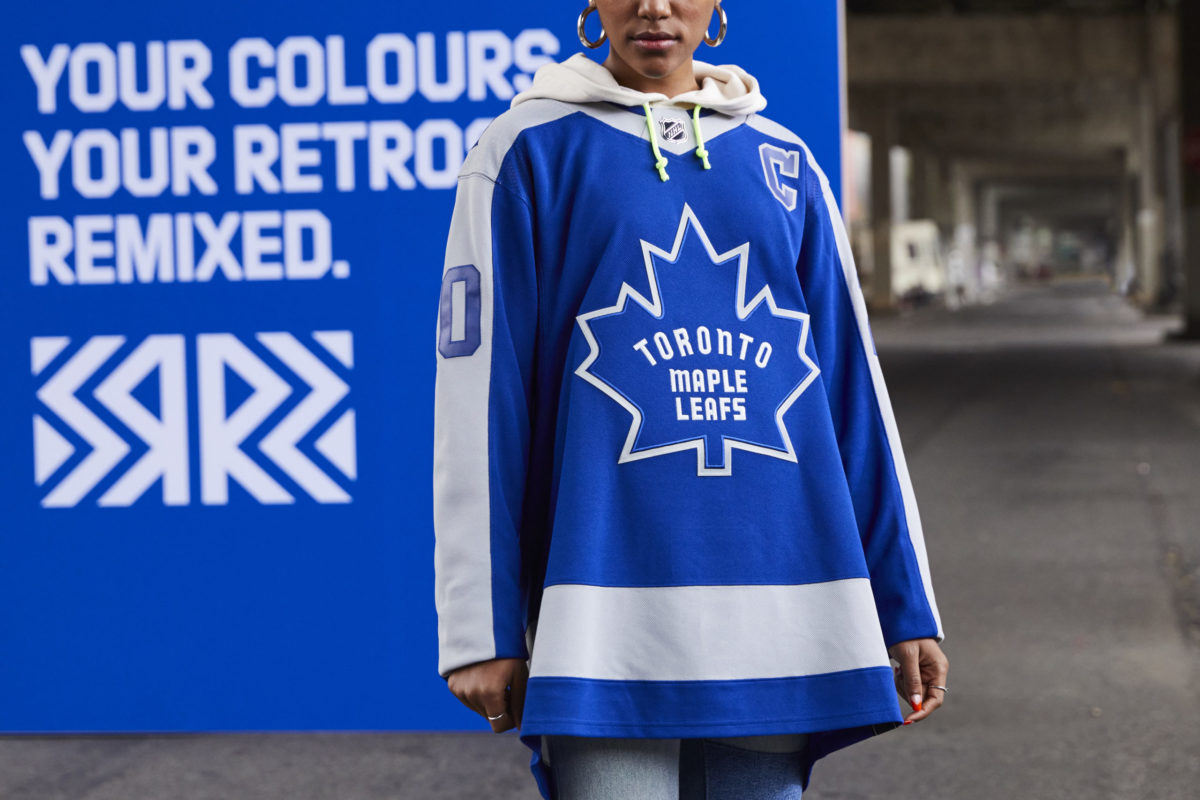
It’s not like Toronto didn’t have options, either. Being one of the league’s most historic franchises, they have an abundance of eye-catching logos to choose from. Instead, they went back to a time where their logo sucked, and their team was even worse. The only positive here is that I don’t have a subconscious need to buy one.
Vancouver Canucks
Grade: B+
If history has taught us one thing it’s that gradients on jerseys look terrible. Yet the Canucks actually didn’t do a bad job here. It’s rare to see a team attempt to fix one of their worst jerseys of all time and it’s even more rare to see them accomplish that feat. The Canucks did both here as a blue-green gradient works well. I just hope for hockey’s sake that this doesn’t replace their black and gold Skate jerseys.
Vegas Golden Knights
Grade: C+
Personally, I don’t like the direction that the Golden Knights are going in when it comes to jersey design. I didn’t really like their new third jerseys that they announced this offseason and I don’t really like this one. Red, gold, and gray is a weird combination for me and I don’t like the idea of turning a shoulder patch into a primary logo.
Then again, whatever Vegas does seems to grow on me over time, so maybe I’ll have a change of heart after seeing these threads live.
Washington Capitals
Grade: A+
My prayers have been finally answered. I’ve been awaiting the return of the eagle for a long time now and the Capitals executed it to perfection. Not only is it a dynamic logo in itself, but the addition of “Washington” written underneath makes this jersey that much better. Plus, Tom Wilson looks amazing in it and that is no debate.
Winnipeg Jets
Grade: F
This jersey fails on so many levels that it’s hard to comprehend. Why incorporate a plain colour scheme when both your current and retro ones are so much better? Why stick with a logo that’s almost retro but not quite? Why continuously put your own spin on your team’s history when fans clearly want something specific?
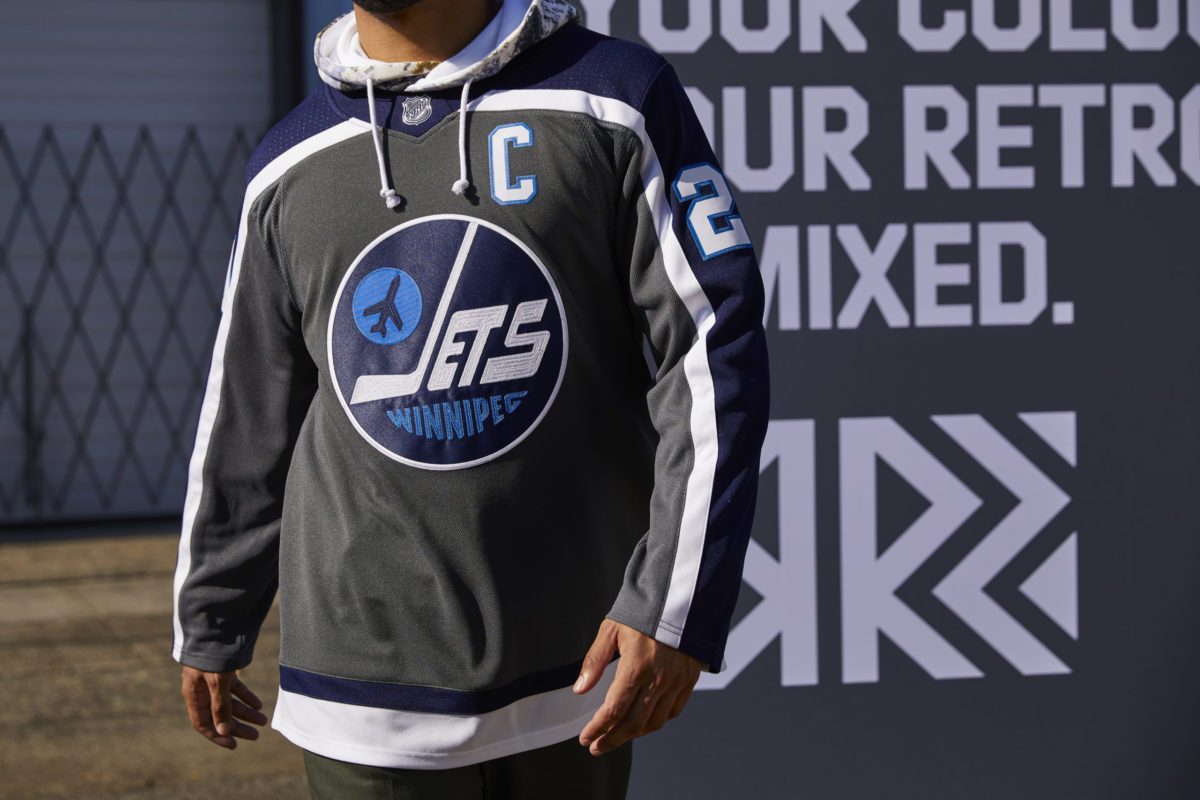
The Jets have a lot of questions to answer after unveiling something as bad as this. I’m not even giving this thing a chance. All I know is that whatever logo Teemu Selanne rocked back in the ’90s is the one that should be used today.
An Exciting Week for Hockey Fans
Regardless of whether you liked your team’s design or not, this is still an exciting time for hockey fans. With a new season nowhere in sight, fans needed something hockey-related to talk about, and the announcement of these Reverse Retro jerseys could not have come sooner. I, like every hockey fan out there, can’t wait to see these on display when the season kicks off.
Would you change any of the grades? How do you feel about your team’s design? Let me know in the comments below.
Free Newsletter
Get Commentary coverage delivered to your inbox
In-depth analysis, breaking news, and insider takes - free.
Subscribe Free →