The trend of disappointing Winnipeg Jets’ alternate jerseys continues.
Two years after whiffing hard with the bland and boring Aviator concept, the Jets have swung and missed again with the new Adidas Reverse Retro uniforms, which were unveiled Monday.
Breaking Down the New Design
The jersey is mainly a greenish-grey (dubbed “Fighter Grey” by the team) and features the 1979 logo in white and Aviator Blue.
It also features vertical stripes in white and Polar Night Blue that stretch from cuff to cuff in an upside-down ‘U’ shape. There’s a Polar Night Blue stripe above a thicker white stripe at the bottom. The numbers are white, outlined with Aviator Blue.
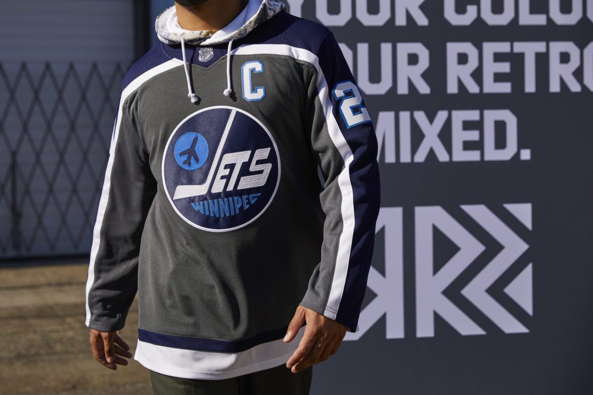
Winnipeg Jets Reverse Retro jersey (NHL/adidas) 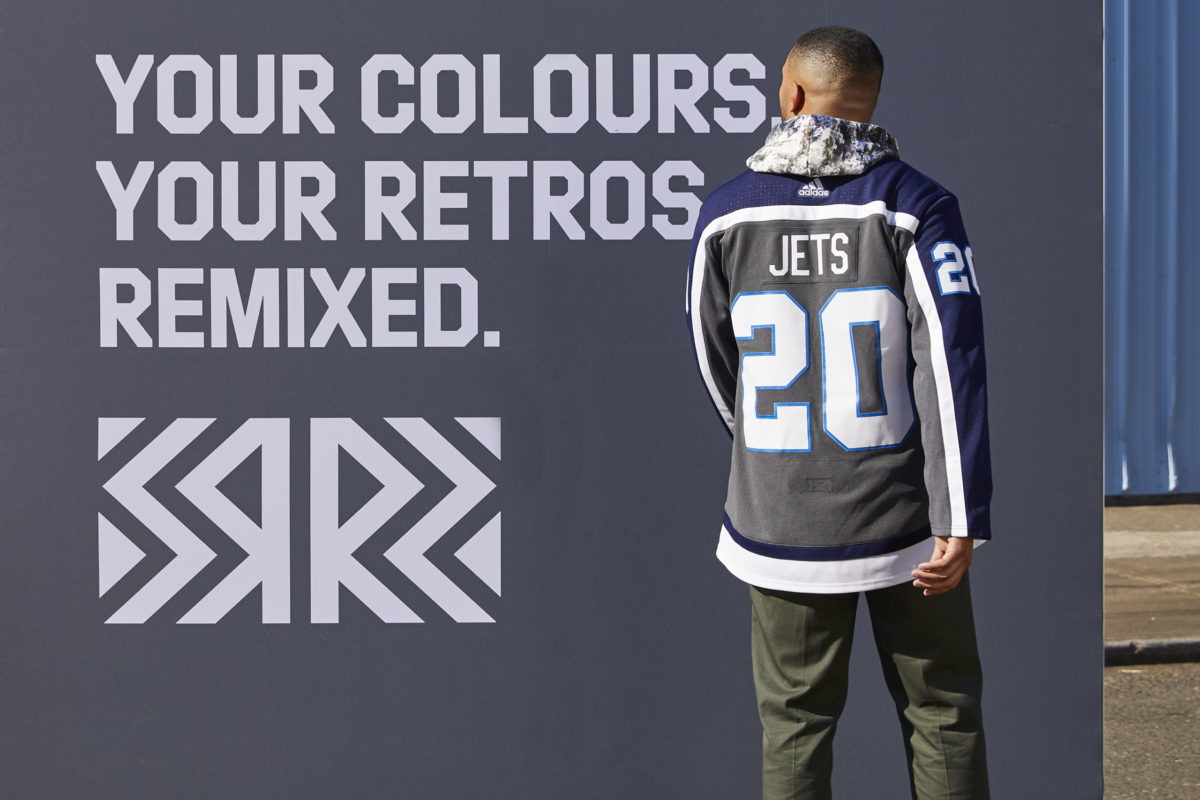
Winnipeg Jets Reverse Retro jersey (NHL/adidas)
The NHL and Adidas describes it as such in a document provided to The Hockey Writers:
This Reverse Retro jersey combines the classic style with the team’s current colourway, a throw back to 1979 honouring the Jets’ first year in the league. This remixed design integrates the iconic heritage plane crest with the bold “Winnipeg” lettering. Remastered in fighter grey, this jersey takes the classic heritage look that the 1980’s era Jets — including legend Dale Hawerchuk — wore and gives it a modern twist.
Despite that description, there’s not that much to the jersey. It doesn’t seem like much thought was put into it at all. It looks like a practice jersey and like the Aviator alternate, it desperately needs some red to contrast with the grey and blues.
The Same Logo, Again? Ho-Hum.
While the Jets’ 1979 logo is a handsome one, it’s the third-straight time it has graced a Jets’ alternate.
(Illustration by Andrew M. Greenstein, The Unofficial NHL Uniform Database) 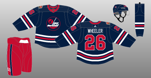
(Illustration by Andrew M. Greenstein, The Unofficial NHL Uniform Database)
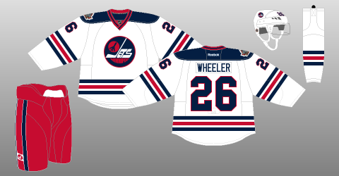
The crest was previously used on the Jets’ 2016 Heritage Classic jersey and 2019 Heritage Blue jersey, which are both spectacular.
However, using the logo for the third time in five years is treading firmly over old ground.
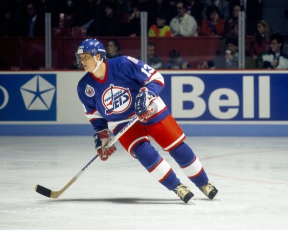
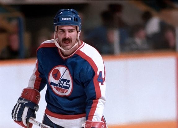
Believe it or not, the Jets did have other logos throughout their history. If they really wanted to make a splash and design something more unique, they would have done a modern take on their 1990s-era jersey — the one Teemu Selanne scored 76 goals as a rookie in. The one Keith Tkachuk donned as captain.
A 1990s-based design was what fans were clamouring for on social media. Unfortunately, the Jets seems loathe to acknowledge that era of their history and snubbed that logo once again, perhaps because it was the one worn during unsteady times (off-ice, at least) just prior to the team’s relocation to Phoenix.
Fans Disappointed, Confused
Unfortunately, the Jets’ Reverse Retro design is just a palette swap of existing Heritage concepts rather than a true redesign. Other teams got brand-new concepts, and some of the Reverse Retro designs are simply outstanding, such as the Anaheim Ducks, Calgary Flames, and Los Angeles Kings, to name just a few.
Overall, Jets fans seem disappointed again. Just check out some of the comments on the unveiling Tweet.
“Looks like something you’d buy at Giant Tiger,” commented one. “So you really think it’ll sell, hey?” commented another. “Looks like a mouldy ashtray,” commented yet another.
Commenters on Reddit expressed similar sentiments. “I don’t really see this one sticking around of a staple of Jets 2.0 fashion but at the least it saves me from getting another jersey,” said one. “To me grey signifies indifference and that’s how I feel about this jersey,” said another. “It’s very ‘March In Winnipeg,’ grey and bleh,” commented yet another.
Many commenters noted the total dearth of red. Many were confused about where the idea to make the jersey grey even came from since it’s not a colour that was featured on any other Jets’ jersey in their history.
The design isn’t all bad, though. The Aviator Blue in the logo and around the numbers is nice and the arm striping — which is a take on the mid-80s jersey — is interesting compared to the horizontal mid-arm stripes of most jerseys. The logo will look cool on a hat or a hoodie.
But the overall package pales in comparison to the Heritage designs and many of the other Reverse Retro offerings. Every time this author looks at it, he’ll think of how much better it could have been. Just hours after the reveal, Twitter account NRG21 Design did two redesigns of the jersey, making it much more striking by switching the grey to Aviator Blue and later, switching it to red.
True judgement must be reserved until the team hits the ice wearing it. Maybe it’ll really pop. However, first impressions are everything, and the first impression of fans is that it’s nothing too special at all.
What do you think of the Jets’ Reverse Retro jersey? Agree or disagree with the author? Comment below!
Free Newsletter
Get Winnipeg Jets coverage delivered to your inbox
In-depth analysis, breaking news, and insider takes - free.
Subscribe Free →