Looking for a gift for that hard-to-buy-for Toronto Maple Leafs fan? After weeks of teasing, Adidas revealed the Reverse Retro jersey. The branding reads Your Colours. Your Retros. Remixed. Well, it seems there is still truth in advertising. A Toronto fan could empty their closet and take the stack of jerseys to a sewing club and come up with this version.
Let’s start with the primary logo on the chest. It’s a supersize version from the 1967 era. That’s right, 1967 – the last time the Maple Leafs won the Stanley Cup. However, it’s not an exact replica. The outline is bigger, but the lettering stayed the same size. With so many cheap knock-off jerseys, the trained eye on a jersey connoisseur will have difficulty adjusting to this mix of new size dimensions.
A History Lesson of Looks
Adidas gives fans a kind and warm reminder of the glory years, but also a punch in the face with the shoulder patch logo. That is the 11-point Leaf design, which is Harold Ballard-era. I know many of you may not recall seeing this, as most Leafs’ fans have a mental block when it comes to these years of the franchise.
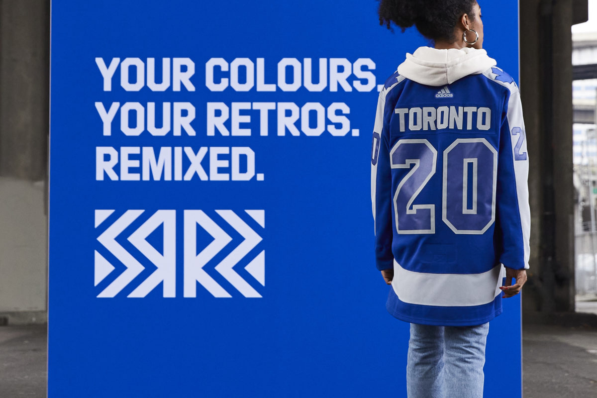
The way the jersey itself is designed is taken from 1970 to the 1992 versions – a thick stripe is on the bottom, and a thick stripe runs from sleeve to sleeve. Previously, that line of fabric has been either blue or white; now, it appears grey. There are also single-stitch jersey numbers on the arms, while the back has double-stitched numbers with blue outlined with silver. That element comes from the 2000 to 2007 Mats Sundin generation. The same jersey that unveiled that baseball-like logo of the letters T, M and L overlapping. That failed logo did not return on the reverse retro.
New Look, Same Reaction
Not surprisingly, the jersey is trending negative on social media. Anytime there is a change with the look of a sports team, it is usually met with resistance. Especially when you’re messing with the look on a century-old franchise with a rabid fan base.
When the Leafs changed the look for the 2016-17 season, it didn’t stir up too many fans. It was basically the look of the team from the 1940s to the 1960s. A few disgruntled fans didn’t like how it resembled a marijuana leaf. Still, those concerns were quickly drowned out by all of the histories in the new logo. The 2017 31-point Leaf logo incorporated some subtle nods to the history of the team. It has 17 veins to represent the 1917 founding of the franchise. The 13 Stanley Cup wins are shown in 13 of those veins placed at the top of the crest. The 31 points represented the Maple Leaf Gardens’ opening in 1931.
In a press release Dan Near, a senior director with Adidas says, “Hockey fans love retro jerseys and Reverse Retro is a great opportunity for Adidas to work closely with the NHL and all 31 teams to bring back a design from a meaningful point in team history with a unique twist.”
In a separate release, Adidas explains the design for Toronto. “The Maple Leafs jersey straddles two seasons with the logo from the 1969-70 jersey and the striping from the 1970-71 jersey. The gray is a nod to the silver that was featured in the Maple Leafs’ Centennial Classic jersey in 2017.”
Either Start Saving, or get on the Nice List
The new threads go on sale Dec. 1 on the Adidas and NHL online stores; they will be available at other retailers starting Dec. 6. It will run you between $200-$250 in Canada, $180-$225 in the U.S. to wear one of these new-look jerseys.
Don’t let this get you too wound up one way or the other. At the end of the day, the jersey is not going to mean that much. The Reverse Retros are not replacing the existing uniforms. They are just adding a third option. At this point, teams could wear potato sacks for all I care. Just give me some hockey.
Free Newsletter
Get Toronto Maple Leafs coverage delivered to your inbox
In-depth analysis, breaking news, and insider takes - free.
Subscribe Free →