*This was originally published in Oct. 2021
Oct. 2021 marked the 20th anniversary of the Edmonton Oilers’ original third jersey. Designed by legendary comic book artist and writer Todd McFarlane, it was unveiled on Oct. 26, 2001, and the team wore it for the first time the next evening when they beat the Vancouver Canucks 3-2 on Hockey Night in Canada in Edmonton.
As you might expect from the man who created Spawn, the design was like something from another planet, one that was far, far away from Edmonton. Mostly navy with silver and white and featuring a lace-up collar, the jersey could not have been further from the Oilers esthetic. Predictably, the reaction was all over the place. Some fans loved it, some hated it, but no one was without opinion.

I’ve always been a big fan of the “McFarlane jersey.” On the day it turned 20, I tweeted that it was “Long overdue for a comeback.” It took about two minutes before I realized that the reaction has only intensified over time.
The responses are still rolling in, from GIFs of nodding approval to vomit emojis; some called it the greatest Oilers jersey, others the ugliest in NHL history. Good or bad, everyone everywhere had a hot take. Two decades on, and this jersey is more polarizing now than in its debut.
Love or hate it, I think we can all agree it’s part of the fabric of Oilers history. Here’s a look at how it came to be, what made it special, and future potential.
The Origin of the McFarlane Jersey
While most NHL teams have a third, or alternate, jersey these days, the concept was still relatively new at the dawn of the century. Only 11 teams used a third uniform in 2000-01, but that number grew each season, and by 2001-02, the Oilers joined the party.
The Oilers initially looked outside the organization for a designer but were ultimately convinced by McFarlane, who was part of the Edmonton Investors Group that then owned the team. McFarlane, a Calgary native, was at the peak of pop culture in the late ’90s and early ’00s, involved in feature films, music videos, action figures and video games, and, of course, comic books.
The Jersey’s Design
The front-page story of the Edmonton Journal described the jersey as having “hip-hop sensibility” with “a generous nod to skateboard chic” and “rap-star appeal with Gen X allure” (from ‘Oilers unveil 3rd jersey’, Edmonton Journal, 10/27/01). It was aimed at the 18-30 set, and as someone who had recently joined that demographic, I can say it worked.
One of my favourite parts of the design was the symbolism; every minute detail of the primary mark (front logo) and secondary mark (shoulder patch) had meaning. It might have been a bit overwrought, but you couldn’t help but admire the thought put into it. The following is McFarlane’s explanation, taken from promotional material that was released by the Oilers and posted on the team website.
The Primary Mark
Sharp, blade-like shapes signify both the blades of a hockey skate and the fast-paced, exciting tradition of Edmonton Oilers Hockey.
The Five Rivets that form around the oil drop represent the five Stanley Cups won by the Edmonton Oilers Hockey Club since its entry into the NHL in 1979. There are also ten gear teeth on the primary mark; five on the large outer gear, and five on the inner gear. Each gear tooth represents each of the previous team captains in the Edmonton Oilers NHL History.
Inner and outer gear shapes signify strong and formidable force while reinforcing the concept of teamwork and industriousness. They provide the stability upon which the ‘well-oiled machine’ is built. Gears, like team members, need to be strong and work together in order to succeed. They operate in a dynamic environment and always need to be ready to perform when called upon.
The Oil Drop is derived from the original Edmonton Primary mark. It has been turned on its side to accommodate and reinforce the speed of the new primary mark. It has also been given a highlight to help define and distinguish it from the rest of the logo. The Oil Drop creates the transition between the tradition of the original Edmonton Oilers logo and the launch of the new one for the third jersey.
These elements provide the perfect mixture of the rich tradition and history of the team, its players, and its legacy blended together into a brand new modern hockey logo. Of course, there’s always room on the logo to add extra rivets.
The Secondary Mark
The type of treatment of the word “OILERS” portrays classic strength and boldness in the tradition of both professional and collegiate-level sports, as well as paying tribute to retro gas station and oil company logos of the past.
The top of the shield logo signifies two things. First, the three peaks form a crown at the top of the badge that references and pays homage to the Edmonton Oilers roots as the “Oil Kings.” Second, the badge or shield-like style of this mark is meant to evoke a sense of authority and command that is commonly associated with both military and police enforcement marks and badges. Sports in general, and hockey in particular, are all about mental and physical strength and intimidation. This mark is a tribute to that.
The gear that completes the bottom of this mark is meant to compliment those seen in the new primary mark. Again, the gear itself represents strength, teamwork, and fortitude. It has to work hard and be unrelenting in order to perform what needs to be done, day in and day out. The analogy to athletic excellence and achievement and consistency here is an obvious one. This gear, like those in the primary mark, also contains five rivets mean to signify each of the Stanley Cup Championships won by the Edmonton Oilers Hockey Club. Of course, the Oil Drop has been brought over from the original primary mark and been placed prominently in the centre of the gear, where it belongs.
The Legacy of the McFarlane Jersey
It can’t be overstated how radical the McFarlane jersey was for the Oilers. Brand-wise, this design was and still is the boldest move in the history of the franchise, which now dates back well over four decades.
For the longest time, the Oilers clung stubbornly to tradition, sometimes to their detriment, recycling former players through the coaching staff and front office (a phenomenon known as “the old boys club”). A more benign manifestation of this can be found in their fashion sense. Every other jersey in team history featured the original crest on the front, and the colours have remained consistent, shades of blue and orange/copper that have only changed in hue.
That’s why the McFarlane jersey is significant. It’s a rare moment when the Oilers stepped out of their comfort zone and challenged their fanbase to do the same. Enough of us loved it, not just Oilers loyalists, but those who wore hockey jerseys for fashion rather than fandom.
“The jersey broke NHL records for third jersey sales for number of units and dollars sold,” said Patrick Laforge, who was the Oilers’ CEO and president in 2001-02. “As we hoped, it was a hit with Todd’s followers as well.”
The organization kept the McFarlane jersey in their rotation until the league switched to the Reebok Edge jersey for the 2007-08 season, when all uniform sets were reduced to two jerseys.
Will the McFarlane Be Seen Again?
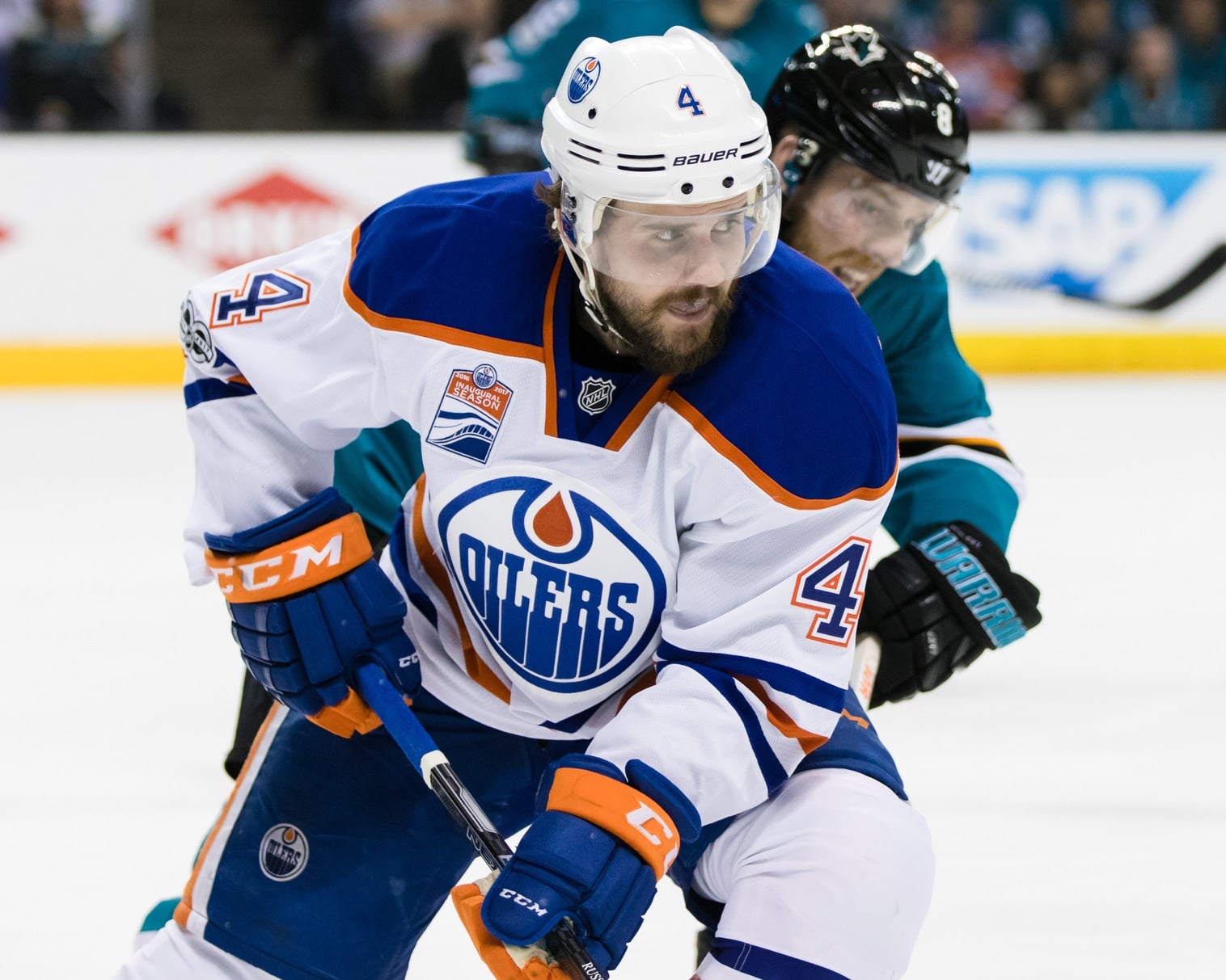
The jersey could resurface with updated colours, cut, style, and patterns that fit the esthetic of the day. Many fans have designed modern versions of the McFarlane, and some look pretty good. Occasionally you’ll see someone at Rogers Place wearing a McFarlane, adorned with #94 for Ryan Smyth, Georges Laraque’s #27, or one of the other popular Oilers of the era. It’s always a conversation starter.
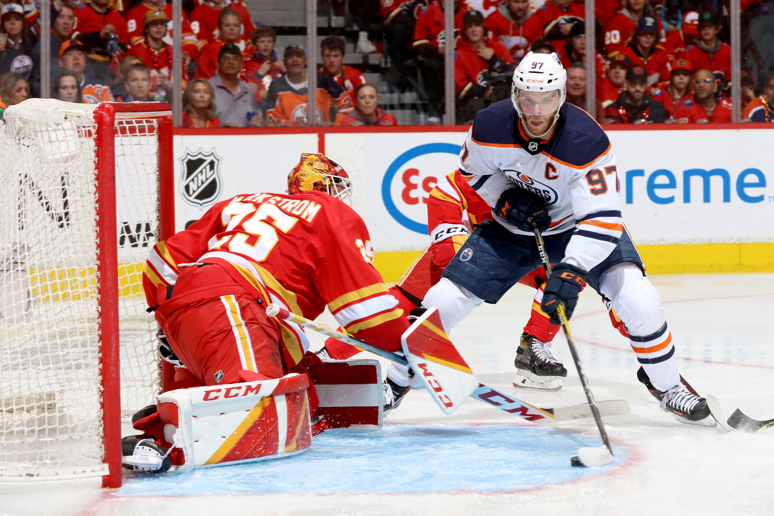
I think it would be amazing to look into the stands and see that jersey with Connor McDavid’s #97 or Leon Draisaitl‘s #29. But that’s just my two cents. As they say, don’t @ me.
Free Newsletter
Get Edmonton Oilers coverage delivered to your inbox
In-depth analysis, breaking news, and insider takes - free.
Subscribe Free →