- The Capitals Wordmark
- Capitals’ Wordmark the Exception to the Rule
- Washington’s Wavering Wordmark
- The Screaming Eagle
- The Washington Capitol Building
- Washington Capitals Current Primary Logo
- The Capitals Wordmark: Version 2.0
- Washington Capitals Current Secondary Logo
- The Weagle
- Washington Capitals Current Alternate Logo
- The Capitals Wordmark: Version 1.5
- The 2015 Winter Classic Uniform and Logo
- The 2018 Stadium Series Uniform and Logo
- Their Modern Redesigns for their Retro Reverse Jersey.
- Washington Capitalizing or Constrained?
When it comes to the Washington Capitals and their logos, they have had a surprisingly long and complicated history.
They have had some logos that fans have absolute adored, but also had logos that fans have voted as some of the worst in the NHL. They have managed to find themselves on both ends of the spectrum throughout their 40+ years in the National Hockey League.
There is no better way to prove the divisive nature of the Washington Capitals’ logo history than by simply going over the entire logo history of the team.
That is what we will be doing in this article.
Related: Everything You Ever Wanted to Know About the Capitals’ Jerseys
It only makes sense that we start from the team’s visual beginnings.
The Capitals Wordmark
The Capitals entered the league in 1974-75 with a wordmark logo, colour-corrected depending upon which jersey it adorned.
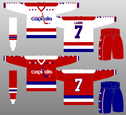
The logo itself features two iterations of a reverse-italicised typeface, one spelling out “Washington” in capital letters, and the larger, primary mark below it reading “Capitals,” all lowercase. The “t” in “capitals” is elongated to be a hockey stick, with a puck lying next to the blade. Directly above the wordmark near the shoulders of the sweater is a layer of stars, composed of two banks of three.
The layer of stars crams even more America into the uniforms, especially when considered alongside the striping and additional stars of the jersey. I like when teams double down on their city’s identity, and the Capitals are the NHL’s poster child for doing it right.
The hockey stick is an equally obvious, yet equally effective, design decision, providing not only colour contrast, but also enhancing the height and overall depth of the emblem. The crossing stroke of the “t” works wonderfully, as well, lining up with the dot on the “i” to create the illusion of speed and movement.
Capitals’ Wordmark the Exception to the Rule
Yes, the Caps would have been wise to go with something more impactful than a wordmark for their first primary crest. Expansion teams don’t often do well (the first-year Capitals were no exception, finishing with a record of 8-67-5, bad enough to still hold the NHL record for worst-ever single-season points percentage, at 13.1 percent), so they sure as hell better look good.
Even worse, the reverse italicisation of the wordmark makes the crest look passive, almost like it’s recoiling.
But there’s a reason this logo lasted 21 seasons, and was brought back largely intact only 10 years after it was retired: There was enough right about the original design to etch itself into the minds of hockey fans the world over. And isn’t that what branding is all about?
Although wordmark logos have received negative criticism due to being lazy, the general consensus is that this logo works with these uniforms. They both are a sign of the times and, when updated to be used in the modern day, have still proven to be a solid overall design.
Washington’s Wavering Wordmark
The Capitals’ original wordmark logo technically didn’t stay original for long, changing slightly several times over the course of its two-decade run. The 1985-86 edition would be retained until the crest’s replacement following the 1994-95 campaign.
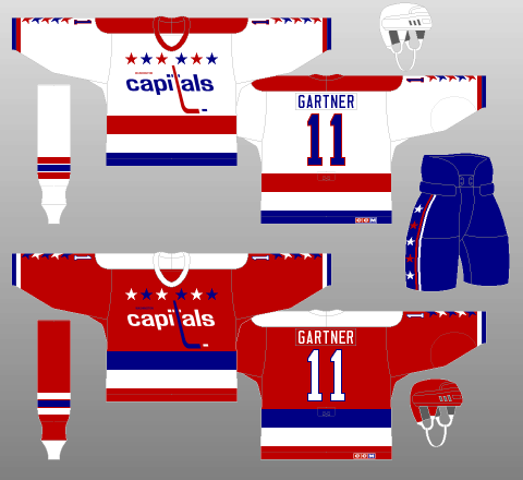
As you can see, the “WASHINGTON” component of the wordmark is considerably smaller than in the initial iteration, a change implemented for 1980-81.
Also in 1980-81, the star layer was enlarged slightly, while the gap between the two star banks was shrunk considerably for 1985-86.
The tail of the hockey-stick “t” was lengthened considerably ahead of 1983-84, with “WASHINGTON” getting a little more separation from “capitals” that very same season.
Whatever the guise, this classic crest served Washington admirably, from their historically awful inaugural season through their painful climb towards respectability, and stuck around long enough to see the Capitals ascend to competitor – even contender – status.
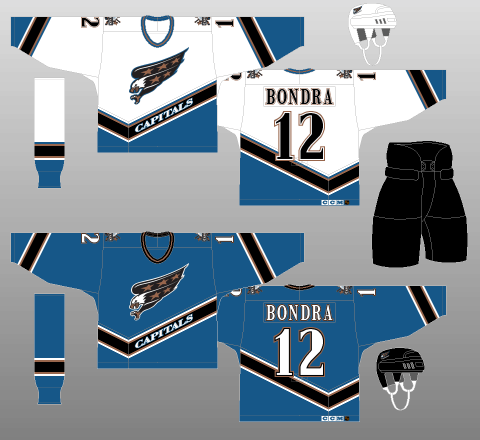
The Screaming Eagle
For the 1995-96 campaign, however, the Capitals took their logo in a wildly different direction.
To go along with complete rebrands of their sweater template and colour palette, Washington introduced a new primary crest, a star-spangled screaming eagle.
And, good gracious, is this one ever a dandy.
Honestly, what better image to emblazon upon a team based in Washington, D.C.? A bald eagle, adorned in stars, seemingly dive-bombing towards a kill, beak open and talons extended? Simply magnificent.
Of course, the red, white and blue colour scheme of the Caps’ original kits was replaced in the redesign, so this crest is perhaps not quite as patriotic as it could be. However, the Capitals have since made this very alteration in a logo which we will get to later in this article.
Instead, the black and bronze accents of the jersey design are replicated on the logo, lending further anger and aggression to an already explosive image. Very fine work.
The Washington Capitol Building
The Screaming Eagle logo was eventually undone by a Washington staple, political interference.
Completely in opposition to the spectacular Screaming Eagle, the secondary logo of the Caps’ new ensemble featured an image of the United States Capitol.
Now, this is a team called the Capitals that plays in Washington, D.C., so there’s no question America is going to factor into the team’s branding – and rightly so.
The Capitals introduced this loud and to-the-point logo, as well as a black alternate jersey to go along with the logo back during the 1997-98 NHL season.
The Capitol Building featured in the centre of the logo is backed by a pair of crossing hockey sticks, flanked by stars and fronted by a puck, with “WASHINGTON CAPITALS” stamped across the front, for good measure.
The Capitol building logo and jersey eventually relegated the Screaming Eagle to secondary status upon the shoulders and placed the Capitol Building front and centre. This jersey would attain full-time status in 2000-01, usurping the Caps’ blue sweater and its Screaming Eagle primary crest.
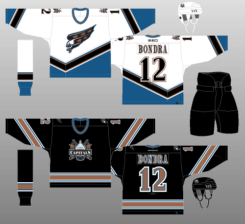
The Capitol Building logo received mixed reviews from fans of the team and the NHL as a whole.
However, similar to the Screaming Eagle logo, this logo was brought back with a modern twist very recently.
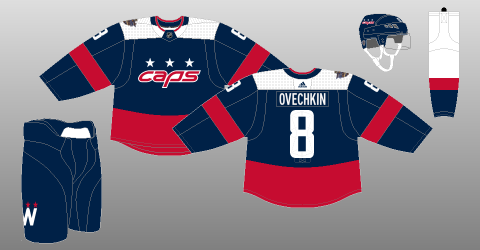
Washington Capitals Current Primary Logo
The Capitals decided that, after the 2006-07 campaign when the Reebok Edge jerseys were coming out and the Ovechkin-era in D.C. was beginning that the team needed a new look. The results were mixed by fans, but it has lasted the test of time seeing as how it has been the primary logo and jersey design ever since.
The Capitals Wordmark: Version 2.0
One of the few teams for whom the Reebok Edge uniform system actually proved beneficial, the Caps took advantage of the NHL’s uniform template overhaul to go back to the future, rolling out an updated version of their original crest.
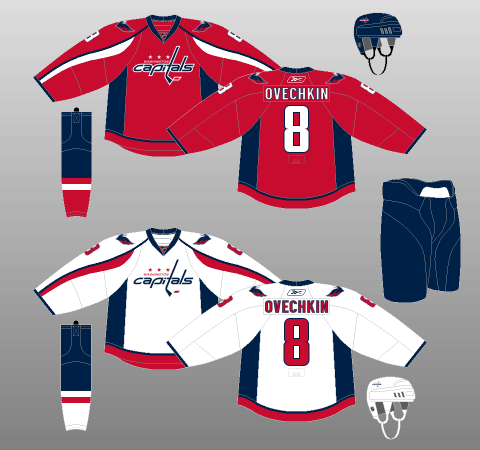
It’s still a combination wordmark, featuring an uppercase “WASHINGTON” and a lowercase “capitals” but, this time, it’s italicised normally, making it look significantly more active and aggressive than the original emblem.
The typeface has changed, too, with a more daring, futuristic look than the original. One particular stylistic element of note is that the cross of the “t” not only draws from the dot of the “i,” but also now merges smoothly into the upper stroke of the “a,” creating a less-truncated look which helps the overall flow of the logo.
Next, rather than the layer of six stars above the wordmark itself, there is a smaller block of three positioned between “WASHINGTON” below and the elongated “t” to the right. These three stars represent the jurisdicitions of Maryland, Virginia and Washington, D.C. This feature fits very nicely into the visual field, creating one unified logo, rather than the several disparate elements of the original.
Furthermore, the use of three stars also references the flag of Washington, D.C. – which itself references the family crest of founding father George Washington.
Obviously, the new colour scheme is darker and more muted than the Caps’ original palette, but what’s less obvious is the removal of certain points of contrast from the crest. For instance, the hockey-stick “t” is no longer in a contrasting tone. Instead, it’s the same colour as the rest of “capitals.”
More significantly, “capitals” is blue and the puck is red on both the home and away iterations. However, the bank of stars and the “WASHINGTON’ portion of the wordmark do differ between sweaters, coloured white on the Caps’ red jerseys, and red on their whites. The logo on the red and white kits are trimmed in white.
Interestingly, the Capitals’ original logo also had a red “WASHINGTON” when adorning the white jersey, but utilised blue on the red threads (providing some nice contrast with the then-white “capitals”).
As mentioned, this set has managed to stick around for 13+ years and saw the Capitals win the franchise’s first Stanley Cup in the updated Adidas version of these sweaters.
Washington Capitals Current Secondary Logo
Accompanying the redesigned primary crest was an objectively beloved secondary logo.
The Weagle
As much as the wordmark emblem took the past and improved on it, the Capitals’ new secondary crest broke new ground for the franchise’s aesthetic – in a good way.
The logo consists of a stylised bald eagle with wings spread, a simple design (nicknamed the “Weagle,”) embedded with some very nice, subtle details.
The body of the eagle is not altogether filled out, replaced instead by the contrasting silhouette of the Capitol Building. A clever nod to the city of D.C., as well as previous Capitals logos.
More noticeably, the eagle’s wings and body are positioned such that they form a “W” – as in, “Washington.” The eagle is also coloured such that there’s a second, more pronounced “W” in the space occupied by navy blue.
On the topic of colouration, the eagle’s sharp, almost lightning-esque red wingtips intersect with the blue of the inner wings to create some quite striking contrast. Not only does this design choice look spectacular, it also gives the definite illusion of movement and excitement, much like the primary crest.
Another positive is the fact that, for all its design complexity, the Weagle is simple enough to be doodled (though the actual Caps’ players themselves don’t make it look very easy). This is an essential characteristic of any good logo, that the most hardcore of fans and the most hardcore of casuals alike are imprinted with the ability to draw it.
The Weagle means business. So much so that many Caps fans have been clamouring for its inclusion on an alternate sweater ever since its release, although the Capitals have not given their fans this wish as of yet.
But hey, that’s not the Weagle’s role. Its role is to serve as the shoulder patch framing the Capitals’ wordmark crest, a role which it plays to resounding acclaim.
As a secondary logo, the Weagle is just about perfect.
Washington Capitals Current Alternate Logo
As one might expect from a team that’s fiddled with their branding as much as the Capitals, another uniform change – this time, the addition of an alternate kit – wasn’t too far behind their Reebok Edge transformation.
The Capitals Wordmark: Version 1.5
The Capitals have reintroduced their original logo a number of times within their current branding scheme, first in 2011-12 following its use in the 2011 Winter Classic.
Interestingly, while the crest used on the Caps’ vintage white jerseys is a straight replica of the original, that used on the red throwbacks, currently the Caps’ alternate sweater, uses a white “capitals” and a white “WASHINGTON,” rather than the latter being blue.
The 2015 Winter Classic Uniform and Logo
One of the more unused logos in the Capitals’ vault, yet also one of the most appreciated, is the logo the team used for the 2015 Winter Classic in which the Washington Capitals hosted and defeated the Chicago Blackhawks on New Year’s Day at Nationals Park in Washington, D.C.
The uniform is a “vintage deep red to symbolize hockey’s deep roots in Washington,” (NHL.com). The stripes are an homage to a previous era of hockey in Washington, long before the existence of the Capitals.
The logo consists of a simple, large navy blue W. Very similar to the Weagle logo hiding the Capitol building in the negative space, the Washington Monument can be seen within the middle point of the W. At each point of the upper-side of the W, there is a white star. These three white stars, much like in the main logo, the alternate wordmark logo, and the D.C. flag, represent the three jurisdictions of Virginia, Maryland and Washington, D.C. The logo also pays tribute to many Capitals jerseys by having the word, “CAPITALS” written across the front.
Although the logo is quite simple, this uniform and logo garnered universal praise when the Capitals adorned in their second outdoor battle.
The 2018 Stadium Series Uniform and Logo
Of all the logos and jerseys the Capitals have released over the years, it is possible that this set has taken the most criticism from fans. The Capitals wore this logo for their 2018 Stadium Series game in which they hosted and defeated the Toronto Maple Leafs 5-2 at the Navy–Marine Corps Memorial Stadium in Annapolis, Maryland.
The uniform itself is what received the most criticism. The navy blue jerseys include a thick red waist stripe, which is meant to represent the Washington, D.C. flag, as well as single-coloured numbers on the back and side of the uniform. The unique part about the white numbers on the back is that they included a pattern on them which was “based on Pierre L’Enfant’s original grid plan for the city of Washington D.C,” (NHL.com).
The logo itself uses the same style as the Capitals’ main logo, however, it uses the team’s nickname, “CAPS,” instead. The text is also entirely red with a white stroke, which is similar to the wordmark logo that has been seen on the team’s helmets for a number of years.
A notable logo can be found on the pants. Very similar to the 2015 Winter Classic logo, it is a W that includes the Washington Monument in the middle of the W. This time, however, it’s a white logo with red stars and no “CAPITALS” across the front of the logo.
There are reports that the Capitals may bring back a logo very similar to this to use as an alternate jersey for the 2020-21 NHL season.
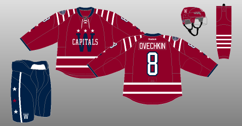
Their Modern Redesigns for their Retro Reverse Jersey.
Back in November, the Capitals, along with the rest of the league, unveiled some modified throwback uniforms called the “Reverse Retro” jerseys. For their rendition of a Retro Reverse jersey, the Capitals decided to alter their 1995 Screaming Eagle jerseys.
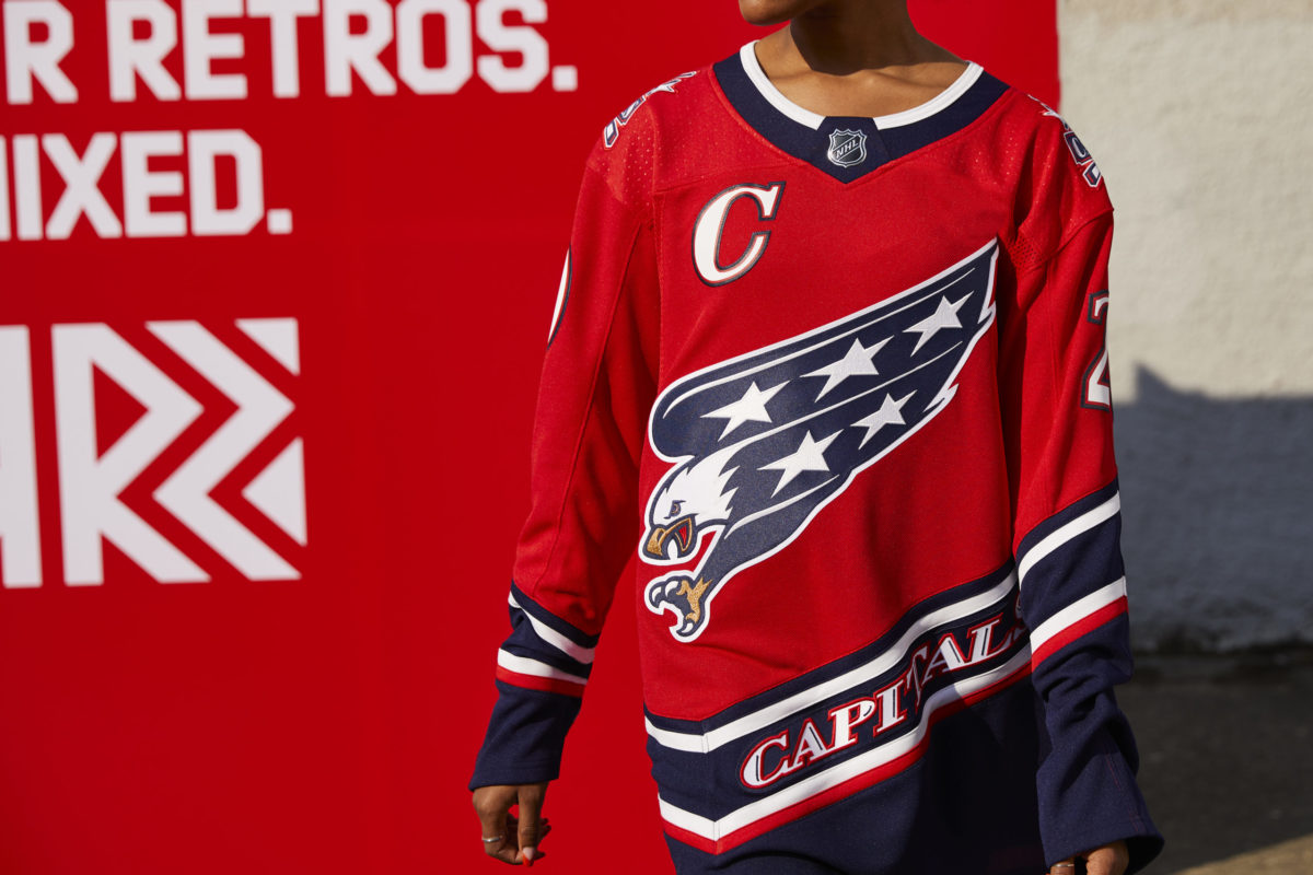
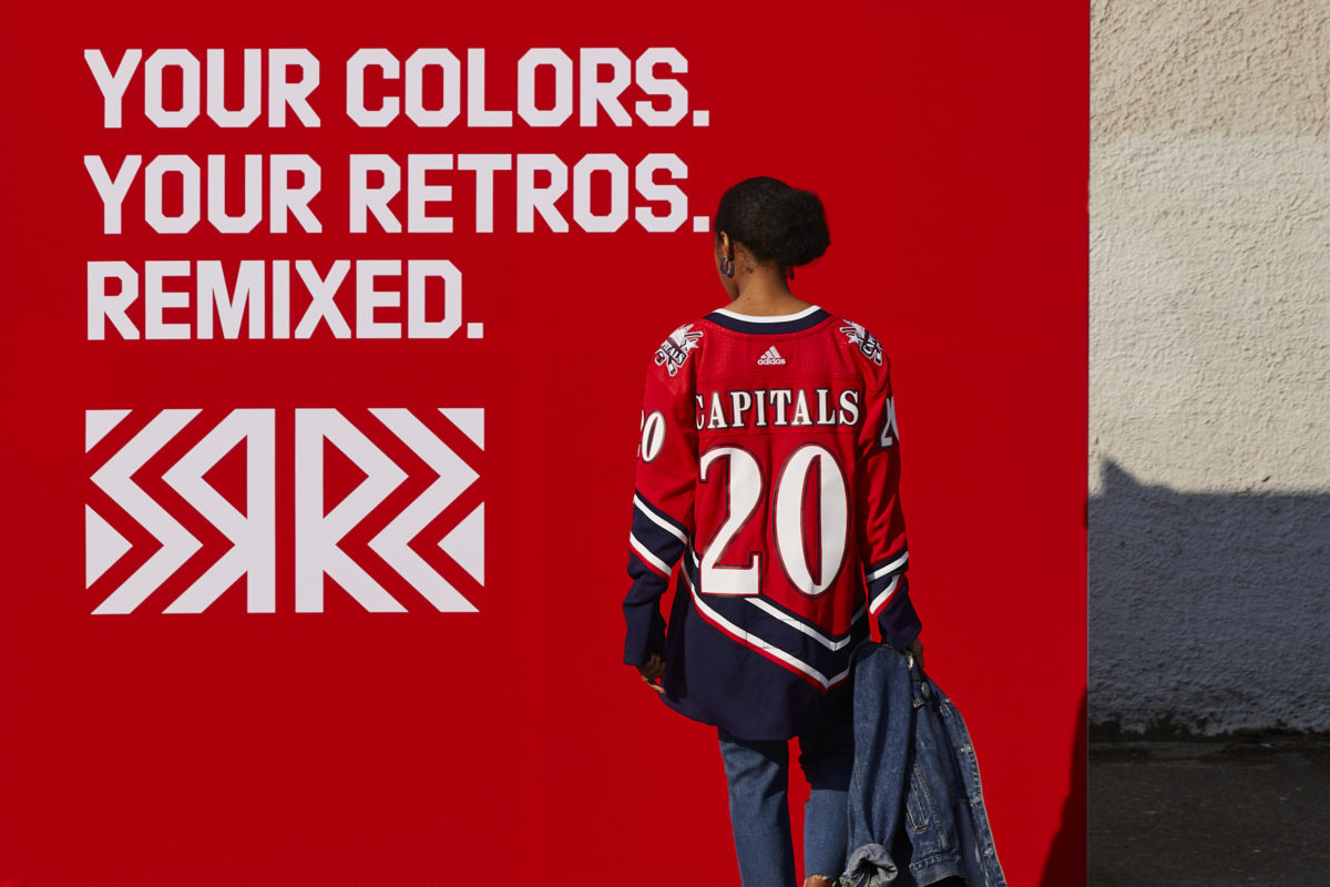
They chose to modify the white Screaming Eagle jersey with their modern-day colours. They swapped the white with their red, their old blue for their new navy blue, and white for gold.
The logo itself is just a re-colourized version of the Screaming Eagle logo, using navy blue as the primary colour of the wings and using white for all the stars on the Eagle. They also use their older Capitol building logo as their shoulder logo which, of course, has been re-colourized as well to match the rest of the uniform.
Washington Capitalizing or Constrained?
Make no mistake, the Caps have always had one of the most recognizable logo sets in the NHL.
However, in recent years, the Capitals seem to have been caught between the pulls of various design forces.
There seems to be constant friction between the futuristic and the traditional. There’s the patriotism angle, with the eagles and the stars. Then there’s the slavish devotion to the past, whether that be the logos of the Caps’ current home and away uniforms, that of their alternate jerseys of recent seasons, or even their Winter Classic ensemble from 2015.
This friction is continued amongst the fans, where the primary wordmark logos are both loved and hated by the Capitals’ faithful.
Regardless of the friction, the Capitals continue to have one of the best aesthetics in the National Hockey League.
Free Newsletter
Get Capitals History coverage delivered to your inbox
In-depth analysis, breaking news, and insider takes - free.
Subscribe Free →