- Capitals’ Colourful, Commendable Commencement
- Capitals Know How to Accessorise
- Capitals’ Kit Changes Kept to Minimum
- Capitals Bid Long Farewell to Red, White and Blue
- Paying Homage to the Capitals’ Red, White and Blue
- Capitals’ Patriotism Goes to Dark Place
- Capitals Blacken Their Name
- Reebok Edge Reinvents Capitals
- Capitals Embrace Colourful History
- ADIZERO Era No New Beginning
- Screaming Eagle Returns With Reverse Retro Twist
- Capitals at a Kit Crossroads
Perhaps no team in the National Hockey League had as inauspicious a start as the Washington Capitals.
In the entire century-plus of NHL history, the 1974-75 Capitals, one of two expansion teams to enter the league that year (after a horrendously unfair expansion draft from an already depleted league), hold the league’s worst-ever single-season points percentage at 13.1 percent, thanks to a record of 8-67-5.
In the seven decades since the league moved to seasons of 60 games or more, only the 1980-81 Winnipeg Jets had as few wins as the eight the Caps managed to scrape together, and no team has had fewer points than Washington’s 21.
Piling on, the Capitals went 1-39-0 on the road their first season and accumulated the NHL’s worst-ever goal differential, at -265. Both of these things aren’t just amazing, they’re legitimately hard to do.
You get the idea. It was a rough season, to put it mildly.
And yet, there was a glimmer of hope from that dreadful first campaign, as the Capitals introduced the NHL – and the world – to one of the great sweater designs in hockey history.
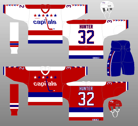
Capitals’ Colourful, Commendable Commencement
For a team based in Washington, D.C. and known as the “Capitals,” it’s only fitting the Caps debuted in red, white and blue.
Also fitting for a team based in a nation’s capital, it looks decidedly like it was designed by committee.
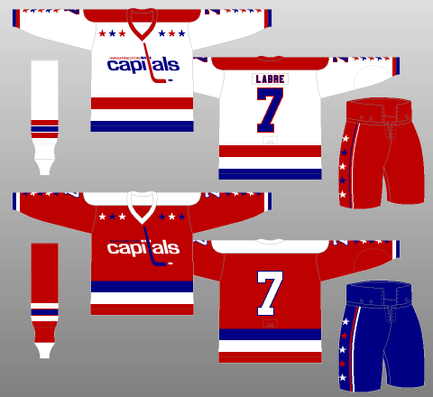
There’s a lot going on here, so let’s start with the base colours and striping.
Along with using the traditional white for their light jerseys, the Caps elected to use a red background for their darks. That’s not that unusual.
What is out of the ordinary is the presence of white shoulder yokes on the red kits, mirroring the red yokes on the white sweaters.
Colored shoulder yokes are an important part of many hockey uniforms, often helping to offset an overabundance of white on teams’ light jerseys. However, it’s exceedingly rare to see the yoke treatment on a colored jersey, simply because the need for such contrast generally isn’t as great.
What’s even rarer is the use of a stark white yoke. The shocking brightness of a white shoulderpiece can often cheapen the look of a kit by making it appear amateurish, not to mention burning the retinas of everyone who sees it.
However, in this instance, it works rather well. The bright spots throughout the rest of the uniform help mute the white shoulder yokes, and their seamless flow into the white V-neck collar looks absolutely incredible.
Well done, Washington; a point to the Caps.
As for the striping, the Caps used a gapped dual-stripe package on the tails of their white kits, with flush dual striping on the reds. If you’re thinking this seems familiar, you’re right. If it weren’t for the thickness of the tail stripes, this design would be identical to that used by the Montréal Canadiens, albeit with the red jersey’s stripe colours inverted.
Curiously, none of the striping packages are consistent on this uniform, with the sleeves having a thin, flush, dual-stripe design on both kits, red atop blue on the white jerseys – consistent with the tail striping – and white atop blue on the reds – the opposite of the tail. The socks, for their part, feature a gapped tri-stipe pattern.
The Capitals chose a nice, thick font, helping fill out their jerseys quite effectively. Even better, both the jersey numbers and lettering are trimmed in contrasting colors.
Capitals Know How to Accessorise
But, who are we kidding; the most noticeable components of these kits are the accessories.
First, the logo, which is a stylised “WASHINGTON capitals” wordmark. The differences in font and capitalisation between the two words are unorthodox, to say the least. Equally puzzling is the hockey stick meant to act as the lowercase “T” in “capitals.” Obviously, hockey sticks don’t have a cross. The Capitals got around that by slapping two tiny, indistinct blotches on either side of the hockey stick that are ambiguous enough to make up the cross of the T, while also looking like a continuation of the dot on the preceding “I.” I can’t decide if that’s prodigious or pathetic.
And how about those stars?? Six stars – two groups of three in alternating colours – are perched atop the logo, with five more joining them on the sleeves between the numbers and cuffs. There are another five – bordered on each side by two contrasting stripes – on the pants. Why different sections have different numbers of stars is a mystery.
Speaking of the pants, the Caps used three (three!) separate pant designs during their inaugural season, the red and blue you see above, and also a short-lived white version. As anyone who’s ever worn – or attempted to wear – white pants can imagine, these did not last very long. Nor did the reds, with the Caps settling on blue for both of their kits the following season.
Interestingly, the blue accenting the pants provided was not replicated on the helmets. Throughout the use of this uniform set, the Capitals used red helmets with their red jerseys. Blue helmets would have provided excellent contrast and improved the overall color balance of the red kits. An opportunity missed.
The simple fact of the matter is, these Capitals’ kits were chaotic and disjointed, with a healthy dollop of tackiness thrown in for good measure.
You may also like:
- Capitals Re-Sign Alexander Ovechkin to a 1-Year Deal
- NHL Rumors: Werenski Trade Pause, Nurse Pivot, Kane to Sabres, Ovechkin Retirement
- 3 Worst Signings From Day 1 of NHL Free Agency
- Capitals Sign Boone Jenner to 4-Year Deal
- 2026 NHL Qualifying Offer Tracker
And yet… I can’t help but love them. Somehow, everything just blends together so nicely. Even though these uniforms are objectively terrible, everyone can find a little something about them they like, so much so the Capitals have brought back both of them as alternate kits in recent years, as we’ll get to later on.
Capitals’ Kit Changes Kept to Minimum
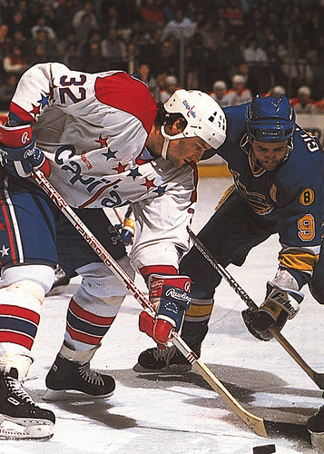
The Caps’ kits would stay largely the same until 1995, with only minor changes throughout their two decades of use.
And when I say “minor,” I really do mean it. Take a look at the duds they donned from 1983-85, for instance:
The most noticeable difference is the new, slimmer, spindly looking font, and the lack of outline around the lettering of the names (the numbers and captaincy letters retained their trimming), a change introduced for 1979, though that initial season saw each letter separated from the next by a space, something remedied the following year.
As for other minor alterations, the stripes are all slightly thicker (except, oddly, for the blue tail stripe on the white jersey), the “WASHINGTON” part of the logo has been shrunk and the stars on the chest have all been enlarged, all changes introduced in 1980.
On the topic of stars, there are now only four stars on the sleeves, a design choice debuted in 1983 that would only last two seasons before a further tweak restored the fifth star.
Capitals Bid Long Farewell to Red, White and Blue
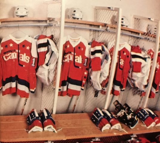
The final iteration of these Caps’ kits was rolled out in time for the 1987-88 season, and would remain unchanged until 1995.
As you can see, the six stars on the jerseyfront have been moved closer together, forming one unbroken line across the chest.
In addition, the name lettering is again trimmed, something which, as a lover of consistency, I appreciate, though I do imagine it can’t have been very easy on the eyes of anyone watching; the outlining of the letters makes the names look jumbled and cluttered, especially from afar.
Paying Homage to the Capitals’ Red, White and Blue
Whatever its faults, the longevity of – and love for – Washington’s red, white and blue kits make them one of the truly iconic uniform sets in NHL history.
And yet, it’s tough to see why. The striping is erratic. The logo feels like a cop-out. And what on Earth’s the deal with those stars?
Seriously, it’s like everyone was told to come to the design meeting with their most ludicrous idea – and then the team just decided to use all of them at once.
But, inexplicably, it’s…it’s glorious. I don’t know how or why, but it just…works.
Let me also say that, living in the modern age of streamlining and efficiency, it’s refreshing to look back on the Capitals using a completely different primary logo for each of their jerseys. To me, this shows the designers were legitimately doing their best to create the most perfectly balanced uniform possible, rather than kowtowing to convention and cost-effectiveness. This theme is also present in their usage, however brief, of three different pant designs; it shows the focus was on the visual product, not the bottom line.
To me, these are examples of art in its purest form, something hard to come by nowadays.
Very few teams ever get their jerseys quite right, but the Capitals hit it out of the park on their very first try.
Capitals’ Patriotism Goes to Dark Place
Perhaps the only thing wrong with the Caps’ uniforms during their first two decades is a lack of aesthetic punch and aggression. For the 1995-96 season, Washington debuted a complete uniform redesign that changed things in a big way.
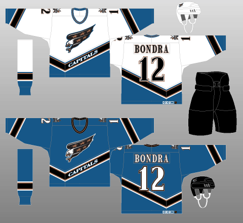
The first and most obvious change is in the team’s color palette. The Capitals went with a muted blue as their new primary color, with black and bronze trimming the ensemble. Black pants for both uniforms and a black helmet for the blue jerseys only accentuate the more truculent look.
Front and center are the team’s new logos. A screeching bald eagle – the universal symbol of America – with bronze-starred plumage is the team’s new primary crest, looking as though it’s going in for the kill. Meanwhile, the shoulder patch consists of two stars, two hockey sticks, a puck and a “WASHINGTON CAPITALS” wordmark surrounding a stylised Capitol Building.
So, right away, it’s clear the Capitals meant business with their redesign, something only accentuated in the details.
Instead of traditional horizontal striping on the sleeves and tail, the Caps went with a diagonal approach that seems to follow the eagle’s flight patch, a design choice made all the more unique by the fact the apex of the striping treatment is off-centre, reminiscent of a checkmark – or even Nike’s Swoosh. The diagonal effect is replicated on the sleeves.
As for the stripes themselves, a bank of five stripes – a thick, black band surrounded on either side by two thin accents – sits atop a blue base (technically, on the blue jerseys, the base of the stripes is just the background of the sweater). The accent stripes immediately outside the black are bronze, while the outer two contrast with the adjacent color. This striping package is, pleasingly, replicated on the socks.
Personally, I don’t think the uniform needs the outer stripes. They make the kits look a little too busy, that’s but a minor niggle in an otherwise splendid package.
Even the collar is great, with a tri-stripe design on each jersey (bronze surrounded by blue on the white jerseys, and bronze surround by black on the blues).
However, perhaps the thing that stands out most on these kits is the font. The heavily seriffed characters are already unusual enough, but there are marked differences in thickness between various strokes, for an old-timey, almost calligraphic feel. Additionally, concerning the numbers specifically: Some components that should, by all rights, be rounded are squared-off, for some reason.
This inconsistent, asymmetric font irritates me, as does the fact the numbers on the back of the uniform overlap with the tail striping. I’m also not a fan of the overly busy trim used on the font, a gapped design on the white jerseys and a two-tone combination on the darks.
Overall, I love the bones of these kits. I might even go so far as to say they’re preferable – or, at the very least, equal – to the Capitals’ original design. However, what gives me pause is the excessive complication of an otherwise brilliant concept.
If ever there was an example of overengineering, look no further than the “CAPITALS” wordmark embedded within the black tail striping. I mean, yeah, we know. You’ve been a franchise for over 20 years at this point.
Capitals Blacken Their Name
For 1997-98, the Caps removed the nonsensical CAPITALS wordmark from their white jerseys – though, curiously, not from their blues (maybe to clarify who they were whilst on the road?) – and introduced a black alternate kit.
Now, when first conceptualising a new third jersey, there are two well-travelled routes to consider: You can either stick with the basic template of your current home and away uniforms and simply adjust the colors (the Vancouver Canucks are an example of a team that’s done this well in recent years), or you can go for something completely different. Instead, Washington tried to have the best of both worlds, and this alternate kit is the worse for doing so.
The tail striping is a more traditional, horizontal pattern, while the sleeves retain the diagonal approach of the standard set. The already overcomplicated striping package is now up to seven (seven!) stripes, with the blue-white-blue trim pieces completely washing out the pleasing contrast provided by the uniform’s primary accent, bronze. Even more infuriating, the socks don’t even use the same pattern; they only have five stripes! Utter madness.
They couldn’t get the already convoluted font right, either, altering their standard lettering by drawing inspiration from a funhouse mirror. It looks like someone got a little carried away with WordArt.
Even the collar is terrible, with blue suddenly elevated to a primary colour, despite barely featuring in the rest of the kit.
But the absolute worst part about the Capitals’ black third jerseys is the decision to use the Capitol Building crest as the sweater’s primary logo. I mean, I get the desire for a third jersey: Spice things up for the fan base, enhance and broaden the brand, and the potential to sell a metric tonne of merchandise. And I also get using a different logo than the standard uniform set. But did it really have to be this logo?
Seriously, there are so many components it’s nauseating. Plus, the image itself isn’t exactly evocative. To go from a screaming eagle to the Capitol Building doesn’t exactly denote aggression, elicit pride, or strike fear into the hearts of opponents in any way, shape or form.
Sadly, the Capitals would retire their blue jerseys ahead of the 2000-01 campaign, promoting their misguided black alternates to full-time status. Mercifully, said promotion also came with a normalising of the lettering.
Reebok Edge Reinvents Capitals
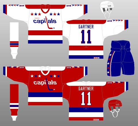
The introduction of the Reebok Edge uniform system gave NHL teams an excuse to completely change their look.
The Capitals took full advantage of the opportunity, bringing in a modernised version of their original threads.

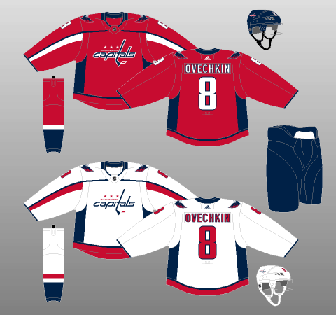
Having waxed lyrical about the Capitals having made two separate primary logos on their original kits, I should point out they also did so in this redesign. Yes, the “capitals” wordmark is blue on both the white and the red jerseys, and the puck is red on both, as well. However, the “WASHINGTON” wordmark and the three stars above it are different colours on each, a small – but welcome – bit of attention to detail.
An even more excellent touch within the logo is the use of three stars. As reader Rob Schroeder informs me, the use of three stars is a reference to the motif used on the flag of Washington, D.C. – which is itself a reference to the family crest of founding father George Washington. Really cool stuff!
As for the construction of the logo itself, it’s important to note it’s not quite the same as the original crest (you can compare the two directly via the throwback jersey at the bottom of the above image). The letters are slanted towards the right instead of the left, and the cross of the T is seamlessly integrated into the surrounding text.
Up on the shoulders, there’s a brand-new secondary crest, too, consisting of a stylised eagle with its wings and head forming a “W,” while the Capitol Building is silhouetted below. It’s definitely aesthetically pleasing, although it might be a bit too simple and generic-looking to stand on its own.
The jersey body itself is relatively plain, with a thin blue stripe – navy blue, unlike the originals – atop a thicker band of red – a more muted tone that the original – at the very bottom of the jersey tail, along with a thin band of navy blue at the cuff. There is more navy throughout, from giant sweat stain-esque blocks under the arms to a thin trim stripe on the front of the jersey which extends from the cheap-looking navy-blue collar all the way down to the wrist.
This shoulder stripe is trimmed with a contrasting flourish, white on the red jerseys and red on the whites. Curiously, this solitary stripe does not have a mate on the back of the uniforms, eliminating the potential for a full shoulder yoke and altogether unbalancing the kits.
Navy blue also takes precedence on the socks, with only the bottom half allotted to the given uniform’s primary colour, a block of shading interspersed with a single, contrasting stripe. Given the Caps use navy pants, this design choice creates a substantial, uninterrupted block of navy blue extending from the stomach to below the knees, somewhat stealing the thunder of the kits’ primary colors. This oversight, however, would be addressed (and altered slightly) for the 2012-13 campaign.
All in all, it’s a pretty futuristic-looking ensemble. Even the font is on-brand, no-nonsense yet sleek and subtle, and trimmed with flush accents. I do have a bit of an issue with the captaincy letters, though. They’re much too small, in my opinion.

That all said, just because it’s futuristic doesn’t mean it’s good. The pit stains look ridiculous, with their perpendicular intersection with the tail striping rendering them doubly absurd. And then, in stark contrast to this blockiness, there is the single, swoopy, asymmetrical shoulder stripe with a swoosh of trim underneath. Thoroughly frustrating to look at, this kit.
Simply put, the Capitals had a chance to pay humble homage to one of the most universally adored uniform sets in NHL history. Instead, they tried to do something different with a similar design and palette, and ended up with a grotesque frankenjersey that, outside of the logo, doesn’t really do a good job honouring the past, and isn’t very nice to look at in the present, either.
Worst, of all, logos aside, the overall design is just…boring. It’s bad, yes. But not so bad that it’s interesting. It’s just a poorly thought-out design with sub-par execution. It’s as simple as that.
In trying to do everything, the Capitals ended up with nothing.
Capitals Embrace Colourful History
For the 2011-12 season, the Capitals took their Winter Classic kit from the season previous and implemented it as their full-time alternate uniform.

There’s not a whole lot I haven’t already covered with regards to this kit, but it is interesting the Caps decided to go with red pants, which were only used during their first season (they wore blue the rest of the time), and only part-time, at that. Given the preponderance of red on these uniforms, I would have thought blue would’ve been the better choice.
Interestingly, though the Capitals did use red helmets during this uniform’s debut at the Winter Classic, they wore white ones when the design was implemented on a full-time basis, a marked downgrade in color balance.
For 2015-16, the Capitals did away with the white throwbacks in favor of a red version, presumably to make it easier for them to wear their alternate kits at home.
As with the white throwback, the red uniform is, largely, a faithful replica. One change of note is the WASHINGTON part of the wordmark is white, rather than blue.
Unlike with their white alternates, these red kits make use of the bright blue pants from Washington’s first uniform design. Unfortunately, the red helmets are also carried over, with the Capitals again missing a chance to better balance an ensemble. In my view, they should have gone with blue buckets, instead. Alas…
(P.S.: Note the new pattern inversion on the socks of Washington’s standard home and away kits, along with the slight striping change on the home socks).
ADIZERO Era No New Beginning
The ADIZERO uniform system came into effect for 2017-18, and the Capitals did largely nothing to celebrate the occasion.
The overall design is much cleaner, with straighter, more conventional lines used for the shoulder striping and trim.
However, with the exception of the underarm sweat stains being slightly shorter, the only other apparent change is the intersection – or lack thereof – of the shoulder striping and the collar.
On the Reebok Edge iterations of the design, the navy stripe made its way up the arm and intersected with the navy collar.
Here, the line intersects with the collar piece as a whole but, because the Capitals did not elect to fill in the outer portion of the neckpiece (a wise decision), the stripe just kinda ends in the middle of nowhere. Could they not have colored in a small meeting point on the collar? Or else directed the striping upwards to intersect with an already colored bit? It’s just mystifying how something like that gets overlooked – or else gets noticed and is allowed to stand.
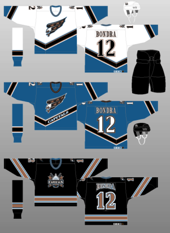
Screaming Eagle Returns With Reverse Retro Twist
After the Adidas Reverse Retro jersey series was announced, fans across the NHL waited excitedly to see how their favorite teams would pull off a new nostalgic look. For the Capitals, this meant a return to a former kit, the 1990s ‘Screaming Eagle’.
This Reverse Retro felt like more of a correction than a brand new jersey, as it fixed one of the glaring issues of Washington’s original look. Gone was the blue and white of the 90s; instead they utilized a deep red as the primary color, which is what the Capitals are known. This, along with a perfect blue and white striping adorning the bottom and sleeves with the word ‘CAPITALS’ held within makes for one of the best looking jerseys on the market.
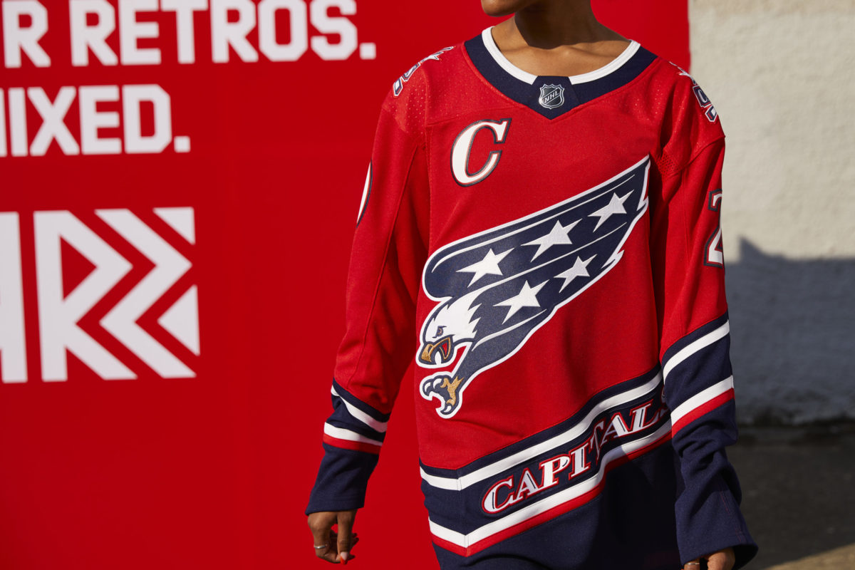
This opinion was held by fans as well, who made Washington’s Reverse Retro the best-selling jersey in the series. Given how positive and strong the response has been to the new ‘Screaming Eagle’, it wouldn’t be a surprise to see the Capitals make this a permanent addition to their line-up.
Capitals at a Kit Crossroads
The current Capitals’ look is over a decade old. It’s probably time for something new one of these years.
Whether they choose something from their past (I’m sure nobody would be disappointed with either of their two previous uniform sets) or go for something completely different, it’s clear the Capitals need to get back to doing what made them such a good-looking team in the first place.
That means being bold, taking chances, not being afraid to look outside hockey’s comfort zone.
Unfortunately, the Capitals have boxed themselves in, doubling down on a deeply flawed design despite having the perfect opportunity to go in a new direction with ADIZERO.
Like much of Capitals’ history, then, their current uniforms are a tale of squandered potential.
That said, the on-ice product finally put things together in 2017-18… Maybe their designers won’t be far behind?
Free Newsletter
Get Hockey History coverage delivered to your inbox
In-depth analysis, breaking news, and insider takes - free.
Subscribe Free →