- The Mighty Duck
- Wild Wing
- The Mighty Duck: Version 2.0
- Mighty Ducks Primary Script
- Mighty Ducks Secondary Script
- The Duck Foot
- The Duck Foot: Debut
- Anaheim Ducks Current Logo
- The Duck Foot: Dominance
- Anaheim Ducks Current Secondary Logos
- The Mighty Duck: Version 3.0
- The Mighty Duck: Version 4.0
- Orange Duck Revolution
- Anaheim Ducks Logo – Just Ducky
Despite that they’ve only been around for 32 years, the Anaheim Ducks sure do like taking a walk down memory lane.
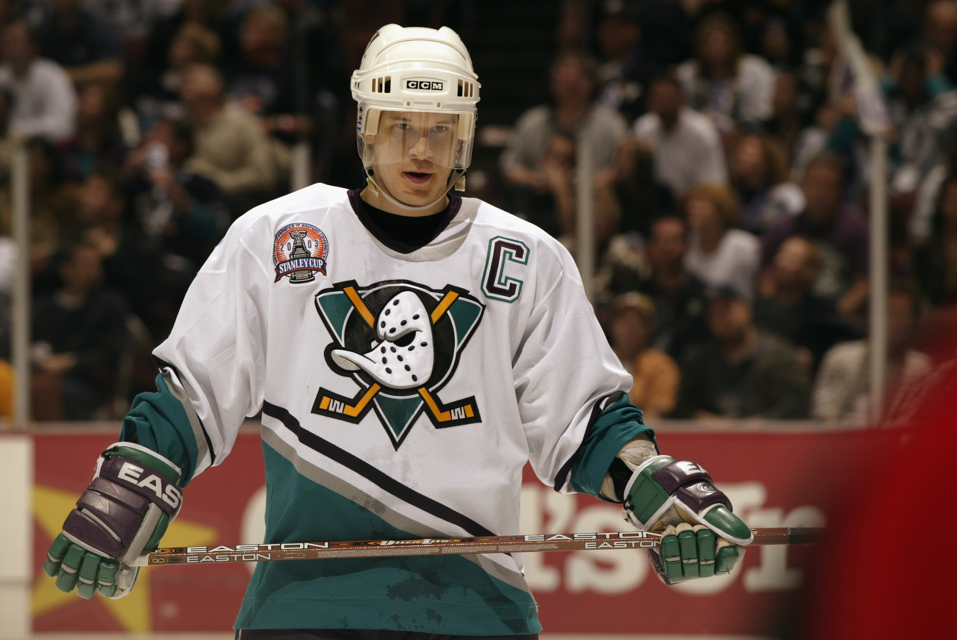
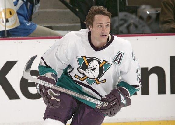
After he spent parts of six seasons with the team, the then-Mighty Ducks brought back Teemu Selanne for the 2005-06 season (and the eight that followed), four years after shipping him to the San Jose Sharks at the 2001 Trade Deadline.
Former Ducks head coach Randy Carlyle, too, is a retread. He first coached the club for seven seasons after the 2004-05 lockout (a tenure that included winning the 2007 Stanley Cup). He was rehired for 2016-17, guiding the Ducks to the Western Conference Final before being fired again in 2019.
Unsurprisingly, the Anaheim Ducks’ logo history bears the same commitment to nostalgia. What’s that? You prefer to think of it as a lack of imagination? I mean, how can you say a team that ripped off the title of a children’s movie lacks imagination? Especially when they were founded and owned (until 2005) by Disney, a company that tries to sell “platinum” and “remastered” editions of films that have been out for decades? Stop talking nonsense!
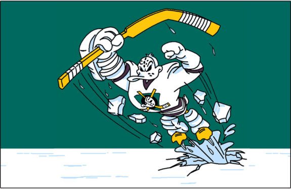
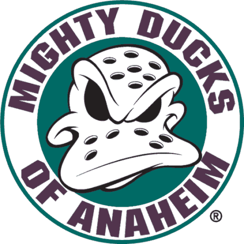
The Mighty Duck
The Ducks’ inaugural logo is one of the most enduring images of the 1990s. The arrival of new teams, not to mention the…creative stylings and colour trends of the time, broke the mould of the NHL uniform. In the case of the Mighty Ducks (of Anaheim), it worked out rather well.
The Ducks’ very first primary logo depicted a duck-shaped goalie mask on top of a cross of two hockey sticks…on top of a black circle…on top of an upside down triangle. Complicated, to be sure and a little cartoonish.
But a good logo takes time to work its way into the heart. Penguins aren’t exactly known for their aggression, but Pittsburgh’s Skating Penguin logo is now one of the NHL’s most iconic crests.
The Ducks’ first attempt at a logo has aged well, too. The darkness behind the mask, not to mention the mask’s angry expression, suggests some sort of vengeful, supernatural power is at play. It stands as one of the most iconic logos of the ‘90s, the aesthetically unhinged decade in which it was difficult to stand out. I was ecstatic when the Ducks brought it back as a shoulder patch in 2010, and as a primary logo in 2015. But more on that later.
Wild Wing
Named after the Ducks’ mascot, this…interesting primary logo was featured on Anaheim’s alternate jersey introduced for the 1995-96 season, as part of the NHL’s “Fashionable Authentic” uniform program.
…yeah. Needless to say, neither this logo, nor the abomination of a jersey it adorned, returned for a second season.
While I respect the creative attempt and the enthusiastic embrace of newly available printing techniques, this Ducks’ logo, along with those of the Los Angeles Kings and St. Louis Blues from the same year, was atrocious.
At least the Kings and Blues had decades of history behind them, which allowed some leeway to make such a mistake. Anaheim, however, had played only two seasons (a season and a half, if you factor in the partial lockout in 1994-95) when they debuted this beauty. The Wild Wing kit might have brought the team publicity, but it must also have damaged the credibility of the fledgling Mighty Ducks in the crowded California sporting scene.
You may also like:
- Ducks Should Re-sign Trouba or Carlson, But Not Both
- Ducks News & Notes: Playoff Recap and Offseason
- NHL Playoffs 2nd Round Takeaways: Marner, Hurricanes & Avalanche Rolling, & More
- Should the Maple Leafs Take a Swing on a Top UFA Defenseman?
- NHL Rumors: Mikheyev Market, Berbube to Oilers, Carlson’s Future with Ducks
Neither the Kings nor the Blues had run into problems with their primary crests previously. The Mighty Ducks, on the other hand, had a cartoon logo taken from a movie (albeit a live-action movie). A cartoon drawing of an already caricatured mascot for a team whose name evoked no emotion? Using this logo for a professional sports club was as ill-conceived as the crest itself was ill-designed.
The Mighty Duck: Version 2.0
After the Wild Wing debacle of 1995-96, the Mighty Ducks went a little more conservative in designing their secondary logo, which was used as the shoulder patch for their home and away jerseys.
The circular border bears the team name, while the goalie mask is squared up to the viewer, instead of staring slightly off-centre, as in the primary crest. However, I’m not happy with the lack of continuity between the Mighty Duck primary logo and this shoulder patch.
The quantity and pattern of the holes on the mask are different. Plus, the disembodied duck head appears to have a lower lip or bill (do ducks even have lips?), an implication that, yes, this is indeed an actual duck rather than a duck-shaped goalie mask with a mysterious presence behind it. So, like, is the duck horribly disfigured? It is the spawn of Jason Voorhees and a mallard? I have so many questions.
Mighty Ducks Primary Script
In 2003, the Mighty Ducks made a rather timid effort to re-enter the world of the alternate jersey, debuting a black and eggplant kit with a script-based primary crest. The lack of imagination that went into the crest matches the drab, colorless and uninspired appearance of the jerseys they adorned.
Mighty Ducks Secondary Script
These alternate jerseys also featured a new shoulder patch, consisting of the letters “M” and “D” overlapping. Real original.
There’s really nothing of substance here, so I shan’t go into them further. The alternate kit, logo included, disappeared after the 2005-06 season. Just a few years later, many people would fall madly in love with script logos (see: Wild, Minnesota). These people are wrong. Thankfully, the Mighty Ducks got out early. Sort of.
The Duck Foot
The Duck Foot: Debut
Before the 2006-07 season, the Mighty Ducks became the Ducks and completely redesigned their uniforms in an effort to rebrand. Gone was the jade and eggplant color scheme, replaced by a harder, darker, meaner palette that emphasized black and was trimmed with gold and orange. The logo, too, changed, from the Mighty Duck to a stylized script. The “D” in the logo was particularly clever, resembling a duck’s foot – and also a duck in flight. I am no fan of script crests, but the Ducks at least put some effort into this one.
The rebrand arrived just in time, as the Ducks won the 2007 Stanley Cup in their new duds. Not a bad debut for the Duck Foot logo.
Anaheim Ducks Current Logo
The Duck Foot: Dominance
The 2010-11 season saw the Ducks introduce a bold new third jersey, featuring the aforementioned “D” isolated and utilized as the kit’s primary crest.
This logo looks rather good; certainly better than the script version. The Ducks must have thought so too as, in 2014, they made the Duck Foot jersey their full-time home uniform, introducing a white counterpart for the road.
The Duck Foot is a fine logo, to be sure. However, there’s just no getting around the fact that it’s…a little plain. I’m sorry, it just is. It isn’t fearsome, it isn’t mysterious; it doesn’t really evoke anything at all. I think it would be better utilized as a secondary emblem, especially since…
Anaheim Ducks Current Secondary Logos
The Mighty Duck: Version 3.0
…the team chose to bring back the Mighty Duck on the shoulder patch of these jerseys.
The oval pattern surrounding the appropriately tinted Mighty Duck logo features “Anaheim Ducks” in the team’s lovely, flourish-laden number font, which would make it a good choice as a primary logo. But you know what would look even better?
The Mighty Duck: Version 4.0
Yes! The Ducks actually listened to their fans. Praise be!
Anaheim introduced a phenomenal orange alternate kit in 2015-16. Front and centre in this spectacular effort is the Mighty Duck logo, free of textual accoutrement and colored to suit the team’s updated palette.
One of the easiest criticisms to hurl at the original iteration of this logo was its cartoonishness. However, hardened by the team’s updated color scheme, it looks properly aggressive. It also helps that the gold-colored hockey sticks now match the color palette; they stuck out prominently on the original jerseys.
I should also note that the Duck Foot logo is used as a shoulder patch on these uniforms. Nice. The Ducks got this one bang-on but Adidas phased out third jerseys when they took over making NHL sweaters for the 2017-18 season, so it disappeared after two seasons.
For 2017-18, the Mighty Duck logo only appeared on the shoulder patches mentioned above, but it returned to the chest of a third jersey reminiscent of the Ducks’ original away sweater in 2018-19.
For this change, the Ducks tweaked the Mighty Duck making the triangle silver rather than gold and the crossed sticks red rather than orange. Luckily, the logo from 2015-17 returned for 2019-20 along with the orange jersey.
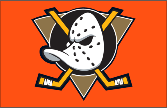
Orange Duck Revolution
During the 2024 offseason, Ducks leadership unveiled the franchise’s new logo and jerseys. The new design still features the famous duck mask logo but now uses vibrant orange as the primary color in a nod to Orange County, where the team is located. Gold accents also shimmer in the logo, which was intended to remind fans of the county’s beaches.
Anaheim Ducks Logo – Just Ducky
So, there you have it. The Anaheim Ducks, like so many NHL teams before them, inexplicably did away with something fans liked. But unlike most of their counterparts, they had the sense to make things right.
It is a gradual process, to be sure – the orange kits with the Mighty Duck logo are still just alternates. But can a full-time uniform set with this logo arrangement really be far behind?
(All logo images are thanks to Chris Creamer’s SportsLogos.Net)
* originally published in July 2017
Free Newsletter
Get Ducks History coverage delivered to your inbox
In-depth analysis, breaking news, and insider takes - free.
Subscribe Free →