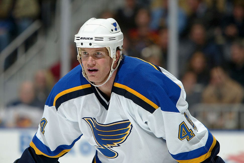
Hockey fans know that North Stars owner Norm Green earned his infamy by moving the franchise from puck-loving Minnesota to Texas, where high school football draws more interest than the NHL.
Fewer know that Green had already flipped the team’s cherished “N” logo over the glass and out of play even before the club swapped hot dish for enchiladas.
The graphic history of the Stars franchise, like the on-ice story, has a few highs, some lows and lots of in between. In the first of a four-part study of the team’s uniforms and logos, we’ll look at the years in Minnesota and the move to Dallas.
Team from the North Country
The National Hockey League’s 1967 expansion, which doubled the size of the six-team circuit, awarded a franchise to Minnesota. No NHL team had featured green as a primary color since 1927. The Toronto franchise changed its nickname from Arenas to St. Pats in 1919 and wore green and white through the 1926-27 season. During that campaign, Conn Smythe purchased the team, changed the name to Maple Leafs in midseason and switched the colors to blue and white the following summer.
The color green then all but vanished from the NHL for 40 years. The only exception was a minor one. The Chicago Black Hawks introduced green as an accent color in their vividly redesigned “Indian Head” crest in 1955. In 1959, green also appeared in Chicago’s crossed-tomahawks shoulder patch.
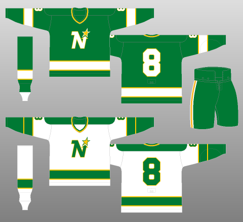
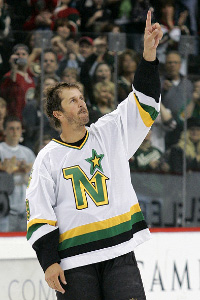
The Minnesota North Stars and California Seals both took the ice in Kelly green gear as the Summer of Love faded to autumn. While the Seals’ scheme was tweaked repeatedly before the doomed team’s demise, Minnesota began its history with more consistency. The North Stars wore an all-green set at home and a white jersey over green pants on the road. They trimmed it all with athletic gold, the traditional secondary color for green teams. It was a look evocative of the snowy forests and prairies of their home state.
The logo incorporated a star and a northerly arrow into the letter “N.” Hindsight might see it as clunky and dated, but at the time it was a cutting-edge example of “mod” design, which favored blending letters with other graphic elements.
Minnesota’s inaugural gear survived essentially intact, with only minor changes to the striping, through the 1973-74 season. For 1974-75, the NHL mandated that teams wear their dark jerseys on the road, and the North Stars took advantage of the change to add a bit of 1970s funkiness to their look. The new sweaters had a double stripe. But more significantly, both the “N” logo and the numerals were given a bold drop shadow, historically associated with the New York Rangers among NHL styles.
Roll Out the Gold, Paint (Some Of) It Black
When the hapless Cleveland Barons were absorbed into the North Stars in 1978, Minnesota celebrated by adopting yet another striping pattern, this time a more contemporary motif that gave gold a bit more play.
1980s graphic style favored the edgy over the festive, and in 1981, Minnesota anticipated the times by adding a black stripe to the home jerseys and socks. In 1988, the team adopted black pants with gold stars replacing the usual stripes. Black was also added to the road socks and sweaters.
By the next decade, Norm Green might well have already been plotting his betrayal of NHL fans in Minnesota. In 1991, the North Stars underwent the first complete graphic overhaul in franchise history, perhaps in anticipation of transitioning into a new market with a less Minnesotan look.
The primary evidence for ulterior motive lay in the new logo. The beloved “N” – by now looking a bit quaint – was replaced with a “Stars” wordmark over a green star. No “N,” no “North” to be found.
Consistent with the toned-down styles of the new decade, the 1991 uniforms were mostly black and white, with green and gold relegated to accent status. The home whites were trimmed mainly in black, while the road jersey was a black-and-white affair. The black pants lost their gold stars in favor of a low-key green stripe.
Finally, the athletic gold color, a bit bright for 1990s tastes, had been replaced by a darker, metallic gold that only appeared in the logo. The drop-shadow on the numerals was gone, too. The North Stars had abandoned their old look and the moving trucks soon followed in 1993.
The Stars Say Howdy, Texas
With the team already having been made graphically ready for a new home city, the Dallas Stars played their first season in essentially the same unis as had been worn during the grim finale in Minnesota. The only changes were a couple of regional touches.
The team added a Texas-map shoulder patch to the jerseys. This graphic also became a secondary logo. It consisted of an angular, cartographically questionable outline of Texas (the Trans Pecos region is mysteriously enormous). Inside the white state shape was a star identical to the one in the primary logo. At the star’s eastern tip sat a block letter “D” marking Dallas’ place on the map.
Finally, the word “Dallas” in gold ran down the side of each pants leg, thus adding a bit of flair to an otherwise basic look. It was in these uniforms that the Dallas Stars began their Lone Star years, leaving the land of lutefisk and shinny to the pages of club history.
This article was originally posted in October, 2014.
Free Newsletter
Get Archives coverage delivered to your inbox
In-depth analysis, breaking news, and insider takes - free.
Subscribe Free →