- 32. Florida Panthers
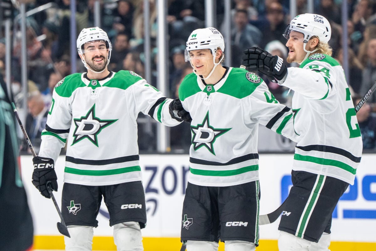
- 31. Dallas Stars
- 30. Columbus Blue Jackets
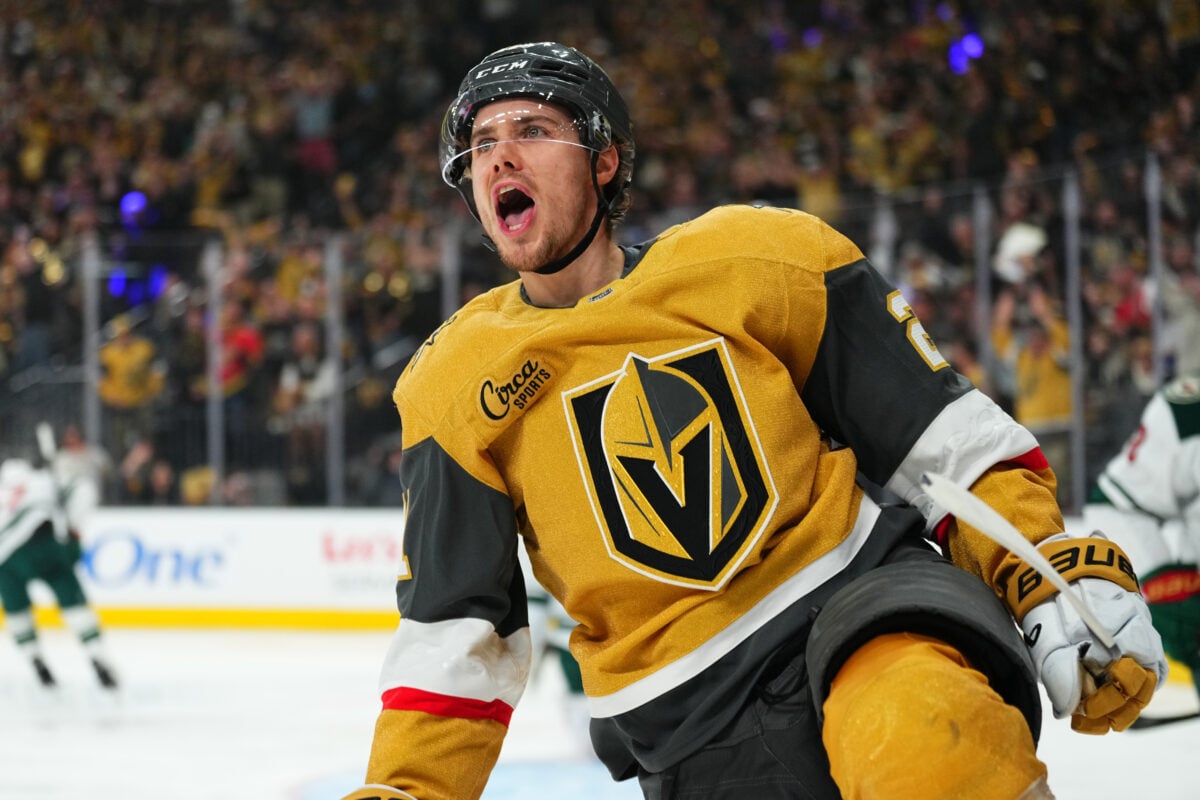
- 29. Vegas Golden Knights
- 28. Carolina Hurricanes
- 27. Washington Capitals
- 26. Seattle Kraken
- 25. Winnipeg Jets
- 24. Nashville Predators
- 23. Tampa Bay Lightning
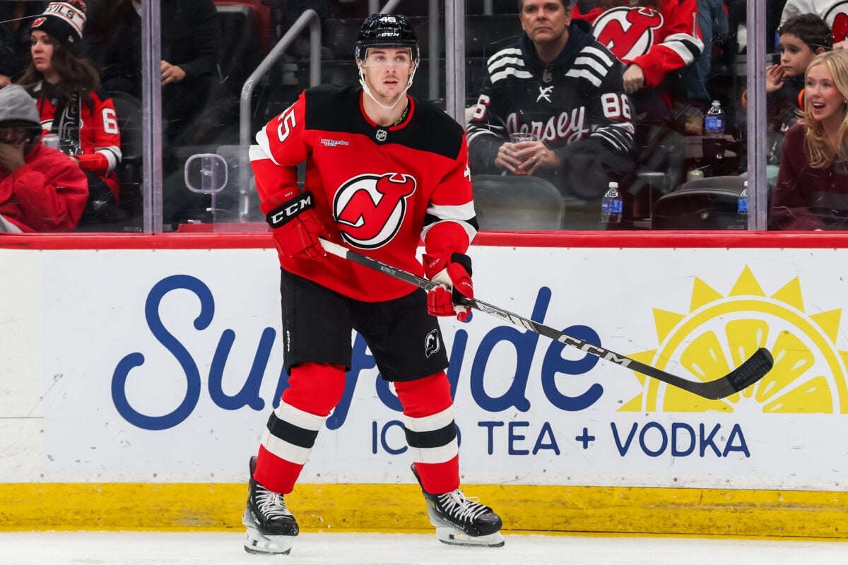
- 22. New Jersey Devils
- 21. New York Islanders
- 20. Minnesota Wild
- 19. Los Angeles Kings
- 18. Ottawa Senators
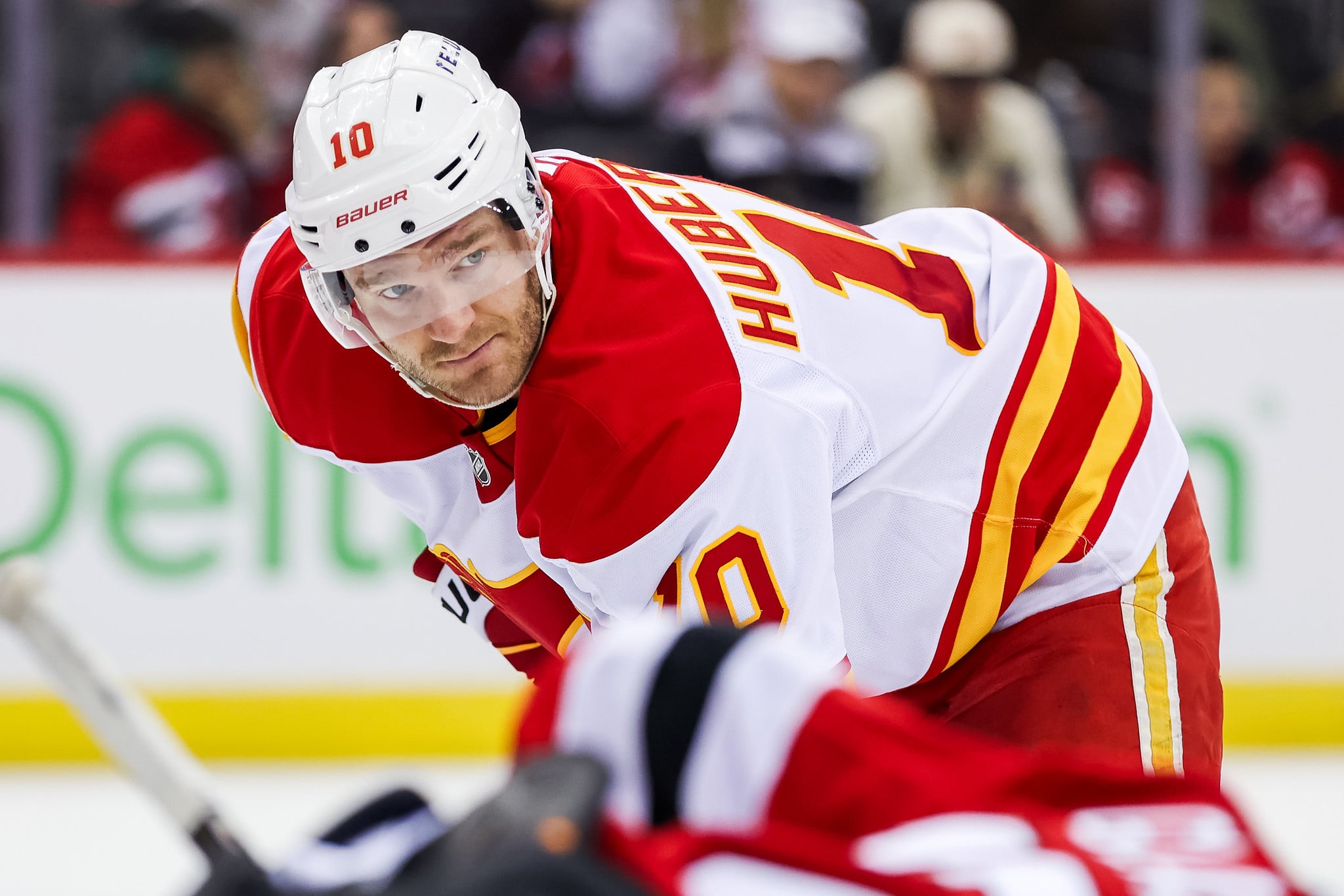
- 17. Calgary Flames
- 16. Edmonton Oilers
- 15. Vancouver Canucks
- 14. San Jose Sharks
- 13. St. Louis Blues
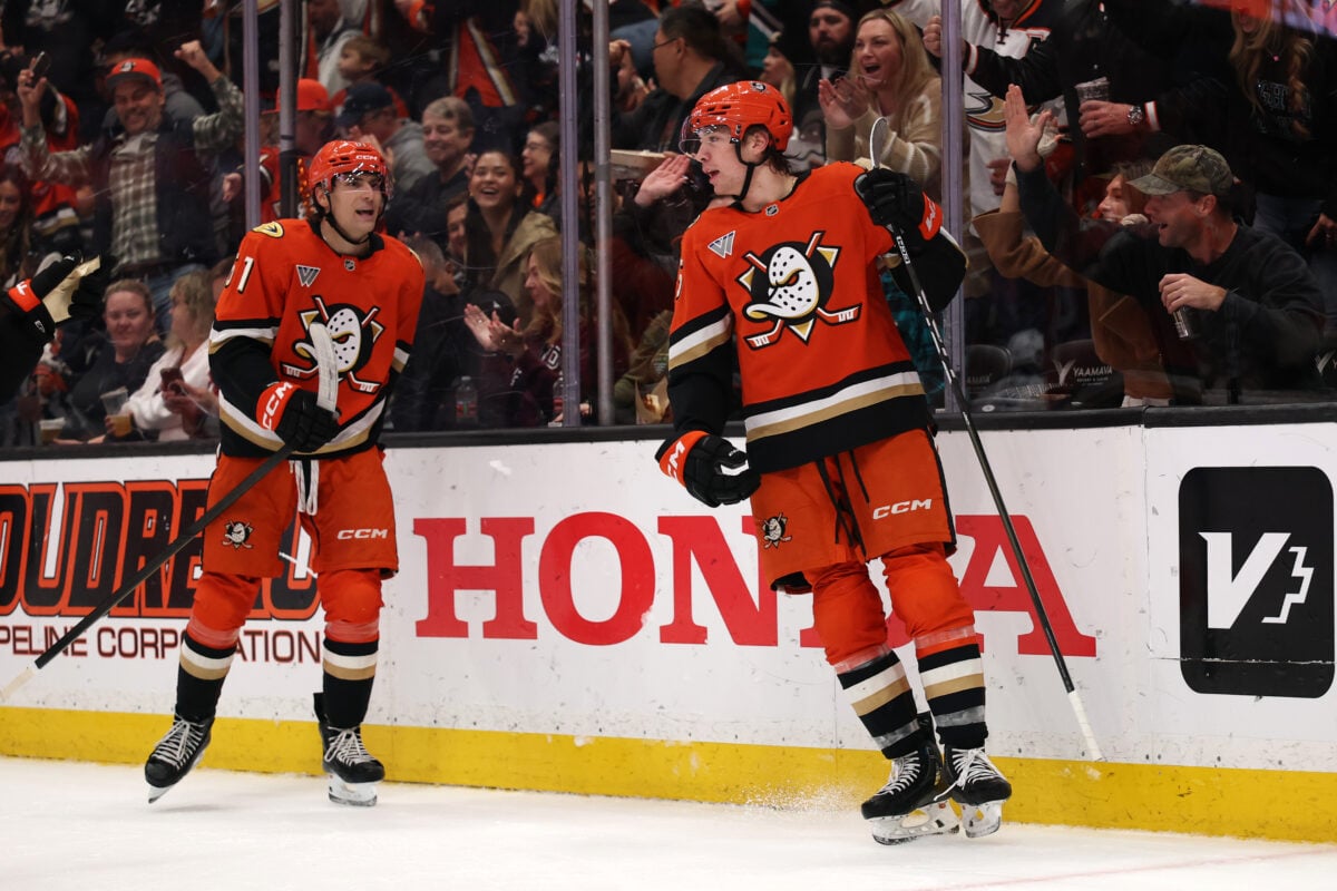
- 12. Anaheim Ducks
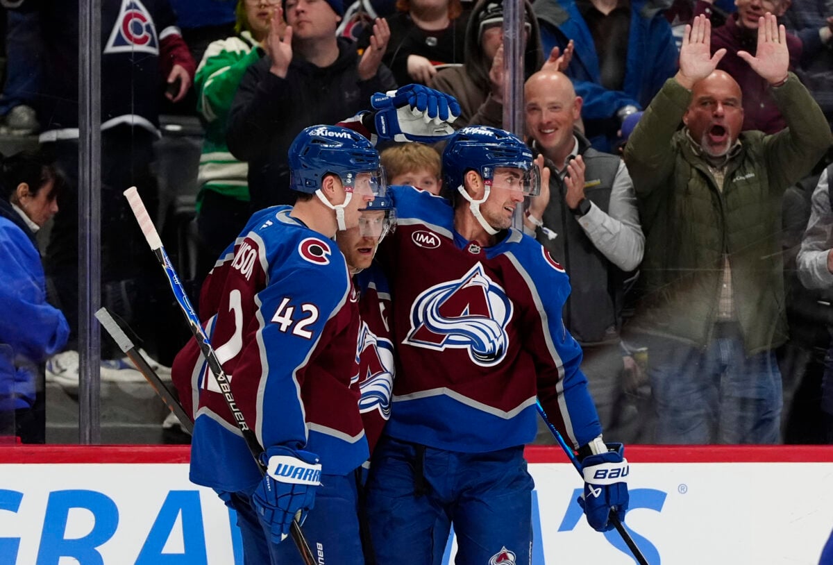
- 11. Colorado Avalanche
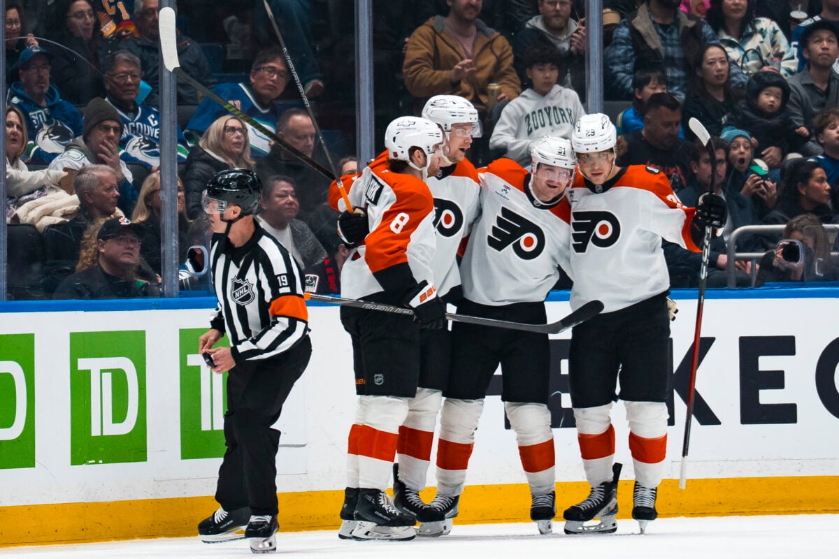
- 10. Philadelphia Flyers
- 9. New York Rangers
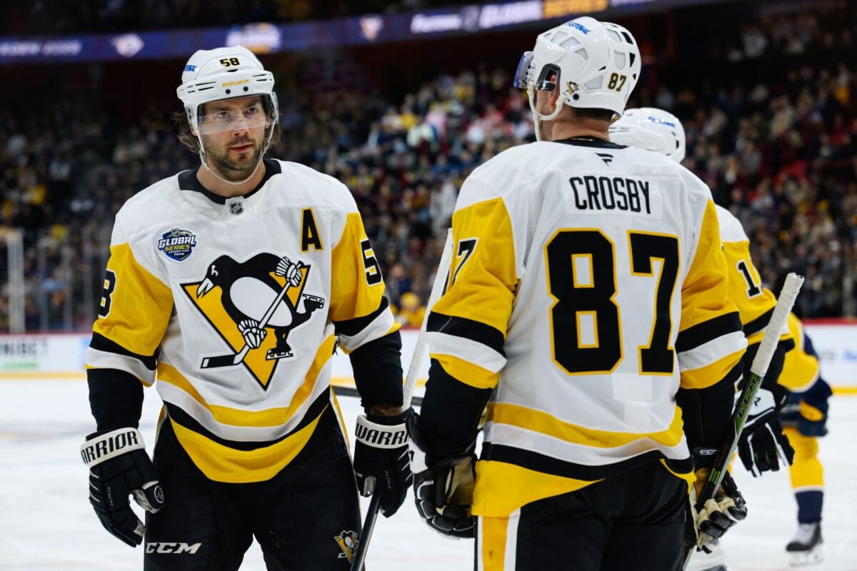
- 8. Pittsburgh Penguins
- 7. Utah Mammoth
- 6. Boston Bruins
- 5. Chicago Blackhawks
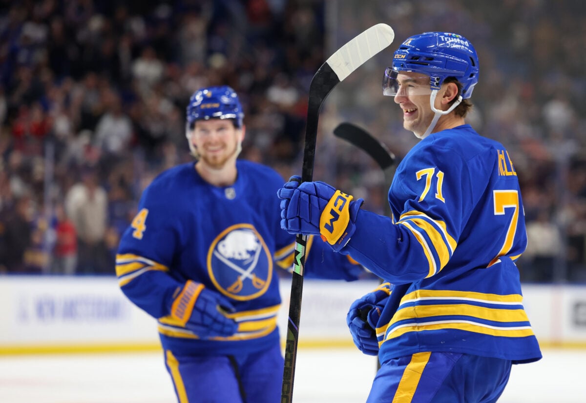
- 4. Buffalo Sabres
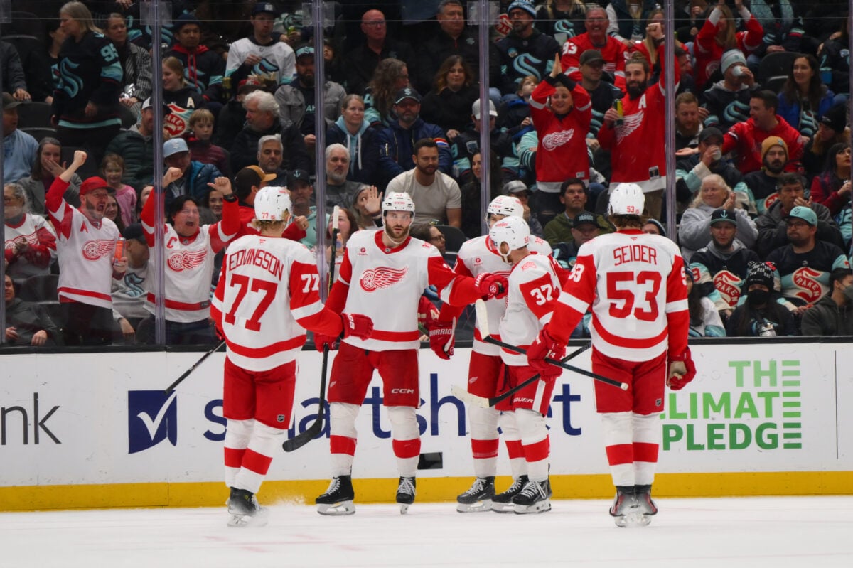
- 3. Detroit Red Wings
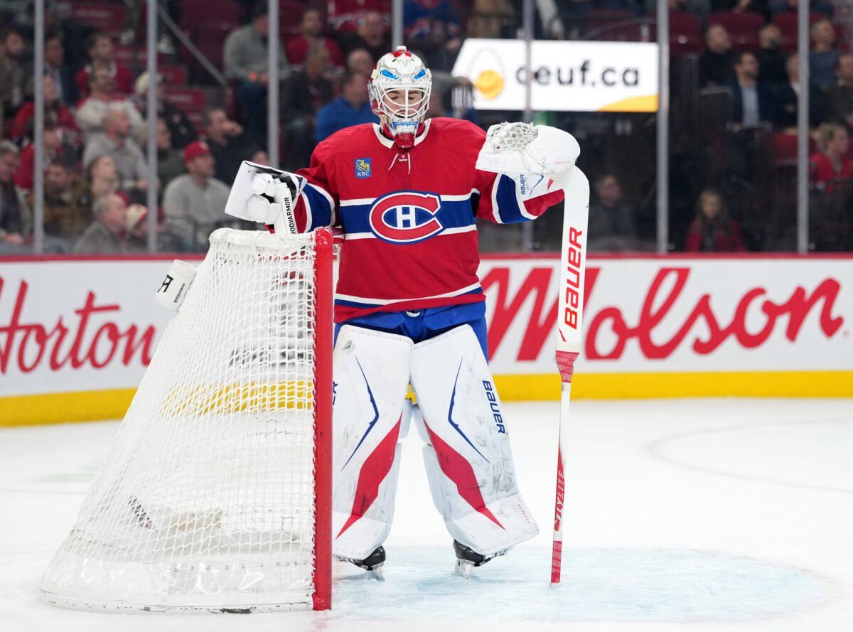
- 2. Montreal Canadiens
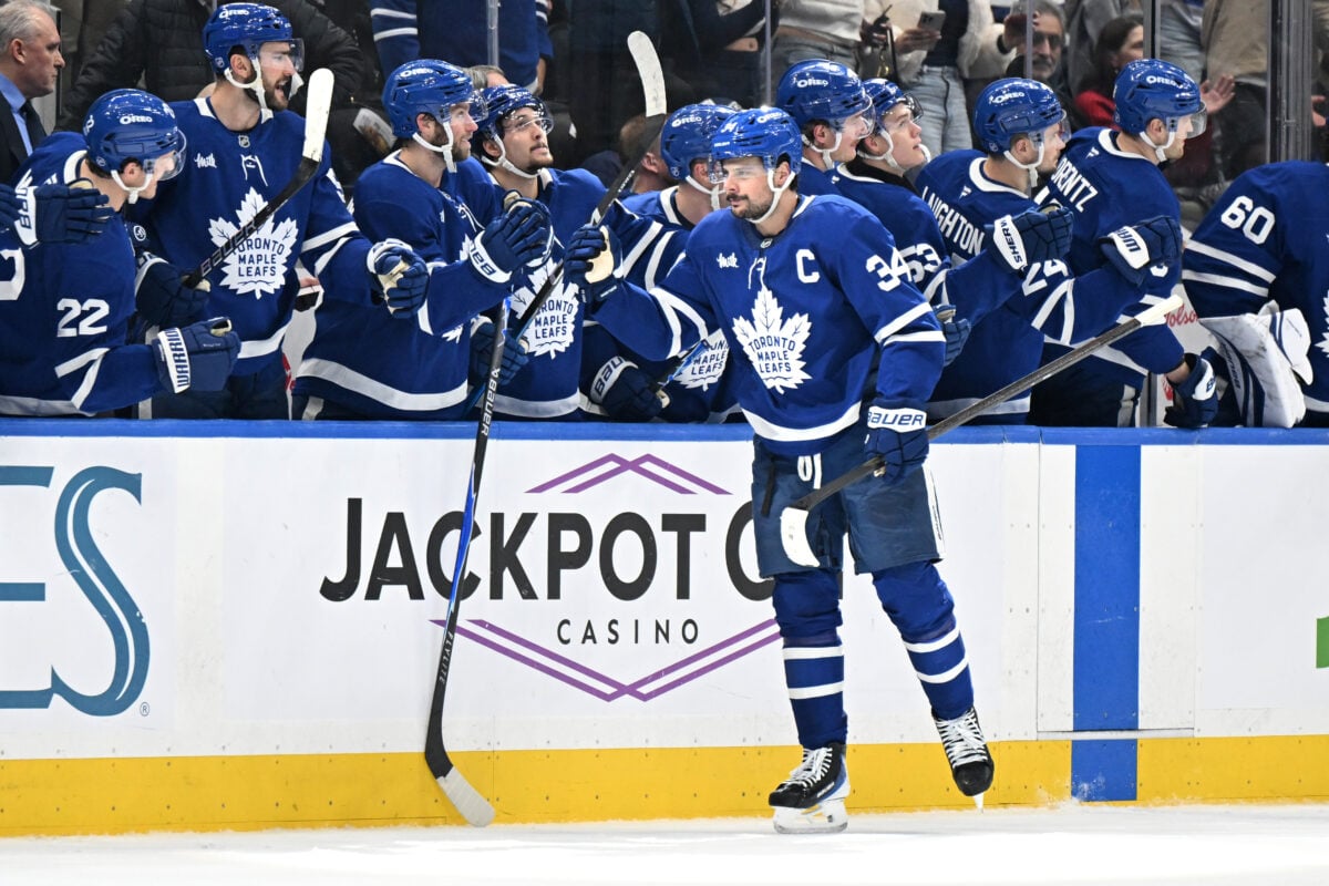
- 1. Toronto Maple Leafs
*this archive was originally written by Ethan Carter
The NHL has some of the most historic and unique logos in the entire world of sports. Now that there are 32 teams in the NHL with the addition of the Utah Mammoth, let’s rank the logos from worst to best around the NHL. There are many great logos, but there are some that reign supreme over all others.
Here’s my ranking of the logos of the 32 NHL teams. Remember, this is my personal preference, so feel free to add your opinion in the comments below.
32. Florida Panthers
The Florida Panthers’ logo looks more like one for a soccer team than for an NHL team. Their older logo was much better, this is nowhere near as fierce.
I’m a fan of the colors, but I also liked the yellow/gold color that they had with the old one. The logos with a badge-like shape don’t do it for me. While I like the Panther in the logo, the rest of it is not good enough.
The logo of the Scott Mellanby era is far better than the one they have now. While I don’t think I would advocate them returning to this look, they can do a better job.
31. Dallas Stars
I’ve always thought that the Dallas Stars should have gone with a yellow and green color scheme, similar to the Minnesota North Stars that came before them. The brownish-gold and green in their early days in Dallas was better than the silver, white, and green they sport now.
The Stars won the Stanley Cup wearing the brownish-gold uniforms. While that was an old-school look, it is still better than the new-school look they have now.
This all goes back to the fact that the Stars should have kept the same colors as the North Stars. That would’ve been a much cleaner look. Can you imagine a 2019-20 uniform set with those colors? It would be special.
The color scheme is sharp and the logo is great. Just make it a Dallas version and you have something. The current look is solid, but not good enough to make it to the top 25 of this list.
They make up for their logo of today with sharp jerseys and a clean color scheme.
30. Columbus Blue Jackets
I’m all for the color scheme and patriotism shown in the Columbus Blue Jackets’ logo, but I think they have had better looks before than they do now.
The original logo for the Blue Jackets was more vibrant and an overall better look than the current one, in my opinion.
The colors for this logo are lighter and sharper, while the hockey stick is something that shows them as a hockey club.
But if we are all being honest, the main logo for Columbus should be the cannon design.
The colors are top-notch: navy blue, baby blue, and cream. This would be one of the best logos in the league if it were the primary for the Blue Jackets. I love that they wear it as their third jersey, but making this the main one would be a huge win.
29. Vegas Golden Knights
Many hockey fans like the color scheme for the Vegas Golden Knights, as well as their jerseys. But I believe that the Seattle Kraken have a better logo than the Golden Knights. Both of the newest expansion clubs are thought to have great logos, but there is something about Vegas’ that I personally don’t like.
The Golden Knights’ secondary logo is great and leaves many possibilities on a potential third jersey the club might have in the 2020-21 season. The hint of red on their jersey and secondary logo is genius.
28. Carolina Hurricanes
The Carolina Hurricanes logo is solid. The logo they first had after relocating from Hartford, has hardly changed. The colors appear brighter now than they were then and the shape is cleaner.
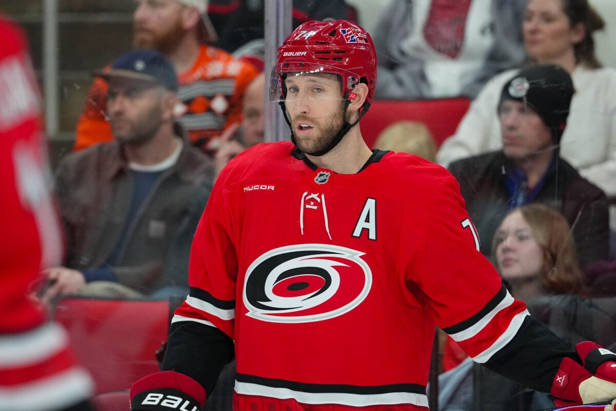
The Hartford Whalers’ logo of the past was unique. The green and blue color combo was something that I liked. Had they kept the same name when moving to Carolina, that would not have been better to me.
It was fun to see the Hurricanes honor the Whalers with the retro uniforms they wore during the 2019-20 season, but what they have now is slightly better.
The Hurricanes alternate logo is pristine. Their black alternate jerseys are glorious and I would be thrilled if they ever switched the look to their number one logo.
27. Washington Capitals
When it comes to the Washington Capitals, I am not a fan of logos that are mainly letters rather than a mascot, so I preferred the early Alex Ovechkin days with the “Screaming Eagle” design.
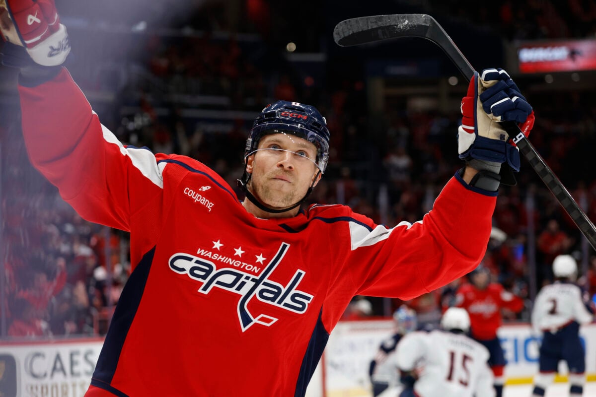
Their secondary logo with the eagle is much better than their main logo. This style would be better with a brighter, more vibrant color scheme. Either way, this is not it.
26. Seattle Kraken
When the Kraken released their logo, I enjoyed it. However, after a few seasons in the NHL, it just doesn’t do it for me anymore. Their logo features a great color scheme and an interesting design.
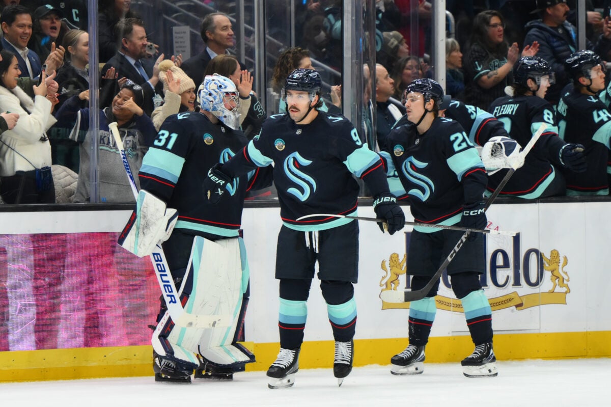
However, I feel like it could have been better, especially after seeing what Utah’s logo looks like (we will get to that later in the list.)
25. Winnipeg Jets
I’m only going to base this off of the current organization and its history. Meaning that the only logos in this Winnipeg Jets’ franchise history are the current one and the Atlanta Thrashers logo.
As for the current logo, I wish they would do something similar to what the original Jets had in the 1990s before moving to Phoenix. The logo now sports an average color scheme and design. It isn’t the worst, but it is nowhere near the best.
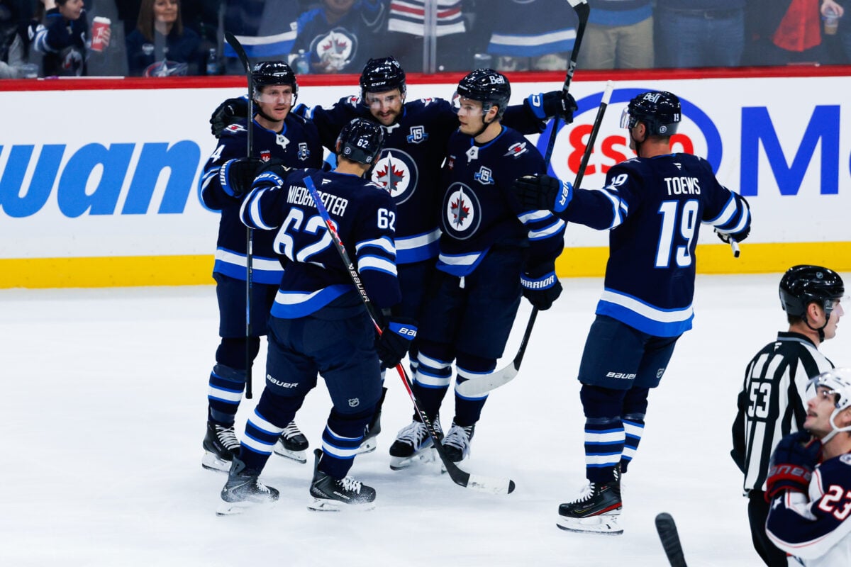
While it has nothing to do with Winnipeg or the Jets, the Thrashers logo was glorious. Bright colors and a unique design that was sharp. It’s too bad that Atlanta could not hold onto a hockey team for the second time.
The Jets’ current third jersey, as seen in the middle below, is an example of what a great color scheme looks like.
The lighter blue to go along with the sharp logo is superb. If they tweaked the logo and added a little red in there and made the jersey in home and away colors, they would surely shoot up this list.
24. Nashville Predators
I like the color scheme of the Nashville Predators and I think their logo is solid but could be better with some touch-ups to the design.
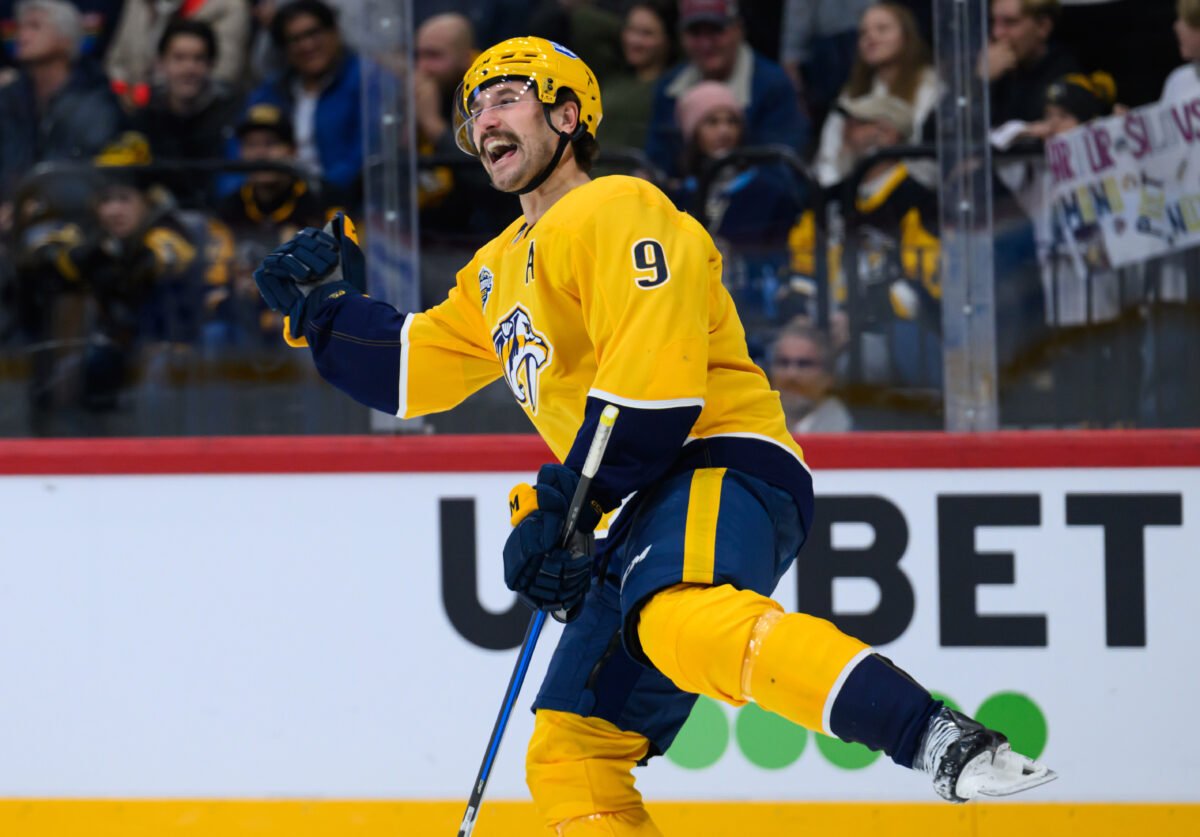
I do think the current one is the best in their 20-plus year history. I think they should have less of the white color and more of the gold/navy blue in it to make it sharper.
Their original logo was similar to the current one but was much uglier. The orange and teal colors are odd, to begin with. I like the shape and the design to a degree, but they improved it much more when it was re-done in 2011. If this was still their logo, it would be in the bottom five.
23. Tampa Bay Lightning
The Tampa Bay Lightning has one of the best names and color schemes in the league. If their logo was more unique, they would break into the top 10 on this list. I love blue and white, though I must say I miss the black they used to have in their logo. They unveiled this design in 2011.

Their logos from 1992 to 2007 were absolute classics. They won their only Stanley Cup in franchise history in 2004 with that logo and jersey. They went away from black in 2011. They have a black third jersey, but it doesn’t do it for me.
I think the Lightning could improve their current logo by adding a black outline to it. Maybe it wouldn’t look good, but it is worth a try. Either way, the Lightning have never had a bad logo in my opinion.
22. New Jersey Devils
Once settling down as the New Jersey Devils, they’ve seen little to no change in their logo. However, their history as a franchise is unique.
Starting off with their current logo, they have darkened the red in the “NJ,” as it was a brighter red from 1992 to 1999. I like the current version, but it isn’t good enough to break into the top 15. The Devils’ logo in general is iconic in hockey.
Before becoming the Rockies and moving to Colorado in 1976, there was a team in Kansas City. I’ve always liked the color scheme that the Scouts had. With a unique logo and great uniforms, if there is ever another team in Kansas City, revitalizing this scheme would be fantastic.
The Rockies used a similar color scheme. This was also a fantastic look and rivals what they did in Kansas City. The logo is better than the Scouts’, but it’s close, a cool look overall.
Finally, we have reached the Devils original logo from 1983 to 1992. This was virtually the same one as they have now, but instead of black, it’s green. I love this Christmas-looking color combination.
This was a great look and the Devils still have an alternate jersey featuring this logo. I would not mind seeing them make the change back to this someday.
21. New York Islanders
The first New York Islanders logo may have been the best one. (From ‘The Islanders Long Island logo comes with history and pride,’ Newsday, 04/24/2019) They have had a similar look for years, with the exception of the fisherman from 1995-1997.

Their current logo has a fantastic color scheme with a good design. It has had few changes since its creation in 1973, and it remains solid overall, making it the second-best New York hockey club logo.
The fisherman logo is a weird one. I like it, but I don’t think it was a long-term logo for them. It wasn’t, as they did away with it after a few seasons, but it remains an odd chapter for the Islanders.
Overall, the logo history of the team has seen little changes, but the first design was great. No reason to mess with it and they haven’t.
20. Minnesota Wild
Since their birth in 2000, the Minnesota Wild have had one logo design. They had “Minnesota Wild” lettering over it until 2013, but the design has stayed the same this entire time.
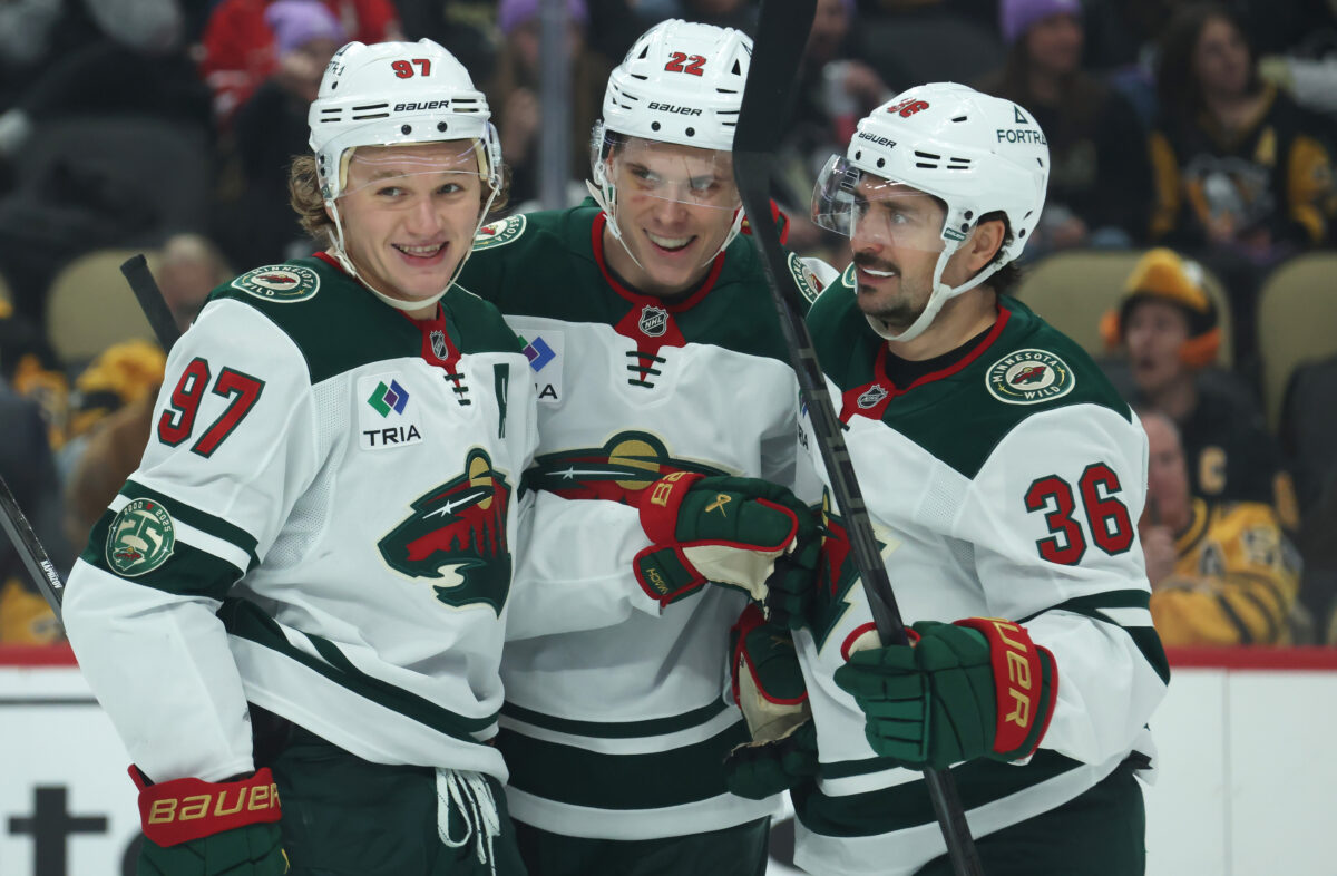
They could have been like many teams and changed up their look after a decade, but they have stayed with their original design and it has been the right move. The colors are perfect and the design is good. They are very close to being a top 10 team, which is impressive considering they have had one primary logo for two decades.
Props to the Wild for having a good logo and bringing hockey back to one of the biggest hockey states in the US.
19. Los Angeles Kings
The Los Angeles Kings’ logo is quite bland and boring. The colors being black, white, and gray doesn’t do it for me. The newer logo is an upgrade over the old, but the color scheme doesn’t do it for me.
The first logo the Kings ever had is better than what they have now. I have always loved the yellow and purple scheme that they once used. It is much more vibrant.
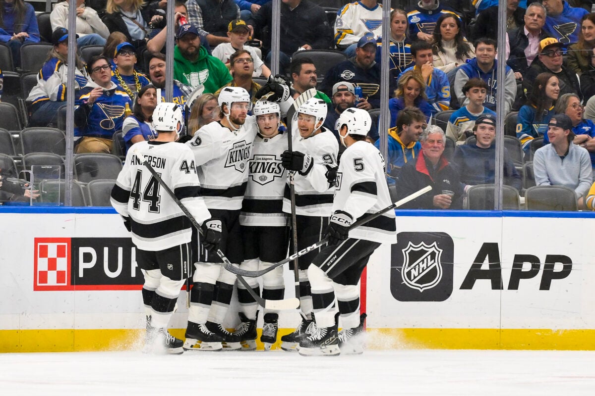
The logo the Kings had when they made the Wayne Gretzky trade in 1988 was superb. While the colors may be boring, the design is great. The crown and shape of the shield to go with the “Kings” font are pristine.
Finally, the logo from the 2000s took on a very Sacramento Kings look. The purple and silver look with black and white accents is solid, and something I still prefer. Overall, anything other than what they have now would work for me.
18. Ottawa Senators
I like this classic look for the Ottawa Senators. It moves them in the grand scheme of NHL team logos. Their former look was not good, so they did the right thing by making the change back to the classic look.

As I mentioned, their logo before the change back to the classic look was the worst in the league. It was just plain ugly. The colors didn’t look good and the design was not good.
17. Calgary Flames
The design of the Calgary Flames’ logo is very cool. The red and gold without the black are fantastic. The white uniform below features the logo that they use now, making a change from the gold and red with black on the outside.
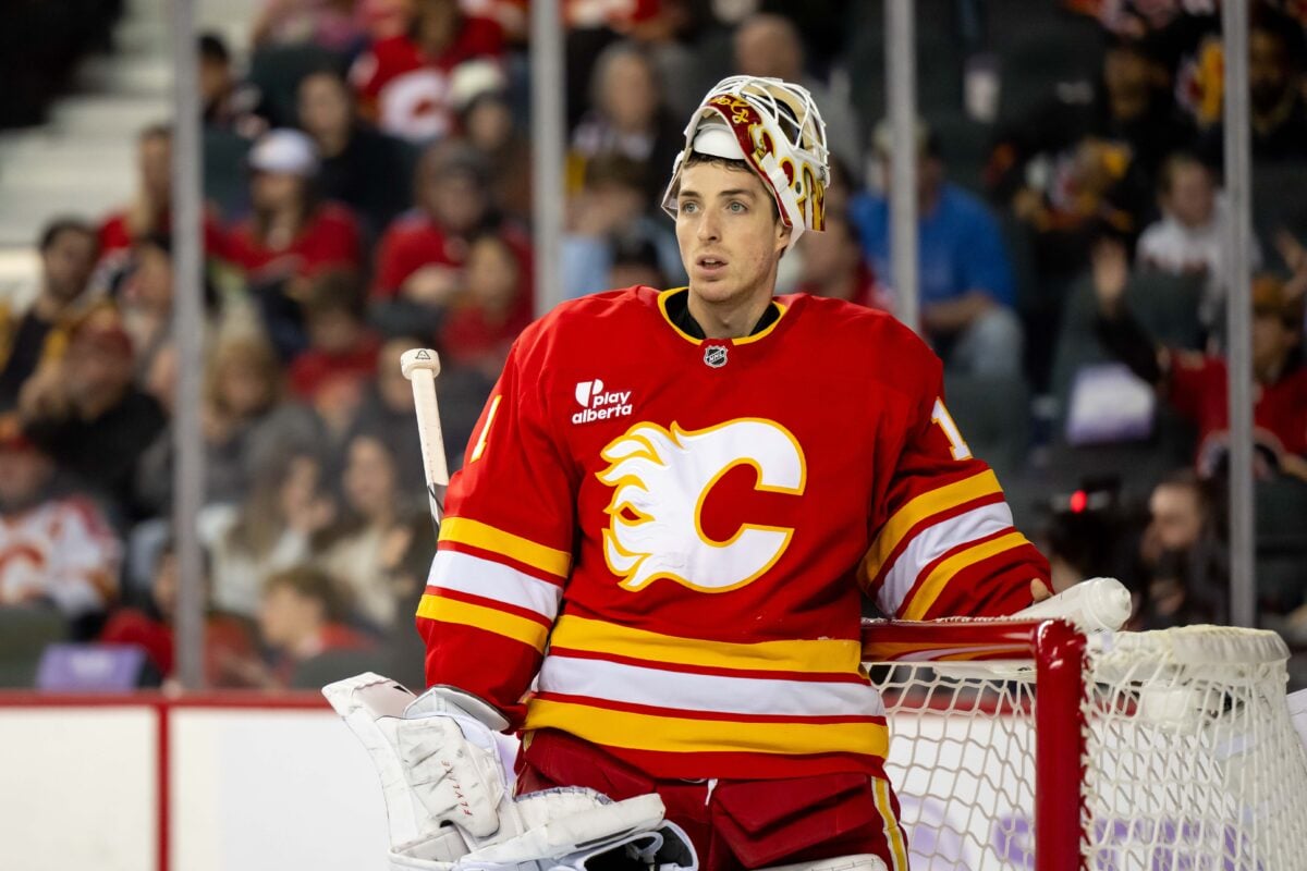
From 1980 to 1994, after moving from Atlanta, the Calgary club sported one of the best logos in hockey, beautiful design with gold and red, and a fantastic uniform to go along with it. The Flames won their first and only Cup in 1989 with this very logo. Thankfully, they finally went back to this design and it pops off the screen.
From 1972 to 1980, the Flames resided in Atlanta, Georgia. The Atlanta Flames, despite their brief history, had a great logo. It’s unfortunate that hockey didn’t work in Atlanta back then, but the Calgary club had a great design to go off of for their logo.
16. Edmonton Oilers
I liked the Edmonton Oilers logo with royal blue in it rather than navy blue because the design is solid and classic.

From 1996 to 2011, they really shook things up with their logo color scheme, adding a tan-like orange color with navy blue and some red around the logo.That logo was bad and I am happy they did away with it less than a decade ago. Connor McDavid would look weird in a jersey with that logo.
The classic royal blue and orange logo they had when Wayne Gretzky and company won four Cups was the best they had. The team went back to that recently and it was the right move.
15. Vancouver Canucks
The Vancouver Canucks have had a unique, yet classic logo history and I’ve always admired it. They have had great color schemes and designs over the years.
Their current logo is good, although it could be better if it featured more green like their uniforms. They made a good decision prior to this season in removing the “Vancouver” lettering.
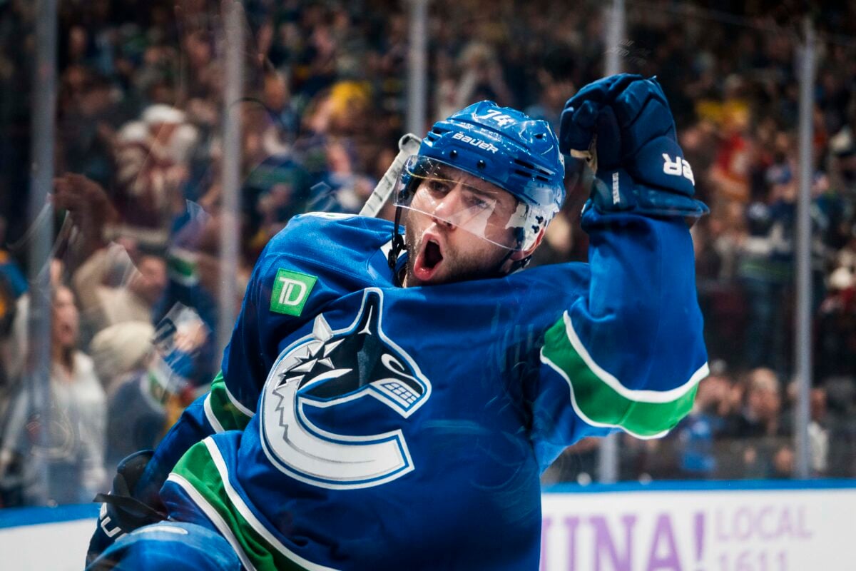
Their logo history from 1970 to 2007 is tremendous, one of the best in the league. They would be in the top 10 if they used one of these now. In 1970, they had the infamous “stick in rink” logo with a great color scheme of green and blue. They use this on one of their alternate jerseys now.
From 1978 to 1997, they had one of the best color schemes in the league, a beautiful skate logo with black, orange, and gold. They have another alternate jersey now that shows that logo in all of its glory. It was one of their best, but it gets better.
Finally, their logo from 1997 to 2007 was the best of the franchise’s history. A beautiful orca, similar to what they have now, but with better colors. The light blue with the dark red is a perfect combination, and they should go back to that. That logo was perfect.
14. San Jose Sharks
The San Jose Sharks have technically had four different logos in their nearly 30-year history, but they have not changed it much over that time. Their current is certainly their best in their history.
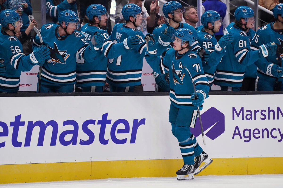
Their first featured a black shark with a yellow-ish hockey stick and a straight triangle, as well as the teal being greener than it is now. I would agree that this one is the second-best in their history.
The Sharks are the prime example of a solid logo history. Nothing over the top or flashy, just a solid design. They have done a great job of not changing too much, which is a good thing.
13. St. Louis Blues
The St. Louis Blues have had a number of looks over the years, a total of eight logos since their birth in 1967. Their first logo featured the glorious blue and yellow, a fantastic classic look.
As far as their current logo, they have blue, navy blue, and gold. It’s a good look, but if they went back to the classic logo they first had, I wouldn’t be opposed.
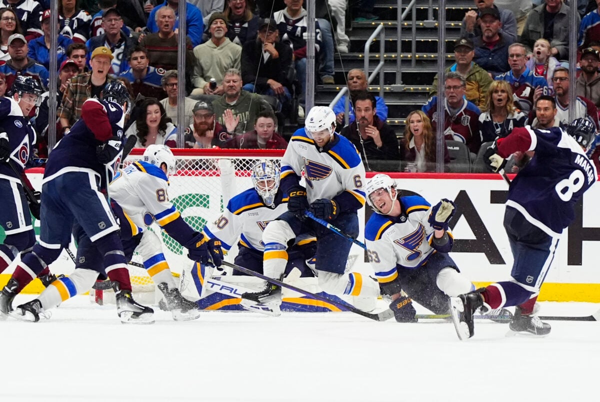
For most of the 1980s and 1990s, the Blues added red to their various logos. While I don’t think that look could have lasted into the 2000s, it was fun for that period of time. We saw some great Brett Hull years with that look, as well as a short Gretzky stint. The club bringing the red alternate jersey back for 2019-20 was an excellent move.
Overall, the Blues have had too many logos in their 57 seasons, but all of them have been solid. Their best was likely in the past, but I believe they have stayed consistent throughout.
12. Anaheim Ducks
The Anaheim Ducks’ old logo wasn’t good enough. They went back to the Mighty Ducks era logo and that was a phenomenal move. The new uniforms and logo are a major upgrade from what they had before.
There is no denying that this was an upgrade for the Ducks. If only they went back to the green and purple color scheme, they would likely be in the top five.
11. Colorado Avalanche
The Colorado Avalanche have had one true logo design in their 25 years. The one change came in 1999, when their main burgundy color shifted its shade. In the same change, they made the blue darker in the logo.
The design is perfect for the name “Avalanche.” It looks fantastic and is absolutely worthy of a top 10 spot. Many were upset that the Avalanche became a club after the move from Quebec, but at least they nailed the logo design. They have also won two Cups.
As for their prior history in Quebec as the Nordiques, they had a great logo then and they kept it great after their departure. It was smart for them to keep a similar color scheme as the Nordiques too. The logo in Quebec was fantastic, and it would be in the top five if it was still around today.
10. Philadelphia Flyers
The Philadelphia Flyers have had the same logo design for their entire existence, going back to the 1967 expansion. The only change came in 1999 when they went to a more burnt orange over the regular orange.
Their current logo is excellent, one of the best of the teams from the 1967 expansion. The color scheme for the Flyers is tremendous with orange, black, and white.
Looking at their logo from 1967 to 1999, the only real change you see is the shade change of the orange. It’s a great logo and the slight change improved it further.
9. New York Rangers
If there weren’t so many great logos around the NHL, the New York Rangers would be in the top five with their fantastic logo.
Another classic Original Six club, the Rangers’ logo has been a similar style for the last 93 years. The American color scheme of red, white, and blue is one of the best. The simple yet unique style is tremendous.
From 1978 to 1998, when the Rangers used a lighter blue color on their logo, that may have been their best logo of all time. The last time they won the Cup was in 1994, sporting that lighter blue design on their sweaters.
From 1936 to 1977, they had multiple variations of a similar logo with navy blue. They used many shades of blue over the years. In 1971, they finally found the font and shape, and have had the same design with different shades of blue since. Their first-ever logo was a sign of what was to come, different shape but similar design.
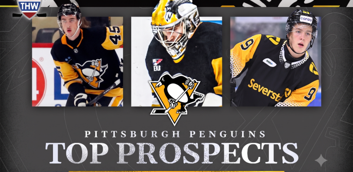
8. Pittsburgh Penguins
The Pittsburgh Penguins came into the league in 1967 and are five-time Cup champions. Their current logo is excellent, and the gold and black color scheme is far better than the brown-gold and black they had prior.
I was a big fan of the “Robo-Penguin” design of the 1990s and early 2000s. The Mario Lemieux era in Pittsburgh was a big selling point for that design. I would love to see them go back to that logo. They would likely be in the same position on this list if they did.
Overall, the Penguins have a consistently excellent logo history. Their color schemes have mostly been great, and their changes over the years have worked.
7. Utah Mammoth
When the Utah Mammoth made the change from the ‘Hockey Club’ to ‘Mammoth’, it was done so well. Their logo has a modern and bold look. It works well with their branding and color scheme. They described just about every detail regarding why they went with the logo and the intricacies of the logo.
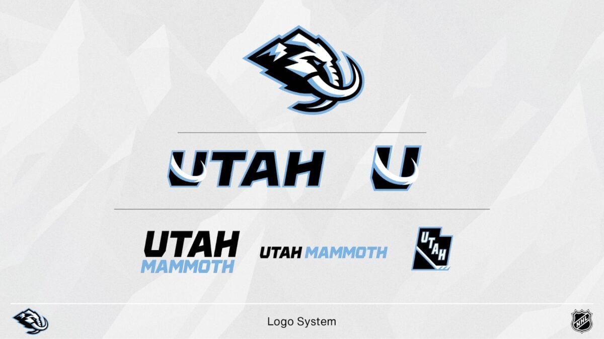
The design is clean, instantly recognizable, and fits the team’s identity perfectly. This is one of the cleanest logos in the league today and, one of my personal favourites..
6. Boston Bruins
The Boston Bruins are another Original Six team in the top 10. Their logo and overall history are classic, among the greatest in league history. They also have a solid history of secondary logos to go along with the main one.
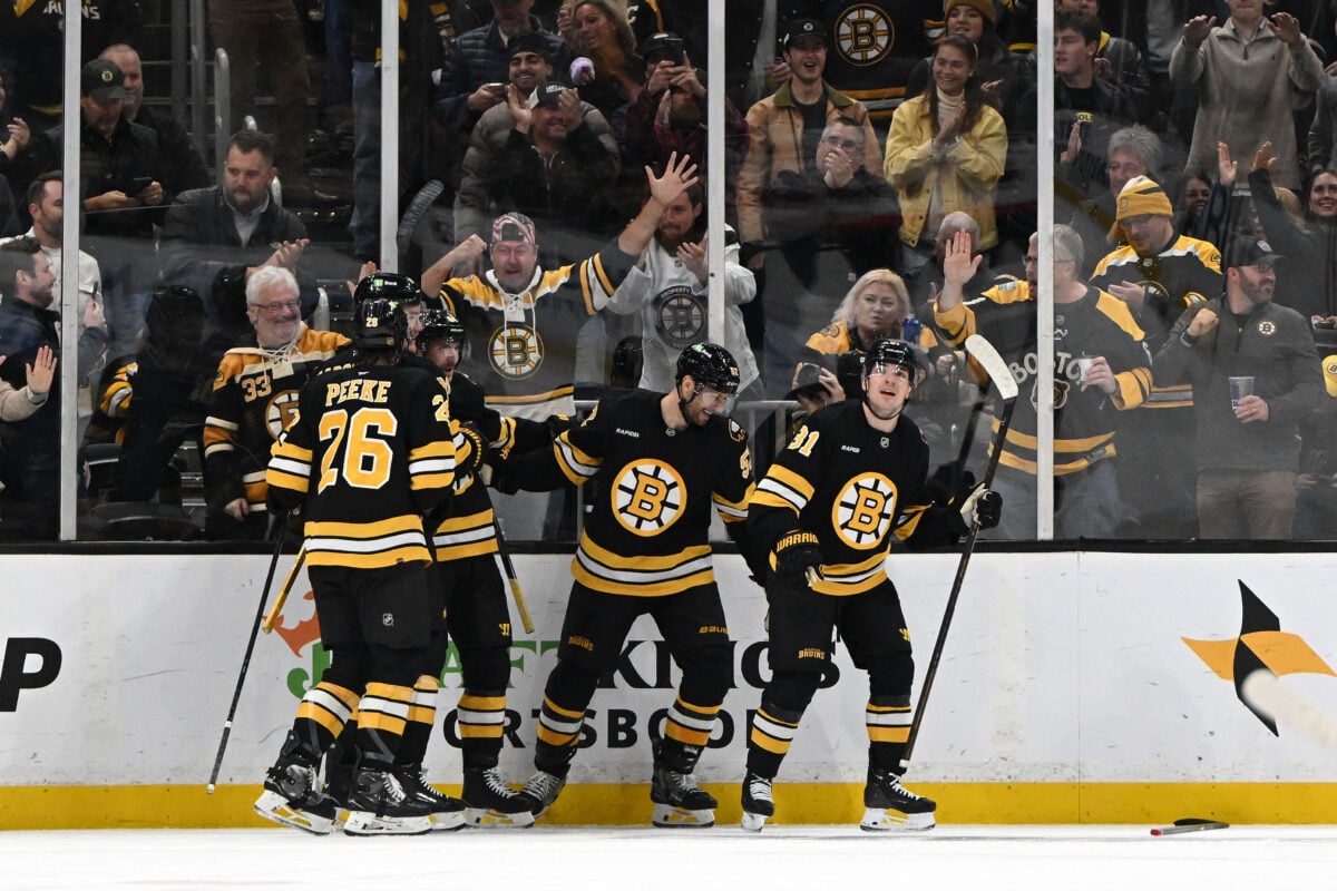
They had brown and gold as their color scheme from 1924 to 1934 and had an actual mascot, a “bruin,” until 1932. The “B’s” nickname is perfect, based on its logo design over the last 88 years.
Despite not being a unique design, their logo from 1934 was tremendous. It lacked some detail, but as simple as it was, it was still a great look that they went back to for the 2019 Winter Classic.
All of the logos used by the Bruins throughout their history have been classics, one of the best in the history of the sport.
5. Chicago Blackhawks
The evolution of the Chicago Blackhawks’ logo is impressive. While it has been the same since 1965, it is still a great logo. The color scheme is great and ties perfectly to the history of the Blackhawks.
From 1926 to 1965, they had variations of this unique design, with slight changes every few years. The logo goes with the name perfectly, which is something some teams don’t have.
The circled design with the logo in the middle is something they could have stuck with. They went back to the 1920s and 1930s for their 2019 Winter Classic jersey.
4. Buffalo Sabres
The Buffalo Sabres logo is one of my all-time favourites in the NHL. They have had an odd logo history, starting out great and falling apart through the years of the franchise.
They rightfully brought back the royal blue logo, which is a perfect partner for the gold and yellow second color. This makes their logo far more appealing.
From 2006 to 2010, they had one of the weirdest logos in the league. I like the colors and the red eye, but the rest was horrendous. They went back to their roots after this look.
Their logo from 1996 to 2006 known as the “goat head” was another one of my favourites. The black, white and red combo was unique and when they decided to bring the goat head back as their third jersey’s recently, fans were very excited.
3. Detroit Red Wings
The Detroit Red Wings have one of the most classic logos in sports history. They have had the same logo since 1949, and it is superb. The design is perfect, and the colors are simple yet terrific.
There isn’t much more that can be said other than this is the best logo in the league. It is widely known in the world of sports. Its simple design is perfect for the city they play in. The classic “winged wheel” has worked in Detroit forever.
2. Montreal Canadiens
Another Original Six team in the top five. The Montreal Canadiens have the most Cups in league history and one of the greatest logos.
Pristine color scheme and a classic design is what you get with Montreal. The detail is amazing, which makes this is another case of their heritage earning them a spot in the top three regardless if there are so many other great logos in the league.
We won’t dive too far into the Habs’ logo history as there are many, but it is impressive. From the 1930s to the 1950s, they sported a lighter red color in their logo, which may look better now than it did then.
One other fun logo was their one-year leaf logo used in 1912. It is very unique and Canadian. The color scheme was perfect, and this logo is forgotten in Canadiens history.
1. Toronto Maple Leafs
Finally, No. 1, the Toronto Maple Leafs are another classic Original Six club. Their logo has been similar but different over the last 90-plus years. It has done nothing but improve over time.
Their current design is great. The detail of the leaf and font is amazing. It is certainly worthy of the top spot. For me, there is nothing better than the Maple Leafs logo in the NHL.
They had the less detailed leaf logo until 2016, when they went back to a similar 1960s style with a more complex design on the leaf. Making this change was the right move.
Free Newsletter
Get Top 10 Lists coverage delivered to your inbox
In-depth analysis, breaking news, and insider takes - free.
Subscribe Free →