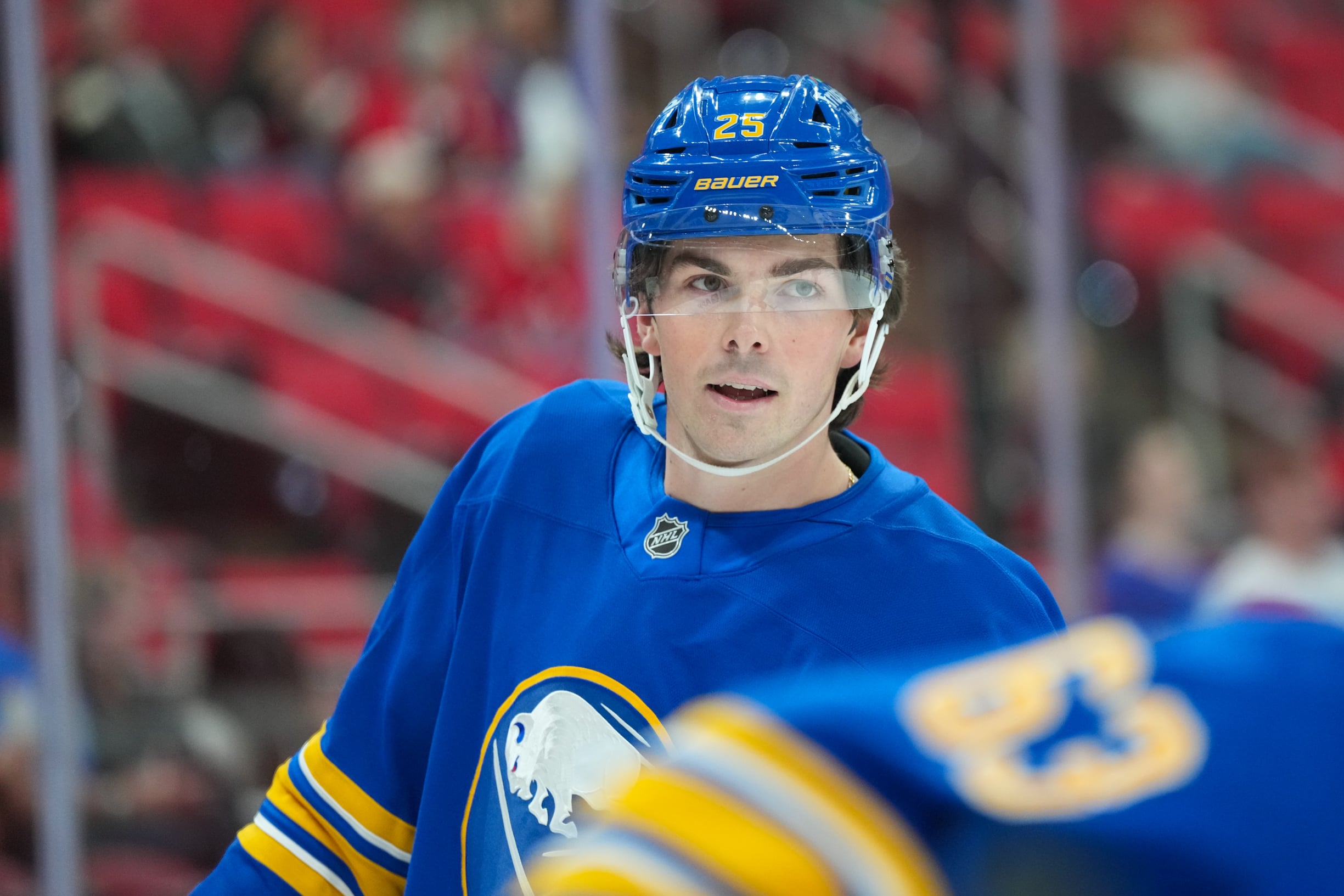
The Buffalo Sabres will look very different on the ice next season, and not just because of their offseason acquisitions. For the first time since the 1995-96 season, the team’s home and away uniforms will consist of royal blue, gold and white. In addition, Adidas’ reverse retro series has re-introduced the infamous “butter knives” as an alternate jersey, but this time using the team’s refreshed colour scheme. Based on formerly used kits, all three of Buffalo’s new uniforms each include variations to the original version. None of the Sabres’ jerseys from last season will be returning.
Let’s take a deeper look at the details, inspiration and history behind each new uniform to better understand the process and reasoning behind the team’s recent identity change.
Home and Away Uniforms
After more than a decade of fans asking the team to ditch navy blue for their original royal blue, the Sabres finally made the switch when they revealed their new uniforms on Aug. 11.
For home games, the team’s new royal blue uniform features three gold stripes with inner white piping on each sleeve and at the bottom of the jersey. The silver piping has been phased out from the previous uniform and replaced with white for a more classic look.
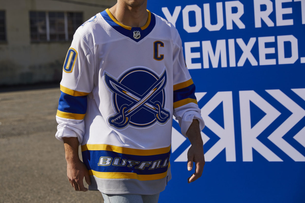
To be worn at away games, the new white-based uniform features royal blue shoulders piped with gold and a large gold stripe between two slightly smaller blue stripes on each sleeve and at the bottom of the jersey. The result gives a perfect balance of royal blue, gold and white. There was speculation that the Sabres were looking to wear their white uniform at home, but it is unlikely that the NHL will allow them to do so.
The refreshed home and away uniforms feature similar design features to those worn by the team in their early years, but with a modern twist.
“Our goal throughout this process has been to create a timeless uniform system that respects team heritage and looks boldly towards the future as well,” the team stated on their website. “Returning to our beloved royal blue was just the start – we wanted to create something truly unique. To do that, we needed to identify key elements that harken back to what’s made this franchise so special through the years.”
Inside the collar, a design resembling the City of Buffalo’s flag honours the team’s “unparalleled bond with the community at large.”
The jerseys have also carried on the use of the crest detailing first seen on the team’s 50th-anniversary uniform worn last season, giving the buffalo a more three-dimensional look with its intricate stitching.
Reverse Retro Uniform
A remix of their original red, black, white and silver “butter knives” jersey worn as an alternate uniform from 2000-2006, the Sabres have made a return to one of their most iconic designs with their new reverse retro uniform. The team elected to use a white-based design, potentially because the NHL denied their request to wear away kits at home.
The original “butter knives” uniform was the first-ever alternate kit in franchise history, first used against the Philadelphia Flyers on Nov. 22, 2000. Players to don the jersey include the likes of Dominik Hasek, Ryan Miller and Daniel Brière.
One of its most distinguished features, the base of the jersey features the word “BUFFALO” to honour the team’s connection to their home city. Other than being re-coloured to white, royal blue, gold and silver, and having a refreshed Adidas-style neck lining, the reverse retro uniform looks almost identical to its predecessor. It will feel truly nostalgic when the team hits the ice in these new threads next season.
It’s an exciting time to be a Sabres fan with new players, including former Hart Trophy-winner Taylor Hall, and an all-new set of uniforms debuting in the 2020-21 season. If all goes to plan, the team will have a chance to show off their new identity as early as Jan. 1, 2021.
Free Newsletter
Get Buffalo Sabres coverage delivered to your inbox
In-depth analysis, breaking news, and insider takes - free.
Subscribe Free →