Sweet Sweaters: The NHL’s 10 Coolest Jerseys

Last week Michael Gwizdala brought to our attention the top 10 selling NHL jerseys in terms of individual players. Well, that got me thinking, what are the top 10 best looking NHL jerseys? Of course this is just one man’s opinion, feel free to chime in with your thoughts in the comments section below.

In no particular order, the following are the 10 sweetest NHL sweaters.

Chicago Blackhawks’ Reds

Patrick Kane Blackhawks
Buchnevich has the offensive skill like Patrick Kane. (Warren Wimmer/Icon SMI)

An oldie but a goodie, the Blackhawks’ powerful red jersey and Native American logo is one of the most iconic jerseys in all of hockey. This original six franchise has barely made any alterations to their main jerseys and rightfully so, these are forever lasting. Even if you are not a Blackhawks fan, if you are just a general hockey fan, or one who roots for an Eastern Conference team and just likes cool jerseys, there is arguably no better choice than a Blackhawks’ red. Perhaps throw a Kane 88 on the back, or can go old school 27 Roenick. Either way, you will be looking fly.

Montreal Canadiens’ Whites

P.K. Subban
P.K. Subban. (Timothy T. Ludwig-USA TODAY Sports)

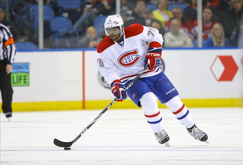
There is no NHL franchise with a more storied history than the Montreal Canadiens. The famous C-H logo really pops on the white jersey. Personally, the logo seems to get a bit lost with the red background of their home red sweaters. Their white jerseys however, are absolutely gorgeous. Perhaps you slap on a 76 Subban or go old school and 9 Richard on the back. Beauties.

Los Angeles Kings’ Blacks

(Jayne Kamin-Oncea-USA TODAY Sports)

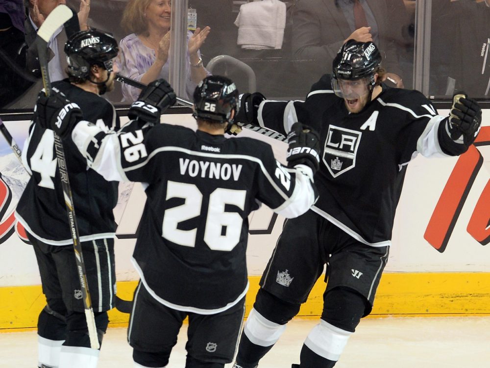
Given the nature of growing up in the Bay Area, my mind is ingrained to poke fun of the Kings jerseys and criticize them. If I’m being honest though, the Kings look really good in their home black sweaters. If you’re a Kings fan, can’t go wrong with a Kopitar 11 black jersey.

Philadelphia Flyers’ Orange

Claude Giroux (Amy Irvin / The Hockey Writers)

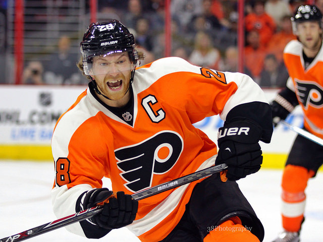
Perhaps this is partially my Bay Area bias coming into play but I absolutely love the Flyers color scheme. The orange and black is a great combination. Their bright orange jerseys are incredibly unique and you can’t go wrong with a Giroux 28.

Detroit Red Wings’ Whites

Pavel Datsyuk is the perennial 2-way forward... and he's Russian (Mark Mauno)
Pavel Datsyuk is the perennial 2-way forward… and he’s Russian (Mark Mauno)

Another iconic logo, the Red Wings’ flying wheel has been a staple of the franchise for its entire existence. Similarly though to the Canadiens, something about their white jerseys makes the famous logo pop a bit more than on their red jeresys. If you are going to go for a Datsyuk 13 or old school Yzerman 19, definitely go with the white sweater.

Pittsburgh Penguins’ Whites

Sidney Crosby and Evgeni Malkin will have to improve their playoff performances this season.(Geoff Burke-USA TODAY Sports)

Similarly to the Habs and Wings, the Penguin logo on the Pittsburgh white jersey really jumps out at you. There also might be something to do with the black font of Crosby 87 on the back that just looks better than white font on black background of their dark jersey. Personally, if you are a Pittsburgh fan, the white jersey is the way to go.

Minnesota Wild’s Reds

2009-10 Collector's Choice #72 Mikko Koivu
2009-10 Collector’s Choice #72 Mikko Koivu

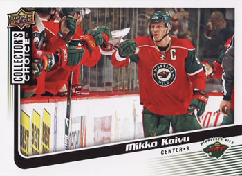
Personally, the red, green, and white combination on Minnesota’s current white jerseys makes me want to vomit. Their primarily red jerseys though with the green sections on the sleeve look ridiculously awesome. A Parise 11 jersey or Koivu 9 jersey in red is the way to go if you are a Wild fan.

San Jose Sharks’ Whites

(Jerome Miron-USA TODAY Sports)

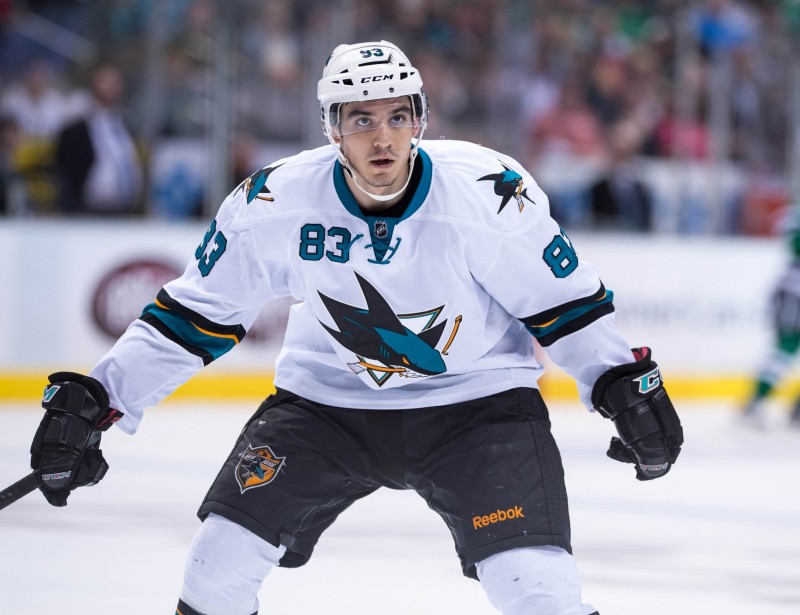
Growing up rooting for this team, their white jerseys have always been the least attractive. However their current whites are absolutely stunning. Taking away the teal shoulder covers was a brilliant move, as they look much better with the teal collar and laces popping in contrast to the white background. If Sharks fans are going to buy a new jersey, a Pavelski 8 jersey or 19 Thornton sweater is really the way to go. As for me, I’ll probably be getting a 57 Wingels white sometime soon.

Boston Bruins’ Blacks

(Greg M. Cooper-USA TODAY Sports)

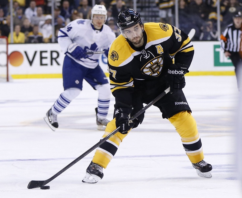
Not sure why, but I’ve always liked the Bruins. Many fans around the league really dislike Brad Marchand, but for some reason I’m a big fan of his play. Perhaps it is just seeing them in the playoffs so frequently but the way that B logo looks with all the connecting lines and the yellow popping out of that black background, just gorgeous. You cannot go wrong with a 40 Rask, or 37 Bergeron.

New York Rangers’ Whites

Valeri Nichushkin has been compared to Rangers forward Rick Nash. (Eric Hartline-USA TODAY Sports)

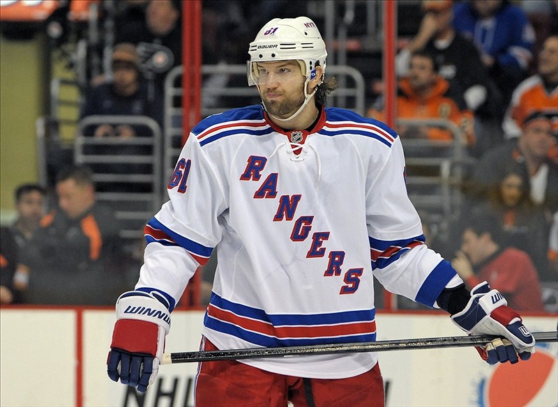
What can you say about the Rangers whites? They are just awesome, the diagonal writing of Rangers in blue across that white background just really jumps out at you. The color scheme is great and for similar reasons as listed for other sweaters, the Rangers’ whites just look that much better than their darks. Fans cannot go wrong with a 26 St. Louis or a 30 Lundqvist.

48 thoughts on “Sweet Sweaters: The NHL’s 10 Coolest Jerseys”

  1. Too much blank space on the Montreal whites, but the Habs reds are my favorite of all time. The kicker on the reds is the old-school blue rugby stripe around the midsection. Sentimental fave is the Sabres whites from back in the late 80s, the current ones with all the stupid piping and grey armpit stains are horrible. And I have always loved the Flyers orange jerseys, so visually vibrant yet simple.

  2. How did the NJ Devils NOT make it on to this list? LEAGUES better looking that LA’s boring sweater. And the greatest jersey that ever was in the NHL, was the Whaler’s AWAY blues.

    • just my opinion, never been crazy about the devils sweaters, and wasn’t including old/former franchises.

  3. If your motive was to generate conversation, congratulations. But half your list is a joke. No Pens (yes Leafs! Call me a traditionalist) I like Minnesota’s third sweaters much more than the reds. Really LA?!? if was to give some love to a newer team it would be Nashville.

    I will give you a little credit for putting the Blackhawks at the top of the list.

    • lol, harsh eh, as i said it is just one man’s opinion. The LA all black unis look sharp in my opinion. And im not one to be gaga over the Maple Leafs, not sure what i am missing about a logo shaped like a leaf.

  4. So you wrote an article on YOUR favourite NHL sweaters… first off, they are not Jerseys… Second… There are lots of other SWEATERS that look far better than some you have chosen to base your article on. Nevertheless… this was YOUR article so naturally, hockey fans will be biased on their favourites as you are.

    Go Canucks ( Home blue Sweaters!)

  5. Good 1 & 2 choices. However the Black Hawks visiting white jersey beats the home red for “Popping ” rights.
    Pick any original 6 jersey over expansion.
    1 last point, for nostalgia, take “9” with no name. Classic!

    • I agree for most of the logos, they pop better on white, but for whatever reason when I think of the Hawks, i picture those bright red jerseys.

    • Perhaps to generate conversation, seeing as there are lots of comments. People enjoy debating over what jerseys are the most stylish.

  6. As a Wild rube, have to say the reds are by far the worst of any of the team’s sweaters. The current white is the best they have. Although, with a stupid name and mascot, there really isn’t a good option for them.

    • really? The current whites? With red font for the name and green font for the numbers? Ugh that looks so weird to me.

  7. I disagree with the author’s Blackhawks choice: white is THE way to go – it makes everything stand out so much better.

  8. I have to say, as a Devil’s fan, I think our logo is one of the best out there! The artist who designed the horns coming out of the top of the J is simply the best. You know automatically what team and where they’re from once you see it. I like most of those you’ve mentioned here; however, I also think the Blues have a good one, too.

  9. The write up on the Blackhawks mentions “if you root for a Eastern Conference team… ummm, Hawks are in the Western Conference. Hello!?! And yes, they have the most badass jerseys in all of sports!

    • What I meant by that is, if you are a fan of an eastern conference team, it is easier to “support” a second team in the opposite conference. As a Sharks fan, i would never wear a hawks jersey even if they look good. However, it’s easier to wear a jersey for style reasons of a team you don’t cheer for if they are in the opposite conference of the team you do cheer for. You feel me?

  10. I think the Blackhawks whites are better than the reds. The logo stands out more. Disagree about the Leafs. Their logo surpasses even that of the Hawks, in my opinion. Rangers white was a great pick, because the shoulder design is awesome on those. 2 of the best logos are from defunct teams: the Nordiques and the Whalers. Classics. Finally, the Canadians logo is way overrated. If they did not have 24 cups, they wouldn’t be in this discussion.

    • i dont get the appeal of the leafs logo that is in the shape of a leaf, the C, H, habs logo seems more intricate/interesting to look at imo. Thanks f or the comment! I generally agree that logos stick out more on the white jerseys but something about the hawks’ red is just iconic, whenever i think of the hawks, i think of them in red.

  11. Wild whites are brutal. Wild reds are cool. Wild greens rock. They should make the whites just like the greens, with the Minne script across the front, or the circle patch like they have for the reds. Best uni in hockey…too hard to pick-I love a lot of them. Red Wings, Canadiens, Hawks, Blues, Leafs. I love the Flyers logo-not a fan of orange though. My all time fave is North Stars logo and original color scheme

    • yeah the current wild whites look like candy canes to me. just too much red and green on the white back drop, i know there is green and off white on the red jerseys, but somehting about the combination on the red jersey just does it for me, and the whites definitely don’t do it for me. Thanks for the comment!

  12. I’ll give you Philly and Chicago. The rest of this list, not so much. Minnesota green, best jersey in hockey. Toronto blue OR white, maybe the best unis in professional sports. Rangers third jerseys are nice, darker blue and ivory. No love for Buffalo blue? I’m a Bruins fan, but I’d leave them off the list until they go back to a yellow jersey. Wings and Pens are ok, I prefer colored jerseys to whites, but that’s just me. I’d probably put St. Louis in the top 8 or 10. Kings? Dead last.

    • not a big fan of the leafs logo, it’s a leaf…and i miss the Sabres red and black jerseys, that was a cool logo

  13. Andrew, I like your list (considering your age, heh). But the Wild jersey..the red? Nobody here in MN likes the Red. Here in the northland we all love the 3rd jersey with ‘Minnesota’ diagonally across the front. It screams heritage here in MN and a reminder of the iron range and ‘old time hockey’ which has produced countless Olympians….

    • Never been a fan of any of the Ducks jerseys since they got rid of the old bad a** disney logo, that was an awesome logo and sik color scheme

  14. ‘Personally, if you are a Pittsburgh fan, the white jersey is the way to go’

    Couldn’t be more wrong bud. We all know you get the home uni and a white is like, the 2nd or 3rd one you end up buying. Maybe phrase it better? Also the Pens alternates (remake of 91/92) are better than any of these. 0_o

  15. What about the NY Islanders??? Ever since I was a kid i loved the blue, orange & white!!! The Blackhawks are my 1st choice the the Islanders,,,,that y in the form of a hockey stick is just tooo cool, I love the blue too!!

    • To each their own, the current islanders darks with the white name plate background doesn’t look good imo.

    • I’ve always been a fan of the black and yellow scheme, pittsburgh steelers rock it, pirates, penguins (sort of), and the Bs, plus that is just an iconic B logo.

  16. Really? The Wild reds?!? I am a Wild fan and I can tell yo this, the green is the cool sweater out of the 3. Partial to the white also, but the christmas tree red is ugly.

  17. Writer needs more research: Not only as the White Red Wing Jersey voted on a few occasions the BEST hockey uniform but also best major sports uniform of all!!

    • Not a fan of the Blues jerseys, they keep making alterations, for a reason, the st. louis rams color scheme doesn’t do it for me.

      As for the leafs, storied franchise, but logo is just a leaf, again, doesn’t do it for me, thanks for the comment!

  18. Mr. Goose is exactly right. Well done, Some of the ones on that list are unbelievable (Kings for crying out loud???).

Comments are closed.