Over the last several years, snapback hats have found their way back onto the shelves of various sporting goods and hat stores. Subsequently winding up on the heads of various consumers willing to shell out anywhere from 20 to 35 dollars for the aforementioned apparel, all types of newly designed and colored snapbacks have been purchased by die-hard and casual fans alike.
Whether donning a team’s snapback for flair or for support, New Era has given individuals a wide selection to choose from when trying to scout out a crisp new brim – especially if that person happens to be a fan of the NHL. While newer designs might still reign supreme for newer generations of hockey fans, New Era has not forgotten about the past generations as their inclusion – and new take – of defunct NHL teams from the mid-to-late 20th century speaks for itself.
Snapback to Reality
Kansas City Scouts

Back in the day, Kansas City – yes, you read that correctly – had a hockey team for a couple of seasons before eventually being sold and relocated to Colorado.
Paying homage to local history by naming the team after a statue in Penn Valley Park, the hat features a horse and its rider (outlined in white and blue) as its primary design, and the letters “KC” connected together in a bold yellow color. Framed inside of a red circle – yet another bold color in this hat – one’s eyes are immediately drawn to the Scouts’ logo, and it’s most certainly easy to remain fixated on the design as one simply doesn’t find such detailed team logos anymore.
Utilizing a dominant navy blue for the hat color, New Era definitely fired on all cylinders with this design (as well as their vintage and grader versions) – keeping it simple and to the point.
California Golden Seals
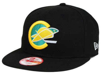
Newer generations of hockey fans might be thinking, “What in the world is a California Golden Seal?”
Well, as part of the NHL’s expansion in 1967, the Golden Seals played in Oakland for several seasons before relocating – much like the Kansas City Scouts – and becoming the Cleveland Barons. While the Seals’ logo would undergo some changes throughout the team’s time in California, the seal inside the Oakland “O” or California “C” was, and still, a solid classic that one could add to their collection.
Placed against a solid black backdrop and highlighted by yellow and teal colors that instantaneously draw the viewer’s attention, this Golden Seals snapback is a must-have for any hockey fan – and it’ll be sure to draw compliments from those that know their hockey history.
Atlanta Flames
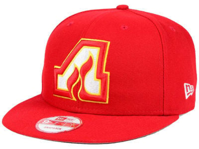
If history has shown us anything, then it’s the fact that hockey just doesn’t draw that much in Atlanta. Whether it was the Flames or the Thrashers, hockey was simply unsuccessful during its two stints in Atlanta, Georgia, but at least the memory of Atlanta’s first endeavor into the hockey world lives on in the form of a hat.
Using a bright red throughout most of the hat, it’s pretty hard to miss this hat in a throng or on a rack of one’s sporting goods or hat store. The Atlanta Flames’ logo was very simplistic, and that is probably the reason why it works so well on a snapback – or any hat for that matter.
Sure, the Flames’ logo utilizes lots of sharp angles on the outside, but the two ascending flames inside of the “A” provide a perfect counterbalance to the structure of the design. As a matter of fact, once the Atlanta Flames were sold and relocated, the logo did not undergo a full-scale revision as the Calgary team retained the design by using a “C” with flames dancing off of the left side of the letter – something that speaks to the successful nature of Atlanta’s initial composition.
Hartford Whalers
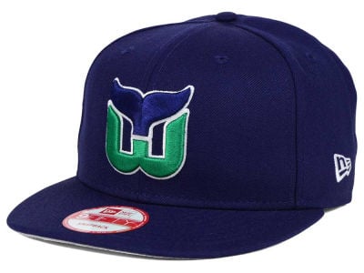
Out of all of the defunct teams previously mentioned in this article, the Hartford Whalers enjoyed the longest stint in the NHL by far.
Before being sold and relocated to Carolina, the Whalers played in the NHL from 1979 to 1997, and their team colors were some of the best. Centered against a solid navy blue, the Whalers’ logo commands attention from anyone as the green “W” stands out right away.
Once one’s attention is drawn, the eye makes its way to the blue whale fin that seemingly sits atop the green “W.” If one looks close enough, they’ll even manage to make out a blue “H” formed by the space between the fin and the green letter. Elegance, simplicity, and subtlety define this design, and one would be hard-pressed to find an equally impressive artwork that has withstood the test of time like the Whalers’ emblem.
Colorado Rockies

During the late 20th and early 21st century, the Colorado Avalanche were a dominant force in the NHL as they won Stanley Cups in 1996 and 2001.
However, from the late 1970s to the early 1980s, the Colorado Rockies played six seasons in the Centennial State before moving to New Jersey. Much like the Atlanta Flames, the Rockies kept their logo simple – an edged triangle representing a mountain, the letter “C” smack-dab in the middle of the blue and white layered mountain, and a bright yellow sun in the center of the “C.”
Centered on a royal blue color, this snapback perfectly captures what Colorado is known for – beautiful mountains, scenic terrain, and an elevation so high that one practically feels as if the sun is beating down on them directly.
Vancouver Canucks

When the Vancouver Canucks made their way to the NHL, they dumped their old “Johnny Canuck” logo in favor for a more traditional design.
Sporting a toque, lumberjack gear, chin-strap beard, mustache, a set of skates, gloves, and his trusted hockey stick, there are many elements that are successfully combined into this illustration. Set against a royal blue backdrop, this hat will most certainly bring the older generation of Canucks fans back to their roots.
Minnesota North Stars
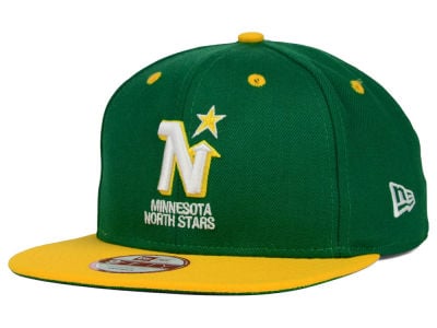
The Minnesota North Stars had the longest tenure (of the teams listed in this article) in the NHL before they relocated and became the Dallas Stars.
Playing from 1967 to 1993, the North Stars stuck to white, gold, yellow, and green color schemes to adorn their jerseys and gear – and it certainly wasn’t a bad choice.With the contrasting yellow brim & green crown/panel colors immediately drawing one’s attention, the North Stars’ logo, a white “N” outlined in yellow with a star on the upper right side of the letter, doesn’t disappoint.
Having the team’s name placed right underneath their logo, the North Stars’ timeless design continues to be adored by hockey fans new and old – and rightfully so as there is nothing to complain about when dissecting the composition of the snapback.
Free Newsletter
Get Top 10 Lists coverage delivered to your inbox
In-depth analysis, breaking news, and insider takes - free.
Subscribe Free →