In sports, uniforms are sometimes taken for granted. With enough time, even the nicest jersey or sweater can begin to feel boring and routine. But over time, great sweaters become iconic. A beautiful hockey sweater tied to a winning team goes down in history, while big mistakes on bad teams go down in infamy (looking at you, New York Islanders).
In today’s NHL, there are more sweaters than ever, with most teams having a third option, many having a retro or throwback alternative, and some having stadium series or Winter Classic alternatives.
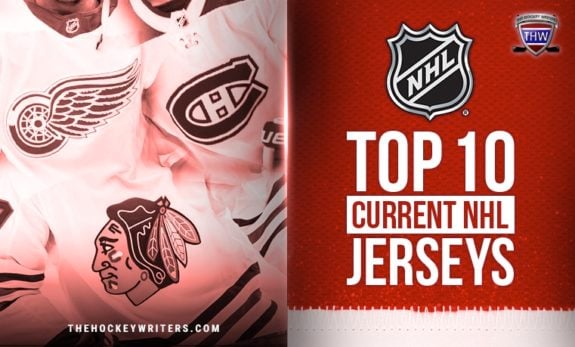
For this article, we’ll take a look at the 10 nicest current sweaters, but we’ll focus on those uniforms that are worn more than a few times in a season. So let’s take a look at the list!
Honorable Mentions
Dallas Stars Home
The Dallas Stars home jersey doesn’t get a lot of recognition, but its “Victory Green” is probably the most unique (and maybe the brightest) color on any sweater in the league.
The Stars are one of the top teams in the league right now, regularly taking deep runs into the playoffs, in turn making their sweater even more well-known around the hockey world. But its legacy still needs to grow. It certainly stands out by color alone.
Anaheim Ducks Home
This summer, the Anaheim Ducks fully committed to a hybrid of their newer color scheme with their older logos, debuting the orange beauties they will wear this season.
These are a beautiful redesign and have been a huge hit with a lot of Ducks fans and analysts around the league. For a team trying to establish a new identity, these new sweater combinations are a great start.
10) Buffalo Sabres Away Jersey
The Buffalo Sabres have fallen on some hard times over the last decade, but at least the threads look good. The recent decision to return to royal blue as a primary color remains one of the few good decisions the organization has made over the last few seasons.
The color palette is a throwback to a happier time for Buffalo fans, back when the French Connection of Richard Martin, Gilbert Perreault, and Rene Robert was tearing up the league. We think it pops slightly better on the away jerseys than the home all-blue look, but take your pick: they’re both nice. The hockey might not look pretty. But at least the jerseys will.
9) Winnipeg Jets Home
Since they took off from Atlanta, Georgia, and landed in Winnipeg in 2011, the Jets have had some of the sharpest home sweaters in the entire league. Though they aren’t exactly plucked out of Jets jersey history, they still have a very classic feel about them.
The revamped Jets jerseys use the same color pattern as the originals, but the logo has changed drastically. The logo pays tribute to the Royal Canadian Air Force — but more particularly to the 17th Wing, which is the Canadian Air Force base in Winnipeg. The uniforms nicely represent the second coming of a very important Canadian organization.
8) Detroit Red Wings Away
The Detroit Red Wings organization has fallen on hard times, though the youth moment is now in full swing. But the sweater the players wear still harkens back to the history shared by the likes of Gordie Howe and Steve Yzerman, Ted Lindsay and Nicklas Lidström.
The Red Wings have won 11 Stanley Cups in their illustrious history, the most by far of any American franchise. And through it all, they have worn essentially the same sweater: red and white with the iconic winged wheel.

The logo on its own is one of the best in the NHL, maybe in all sports. It both captures the team’s name and the city’s history, and it stands out perfectly on the white away sweater. As any hockey purist will tell you, white home sweaters used to be the norm, so for many Original Six teams, the away sweater feels more classic than the home, anyway.
7) Seattle Kraken Away
They’re among the newest sweaters in the NHL, but they may be one of the nicest. With both the Vegas Golden Knights and the Seattle Kraken, the NHL has hit home runs on building brands that are clean and distinct amongst NHL sweaters. Even among those sweaters, though, the Seattle away sweaters are as clean as clean gets.
From the two vibrant, unique shades of blue in the logo and on the sleeves, to the simple (if possibly oversized) main logo, to the perfect and simple alternate Space Needle anchor logo on the shoulder, these sweaters bring a certain amount of prestige to the Kraken right out of the gate. It was the sweater they wore while picking up their first franchise win against the Nashville Predators, and in a few seasons, when it’s been around longer, it might climb even higher on this list.
6) Calgary Flames Home
Speaking of jerseys that began as an alternate, but were so popular they replaced the primary home jerseys, we have the Calgary Flames. When the Atlanta Flames moved to their new and permanent home in Alberta, the franchise did little to alter the look of the jerseys except turn the flaming “A” into a flaming “C.” That look became iconic, but through the years, the franchise decided to try some different things. But recently, they realized their mistake and brought back the classic look. Then last season, the Flames made it their primary home jersey.
If there is any complaint with this sweater, it’s a minor one. On the Flames’ primary jersey, the “A” that demarcates an alternate captain is also an homage to the Atlanta Flames’ “A” at the center of those jerseys. For whatever reason, in replicating these sweaters, the Flames chose not to put that touch on the third sweater. It’s a shame, as that’s one of the nicest little touches on any sweater in the NHL; however, the sweater as a whole is still one of the sharpest in the league.
5) Chicago Blackhawks Away
The Chicago Blackhawks jersey has undergone very few changes since the mid-1950s. While the jersey is an NHL staple, the team logo has received some backlash over the years as it had been deemed culturally insensitive. The logo’s origins stem from team founder’s division of the U.S. Army. With this aside, the Blackhawks’ uniforms are extremely sharp and still merit a spot on the list. The ‘old school’ style makes the jersey one of the league’s nicest.
In today’s climate, there will always be discussions about whether changes should be made to the Blackhawks logo. But it remains iconic, not only for its ties to Blackhawks legends like Tony Esposito and Stan Mikita but also for its association with the modern-day Blackhawks dynasty that won three Stanley Cups in six seasons.
4) Boston Bruins Home
The Boston Bruins were named by their original owner, Charles Adams, who wanted the team to be powerful and feared. In Adams’ vision, the team would build a reputation to match its name. The ‘big bad Bruins’ have been one of the most physically dominant teams in NHL history, and their powerful uniform colors and team name match that perfectly. After celebrating their 100th anniversary with a whole new set of sweaters, it was back to the originals for the 2024-25 season.
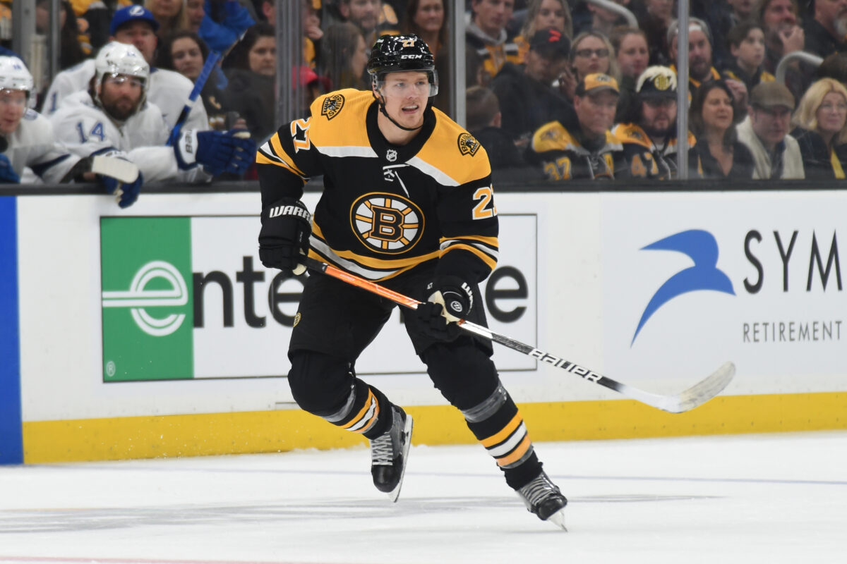
Like some of the other Original Six teams on this list, the Bruins’ logo hasn’t significantly changed over the years. Like its winged counterpart in Detroit, the spoked wheel is an iconic hockey logo. Yet another classic on the list, these uniforms are synonymous with the hard-hitting hockey that has made the team so successful since the start of the NHL. The logo alone carries a sense of foreboding for any opponent unfortunate enough to line up across from it. If you’re staring at the spoked wheel, you’re probably in for a long night.
3) St. Louis Blues Heritage
We mentioned that one-time-use jerseys would not be on the list. But fans loved the St. Louis Blues’ 2017 Winter Classic sweaters so much that when it came time to announce the third jersey for the 2018-19 season, there was no question the design would return.
The so-called “Heritage” sweater returns to the design of the Blues’ 1967-68 inaugural season, but with subtle added touches, including the flag of the city of St. Louis stitched inside the collar. Is it any surprise that in their first season wearing the sweater regularly, the team won its first Stanley Cup?
The baby-blue color of this uniform is as slick as any color in the league, and the Blue Note logo, while not as iconic as a few we’ve discussed, is still one of the most beloved in sports. It’s the favorite uniform of Blues fans, and one of the freshest in the entire league. This season, the team is competing once again in the Winter Classic, and given that they’ve had two big hits in a row, expectations are high for what’s to come.
2) New York Rangers Home
The “Broadway Blue” New York Rangers jersey is one of a number of classics found on the list. A jersey donned by some of the greatest of all time, such as Wayne Gretzky, Mark Messier, and Brian Leetch, (among many others), the Rangers jersey represents New York very nicely. The glam of the city and its character are nicely conveyed on the Rangers’ uniform.
These uniforms are able to capture so many aspects of the city and country that they represent. The red, white, and blue color scheme nicely pays tribute to the United States, while a little bit of Broadway flashiness depicts New York nicely. The Rangers are looking at a bright future, but with these sweaters, they’re always rooted in their history.
1) Montreal Canadiens Home
The Montreal Canadiens jersey is the most historic in the league; the uniform has stayed pretty much the same since the early 1910s. The jersey has been one of the few consistent things throughout the incredible team history. Like many others on this list, the Habs’ design and jersey have withstood the test of time.
History aside, the Habs’ jersey still merits the #1 spot on the list. The Habs paid testament to their past by adding the lace and white collar to their classic jersey to give it the ‘vintage’ feel, which many fans love. The jersey is also referred to as “La Sainte-Flanelle” which translates to “the holy flannel” or “the holy sweater.” The Montreal Canadiens’ jersey is the league’s nicest because of its history, its design and its meaning to Montreal.
What Did We Miss?
Any article ranking a “top 10” is bound to be controversial. So what did we miss? Who should be higher on the list? What sweaters shouldn’t be on here at all? Keep the debate going and let us know the king of hockey sweaters in your eyes!
