- The WHA-Era Winnipeg Jets
- The NHL-Era Winnipeg Jets
- The Jets Return to Winnipeg
- Jets WHA Era Jerseys Started Strange, Got Iconic
- Jets’ Takeoff Lacks Direction
- Jets Debut Now-Classic Look
- Jets Ditch Good Taste
- NHL 1.0 Era (Eventually) Produced Stunning Uniform Sets
- NHL-Bound Jets Rip Off Rangers
- Jets’ Early NHL Days Sleek, Polished
- New Decade, New Look
- Jets 2.0’s Jersey Has Some Turbulent Aspects
- Jets’ New Logos Make the Grade
- Jets’ Jerseys Complicated, Confounding
- Jets’ Alternate Jerseys Run Gamut From Terribly Uninspired to Outstanding
- Jets’ First Attempt at Alternate Not Worth the Wait
- Jets’ 2016 Heritage Classic Throwbacks Sparkled In Comparison, But Was Short-Lived and Ignored
- Jets’ Finally Got it Right With Heritage Blue Third Jerseys
- Jets Honour RCAF History With ’48 Alternate
- Reverse Retros Produce Uneven Results
- First Attempt at Reverse Retro A Swing And A Miss
- Second Go-Around At Reverse Much Retro Better, But Still Not Perfect
- Jets’ Jersey Marketing Strategy Not Cleared for Takeoff
*This article was originally published in Sep. 2018, completely rewritten in Aug. 2023, and updated in Aug. 2025.
When you think of a Winnipeg Jets jersey, what’s the first one you think of?
Is it the current home blues or away whites? Is it the ’90s jersey Teemu Selanne wore when he put up 76 goals as a rookie, or perhaps the ’80s setup captain Dale Hawerchuk wore during his decade of dominance? Perhaps it’s a WHA-era jersey featuring the iconic hockey stick “J,” or perhaps it’s simply the one you have in your closet with your favourite player’s name on the back.
Whatever jersey comes to mind first, there’s no denying the Jets have had a lot of different ones over the past 50 years. Some have been fantastic, some have been boring, and others have been downright weird.
This is a deep dive into every uniform they’ve ever worn.
The WHA-Era Winnipeg Jets
The Jets have three distinct eras: the WHA era, the NHL 1.0 era that directly followed, and the current NHL 2.0 era. We’ll start from the beginning.
In late 1971, the city was awarded a professional hockey franchise that would begin play the following year. It was not a National Hockey League team, but rather a World Hockey Association team. The upstart league lasted seven seasons and went through plenty of turbulence before the NHL absorbed four of the six remaining WHA teams in 1979.
The Jets had a lot of WHA success. They made the playoffs in six of seven seasons, won the Avco World Trophy three times, and played for the championship on two other occasions.
The most prolific players in team history – WHA history, too – were Anders Hedberg, Bobby Hull, and Ulf Nilsson. Together composing the dominant “Hot Line,” they were in Winnipeg for a good time, but not a long time, to borrow a phrase from Canadian dad-rock group Trooper. Hedberg and Nilsson bolted for the New York Rangers in the summer of 1978, while The Golden Jet stuck around longer but was revealed to be a less-than-savoury character off the ice.
The NHL-Era Winnipeg Jets
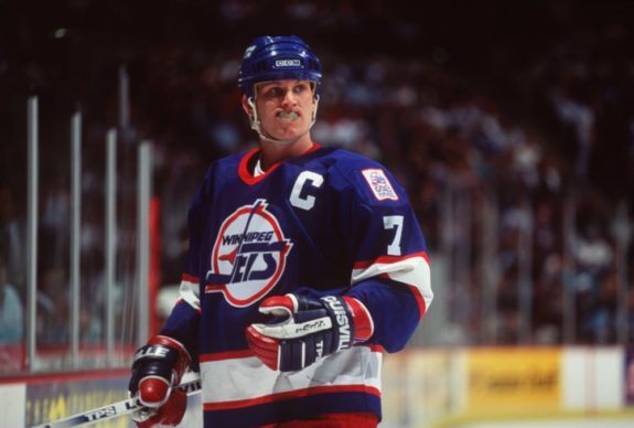
The move to the NHL provided the Jets an opportunity to reinvent themselves and again reach the precipice of their domain. They started out a bottom-feeder due to the NHL’s harsh expansion rules, but ascended throughout the 1980s along with fellow Smythe Division powerhouses Calgary Flames and Edmonton Oilers. Winnipeg made the playoffs eight of 11 seasons between 1979-80 and 1989-90, playing either the Flames or Oilers in all but one year.
Despite eventually building up a roster that included the likes of Dale Hawerchuk, Paul MacLean, Thomas Steen and 1981 Norris Trophy winner Randy Carlyle, the Jets were only able to get past the first round twice (in 1985 and 1987), both times at the expense of the Flames. Also on both occasions, they were then promptly swept by the Oilers.
In 1990, the Jets were finally able to push the Oilers, now sans Wayne Gretzky, to the brink of elimination, before blowing a 3-1 series lead and losing in Game 7. Of particular note, Game 6 in Winnipeg was delayed by an overzealous fan throwing popcorn on the ice, jinxing the Jets, according to some.
The Winnipeg Jets: Always the bridesmaid, never the bride. They never got further than they did in 1990, and six years later, they were gone, relocating to Phoenix for the 1996-97 season due to their inability to attract a new owner, a poor Canadian Dollar, and decrepit arena.
The Jets Return to Winnipeg
The current iteration of the Jets came about in 2011, thanks to True North Sports & Entertainment purchasing the struggling Atlanta Thrashers and relocating them to Winnipeg, with NHL Commissioner Gary Bettman showing all the enthusiasm of a hostage on a ransom video during the announcement that sent the city into a frenzy.
Through 12 years, the Jets have had spurts of success but just three playoff series wins in six playoff appearances. Despite that, they’ve been well-supported by Winnipeggers and the franchise is on firm financial footing, holding a $805 million valuation as of 2023 (the franchise was worth just $135 million in their last season in Atlanta.)
The Jets’ WHA, 1.0 and 2.0 eras are obviously very different, but one thing is the same: the team’s wildly varying jersey quality.
Jets WHA Era Jerseys Started Strange, Got Iconic
Jets’ Takeoff Lacks Direction
The Jets were a brand-new team in a brand-new league, debuting in the WHA’s inaugural 1972-73 season with a uniform set that…well, looks like the uniform set of a brand-new team in a brand-new league.

The centrepiece of the jersey is the logo, a pretty generic-looking “Jets” wordmark flanked on the left by a hockey player in flight. Not exactly inspiring iconography for a fledgling fanbase, though the “J” in Jets does look rather good doubling as a hockey stick.
Nor were the backs of these jerseys any good, with the contrasting nameplates and cartoony typeface looking just slightly less than professional.
That all said, the bones of these kits are really rather good. Gapped tri-stripe patterns on the sleeves and tails, a feature replicated on the socks, give the uniforms a crisp, traditional feel, while the classic blue, red, and white colour palette provides just enough contrast – thanks in large part to red pants – to make the kits sufficiently interesting to look at. The no-nonsense number font, complete with flush trim, even lends a hint of aggressiveness to the ensemble.
You may also like:
- NHL’s Top 10 Goalie Tandems for 2026-27
- 5 Jets Bounce-Back Candidates for 2026-27
- Every NHL Team’s Best Move This Offseason
- 5 Must-Watch Winnipeg Jets Games in 2026-27
- Jets’ First Month of 2026-27 Will Be a Gauntlet
The white jersey is especially good, with contrasting cuffs and shoulder yokes, to go along with a red collar. The blue uniform could do with a bit more contrast, particularly towards the top of the jersey, something which would be rectified the following season.
Generally speaking, the Jets’ first attempt at a uniform was pretty much what you’d expect from a new team playing in an upstart league: Conventional enough to be attractive to the masses, with enough zaniness thrown in to make the WHA stand out from the NHL. A great idea, with thoroughly mixed results in execution.
Jets Debut Now-Classic Look
In only their second season of existence, the Jets decided to overhaul their look. They ditched the wordmark and debuted the now-classic logo that, with some changes, would stay with the team through their transition to the NHL, right up until their move to Phoenix.
As you can see, many of the issues with the original uniforms have been rectified, with a contrasting neckline being introduced on the dark jersey, while the ridiculous contrasting nameplates and their childish typeface on both kits have been replaced by sturdy, straight-laced block letters. The Jets also chose to dispense with the contrasting cuffs on the white sweater.
The result is a much cleaner and more conventional look than the Jets’ original ensemble.
Though the cleanliness of a sweater is generally appealing, sticking too close to convention can sometimes leave a uniform looking dated, generic or, worst of all, boring. However, whenever a team tries to implement something new and exciting, there’s always the chance the viewer’s focus will be drawn almost entirely to said element at the expense of everything else. Needless to say, they’d better get it right.
With their absurd inaugural nameplates, the Jets decidedly did not, and they rightly tidied up their image for their second season, resulting in massive improvements in their on-ice aesthetics.
The only real issue with this uniform set is the use of a single logo between the two kits, as the blue background of the crest, when set atop the blue jersey, makes the outfit look a little drab and dreary.
That said, when they reached the NHL, the Jets began using a white-backed logo for their blue uniforms, solving this problem by improving the colour balance of the darker kit.
One interesting note is that the Jets’ pants, which underwent constant tweaking, changed, in 1975-76 (the uniforms depicted above are from the 1976-77 season, but retained said changes), to something closely resembling those of the New York Rangers. More on that later.
Jets Ditch Good Taste
For 1977-78, the Jets again altered their look, switching to uniforms they’d wear for the final two seasons of the WHA’s existence.
Everything was made more complicated, and Winnipeg’s uniforms were the worse for it, with the dark uniforms again bearing the brunt of the assault on good taste.
Most noticeable is the addition of contrasting shoulder yokes to the Jets’ blue sweaters. The staunch whiteness of these additions significantly disrupts the colour balance of the kit, making it overly saturated with white. Not only is this ill-advised design feature unnecessary on dark uniforms, it’s very hard on the eyes and, for the Jets specifically, the dark backing to their logo makes the white shoulders look doubly obtrusive.
Another seismic shift was implemented in 1978-79 (the year depicted above), when the pants were switched from red to blue. Not only does this make the dark kits overly blue and altogether washed out, the change to blue pants makes the inclusion of red in the colour scheme look like an under-utilized afterthought – even on the white uniforms, rather than the key component of a classic colour scheme it should be.
A more minor change is the creation of a two-tone, three-stripe collar, which, though quite nice on the white sweaters, looks utterly gaudy and ridiculous on the blues.
The numbers on the backs of the jerseys are much slimmer than previous iterations, while the trim of those on the sleeves is significantly thicker. Not only are these changes seemingly devoid of all reason and rationale, the two sets of numbers are now noticeably different, creating a lack of continuity throughout the uniforms.
The Jets had a real good thing going but, like so many before them – and so many that would follow, they tried to tinker with a good thing, with ultimately weird results.
NHL 1.0 Era (Eventually) Produced Stunning Uniform Sets
NHL-Bound Jets Rip Off Rangers
The Jets entered the NHL in 1979-80, wearing uniforms that were eerily familiar to fans.
You see, Jets general manager John Ferguson Sr. used to be GM of the New York Rangers. For the 1976-77 season, Ferguson Sr. completely redesigned the Rangers’ uniforms, using the template seen below.
To be honest, it’s not a bad-looking setup. However, the Rangers already had a perfectly good thing going with their sweaters, not to mention a half-century of history behind them, and Ferguson Sr.’s changes – along with the man himself – only lasted two seasons in the Big Apple.
In one of hockey’s most under-covered twists of fate, Ferguson Sr. lured Jets stars Hedberg and Nilsson away from Winnipeg in March 1978, only to be fired as GM of the Rangers that June, before being scooped up by the Jets a few months later.
It’s also worth pointing out that, starting in 1978-79, following Ferguson Sr.’s departure, the Rangers began using a template for their dark jerseys that was essentially identical to that of the WHA Jets from earlier that decade. It looks like turnabout is fair play and that nothing is original under the sun.
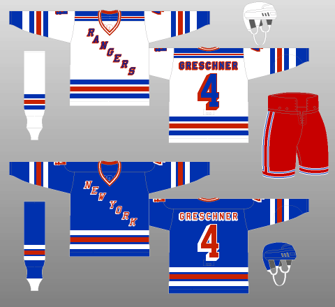
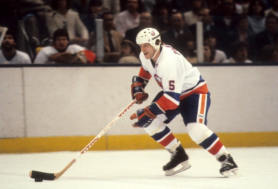
Jets’ Early NHL Days Sleek, Polished
Back to the Jets’ jerseys, it was the right setup at the right time.
On the white jerseys, a blue, full-length shoulder yoke is trimmed in red, complemented by a thick blue tail stripe with flush red trim. This pattern is reversed on the road sweaters, with white and blue swapping places. As for the socks, they mimicked the tail striping for 1979-80, but switched to a tri-stripe pattern the following season (depicted above).
The tail striping is asymmetrical but the blue stripe on the tail of the white home jersey flows seamlessly into the blue pants, creating one clean block of colour, trimmed on top by the jersey’s red stripe, and on the pants by the red and white trim.
As for the road kits, the white tail stripe contrasts nicely with the blue pants, not in such an overpowering fashion as to be hard on the eyes, but just enough to prevent the outfit from looking washed out.
Speaking of contrast, as mentioned, the logo on the blue jerseys is now backed by white, enhancing the colour balance of the Jets’ road sweaters.
With flush-trimmed numbers added to an already exciting uniform package, the Jets took the ice during the 1980s in sleek, sophisticated kits, as crisp and clean as any in NHL history, while highly reflective of the fast-paced, run-and-gun play the 1980s favoured.
This uniform set is a rare one that not only looked sharp at the time, but would also still look pretty darned good today.
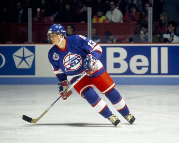
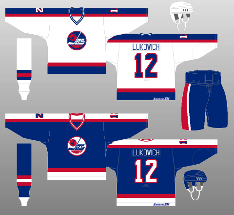
New Decade, New Look
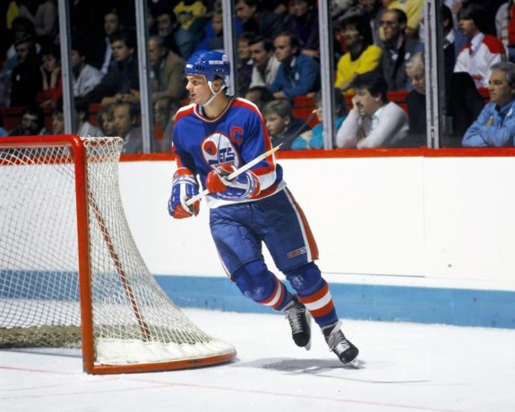
Winnipeg redesigned their uniforms for 1990-91, doing away with their “Rangers heritage” and debuting a set of kits that were simply spectacular in every way and would become forever etched into the memories of their fans when the Jets left for the desert in 1996.
Starting with the logo, the revamped crest moves the “WINNIPEG” part of the wordmark to the top of its “JETS” counterpart, while the image of the jet itself is now turned on its side – two changes that, in a cruel act of foreshadowing, seem to suggest movement.
Of note, the Jets reverted to the use of a single logo across both their sweaters. Backed by white, the crest provides pleasing contrast on the Jets’ blue jerseys, but is dangerously close to washing things out on the home whites.
Logo aside, the rest of the redesign is proof of just how stunningly beautiful a simple sweater setup can be.
A slim-thick-slim striping package adorns the tails, sleeves and socks. Blue is again the dominant colour though, this time, it’s properly balanced by red in the collars, the stripes and, most crucially, the pants of the ensemble.
The simple jersey template is finished off with equally uncomplicated numbers and lettering. Interestingly – and somewhat unusually, neither the names nor the numbers are trimmed. However, had they been trimmed, presumably in red, the kits might have looked overly busy. It was a courageous design choice – and one which necessitated a conscious decision, given that the Jets’ previous setup featured number trimming.
While it was certainly a big blow to the city when the Jets relocated, the team was visually stunning on the ice their final few years in Winnipeg – in aesthetics, if not in play. One can still see plenty of Jets fans nowadays rocking these with pride at home games and out and about.
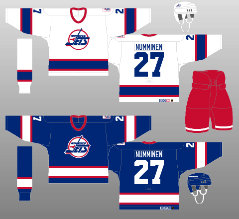
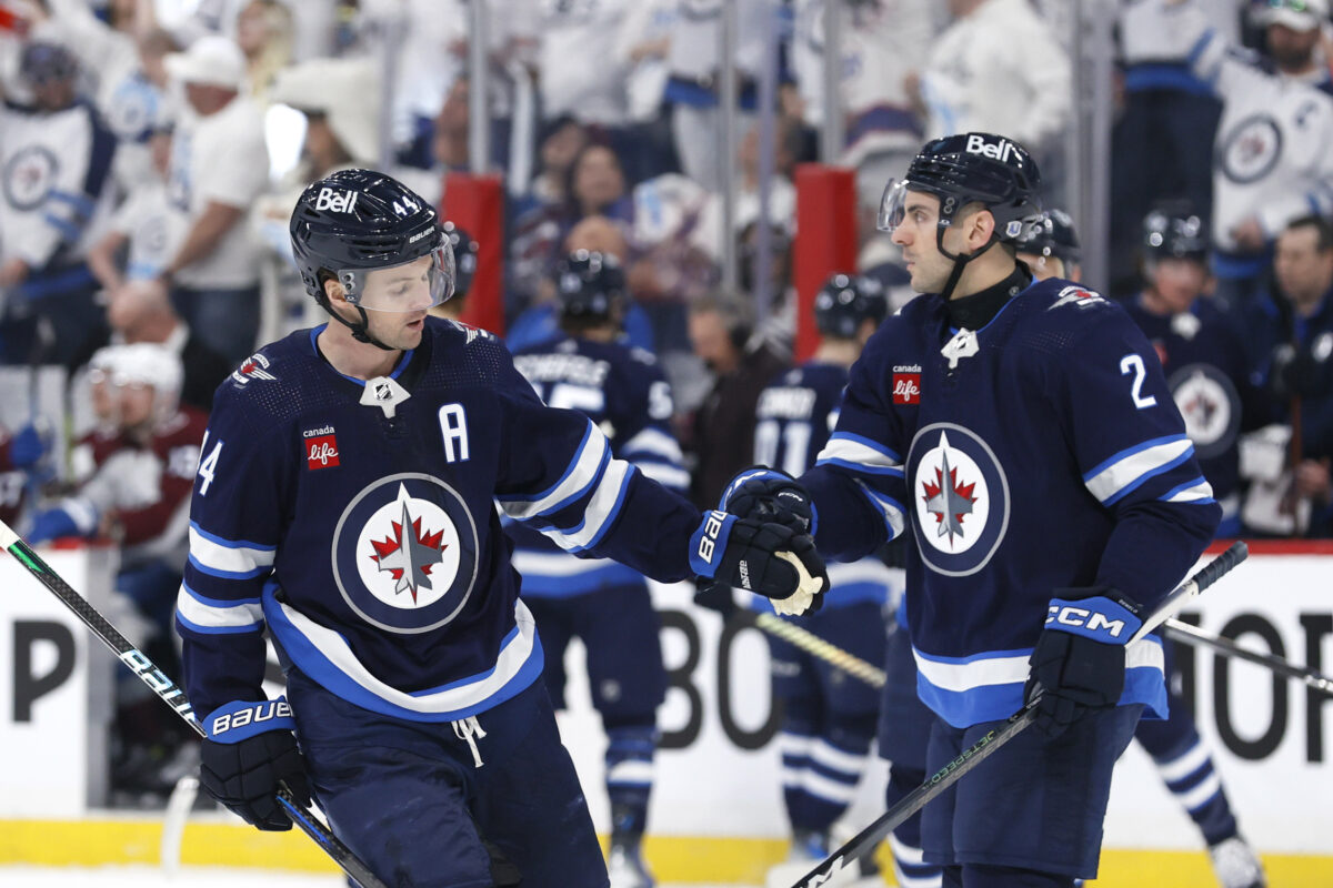
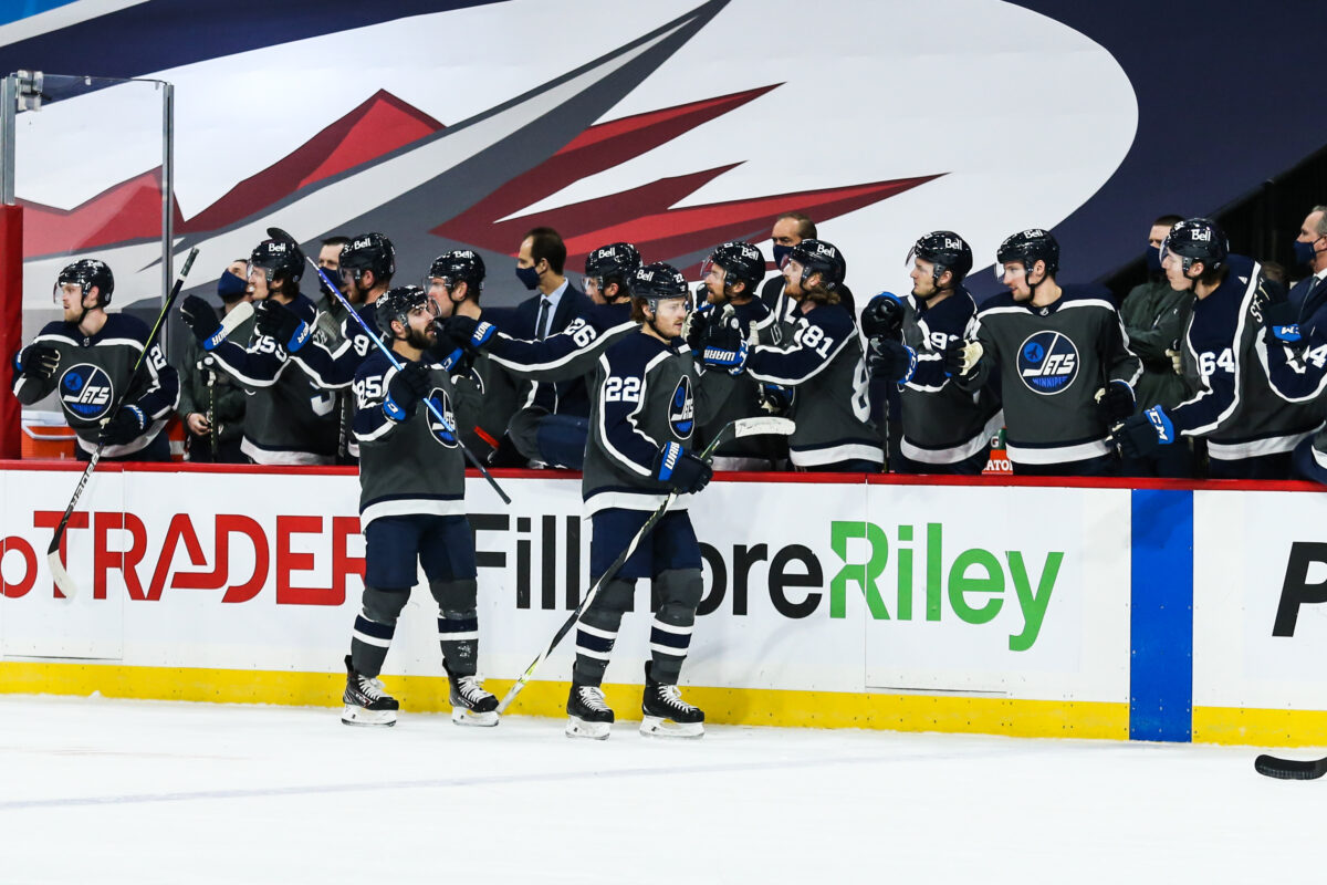
Jets 2.0’s Jersey Has Some Turbulent Aspects
In 2011, True North Sports & Entertainment bought the hapless Thrashers from their uninterested Atlanta Spirit and relocated the team to Winnipeg for the 2011-12 season. Fans who’d endured 15 years of Manitoba winters without NHL distraction (although the IHL and later AHL’s Manitoba Moose, also owned by True North, did their best to fill the void) could rest easy (and open up their wallets, which they did by selling out every home game for nearly a decade.)
With a new colour scheme featuring silver, red and two types of blue (“polar night blue” and “aviator blue”), the Jets struck an admirable balance between paying homage to history and breaking away from the past with a modern, exciting colour palette.
Unfortunately, when it was actually put into action, the Jets 2.0 ended up in uniforms that looked as though the designers poured a decade and a half of ideas into one ensemble. Worse still, though they debuted during the reign of the Reebok Edge uniform system, they’ve stayed the same despite the transition into the ADIZERO era that began in 2017-18 when Adidas took over as the NHL’s uniform manufacturer.
Jets’ New Logos Make the Grade
To start with, the logos are excellent.
While militaristic themes in uniform design can be hit or miss, when the team is called the “Jets” and their city of play is home to an air force base (Canadian Forces Base Winnipeg), it’s certainly a logical choice. (interestingly, the Jets were originally named as such when they entered the WHA not because owner Ben Hatskin was a military man, but rather was a big fan of the National Football League’s New York Jets.)
The primary crest is a blue roundel with a white background, topped by a stylized red maple leaf and a grey fighter plane. Basically, it’s the Royal Canadian Air Force’s roundel with a jet on top. The secondary emblem is made to look like an aviation patch, with a “WINNIPEG JETS” wordmark and a maple leaf atop a winged design, all backed by crossing hockey sticks. Again, thoroughly acceptable, aesthetics-wise. Even the logo used on the pants, a stylized “WINNIPEG Jets” wordmark, makes the grade.
The older Jets logos would no doubt have been a hit, but these new designs ensure the rebooted team is firmly grounded in the 21st Century.
Jets’ Jerseys Complicated, Confounding
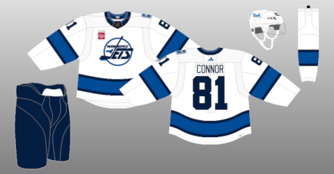
Where the Jets’ jerseys are a bigger mixed bag is, well, everything around the logos.
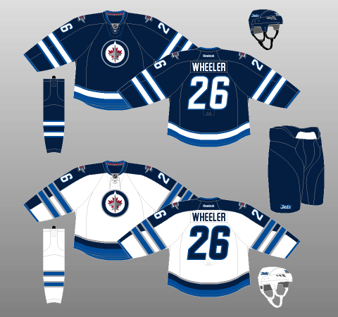
Starting with the away whites, the Jets chose to go with a full-length shoulder yoke, perhaps a nod to their first decade in the NHL. That said, unlike their previous kits, the yokes are untrimmed.
Whatever the case, the look is spoiled by the dual slim-thick-slim, tri-stripe design which also adorns the sleeves. This striping package looks fine on the socks of the kits but, on the sweater, it just looks like a pair of rubber bands wrapped around the arms.

On the tail, there’s a collection of three more stripes in a completely different pattern, muddling the continuity and flow of the kits. As for the collar, it is pointlessly two-toned, given that the polar night blue outer ring is the same colour as the yoke it borders.
There’s simply too much going on, and most of the design features have been poorly implemented.
The home blues are better, mostly due to the lack of a full-length shoulder yoke, which makes the sleeve striping look more natural. However, the use of striping – and colour as a whole – is still rather disjointed and by 2023, looks outdated (sort of like a BlackBerry phone or a LMFAO song.)
That’s not to say these kits are completely hopeless. As mentioned, the logos certainly hold water. The numbers and lettering use an interesting typeface. The colour palette works pretty well, though more red used outside of the logo would be nice — we will later continually note the lack of red in more recent jerseys — along with more of the lighter, aviator blue to provide contrast with the darker, polar night blue background of the home uniforms (perhaps a stripe on the pants?)
In general, taken individually, the elements of the Jets’ current jerseys are pretty inoffensive and, in some cases, refreshingly unique. However, when taken altogether, there’s a lot going on and not all of it’s good.
Possibly the lesson here is cramming 15 years of pent-up ideas into one ensemble makes it less than the sum of its parts.
Jets’ Alternate Jerseys Run Gamut From Terribly Uninspired to Outstanding
Jets’ First Attempt at Alternate Not Worth the Wait
At least the Jets tried when coming up with their main uniforms. It seems they didn’t put any effort whatsoever into their first attempt at a third jersey, introduced for 2018-19. The bare bones alternate, dubbed the Aviator, was not worth the near decade-long wait.
It features an aviator-blue base surrounding a brand-new alternate crest with a “Jets” wordmark written out in a handwriting-like script. Underneath the script and on the sleeves, there is a wide stripe of white bordered above and below by thinner strips of black. The pants are polar night blue, while the socks mimic the jersey in colour and striping.
Starting with what the Jets actually got right, aviator blue is a great colour choice. Lighter-blue sweaters were all the rage in sports a few years back, with very few teams actually managing to pull it off adequately. The Jets are one of these few. Balanced out by white and polar night blue striping, the light blue base looks fabulous in contrast with the ice. Plus, its resemblance to the sky on a clear day connects with the Jets moniker.
The classic-looking numbers and lettering are direct carryovers from the WHA throwbacks worn at the 2016 Heritage Classic (more on that in a moment), also a win. Unfortunately, that’s as much good that can be said of the ensemble, which is devoid of any “wow-factor” and or unique touches.
As good as the light blue base colour is, the lack of red is very noticeable. Already a criminally underused colour on the Jets’ home and away jerseys, red is utterly non-existent on this alternate. The dark blue and white accents look sharp, but there’s just not enough punch or energy in the sweater to evoke any sort of endearment.
The jersey template is a replication of the final uniforms of the Jets 1.0, with a slim-thick-slim striping package adorning the sleeves, tail and socks of the kit. The adherence to the past isn’t strict, however, with the numbers and captaincy letters being trimmed, unlike on the uniforms that inspired this ensemble. It’s a simple, traditional template that, when implemented correctly, would be utterly glorious. Unfortunately, that’s definitively not the case here.
As for the wordmark, it’s downright boring. Even worse, there’s no secondary crest on the shoulders to balance things out. The Jets used a wordmark-only logo in their very first season and, wisely, never again since. Even that ill-fated first crest had some personality to it, with the “J” looking like a hockey stick and a jet-like blurring effect on the “t.”
In contrast, this wordmark expresses zero connection to hockey, and only fleetingly references the team’s moniker via a completely buried design feature. The press release notes, “It [the logo] is highlighted with the “t” in “Jets” being crossed with the outline of a fighter jet.” “Highlighted” is the key word here, because there’s absolutely no way the average person was seeing it otherwise.
It isn’t even adequate as a nod to history, as the homage paid to the aforementioned previous jersey template completely overlooks the sweater worn by the Ottawa RCAF Flyers when they won Olympic gold in 1948 – a sweater replicated by the Jets’ American Hockey League affiliate Moose in 2008.
The Jets’ first attempt at an alternate jersey can be compared to having to explain a joke. Sure, you might be able to guide someone through the mental gymnastics necessary for them to understand it, but the explanatory process sort of ruins the effect. More to the point, the responsibility for immediate appreciation of the joke falls on the joke-teller, not the recipient.
Bottom line: the flabbergastingly dull and boring third jersey still remains dull and boring no matter how much they try and explain it.
Jets’ 2016 Heritage Classic Throwbacks Sparkled In Comparison, But Was Short-Lived and Ignored
It didn’t have to be this way either, as the Jets had already designed a crowd-pleasing sweater that would have been perfect as the alternate: the gorgeous Heritage Classic jerseys they wore during their 2016 outdoor game versus the Oilers.
Nearly perfect in almost every way, the retro-style jersey used the logo introduced by the WHA team in 1973. While it featured modern touches and a slightly different colour palette, it was quite loyal to the original and received acclaim, with fans quickly snapping them off the shelves.

It combined the best design elements of their WHA years with a darker, more aggressive blue. The best detail? The tiny Jet in between the stripes of the pants. Simply marvellous.
Unfortunately, the design was short-lived. The Jets wore them three more times in the 2016-17 season before Adidas took over as the NHL’s jersey’s supplier and all Reebok jerseys were permanently shelved.
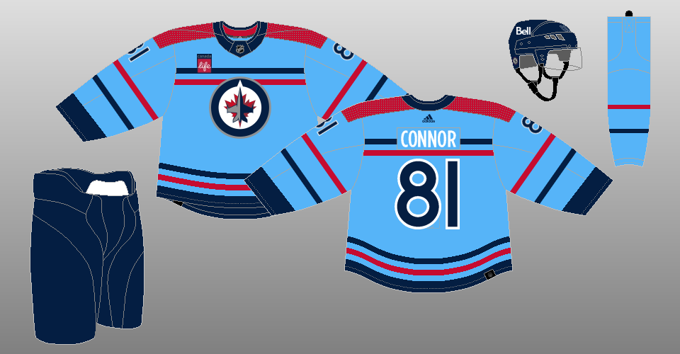
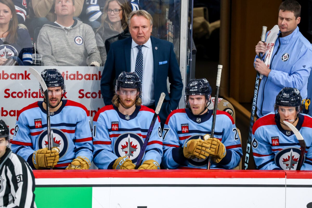
Jets’ Finally Got it Right With Heritage Blue Third Jerseys
A year removed from the Aviator crash-landing onto the scene, the Jets designed something much more eye-popping: the Heritage Blue uniform for the 2019 Heritage Classic in Regina, Saskatchewan.
“The Jets’ Heritage Blue jersey and full uniform draws inspiration from the championship era of the late 1970s and features a crossover V-neck colour and vintage-inspired mesh striping.” a team press release explained after they were unveiled. “The crest employs traditional chain stitching to lend a distinct authenticity to the throwback uniform. A pant logo highlights the historical Jets ID set, complete with an era-accurate name and number set.”
The jersey features the same logo as the Jets’ 2016 Heritage Classic uniform, but is much more than a palette swap. The 2019 design features a red collar and stripes on the arms and beneath the crest: one red between two thin blue, which are in turn, sandwiched by two white. They’re the same stripes Hull, Nilsson, and Hedberg wore while streaking around Winnipeg Arena as part of the “Hot Line.”
The red numbers outlined by white, the white names, the red pants featuring a thin vertical stripe, and the sock patterns also all pay homage this era.

The jerseys got rave reviews, and the Jets wore them three more times in 2019-20 after the 2019 Heritage Classic. In 2020-21, they shared the third-jersey duties with the Aviator.
Thankfully, after seeing how much more fans liked the Heritage Blue than the Aviator, the Jets retired the Aviator and in August, 2021 announced the Heritage Blue would be their official third jersey going forward.
Jets Honour RCAF History With ’48 Alternate
The latest addition to the Jets’ jersey catalogue is a faithful take on a classic uniform steeped in rich hockey and military history.
The ’48 alternate — unveiled in September 2023 prior to the 2023-24 season — pays homage to the RCAF Flyers team that won a gold medal at the 1948 Winter Olympics in St. Moritz. The team was made up of active and former Royal Canadian Air Force members and Canadian Army personnel; six years prior, they’d won the 1942 Allan Cup.
The uniform, commemorating the RCAF’s centennial, is nearly identical to the ones worn by those remarkable men. The jersey is powder blue and has two horizontal stripes — one dark blue atop one red — above and below the crest, which is the current Jets’ logo. It has the same stripes (but reversed in colour order) on the arms with red atop blue, and wide rectangular red shoulder patches.
The numbers on the sleeves and back are dark blue surrounded by white trim, the player names are white with no trim, while the gloves are brown in a nod to the leather equipment of the 1940s. The helmet and pants are dark blue, and the socks are powder blue with the same striping featured on the jersey and sleeves, with red atop blue.
The ’48 is the third RCAF-inspired jersey True North has created. The 1.0 Manitoba Moose wore a similar jersey — but with the actual RCAF roundel — in the 2007-08 AHL Season. The Moose 2.0 also wore a similarly-themed jersey, albeit with the Moose logo, in the 2021-22 season.
Reaction to the threads was divisive, although more positive than negative (especially when fans saw the entire kit on the ice with the brown gloves and brown goalie pads.) While the concept is sharp, striking, and tasteful, there’s an argument to be made that the current Jets’ logo was the wrong choice for the crest compared to the RCAF roundel like the Moose jersey used.
Reverse Retros Produce Uneven Results
First Attempt at Reverse Retro A Swing And A Miss
The Jets’ first attempt at a Reverse Retro jersey was a whiff like the Aviator. The overall package, unveiled in November, 2020, paled into comparison to many of the other outstanding Reverse Retros that were unveiled at the same time by other teams.
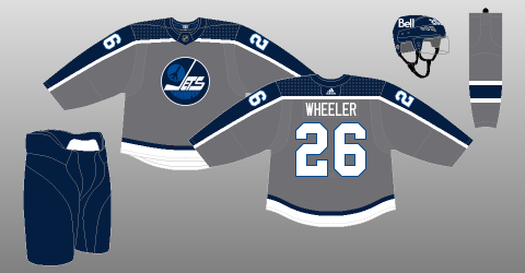
The jersey is mainly a greenish-grey (dubbed “fighter grey” by the team) and features the 1979 logo in white and aviator blue. It also features vertical stripes in white and polar night blue that stretch from cuff to cuff in an upside-down ‘U’ shape. There’s a polar night blue stripe above a thicker white stripe at the bottom. The numbers are white, outlined with aviator blue.
The NHL and Adidas described it as such in a document provided to The Hockey Writers:
This Reverse Retro jersey combines the classic style with the team’s current colourway, a throw back to 1979 honouring the Jets’ first year in the league. This remixed design integrates the iconic heritage plane crest with the bold “Winnipeg” lettering. Remastered in fighter grey, this jersey takes the classic heritage look that the 1980’s era Jets — including legend Dale Hawerchuk — wore and gives it a modern twist.
Despite that description, there’s not that much to the jersey and it quite honestly seemed designed in a couple of days. It looks like a practice jersey and like the Aviator, desperately needs some red to contrast with the grey and blues.
By using the 1979 logo for the third time in five years, the main feature was a retread and disappointed fans who wanted something from the 90s era, which hadn’t been represented by a Jets 2.0 jersey to that point. Even the connection to the past — a main selling point of the Reverse Retro concept — was tenuous at best; it was confusing where the idea to make the jersey grey came from since that colour was not featured on any Jets’ jersey in WHA or 1.0 history.
The design isn’t all bad, though. The aviator blue in the logo and around the numbers is nice and the arm striping — which is a take on the mid-80s jersey — is interesting compared to the horizontal mid-arm stripes of most jerseys.
Overall, though it could have been much better and represented another missed opportunity. It will probably go down as the most forgettable jersey in Jets 2.0 history, as they wore it only twice in 2020-21 before dropping it (while other NHL teams wore their first Reverse Retros the next season.)
Second Go-Around At Reverse Much Retro Better, But Still Not Perfect
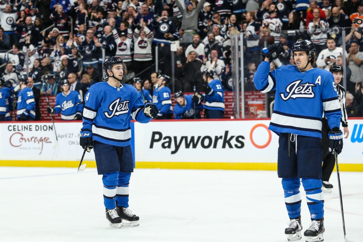
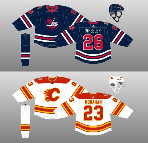
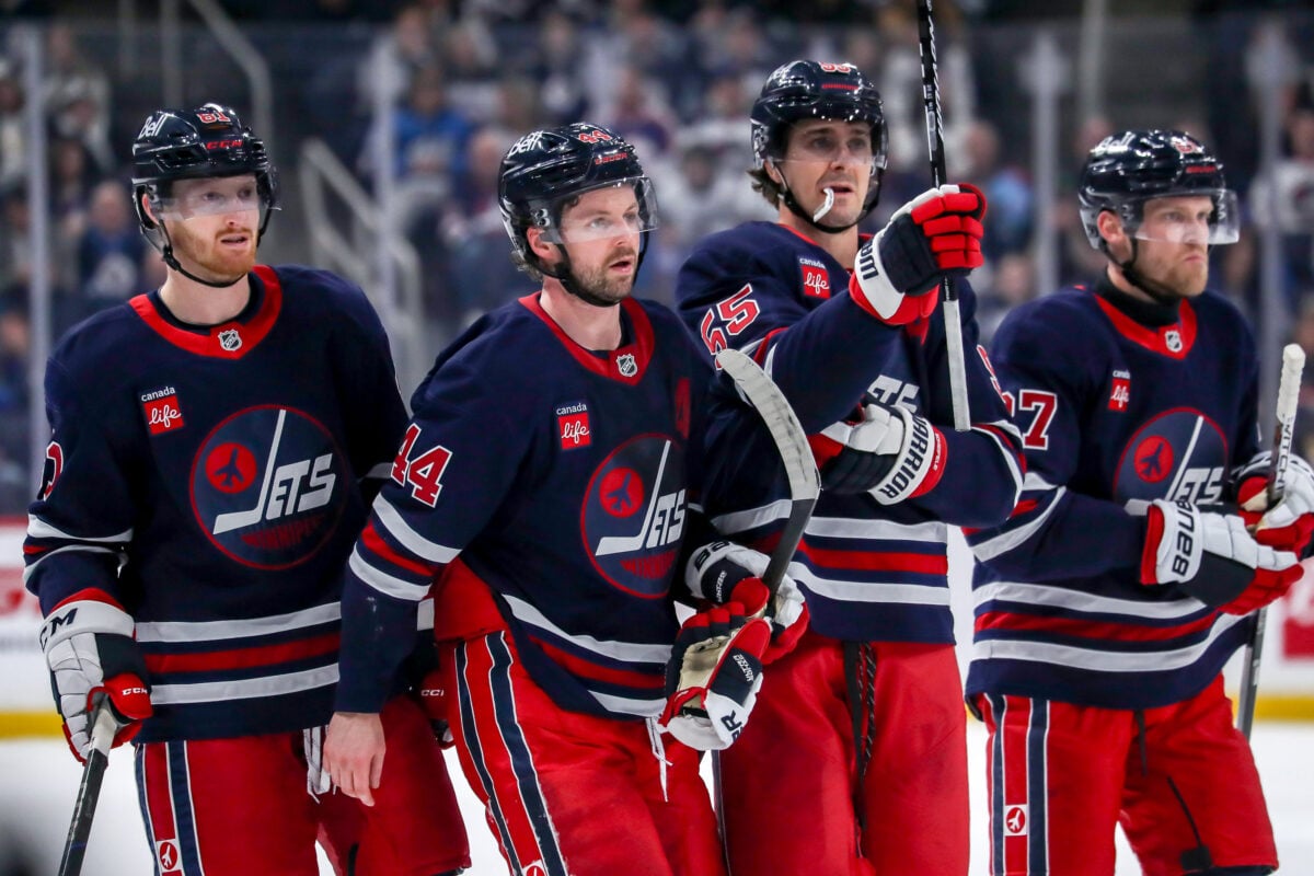
The Jets’ 2022-23 Reverse Retro was a much better effort: it is not perfect, but neither was the era. Introduced in November, 2022, it finally features the logo the Jets wore from 1990-91 through 1995-96.
The jersey is white and features the “Winnipeg Jets” wordmark in dark blue with the inner Jet and outer circle in aviator blue. The jersey has a wide aviator-blue horizontal stripe on each arm and a wide stripe below the logo. The arms and lower stripe are both framed by thinner horizontal dark blue stripes.
The numbers of the shoulders and back and the name plates are dark blue with no outline. There is a shoulder patch with the True North Youth Foundation Logo, a neat reference to the “Goals for Kids” patch that was on the jersey from 1987 through 1996. The NHL crest in the middle of the collar is orange, which it was back then.
The “foundational year of 1990” is represented by being sewn into the jersey’s inside neckline, a news release from the Jets also notes.

Unfortunately, the 2022-23 Reverse Retro — like the Aviator — once again doesn’t have any red. Why True North is so loathe to add red to any jersey other than the Heritage concepts is beyond this author, as the red (specifically red pants) was a key feature of the jets’ most striking’ WHA and 1.0 uniforms.
Even red striping on the arms, below the logo, in the logo, or around the numbers or letters would have gone a long way to breaking up the chromatic colour scheme.
Jets’ Jersey Marketing Strategy Not Cleared for Takeoff
Ultimately, the Jets’ jersey marketing strategy has been muddled, but is improving.
True North will sell jerseys to Jets fans regardless of what those jerseys and related swag look like. Even if only a minority of Jets fans liked the Aviator or first Reverse Retro, a minority of Jets fans still constitutes many thousands of people.
However, the NHL stretches across North America, and hockey itself is an international game, so any strategy to sell jerseys – or to build a brand, in general – should also take into account tens of millions of non-Jets fans. Winnipeg has been and is still awash in marketable stars – Kyle Connor, Nikolaj Ehlers, Josh Morrissey, Patrik Laine, and Blake Wheeler, so it stands to reason people outside of the Jets’ sphere of influence might be interested in a Winnipeg jersey.
While the Jets have gotten better at marketing to their own fans by giving them what they wanted — the Heritage Blues, the second Reverse Retro — the 2.0 era has yet to come up with anything more widely appealing to anyone outside of their core constituency. That’s a bit of a shame considering Winnipeg’s glorious back catalogue.
This may change soon. 2023-24 is Adidas’ last season as the NHL’s uniform manufacturer, and controversially, the sometimes-maligned Fanatics brand will take over beginning in 2024-35 on a 10-year contract.
Will the Jets main uniforms get a significant redesign, one that should have happened when Adidas took over, when Fanatics starts producing the uniforms? Are more alternate jerseys or Reverse Retros on the horizon? Fans will just have to wait see, and in the meantime, keep rocking whatever they’ve got in their closets.
After all, while we’ve made much of the Jets’ jerseys throughout the years in this article, the most important part of a jersey from a fan’s perspective is not the details — although those are important, too — but that they give just about anyone a chance to wear what their favourite players wear.
Free Newsletter
Get Jets History coverage delivered to your inbox
In-depth analysis, breaking news, and insider takes - free.
Subscribe Free →