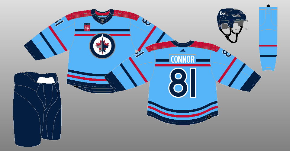
The Winnipeg Jets’ new addition to their jersey catalogue is a faithful take on a classic uniform steeped in rich hockey and military history.
Jets Ready to “Fly The ’48”
The “48” alternate uniform — unveiled at Saturday’s Fan Fest and on social media with a video featuring new captain Adam Lowry — pays homage to the RCAF Flyers team that won a gold medal at the 1948 Winter Olympics in St. Moritz. The team was made up of active and former Royal Canadian Air Force members and Canadian Army personnel; six years prior, they’d won the 1942 Allan Cup.
The uniform, commemorating the RCAF’s centennial, is nearly identical to the ones worn by those remarkable men. The jersey is powder blue and has two horizontal stripes — one dark blue atop one red — above and below the crest, which is the current Jets’ logo. It has the same stripes (but reversed in colour order) on the arms with red atop blue, and wide rectangular red shoulder patches.
The numbers on the sleeves and back are dark blue surrounded by white trim, the player names are white with no trim, while the gloves are brown in a nod to the leather equipment of the 1940s. The helmet and pants are dark blue, and the socks are powder blue with the same striping featured on the jersey and sleeves, with red atop blue.

This is not the first time True North Sports & Entertainment has created an RCAF-inspired jersey. The 1.0 Manitoba Moose wore a similar jersey — but with the actual RCAF roundel — in the 2007-08 AHL Season. The Moose 2.0 also wore a similarly-them jersey, albeit with the Moose logo, in the 2021-22 season.
Jersey Reaction Divisive, As Always
Reaction to the new threads was swift and divisive. An informal scan of comments of the platform formerly known as Twitter and Reddit shows some fans loved the concept, viewing it as sharp, striking, and tasteful. Others hated it, viewing the powder blue as ugly and the current Jets’ logo as the wrong choice for the crest compared to the RCAF roundel.
Personally, this author’s all-in on the new design. He’s a sucker for powder blue, views the faithfulness to the original as a asset, and enjoys that True North wasn’t afraid to incorporate some red. Red was conspicuously absent from the terribly-forgettable Aviator alternate and both Reverse Retro designs (although the second shot at the Reverse Retro is much better than the first.)
Related: Winnipeg Jets Jersey History
Regardless of one’s initial reaction, the best judge of a uniform is how it actually looks on the ice. The Jets will wear them three times: Dec. 4 vs. the Carolina Hurricanes — which is the kickoff of the RCAF’s centennial celebrations — Jan. 27 vs. the Toronto Maple Leafs, and April 1 vs. the Los Angeles Kings, which marks the 100th-anniversary of the RCAF (it was officially granted royal title on April 1, 1924.)
Lowry, for one, likes the design he heavily modelled over the weekend.
“I think it’s a pretty good-looking jersey, and with the history behind it and everything, I think they did a great job trying to keep all the original parts,” he said Saturday. (From ‘Welcoming crowd, new jerseys put pep in Jets’ step,’ Winnipeg Free Press, Sept. 23, 2023.)
The Heritage Blues remain the Jets’ primary alternate uniform for this season and will be worn 11 times on dates to be determined.
What do you think of the ’48 alternate? Comment below!
Free Newsletter
Get Winnipeg Jets coverage delivered to your inbox
In-depth analysis, breaking news, and insider takes - free.
Subscribe Free →


