- The Boston Bear
- The Boston Bear: Version 2.0
- The Boston Bruins Go to College
- The Boston B
- The Bruins’ Days Are Numbered
- The Spoked-B
- The Spoked-B: Version 2.0
- The Bruin Head
- The Spoked-B: Version 3.0
- Winnie the Pooh
- Bruins Secondary Script
- Boston Bruins Current Logo
- The Spoked-B: Version 4.0
- Boston Bruins Current Secondary Logo
- The Boston Bear: Version 3.0
- A Good Thing Bruined
The Boston Bruins: known worldwide as one of the National Hockey League’s Original Six…except they didn’t actually come along until seven years after the league began play. There were also only four teams in the NHL’s original iteration. Whatever. We’ll gloss over that.
The Boston Bruins: known worldwide for their classic, Spoked-B logo…except that this logo didn’t appear until a quarter-century into the team’s existence. Along with their seminal crest, the Bruins have chosen aggressive animals, giant letters, football numbers, collegiate script and Winnie the Pooh to adorn their jerseys. Plus, once something actually works, they feel the need to incessantly tweak it. But yeah, classic, timeless, legendary, Bobby Orr, Ray Bourque, Tom Brady, etc etc etc.
Why is this sport so needlessly complicated?
The Boston Bear
The Bruins entered the NHL for the 1924-25 season with a brown and yellow (sorry, “gold”) kit, featuring a bear on the prowl surrounded by a “Boston” wordmark.
Boston’s first attempt at a logo was really quite reasonable. Yes, brown really shouldn’t have a place in the color palettes of professional sports teams, but this was nearly a century ago when tastes were different and, according to the progression of photographic technology, the human eye was just developing the ability to see color. It helped that the team’s founder and owner, Charles Adams, also owned a chain of grocery stores, whose color scheme just happened to be brown and gold.
Laid against the all-brown backdrop of the team’s first jersey, at the very least, this crest did not look out of place. The wordmarks sandwiching a vicious predator would have presented a strong image of the nascent team to the rest of the NHL.
That said, even in 1924, one would think it would have been common knowledge that bears generally have four legs. In addition, “Boston” and “Bruins” are written in two different typefaces. And why the B and N are so big is beyond me.
But not a bad attempt, all things considered. It was even brought back for the 2016 NHL Winter Classic where, set atop a black background, it looked even better. This jersey was later adopted as Boston’s full-time alternate.
The Boston Bear: Version 2.0
The very next season, the Bruins livened up their uniforms with the addition of white. This design choice was accompanied the following year by the standardization of some of the aesthetically problematic elements of their inaugural logo.
As you can see, all letters of “Boston,” though still in a different font than “Bruins,” were made a uniform size. The fact this redesigned crest was surrounded by white, rather than brown, really helped this logo to pop off the chest. It was also this logo that celebrated Boston’s first Stanley Cup, in 1929.
The bear, however, was still missing a leg.
I like these logos. Despite the color scheme and artistic inconsistencies, they strike a nice balance between image and text, and have a classic look truly befitting of a storied franchise like the Bruins. Of course, the longevity and reasonable success of the Bruins can’t have been known at the time, which makes these designs all the more impressive. I wouldn’t mind at all seeing one of them on an alternate jersey in the future, as the Bruins have had in previous years.
The Boston Bruins Go to College
So, what does a fledgling organization do just after tasting success for the very first time? Why, rebrand, of course! And nothing says “professional hockey team” like taking uniform queues from collegiate life and American football.
The Boston B
In 1932, the Bruins mothballed their bear-adorned kits and went with a blocky B as their logo.
I mean, there’s nothing technically wrong with it. It’s just not particularly evocative.
It’s not ferocious, not mysterious, it’s not grounded in history and it’s not especially good-looking. Even the team’s 1934 switch from brown to black didn’t help matters.
You may also like:
- Bruins Playing It Safe With Retread of Connor Clifton
- Bruins’ Kevyn Adams Hire Brings New Voice to Management
- Bruins Won the Joonas Korpisalo Trade With the Rangers
- 3 Free Agency Fits for Anthony Mantha
- Cam Neely Trade Tree: Vancouver Canucks to Boston Bruins
Maybe they thought they had already built a solid fan base, so there was no longer any need for an actual bruin on the jersey. Maybe they wanted to be different from the other eight teams in the circuit, of whom all but the lowly New York Americans used a proper crest. Or maybe the old logo was just too inefficient to produce.
Regardless, this logo made the Bruins jerseys of the time look like a letter jacket from some generic university. Go team.
The Bruins’ Days Are Numbered
Oh but wait, it gets better.
In 1936, the Boston B was bumped to the shoulders of the Bruins jersey, replaced on the front by a number. Yes, the same number that was on the back. Yes, like a football jersey. Yes, ‘twas a silly time.
I’ve often said that perhaps the greatest sin a sporting organization can commit, aesthetics-wise at least, is having a boring, uninspiring logo or jersey. Well, it appears I was wrong.
The greatest sin a sporting organization can commit, aesthetics-wise, is having no logo at all.

Yes, the Bruins’ football jerseys were joined five years later by a gold alternate kit that actually had a real logo – albeit an unimaginative college script-style wordmark, but this blessed relief lasted a scant four seasons. Meanwhile, the logo-less wonders persisted for five more campaigns, bringing their tenure to 12 full seasons.
Despite a distinct lack of brand or identity, the Bruins still managed to win two Stanley Cups wearing these monstrosities (1939 and 1941).
The Spoked-B
For 1948-49, Boston reverted to using the Boston B crest on the front of their jerseys, this time adding serifs, coloring it gold and setting it against a black background.
Much more significantly, to commemorate the Bruins’ 25th season, the team rolled out an anniversary sweater, featuring an early version of the Spoked-B logo we all know and love.
As you can see, the B is written in a jaunty, Comic Sans-esque font, and is flanked by the numbers 24 and 49, referring to the team’s inaugural and anniversary seasons. This logo was copied, albeit with a brown border and spokes, for the 2010 NHL Winter Classic.
Given that this crest only lasted a season and was only created for celebratory purposes, I shan’t spend too much time on it. Especially considering the significance of what would debut the following year.
The Spoked-B: Version 2.0
In 1949-50, the Bruins made the Spoked-B a full-time primary logo, joining the Boston B. After 1954-55, the latter was retired, leaving the Spoked-B alone to carry the torch. It does so to this very day, and wasn’t so much as tweaked for its first 46 seasons.
A circular border surrounds a blocky B, which was taken from a different typeface than that of the Bruins’ other logo (note the lack of serifs). Still a relatively simple design, to be sure. And still no explicit reference to the team’s moniker.
What makes this logo so great is its ambiguity. Is it representing the cycle of life? The very existence of a sports team is one of constant rebirth. Are the spokes supposed to be some sort of sunburst design, signifying a perpetually bright future? Maybe it is supposed to mean the Bruins will explosively take on all comers? Or perhaps the logo is a menacing wheel, set to roll over Boston’s opponents? This last one certainly fits in with the reputation the Bruins would soon earn – and one they value to this day – for playing bruising, hard-nosed hockey.
The general consensus is that the logo was created on the basis of a description of Boston from Oliver Wendell Holmes Sr., the noted American physician and poet of the 1800s, who referenced Boston (specifically, the Massachusetts State House) as the “hub of the solar system.” Hence, the hub-and-spoke design of the Spoked-B logo, with Boston represented at the center of the world/solar system/universe. Humble, those Massachusettsans.
Whatever the case, the Spoked-B is now etched into hockey lore as the definitive logo of the Boston Bruins.
The Bruins would have jerseys in three primary colors over the next 46 years, with this logo being colored slightly differently for each iteration. Backed by black, the logo had a golden border and B, with black spokes. Atop a white base colour, the logo was framed in black, with a black B and gold spokes. And placed on gold, the logo outline and spokes were black, while the B was golden.
The Bruin Head
In the 1976-77 season, the Bruins added a menacing bear’s head as a secondary logo.
Utilized as a shoulder patch, this terrifying, weirdly stripey bruin was clearly created the night before it was due by someone with no sense of proportion and only the vaguest idea of what bears look like, before being colored in by a six-year-old who likes tigers. A cross between a panda, an anteater and a bumblebee, this crest adorned the shoulder of every Bruins jersey until its retirement following the 1994-95 season.
As artistically problematic as it may be, this is pretty much everything one could ever hope for in a logo for a team called the Bruins. Those ferocious teeth and the wide-eyed, maniacal look suggest instant death. The color scheme, though disorienting, made the logo pop off the jersey, rather than being a superfluous addition just along for the ride. Going into the corner and seeing that logo coming towards you on the shoulder of some punishing body-checker no doubt only enhanced the infamy of the “Big Bad Bruins.”
The Spoked-B: Version 3.0
For 1995-96, the Bruins conducted a major uniform overhaul, updating the Spoked-B – and dispensing with the Bruin Head altogether – along the way.
As you can see, the B is slightly taller, more closely resembling the font used in the original Boston B logo. Most noticeable though are the new trim accents around the B, the spokes and the border.
These accents add depth to the crest when viewed in isolation, but detract from it on the jerseys. True, the Bruins’ new kits had many such superfluous accents themselves. And no doubt the ever-increasing influence of television, along with the very early stages of the Internet, meant that the Bruins’ logo now had to do much more than simply front a uniform; it had to be a brand. Plus, the yellow accent around the border meant the team only needed to produce a single logo, rather than two separate ones. So I do understand the revisions.
However, I just can’t get away from the fact these accents and trim pieces disrupted what was a clean, crisp polished look that had worked for nearly half a century.
Winnie the Pooh
Making matters worse was the secondary emblem that came out of the redesign, a crest that can only be described as Winnie the Pooh.
After doing away with the hugely fun, yet artistically disproportionate Bruin Head, I would have expected the Bruins to come back with a cleaner, more proportionate version that still retained the aggression and brutality of its predecessor.
Instead, we got a pensive, even pained-looking bear’s head, which looks more like it’s about to be mounted on somebody’s wall, rather than tear out the throat of an opponent. Its striking resemblance to the popular children’s character did not stop Boston from devising a putrid third jersey with this logo as the primary crest.
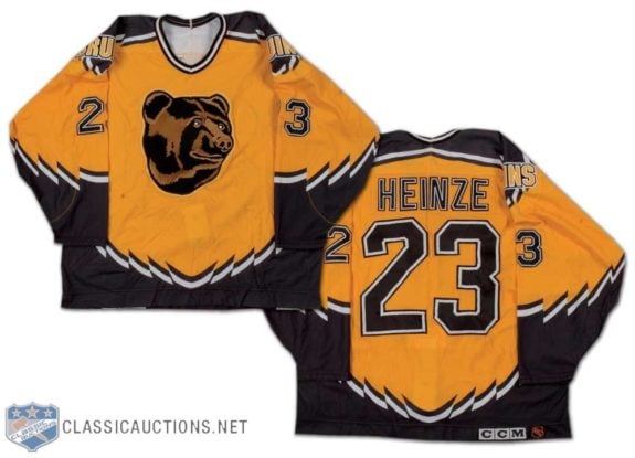
Keep in mind, this was just one entry in the franchise’s long line of unfathomable uniform decisions.
Bruins Secondary Script
The Winnie the Pooh jerseys featured an oversized “Bruins” wordmark on the shoulders.
The jersey was an ill-advised concoction to being with, but the boring, yet comically large shoulder script made it all the more absurd.
Boston Bruins Current Logo
Mercifully, the Bruins did away with Pooh Bear following 2005-06, and revamped their threads entirely a year later, including tweaking the Spoked-B once more.
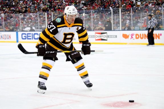
The Spoked-B: Version 4.0
The 2007-08 season saw the introduction of the Reebok Edge uniform system and with it, the redesign of many uniforms across the NHL. The Bruins thoroughly revamped their kits, cleaning them up quite a bit. With the fresh duds came more alterations to the logo.
The new crest, still used today, features a smaller B and a raft of thicker black accents, giving the current emblem a modern, more aggressive appearance. This look is additionally enhanced by the used of a serifed typeface for the B, a first for the Spoked-B series of logos.
Though cleaner in appearance than its predecessor, the present-day Boston logo is still not as simple and crisp as that which worked just fine for 46 glorious years. All the accents do, particularly with regards to the jarring intersection of colors where the spokes meet the B (in comparison to the seamless transition in all previous iterations), is overcomplicating a brilliant design.
Too many cooks in the kitchen. They’ve overdone it.
Boston Bruins Current Secondary Logo
The Boston Bear: Version 3.0
The Bruins slapped a shoulder patch on their Reebok Edge home and away jerseys, spoiling an otherwise lovely uniform. That said, this secondary logo, judged on its own merits, is really rather good, and worked quite well as the primary crest (albeit with the wordmarks swapped) on Boston’s otherwise dreary, cheap-looking old alternate kit.
Harkening back to the first days of the franchise, this logo features an angry bear on the prowl, sandwiched between “Boston” and “Bruins” which, this time, appear to be in compatible, if not identical, typefaces. Said wordmarks even seem to match the B in the team’s main primary logo.
Yes, the bear still has three legs, and yes, on the home and away jerseys, this crest ruins the cleanliness of the shoulder yokes, but you can’t have everything.
Judged on its own, the Bruins’ secondary logo works rather nicely. It’s just been implemented poorly. I would like to see the shoulder yokes removed from the Bruins’ home and away jerseys to give this crest a more prominent role. Either that or just get rid of it altogether and leave the shoulder yokes be. Having both just isn’t working.
A Good Thing Bruined
The Adidas takeover of the NHL’s uniform system saw a number of teams revamp their wardrobes with new changes coming seemingly every year. The Bruins remained true to their Spoked-B design with the new Adidas uniforms, going cleaner with the numbers and names on the back, however.
They also explored their roots with their uniforms for the 2019 Winter Classic.
Basing their uniforms (down to the logo) on uniforms worn from 1932 to 1936, the Bruins went back to the Boston B for the spectacle.
You may also like:
- Bruins Playing It Safe With Retread of Connor Clifton
- Bruins’ Kevyn Adams Hire Brings New Voice to Management
- Bruins Won the Joonas Korpisalo Trade With the Rangers
- 3 Free Agency Fits for Anthony Mantha
- Cam Neely Trade Tree: Vancouver Canucks to Boston Bruins
I would like to see Boston get back to the clean and crisp, yet aggressive and no-nonsense setup they had prior to fiddling with the Spoked-B centerpiece.
Like a lot of Bruins organizational decisions of recent years, they’ve had a good thing going, but have not appreciated it. Instead, they’ve tried to improve upon it, sometimes even ruining the original good thing in the process.
Things appear to be looking steady and consistent for the Bruins right now. Logo-wise, at least. ‘Cause Thornton, Kessel, Seguin and Hamilton ain’t coming back.
Free Newsletter
Get Bruins History coverage delivered to your inbox
In-depth analysis, breaking news, and insider takes - free.
Subscribe Free →