The Boston Bruins have had a weird few years. Come to think of it, they’ve had a pretty strange history. Every time they have a run of success and seemed poised to become a bona fide dynasty, circumstances conspire to ensure that dream falls just a little bit short.
You Win Some, You Lose Some…More
Bobby Orr might well be the greatest player in National Hockey League history. However, injuries limited him to just 631 games – spread over ten seasons, in a Bruins uniform. Though they did win the Stanley Cup in 1970 and 1972, those teams were – and are – wholly overshadowed by the dynastic Montreal Canadiens of the same decade.
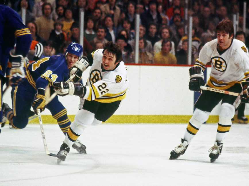
The Bruins also iced very good teams throughout the 1980s and early 1990s, making the playoffs every season. But they lost out each time, including four years in a row to the Canadiens (1984 to 1987) and twice, in the Stanley Cup Final, to the Edmonton Oilers (1988 and 1990), the latter time without having to play against Wayne Gretzky. However, they did manage to fleece the Vancouver Canucks in acquiring Cam Neely…only to watch his career be slowed and, ultimately, truncated by injury.

The early 2000s saw a resurgence…followed by the lopsided trading of superstar captain Joe Thornton for his lack of production during the 2004 Playoffs – a broken rib isn’t a good excuse, apparently.
Oh but it’s okay, they were bad enough to garner the fifth Overall Pick in 2006, using it to select Phil Kessel…a budding star who they then proceeded to trade in 2009.
Oh but it’s okay, they rebounded and, in June of 2011, got themselves a Stanley Cup! But then their starting goaltender went crazy and they traded away budding superstar Tyler Seguin for being 21 years old.
Oh but it’s okay, they made the Cup final again in 2013, so everything’s fine for the future, right?? But let’s trade away future stalwart defenseman Dougie Hamilton, just to be safe. Might as well get rid of prototypical Bruin Milan Lucic, too.
Oh but it’s okay, now we have 3 First Round picks in 2015! It’s not like they’ll ALL fail their physicals, right? Right?! …guys?
What an interesting, interesting organisation.
If It ‘Aint Broke, Break It
Their uniform history has been up and down, as well. Check out the mid-century versions below, with the design that can’t make up its mind. The stripes on the jerseys are bad enough, but the socks look as though they let a two year-old have at the colour palette as if it were Whac-A-Mole. Did they blow the entire design budget on three completely different jerseys, forcing them to make one pair of socks for the lot? Were they simply trying to distract everyone from whatever was going on with the tail striping? And since when are yellow pants ever a good idea?

It’s almost enough to distract you from the fact that, for a solid decade, the Bruins wore what were, essentially, football jerseys. These kits featuring no logo and player numbers on both the front and back were joined, for 1940-41, by a special jersey featuring a collegiate wordmark on the front. After all, nothing says “professional” quite like something you’d find in a student union bookstore.

And, of course, everyone fondly recalls the 1990s, when the Bruins decided, “Hey, you know that awesome, “Spoked-B” logo we have? Let’s change it to Winnie the Pooh!”

So Close, and yet…
But hey, for a team with nearly a century of history behind it, one has to grant them a few duds. Thankfully, the current iteration isn’t too shabby.

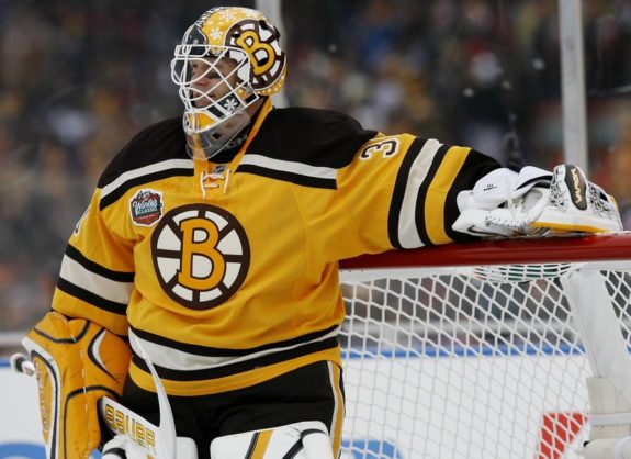
Mercifully, the Bruins did not give into peer pressure with the advent of the Reebok Edge uniform system and institute vertical striping under the arms. A simple three-stripe, two-colour combination graces the sleeves and tails of the home and away jerseys, with a lovely, two-tone shoulder yoke, as well. These elements are gritty enough to satisfy the stereotypical, tough-guy image of Boston, while being artistically balanced enough to appease the eggheads in the surrounding suburbs. And the Spoked-B logo is, quite simply, one of the best of all time. Combine this with a simple helmet, pant and sock, and the Bruins have a real winner on their hands. Sort of.
My only real beef is with the secondary logo. It draws inspiration from Boston’s very first emblem and, truth be told, is really not bad-looking thing at all. However, its presence on the shoulders of the Bruins’ home and away uniforms, breaks up what I like most about them: blockiness and simplicity. It just looks out of place. If the yokes were not there, the secondary logo would look less intrusive (though the jersey itself might be ruined), but the easiest solution would be to just get rid of it altogether. I would even be fine with it on a third jersey…
…where it, surprise surprise, looked great! Actually, it was the best part of the Bruins’ old third jersey, which looked like a practice uniform. Where are the tail stripes? And why do away with the lace-up collar? The thick, yellow one looks like it belongs on an off-brand jerseys found at Walmart. This third jersey was concocted solely for the purpose of making money. It is boring and cheap-looking, and was clearly designed on the back of a napkin at breakfast by someone who forgot about the project until 23 minutes before it was due.
The 2016 Winter Classic against Les Habitants provided an ideal opportunity to redesign their alternate kit. And redesign they did, drawing heavily upon Boston’s original uniform, worn way back in 1924-25.

And you know what? It’s not awful. I love the sweater-like collar. The striping is good. The big numbers that teams like to use for outdoor games have been made to look passable in this iteration – not an easy feat. And I especially like how, in going retro, these jerseys still retain the Bruins’ current black backdrop – brown is a tough colour to make work with any apparel, let alone that of a sports franchise. This design was chosen to replace the blue-light special as the Bruins’ full-time third jersey for the this season.

But that logo… Come on. Seriously? It was wonky the first time, what with the big “B” and “N” flanking a much tinier “OSTO”. Why would you reuse it? And why, oh why, would you keep it brown?! Just use the alternate logo you already have! Or what about your 2010 Winter Classic jersey (see below), how about some variation of that?
Oh wait, you blew that one, too! The traditional yellow and black colour scheme is “complimented” by brown. Nothing says modern like a cartoon, Comic Sans-esque logo and a colour palette from the 1970s, amirite??
Make It Right
A team with this much history and this passionate a fanbase deserves a uniform kit to match. Stop screwin’ around and make this right.
But please, feel free to keep on trading all of the players you draft in the First Round – that’s just good, wholesome entertainment for everyone.
(All illustrations by Andrew M. Greenstein, The unofficial NHL Uniform Database.)
Free Newsletter
Get Archives coverage delivered to your inbox
In-depth analysis, breaking news, and insider takes - free.
Subscribe Free →