The first task of any marketer is to find the starving crowd. This applies to every business, from the local sandwich shop to the billion-dollar sports franchise, because no matter how brilliant a business idea might seem at first glance, if there isn’t a starving crowd waiting in the wings it’s going to fail.
Enough has been written about whether or not the Golden Knights will be marketable in Vegas, but what about their brand? What exactly is their image and how will it be conveyed?
Choosing a Name
In the case of this newly minted franchise, the first thing it needed was a name. In a city like Vegas already suffocating in stereotypes and so bereft of anything NHL, one can only imagine what kinds of travesties must have been bandied about in the initial bull sessions.
“Fire away people and remember there is no such thing as a stupid idea.”
“I’ve got one, how about the Vegas Rolling Dice?”
“I’ve got one too, how about the Vegas Card Counters?”
“No wait, I’ve got a better one, the Vegas Card Sharks!”
“But isn’t there already a team called the Sharks?”
“Oh yeah, the San Ramon Sharks.”
“I think it’s actually San Jose.”
“No, that’s the Clippers.”
“Okay, fine, regardless, looks like Sharks is out.”
“How about the Las Vegas Salmon?”
“I’ll note that but not sure if a salmon elicits the fighting spirit we’re after.”
“They could be fighting salmon.”
“I’m feeling your flow, but I don’t think salmon are indigenous to Vegas.”
“They’re indigenous to the buffets!”
“Yes, but give me something, you know, more desert like…”
“How about the Vegas Dust Mites? And before you say no, they could be fighting dust mites!”
A few hair-pulling sessions like this could leave any executive tasked with brainstorming the name balder than Ryan Getzlaf. Fortunately for the golden ones they early on tapped the talents of Jeff Eagles, Design Director at the Adidas Group Sports Licensed Division and his creative team. NHL reps were also a consistent presence during the process, so it’s unlikely that anyone got sucked down any divergent rabbit holes like the kind embellished above.
Besides, owner Bill Foley is a graduate of West Point, and his affection for his alma mater’s football team, the Black Knights, had already given everyone a clear starting point. Knight would be in the mix in some form or fashion.
According to the Las Vegas Sun, the name Golden Knights had worked its way to the top of Foley’s short list by the summer of 2016. Desert Knights and Silver Knights were also contenders but Black Knights was nixed despite the fact that it scored higher when it came to fan polling.
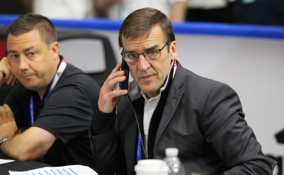
Golden Knights was also the favorite of general manager George McPhee, and after it became official in the fall of 2016, the Adidas creative team went to work.
Designing the Logo
The challenges that come with logo creation are that if it’s too complex you risk losing your audience. On the other hand, if it’s too simple it can appear childish. Oh, and by the way, it better be something the fans will want to wear.
The other challenge for the designers was that the Golden Knights had no history to tap into. Rather than seeing this as a negative, however, team Adidas instead capitalized on the creative freedom afforded them since there weren’t any sentimental ties that could have served as obstructions.
When it came to choosing historical Knights from which to draw inspiration, they found the landscape saturated with vast swathes of iconography. The curse of too many choices if you will. Their plight is easy to empathize with since even I can think of a few right off the top of my head — Don Quixote jousting with windmills, the Black Knight of Monty Python lore or even modern-day dalliances such as the kind committed by the cast of “Jack Ass” with their version of BMX jousting.
Being the professionals they are, however, team Adidas stuck with a more appropriate version using as inspiration the helmet of Zawisza Czarny, a Polish Knight regarded as a model of knightly virtues and according to Eagles, also a favorite of Foleys from his days at West Point. Next came the colors.
Color Selection
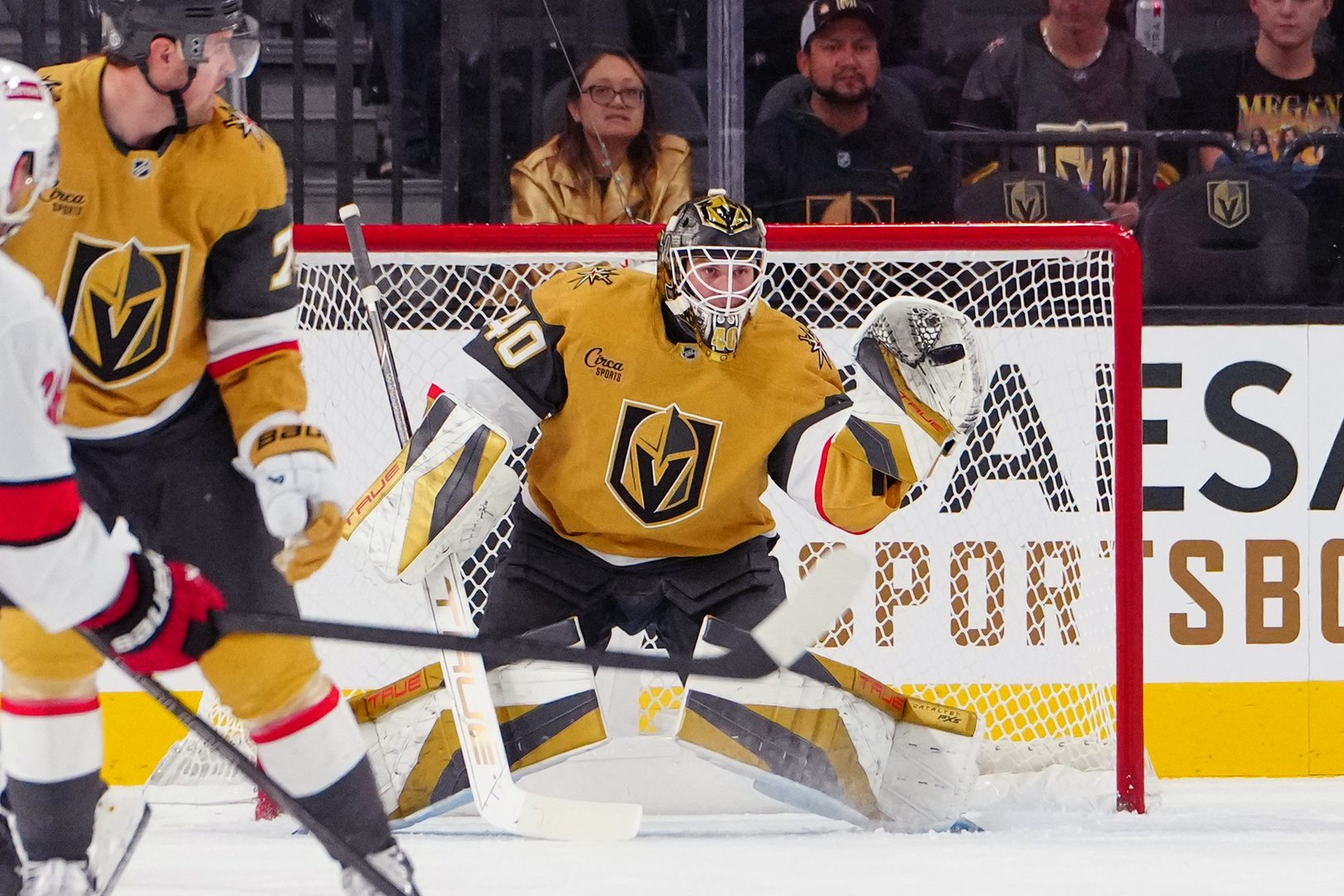
The obvious starting point for the creatives was to investigate the colors used by other teams to avoid duplication. In the YouTube interview above, hosted by Sportsnet, Design Director Eagles explains how they went with a stormy dark color as the base to match the armor of a real knight. The next color was gold, but not just the typical athletic gold, they wanted a real glitzy gold something unique to Vegas.
The next request came from McPhee. He wanted to add a “real energy color” and Foley agreed. The designers chose the color red from the hues reflected off the rock and clay formations in the surrounding desert. And there you have it. In the words of Eagles, “A strong base of black and storm gray, the Las Vegas gold, and that energy red to complete the color palette.”
Other Iconic Elements
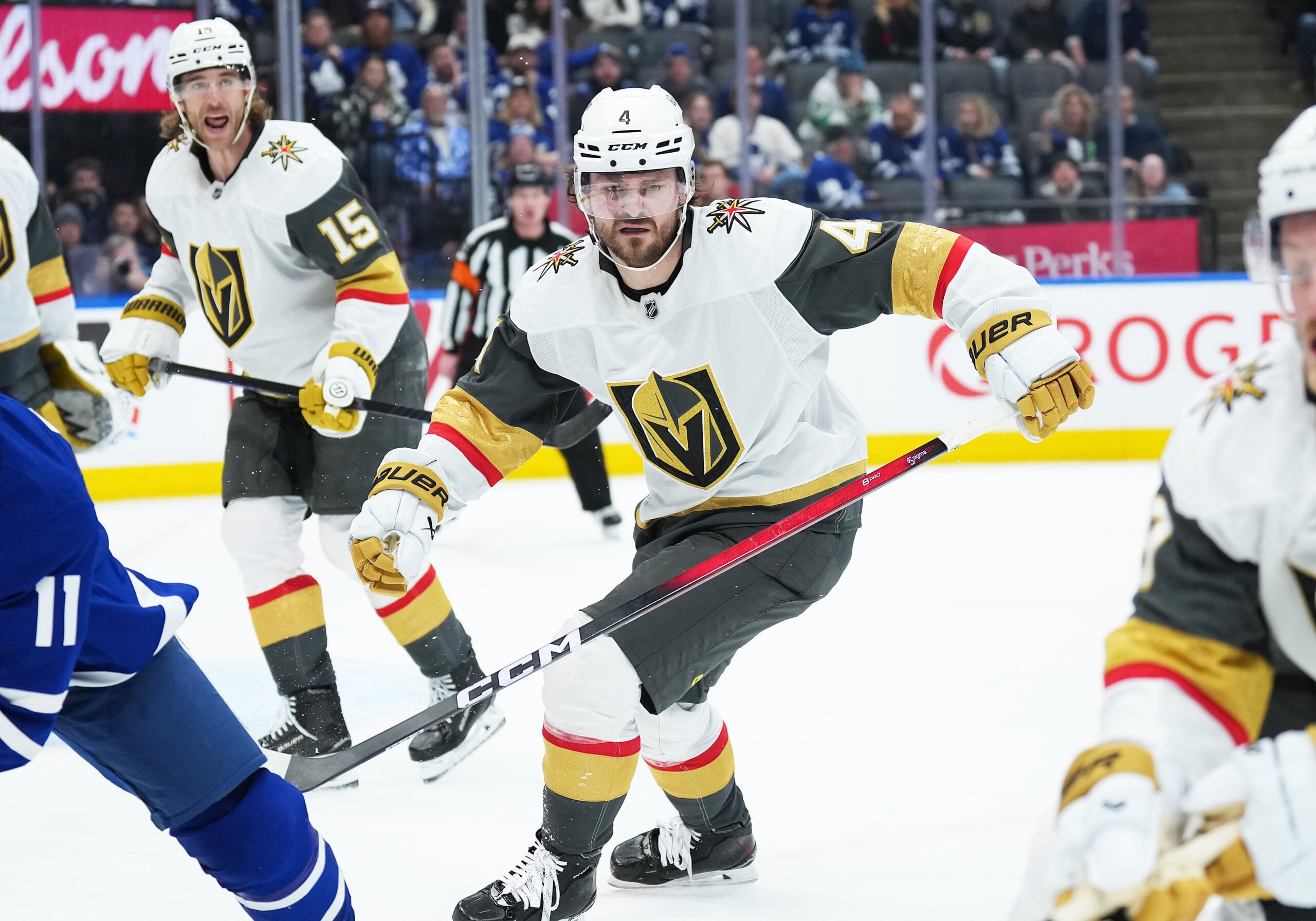
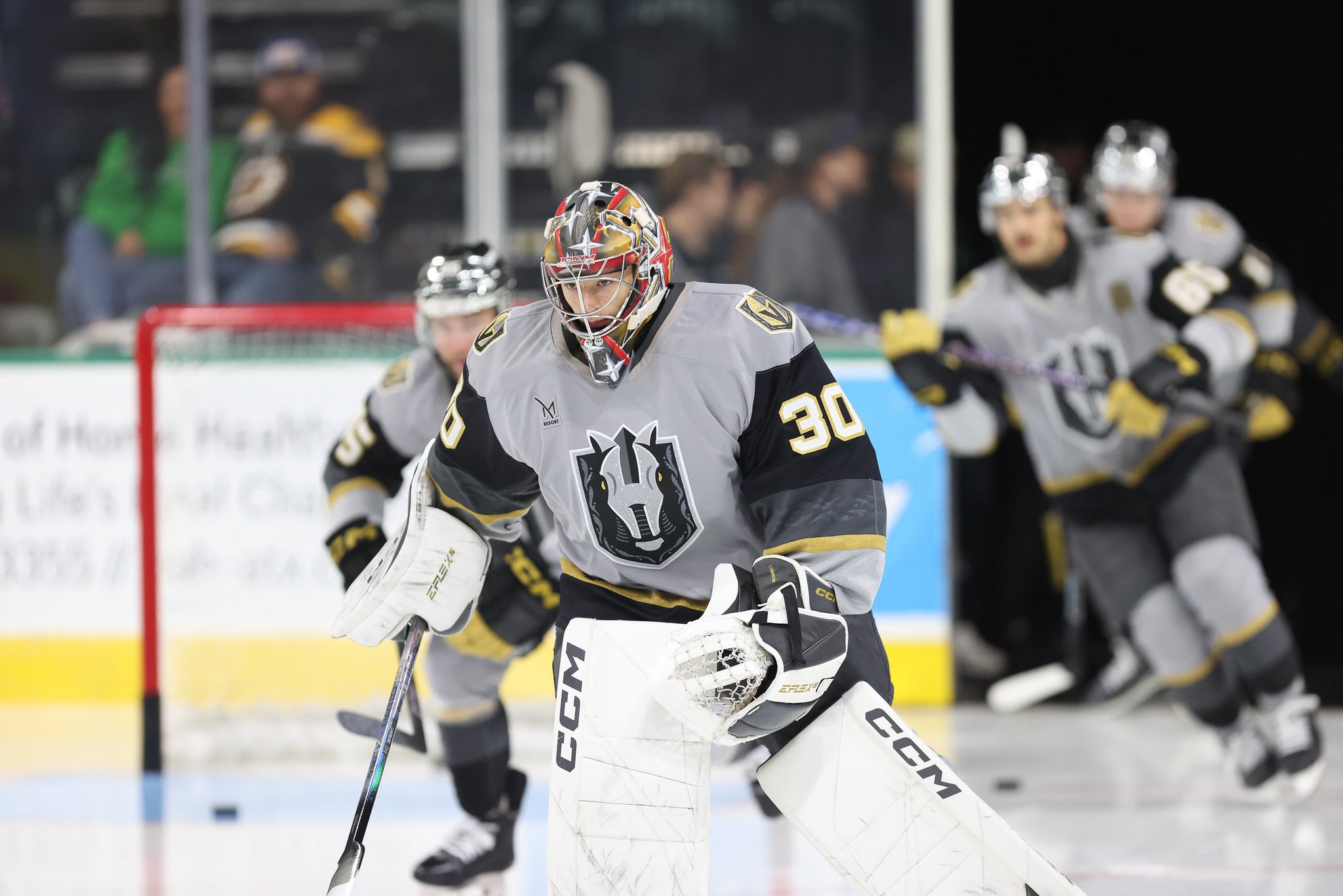
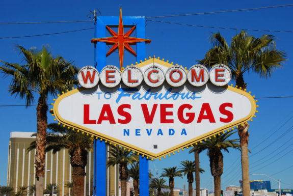
Other local elements were incorporated into the design as well. For example, the Vegas V is branded into the negative space at the front of the helmet. Also from the famous Vegas neon sign came the star that is now embroidered with swords on the jersey’s shoulder. Look closely and you can also see Sagebrush, the Nevada state flower, baked into the golden sleeve.
Lastly, after the up close and personal inspections were approved came the on-ice testing. The NHL was very keen on overseeing this process since the entire uniform had to pass muster from a distance, not only for the referees but for the fans in attendance as well as the broadcast audience.
The Golden Knights Brand
Among other things, besides clearly differentiating oneself from the competition, a good brand crafts a clear message about what the organization is most passionate about and it communicates that consistently across many applications. It’s way more than just a slick logo.
And now as they say in radio, back to your regularly scheduled programming…
MARC-ANDRE FLEURY STARING INTO YOUR SOUL! pic.twitter.com/kyzfyLYJ4F
— Vegas Golden Knights (@GoldenKnights) September 7, 2017
Eagles summed it up best, “Mr. Foley was really smart in embracing the idea that he didn’t want to pretend they were something they weren’t. This is not an original-six team, this is hockey in the desert. And really the vision for his brand is, what is this team going to become? With that, we knew that this should be a more forward-looking brand, a team of the future.”
Free Newsletter
Get Vegas Golden Knights coverage delivered to your inbox
In-depth analysis, breaking news, and insider takes - free.
Subscribe Free →