Adidas and the NHL unveiled the second iteration of their popular Reverse Retro jersey series on Oct. 20. The concept of the project is to create a uniform that honors jerseys and logos from the past with some modern modifications. With one of the more popular retro logos in North American sports, this was a perfect opportunity for the Anaheim Ducks to bring back the Wild Wing crest.
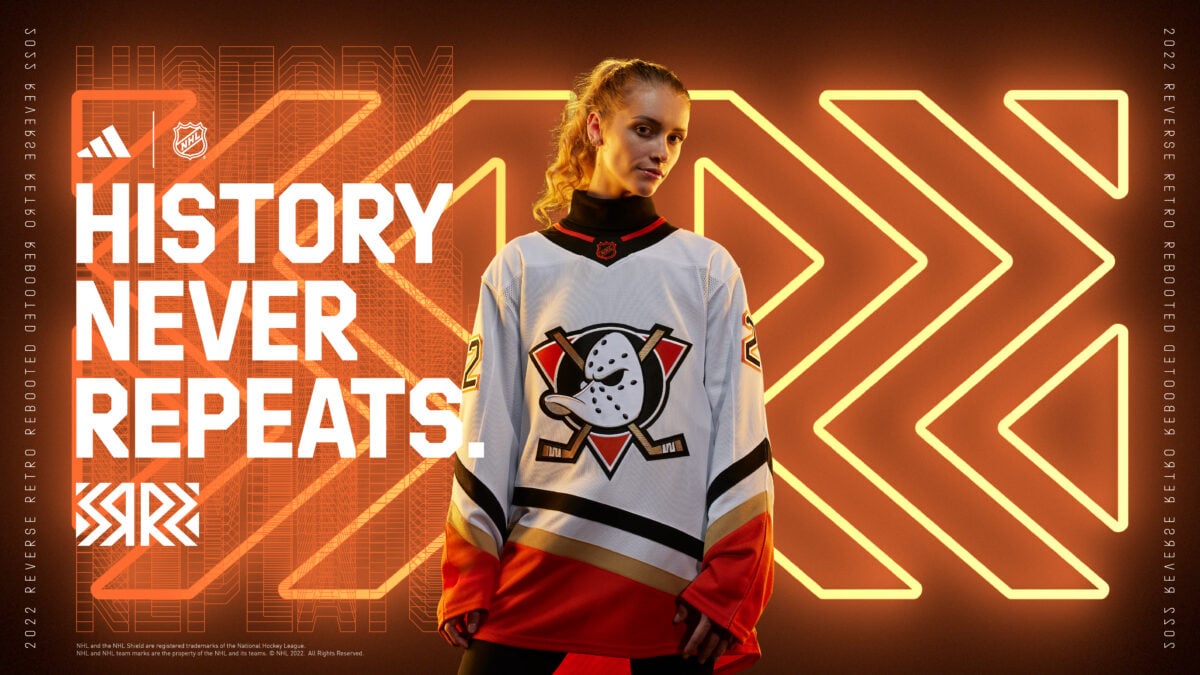
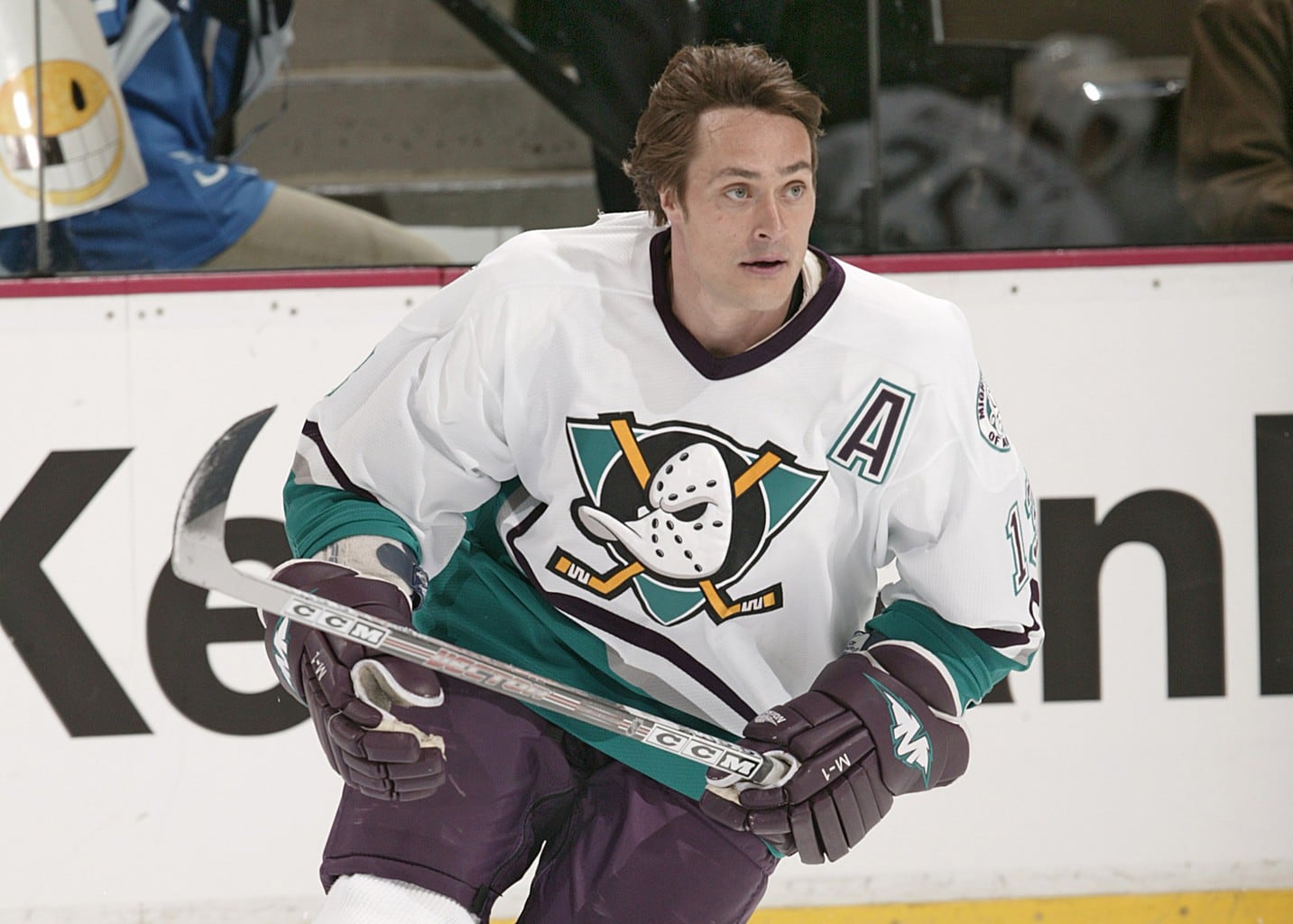
The Ducks’ Reverse Retro 2.0 is a modernized take on their inaugural uniforms from 1993-94, replacing the classic eggplant and jade colors with the orange, black, and gold of the modern kits. While it lacks the goofy charm that made the Ducks’ first Reverse Retro so popular, the new design is more modest and reasonable to wear with frequency. The return of the original Mighty Ducks logo was always going to be a hit with Ducks fans and hockey fans alike. THW’s Jacob Billington ranked the uniform 11th among all Reverse Retro 2.0 designs, a significant improvement over the team’s present-day jerseys that typically rank near the bottom of any list.
As the Ducks’ franchise emerges from its multi-year rebuild, demands for a rebrand are becoming more apparent. A wave of young talent is beginning a new chapter in Anaheim, and with it comes an appropriate time to re-assess the uniform design. The Ducks should consider a return to the beloved Mighty logo, with this year’s Reverse Retro 2.0 as a blueprint for a future away jersey.
Ducks’ Desperately Need to Rebrand
It’s no secret that the Ducks are in a difficult place with their uniforms. They introduced the webbed “D” as part of a script logo just in time for their Stanley Cup win in 2006-07. After a few seasons on the script logo, a larger webbed “D” became the primary design on home and away jerseys in 2014. What this means is that while the logo does have some ties to the franchise’s lone Stanley Cup, the oversized duck foot worn today has more ties to playoff collapses and basement-dwelling rebuilding.
The Ducks are coming out of the worst years of the team’s history with serious star power. Trevor Zegras, Mason McTavish, and Jamie Drysdale are gems in a loaded prospect pool. With more prospects climbing up the system in combination with Ryan Getzlaf’s retirement over the offseason, Anaheim has ushered in a new chapter of Ducks hockey. With this new chapter should come a reassessment of the uniforms.
Zegras’ star power has already forced the conversation to begin. He was named as one of the cover athletes for the NHL 23 video game, but instead of wearing the usual home uniform for the cover, Zegras is wearing the Ducks’ orange alternate jersey with the Mighty Ducks logo. He has also voiced his support for the old logo because he grew up with The Mighty Ducks movies (from, ‘Ducks’ Trevor Zegras answers reader questions about hobbies, goals, favorite opponents and his next number’, The Athletic, 10/21/21).
For the NHL and game developer Electronic Arts, the decision to put Zegras in the alternate jersey makes sense. The cover of the video game is an advertisement for the game itself, and the Mighty logo has a significantly larger cultural footprint than the webbed “D.” But as the Mighty logo gets used with more frequency, it’s harder to justify buying into merchandise with the primary logo. The Ducks’ current logo feels like it’s in the early stages of being phased out. Even if that isn’t in the immediate plans for the franchise, the perception has set in, and fans will be more and more hesitant to spend money on an unpopular logo that may not be around in a few years.
Ducks Rebrand Should Feature Old & New
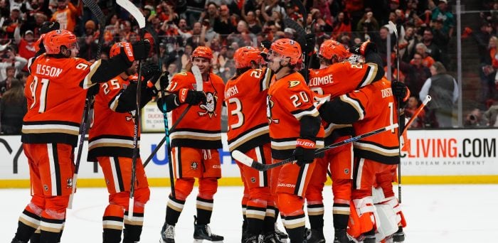
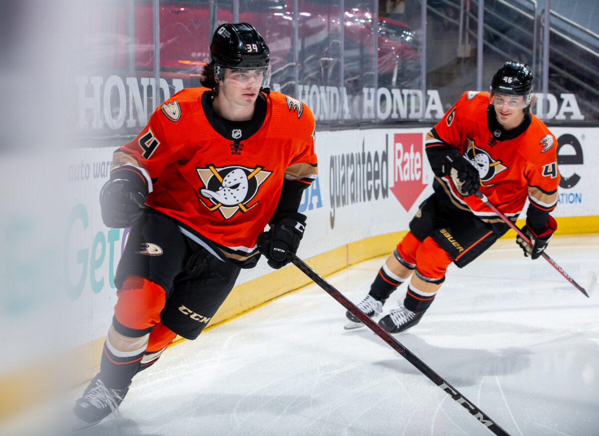
With a well-received logo already at their disposal, the Ducks don’t need to go through the process of getting the fanbase to embrace a new design. While the modern black, gold, and orange aren’t as whimsical as eggplant and jade, the Reverse Retro 2.0 and alternate jerseys are proof that the colors can play well with the more cartoonish logo. This is fortunate because the franchise appears to be attached to the modern colors, with orange paying homage to Orange County, as well as being the team’s color theme for the playoffs.
Anaheim should look no further than to the Arizona Coyotes for proof of concept. After re-introducing their popular Kachina jersey as a one-off in 2015, it became their alternate jersey by 2018. The Coyotes eventually pivoted into wearing it for every home game for the shortened 2020-21 season. Before the start of the 2021-22 season, the organization announced the Kachina as their primary logo, with brand-new road uniforms joining the existing home threads.
The Ducks could see a similar gradual rebranding. Their orange alternates are a common sight among fans in the arena and would make for a solid home uniform on an interim basis. An eventual overhaul of the uniform could bring the chaotic striping of the sleeves to be more in line with the Reverse Retro 2.0, which should act as the blueprint for their future away uniform. It’s worth noting that the Ducks have only played one home game so far this season, and they made the interesting decision to wear their alternates for the opener. With a handful of games in their alternates in combination with the eight scheduled games featuring their Reverse Retro 2.0 jerseys, the Mighty logo will be getting plenty of television time.
Free Newsletter
Get Anaheim Ducks coverage delivered to your inbox
In-depth analysis, breaking news, and insider takes - free.
Subscribe Free →