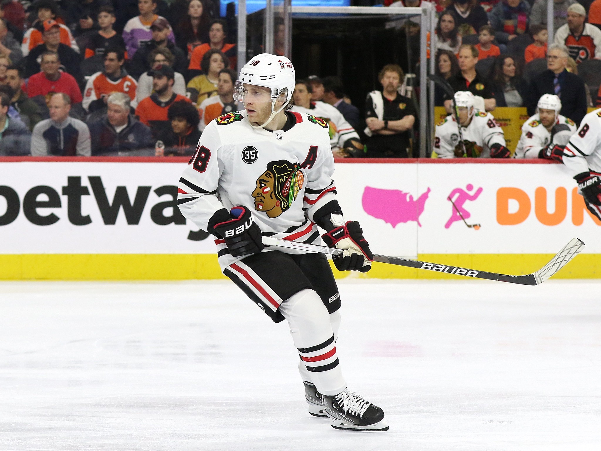
- #32 – Chicago Blackhawks
- #31 – Philadelphia Flyers
- #30 – Detroit Red Wings
- #29 – Vegas Golden Knights
- #28 – Columbus Blue Jackets
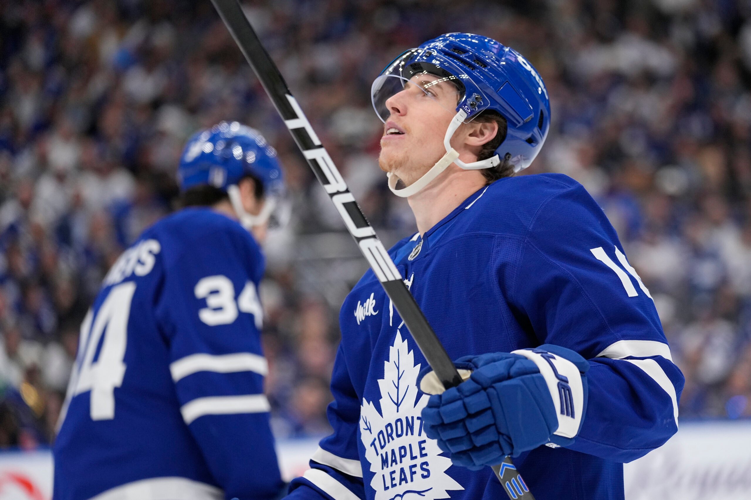
- #27 – Toronto Maple Leafs
- #26 – Carolina Hurricanes
- #25 – Ottawa Senators
- #24 – Dallas Stars
- #23 – Nashville Predators
- #22 – Colorado Avalanche
- #21 – Seattle Kraken
- #20 – St. Louis Blues
- #19 – New Jersey Devils
- #18 – Boston Bruins
- #17 – Edmonton Oilers
- #16 – Vancouver Canucks
- #15 – Winnipeg Jets
- #14 – Arizona Coyotes
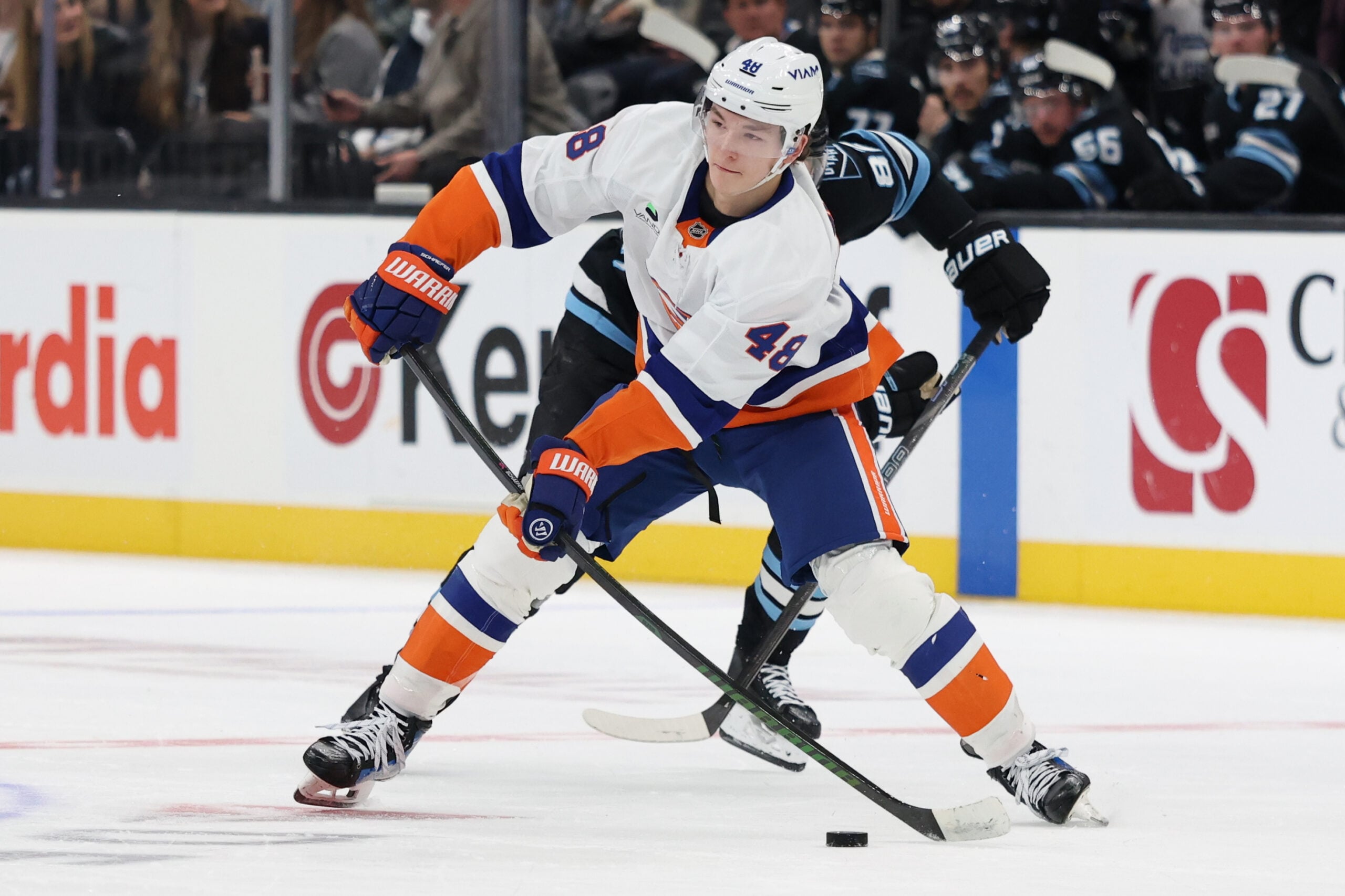
- #13 – New York Islanders
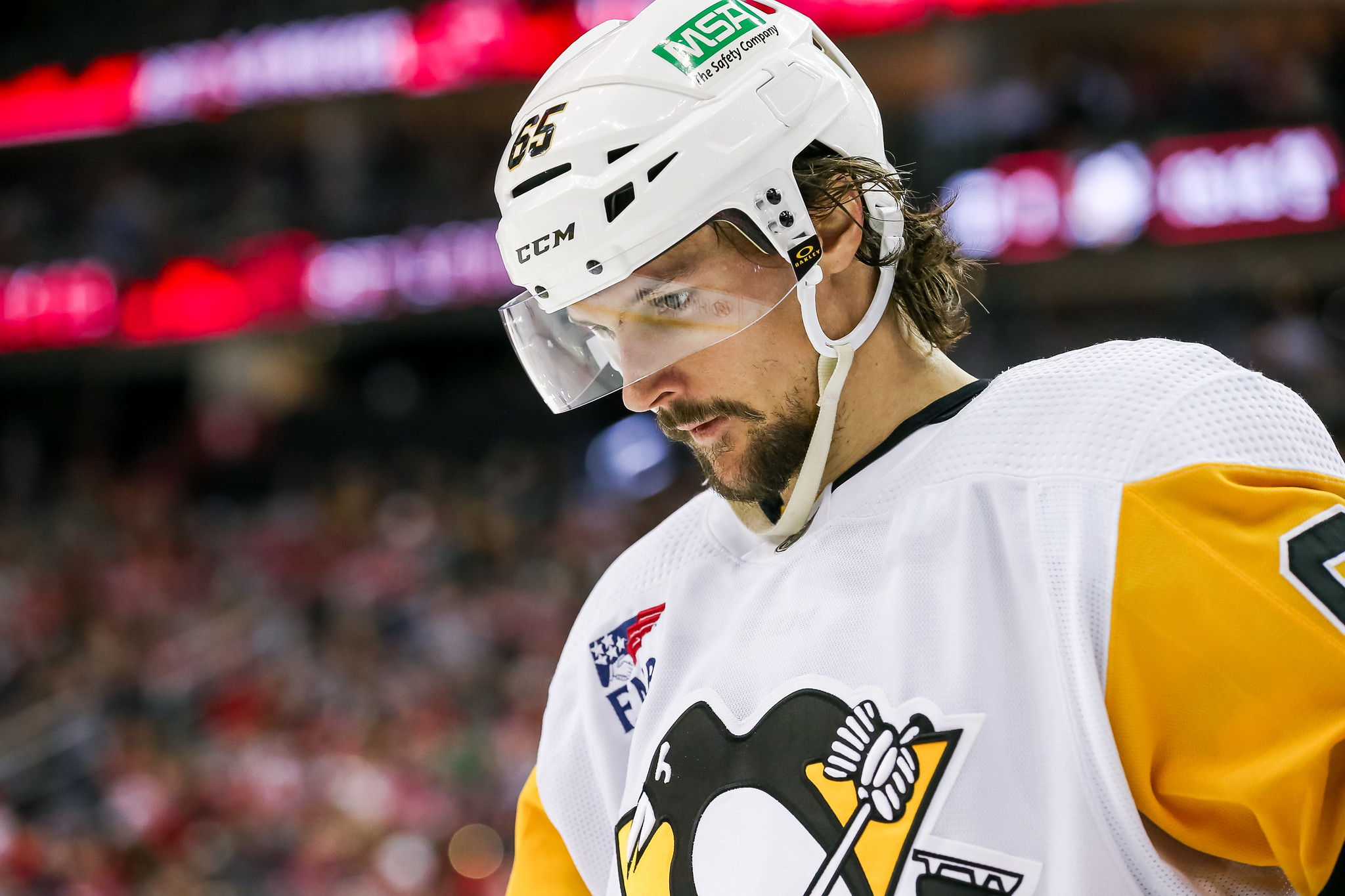
- #12 – Pittsburgh Penguins
- #11 – Anaheim Ducks
- #10 – Calgary Flames
- #9 – Washington Capitals
- #8 – New York Rangers
- #7 – Tampa Bay Lightning
- #6 – Minnesota Wild
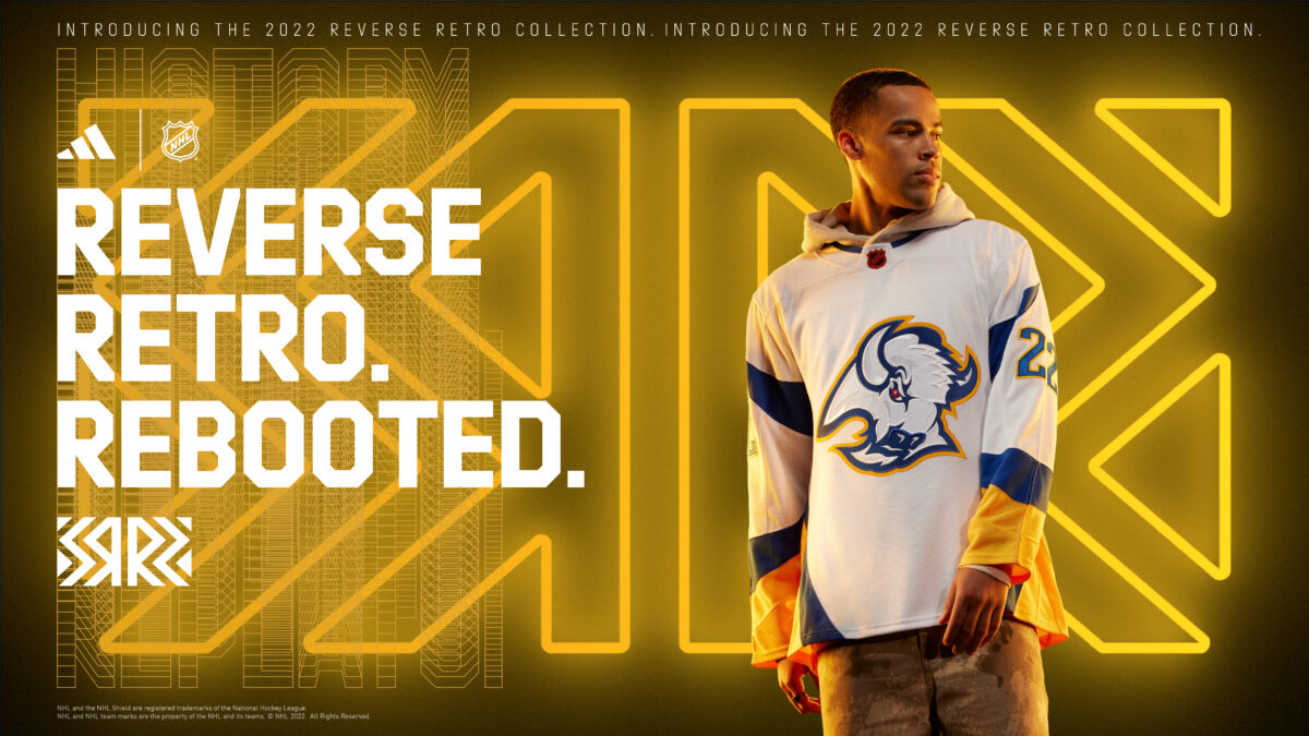
- #5 – Buffalo Sabres
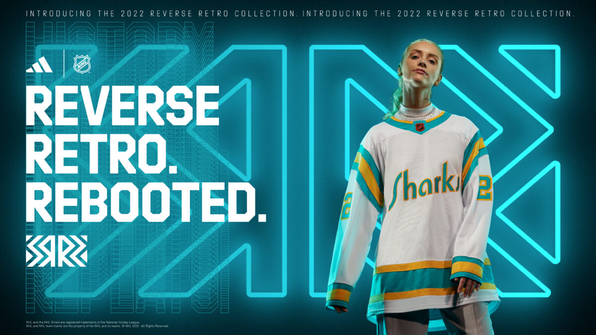
- #4 – San Jose Sharks
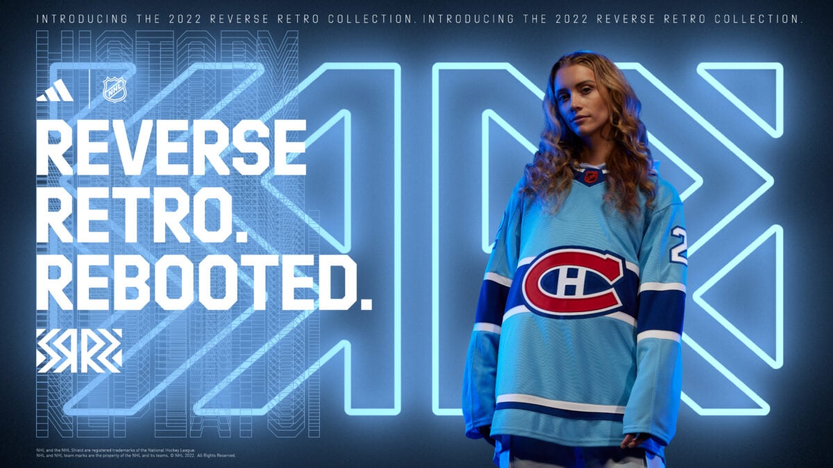
- #3 – Montreal Canadiens
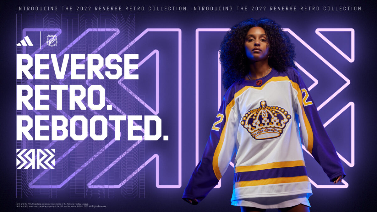
- #2 – Los Angeles Kings
- #1 – Florida Panthers
The NHL released their second series of Reverse Retro jerseys on Thursday (Oct. 20) and what better way to react than a set of rankings?
The Reverse Retro series is fairly self-explanatory, but for those of you who are unfamiliar, the goal is to modernize a historic version of an NHL jersey. Some teams decided to represent their previous team, another team from the same city, or even just try something new. Regardless of what they decided to do, I will say that most of these jerseys turned out very, very nice.

Some of the things I took into consideration when ranking these include:
- How the jersey looks overall
- The uniqueness of the jersey
- The incorporation of the “retro” aspect
Before we get into the rankings, I just want to make things clear, this is my opinion only. If your favorite jersey is ranked too low, or your least favorite is ranked too high, let me know in the comments or feel free to start a conversation on Twitter.
#32 – Chicago Blackhawks
This Chicago Blackhawks jersey is fine. Though it is in last place for me, it’s not a terrible jersey. They have a tough jersey to do a Reverse Retro design of, as they have had a very similar style throughout their whole existence. A version of their 2019-20 alternate jersey, which was black and white, would have been a much better path to go down, though.
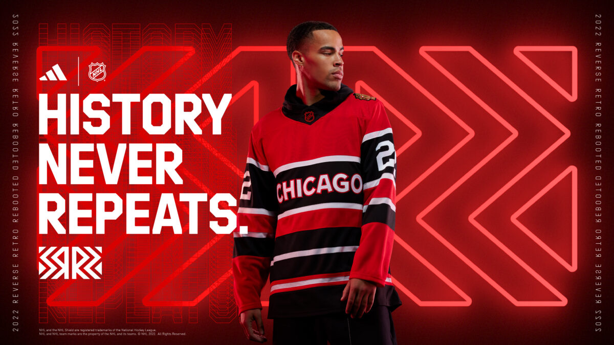
Choosing to go with a text and stripe design, rather than a rendition of their primary logo was an interesting choice. Paying homage to the striping being a primary focus through their uniforms in the 1940s and ’50s is a good way of doing it, but I was hoping to see a bit more creativity with the rest of the jersey.
#31 – Philadelphia Flyers
The Philadelphia Flyers, like the Blackhawks, have had a very similar jersey set-up throughout their time in the NHL. The only way there were going to be able to pull off a design that wouldn’t be close to the bottom for me, would be if they did something extremely unique. For what they had to work with, they did a fine job. I like the jersey, but it is boring.
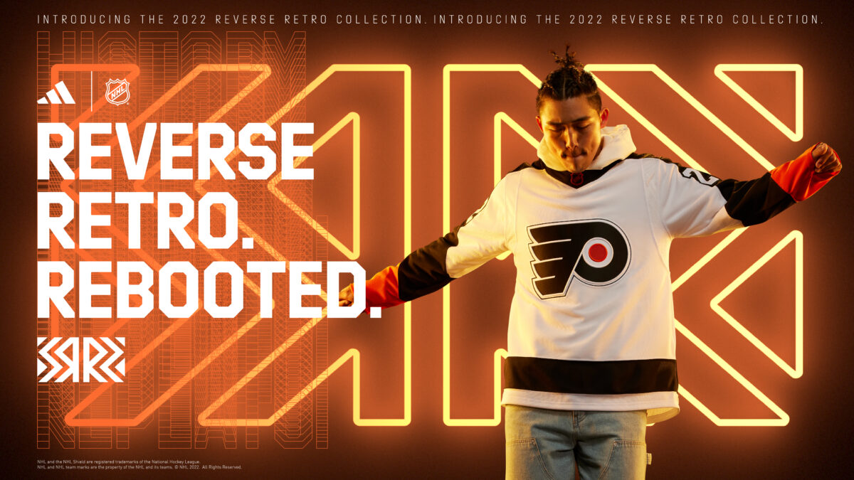
This jersey is very similar to the 2002-2007 away jersey, with the black and orange swapped on the arms, and the striping changed at the bottom. Again, there is nothing particularly wrong with it, but nothing pops out to me, and to many people, it doesn’t look much different from their current road jersey.
#30 – Detroit Red Wings
The Detroit Red Wings follow the theme of the previous two. It is so hard to do something creative and fun when it comes to these jerseys because of how long they have kept such a similar design. They did change it up a bit, though, opting to go with text and stripes on the jersey, rather than the winged wheel.

The jersey is based on the Detroit Cougars from the late 1920s, with the two stripes above and below the text, but this time with a red jersey. The Cougars only had this in white. Personally, I was hoping for the Cougars-style jersey with the large “D” on the front, and while I have this jersey ranked low, I can definitely see it growing on me, especially once I see it on the ice.
#29 – Vegas Golden Knights
The Vegas Golden Knights get a bit of a break from criticism here, as they don’t have much hockey history. The idea of the team going with a jersey they envision as “an alternate jersey they would have had in 1995” works kind of well, but the design using the diagonal text isn’t as creative as they could have gone with that era.
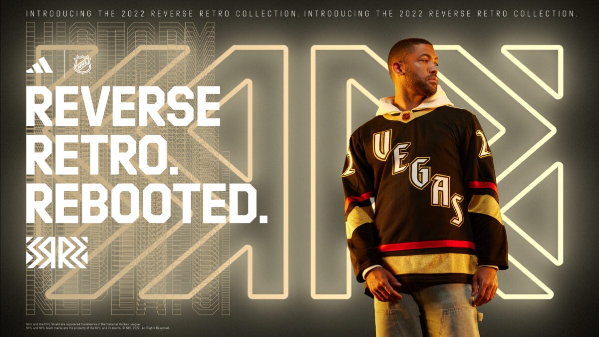
Their first Reverse Retro jersey had a lot of details that paid homage to hockey teams in the Vegas area, such as the Las Vegas Wranglers of the ECHL, and the Las Vegas Thunder of the International Hockey League. The lettering on the front of the jersey represents the font used by Excalibur Hotel in their city to honor hockey in Vegas, but other than that, I don’t see a lot of creativity.
#28 – Columbus Blue Jackets
There are some parts of this jersey I really like, and others I really don’t. The shoulders and arms look great, and the three stars above the wrist is such a great aspect. The black torso doesn’t fit as well as a navy blue would have. If they had used a black jersey in the past, maybe, but this just feels off. I do like the blending with the white and navy pinstripes, though.
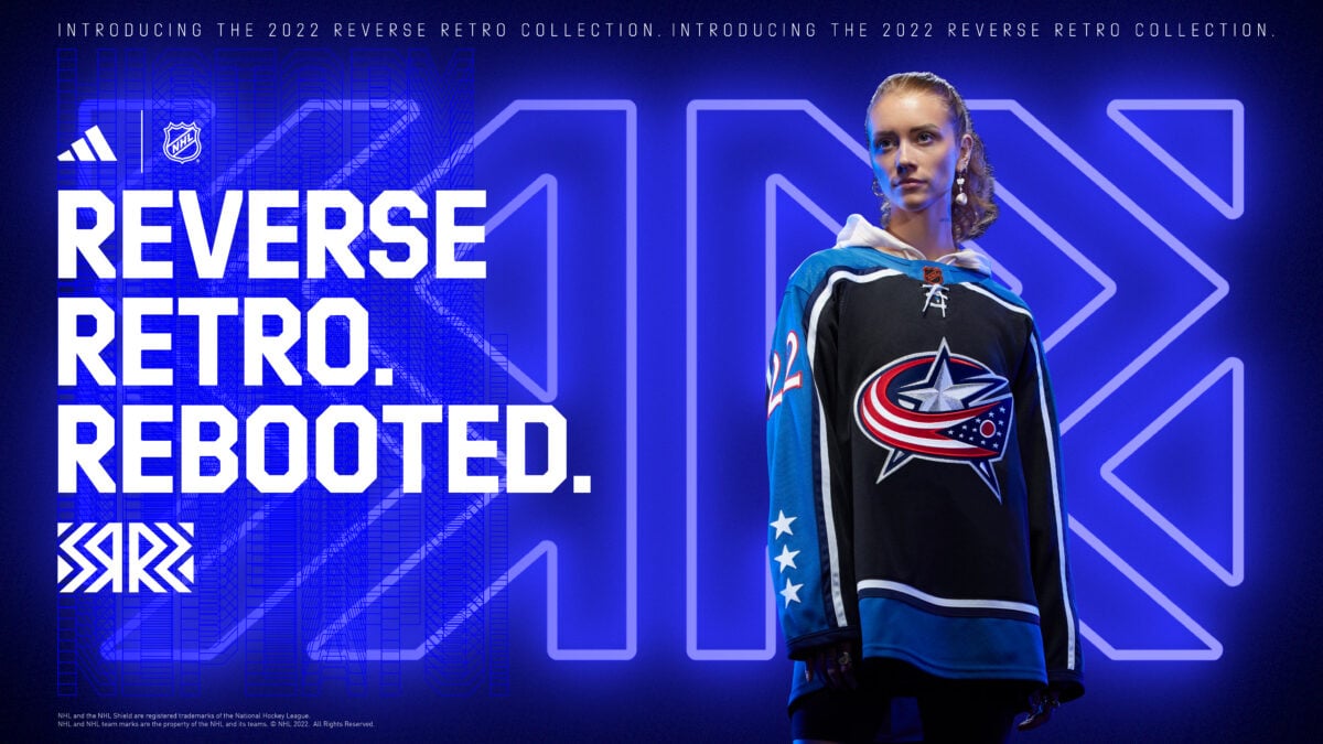
I would have also enjoyed seeing a different logo. I was really hoping for their mascot, Stinger, to be used somehow, along with the bright green color somewhere. This could have been one of the most fun jerseys, but for me, it sits here near the bottom.
#27 – Toronto Maple Leafs
The Toronto Maple Leafs have used so many jerseys over the past number of years, and they are all slightly different but mostly the same. I like the level of texture and detail in the leaf, but the rest of the jersey is too similar to what they have used so many times.

Honoring the Toronto St. Pats or Arenas would be nothing new, either, but if the team could have come up with a way to blend two or even all three, that would have been really cool. I like that they changed up the shoulders, but this jersey looks too much like all of the other ones they have used in the past.
#26 – Carolina Hurricanes
The Carolina Hurricanes have had so many jerseys released lately, it is hard to come up with something new. At this point, the only way they could really go retro is with the Hartford Whalers jersey, which was already done. A lot of people were hoping for a Hurricanes-colored Whalers jersey, but instead were presented with a text jersey with the hurricanes warning flag in the “C”.
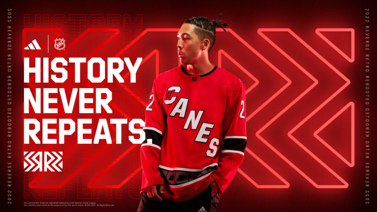
I really like the jersey, but it doesn’t feel like a Reverse Retro. The diagonal “Canes” has only been used for the past three years, and the hurricanes warning flag has been used at the bottom of every jersey. I think it will sell well, and look great on the ice, but doesn’t feel like a Reverse Retro.
With so many jerseys on the list this year, it will be interesting to see what the fans respond best to and what sells the most.
#25 – Ottawa Senators
The Ottawa Senators return to the “Senagoth” style jersey, which is a great start. The numbers and the swoop under the logo are great, but this feels too much like their home jersey. They used this style in the early 2000s, which is an era Senators fans love to talk about and be reminded of, with this jersey immediately reminding people of Dany Heatley, but there are a few elements that could have made this much higher on the list.
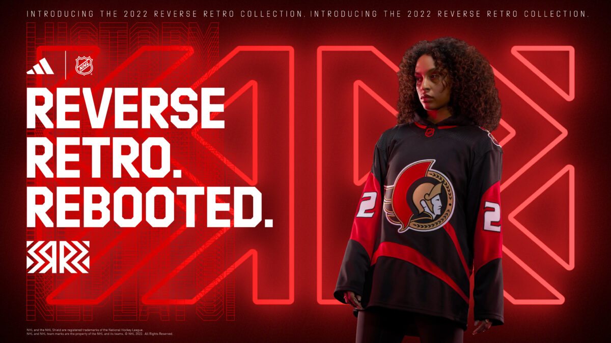
If this jersey had white filled in between the lines of the swoop, or had the original “Senagoth” logo on the front rather than the shoulder, this would have been much higher. I actually quite like this jersey, but having either of those aspects would have made it that much better.
#24 – Dallas Stars
The Dallas Stars did a much better job this time around. Using this logo, while dropping the “Dallas” text above it was absolutely the right call. I like the use of their famous “victory green” to modernize it, and the jersey itself is very nice. The 1990s style design works great with the colors, there isn’t much to complain about for this, but it doesn’t really pop for me.
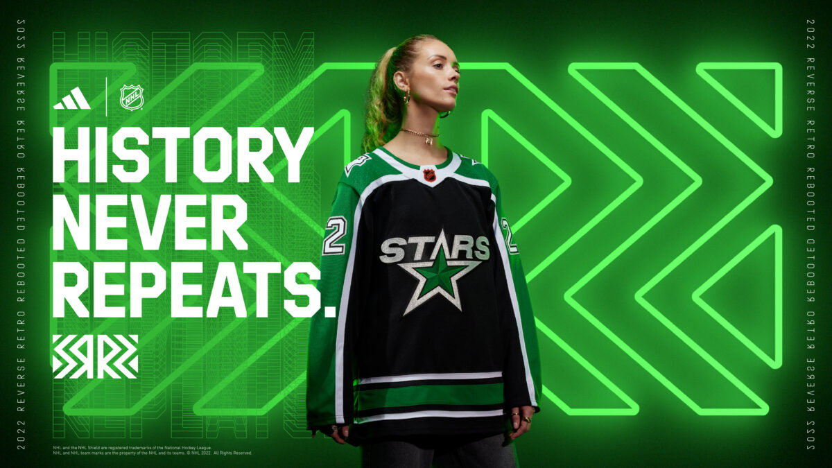
One key addition to this jersey would have been the star outline at the bottom of the jersey instead of stripes. That is the only thing I can critique. I like this jersey, but I couldn’t justify having it ahead of some of the next ones.
#23 – Nashville Predators
The Nashville Predators did some major fixing of this jersey. The obvious one was changing the mustard-colored jersey to its current yellow. Secondly, and less noticeable, they fixed some of the coloring inside the logo itself. Overall, this jersey is great. I am not a huge fan of this logo, which may be an unpopular opinion, but I do like the jersey.
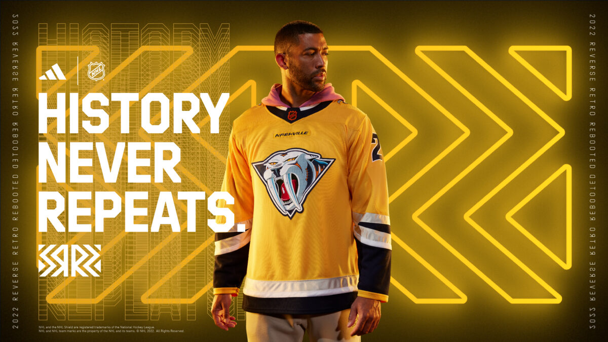
The “Nashville” text seems out of place, but I like it. It works. The offset striping on the arms is unique, but works really well with the silver they used. I would have liked to see them go with a navy jersey, but this one isn’t bad by any means.
#22 – Colorado Avalanche
The Colorado Avalanche opted to go with their state flag’s logo for their Reverse Retro, and used some colors from the Colorado Rockies team, which looks very good. The subtle usage of the red and yellow outside the logo is really good, as it is not overpowering for the jersey. One critique would be that the torso feels very empty, which could have been filled by some alternate striping patterns.
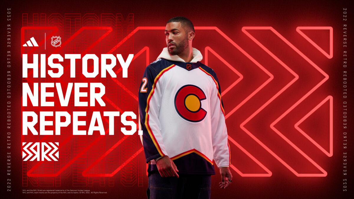
The stripes along the bottom and sleeves match the design of the current Avalanche jersey, and the addition of the Rockies colors and logo does a great job of hitting the goal of the Reverse Retro. I think the peak at the bottom could have come up a bit higher, but other than a few small things, I quite like this one.
#21 – Seattle Kraken
Now, the Seattle Kraken only have one NHL season under their belt, so a Reverse Retro was hard to do. They did a great job of incorporating Seattle’s hockey history into the jersey, though. The Seattle Ironmen used a jersey with very similar patterns with the stripes and the swap between colors halfway through the torso, and Seattle obviously used their logo instead.
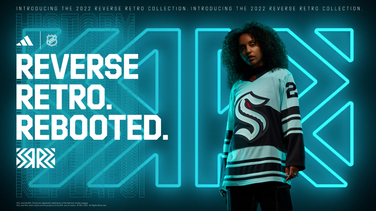
Though the Ironmen’s logo was similar, being an “S” with stars at the top, it is different, but the way the logo was used could have worked great here. In the Ironmen logo, the “S” is halfway on each of the colors in the torso, and the logo swapped colors to be opposite of the background color. I think that would have been a great way to polish this jersey off, but regardless, this is a very nice jersey.
#20 – St. Louis Blues
The St. Louis Blues have some of my favorite jerseys. Their blue and yellow combination looks great on almost everything, and their primary logo is stellar. For this jersey, it is lower than I originally had it based on first impressions. The more I look at it, the more I question how much I like it. There are some really great pieces, such as the striping, the shoulders, and the blue wrists, but the center of the jersey isn’t what I was hoping for.
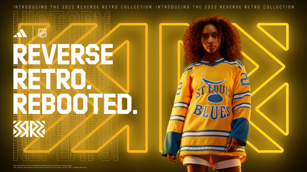
The top of the “L” where it crosses over the music note blends too much, and doesn’t look clean. The bulging of the letters in “Blues” isn’t something I am a fan of either. I have a lot of small things to complain about with this, I know, but I still really like the jersey, and if those small details were fixed this would have been much higher.
#19 – New Jersey Devils
The New Jersey Devils went with the same theme as the Avalanche, with both teams honoring the Rockies organization. The usage of the colors could have been better, as this jersey feels really busy, but overall I quite like it. The shoulders are perfect, and the bottom of the jersey is great. The sleeves’ striping feels a bit weird to me with the colors being swapped from the bottom, and the wrists feel empty.
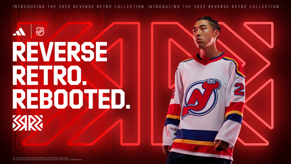
The blue ring around the logo is a great way to incorporate their colors into it. The jersey isn’t a copy of any Rockies jersey, as the shoulders are unique to this jersey, but this one should look really good on the ice.
#18 – Boston Bruins
The Boston Bruins deciding to use their bear head jersey from the 1990s was a great decision. That jersey needed an upgrade. The logo looks much better on this jersey than it did on the older yellow one, and fills up a lot more of the torso. The jagged pattern with the stripes is very unique, and I am a big fan of it.

I don’t have anything to critique on this jersey, but there is nothing I love about it. It is a good jersey, and if I was in the market for one, I could see myself adding this to my collection, but it sits pretty close to the middle of the pack for me.
#17 – Edmonton Oilers
A lot of people were really excited to see the cog logo return. I was never a big fan of it, but with the orange additions to the jersey and logo, I enjoy it a lot more than I thought I would. The top half of the jersey is too empty, as I would have liked to see some color on the collar or shoulders, but I really like the subtlety everywhere below the top of the logo.
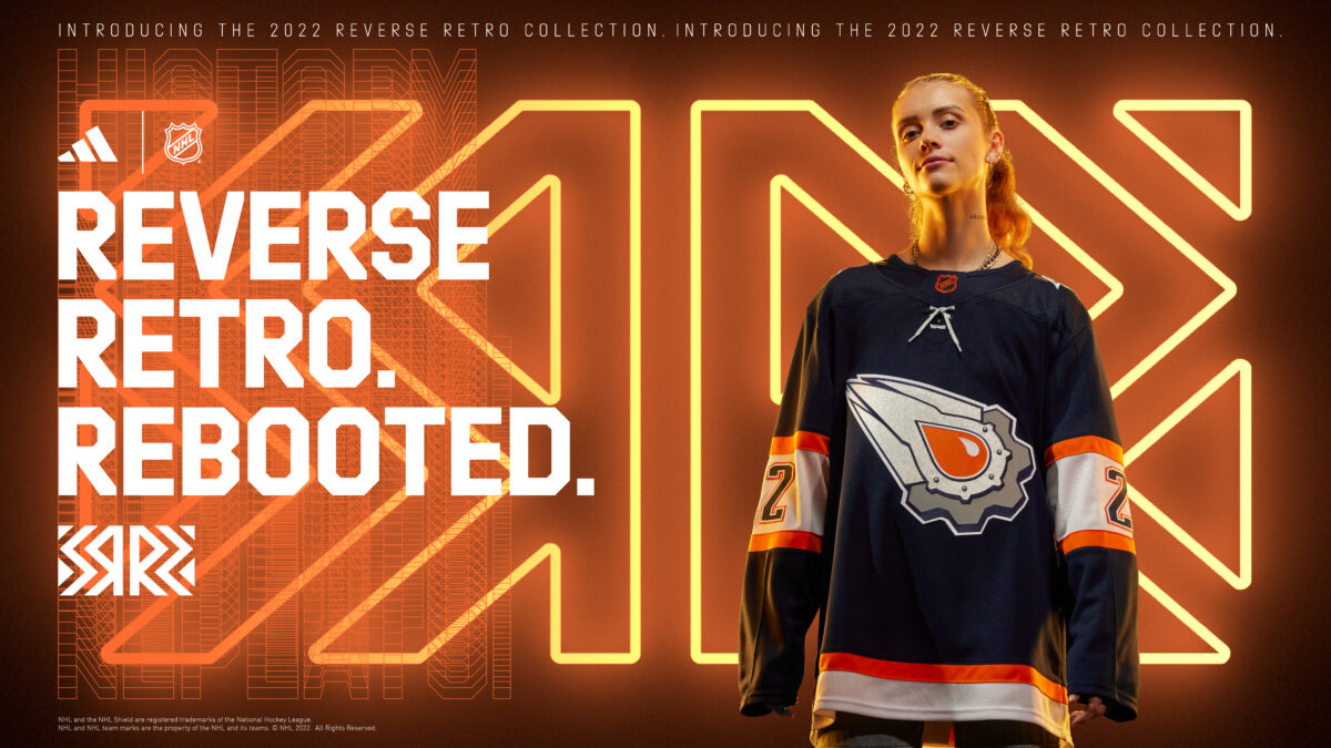
Many people see this jersey and think of Ryan Smyth, which brings back some good memories of that Oilers era, which is part of what this jersey is supposed to do. I think this will be a great alternative to see on the ice, and will be embraced very positively in the Oilers market. I like the jersey, but similar to Boston, it is hovering around the middle of the group here.
#16 – Vancouver Canucks
Johnny Canuck returning to the Vancouver Canucks logo is a great move by the organization. This one has never been used as a primary logo before in the NHL, and it works really well. I like a ton of things about this jersey. The collar keeps the top of it clean, and the striping fits really well with the jersey. The color on the wrists is the perfect amount, and the whole jersey blends really well together.
What drops this jersey quite a bit for me, are the numbers on the front. I know it is how they did it before joining the NHL, but it takes a lot away from the beauty of it. I am sure a lot of people will like the authenticity of the addition, but it’s just not for me. Other than that, this jersey is great.
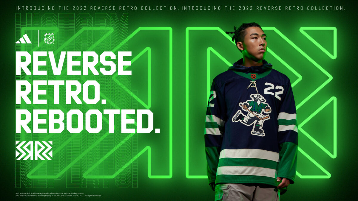
#15 – Winnipeg Jets
The Winnipeg Jets continue to make their group of jerseys better and better, with this addition reminding everyone of Teemu Selanne. With an updated version of their 1990s jersey, it is hard to go wrong with that. The Jets have been using this lighter shade of blue on a handful of jerseys recently, and it matches up very well with this classic jersey style.
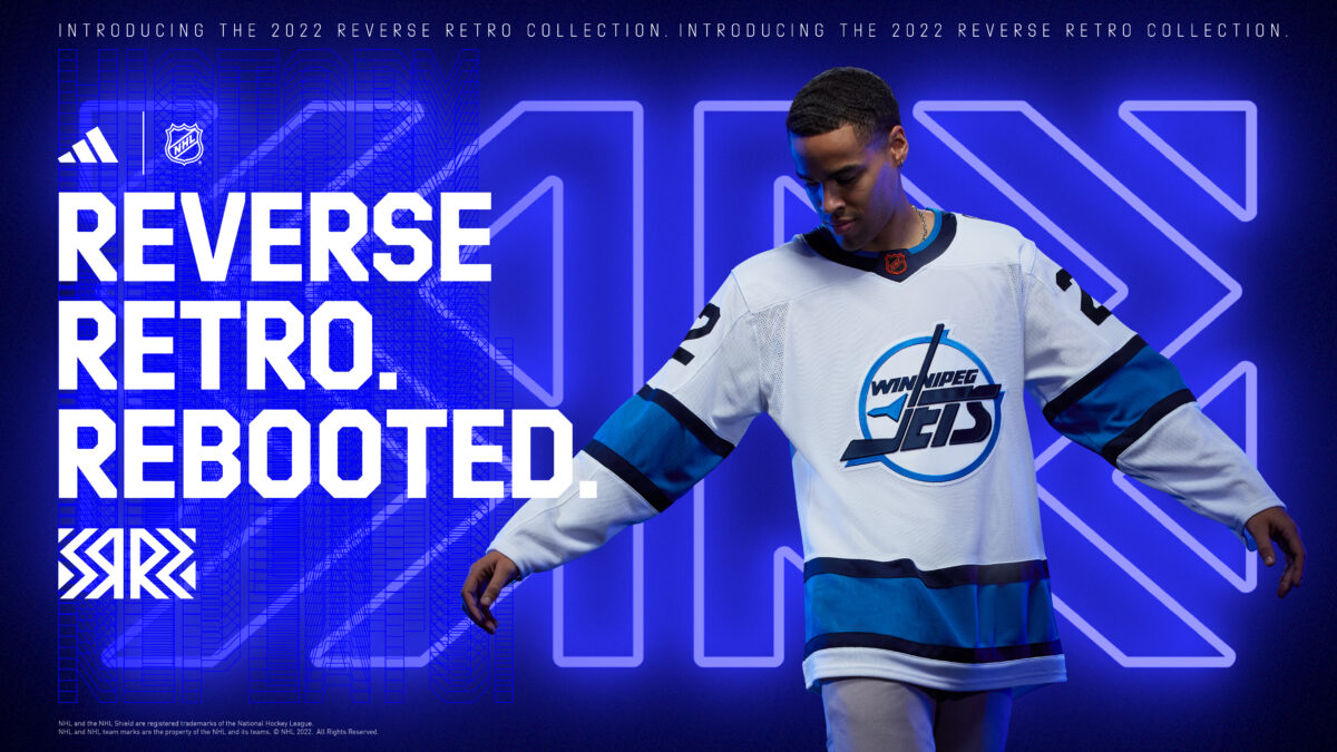
I love how clean, and classic this jersey feels. Adding modern coloring to the basic, most famous Winnipeg jersey works perfectly. This is another example of a team representing their city’s past team, and there is absolutely nothing wrong with that. This is a jersey I would like to add to my collection someday.
#14 – Arizona Coyotes
There are plenty of things to like about this jersey. The Kachina style logo always looks great, and the landscape at the bottom, which was used on the previous Reverse Retro, is also great. The reason this jersey falls so slow for me is the lack of originality. This is the exact jersey they used during the last series of Reverse Retro jerseys. The burnt orange color is fine, but not nearly as nice as the previous purple one.
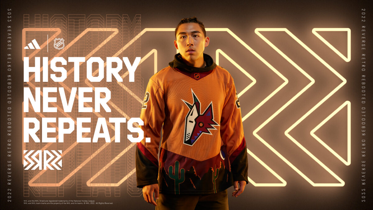
The purple jersey set a really high bar. Purple in jerseys makes for some of the best, and to me, this is not only a copy but also a downgrade. I still really like this jersey, but I can’t justify having it any higher on my list, as much as I want to.
#13 – New York Islanders
Ahh yes. The fisherman. What was once one of the most hated jerseys ever has become a fan-favorite. I am very glad the New York Islanders brought this back, and did a great job doing so. While I did like the teal, this version with the current Islanders colors looks great. The only major complaint I have is the lack of the wave in the bottom stripe.
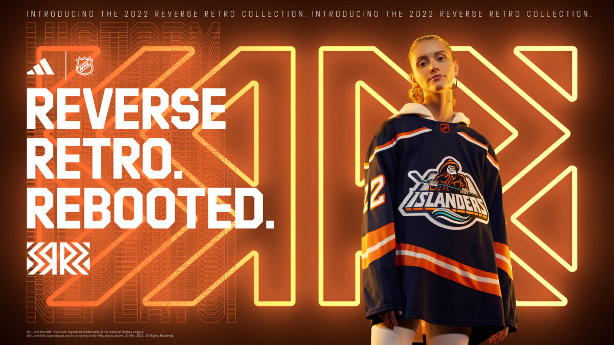
The shoulders, the striping, and of course the logo are all perfect, other than the wave I mentioned already. None of this jersey feels empty, it is all filled with color, and the orange and white stripes accent the logo very well. The teal in the logo feels a bit out of place, but at the same time, if they had changed that, it would have been worse.
#12 – Pittsburgh Penguins
The Pittsburgh Penguins have a fantastic history of jerseys. The Penguins have not used this style of jersey with the yellow shoulders and sleeves with this white stripe pattern. The logo used is one of the teams best, and is a sure-fire way of designing a great jersey.
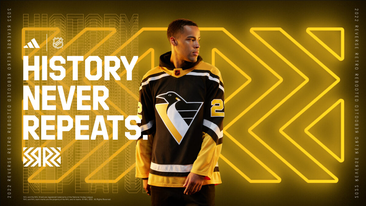
Not much beats the black-and-yellow scheme the Penguins have. They knocked this one out of the park, and I am excited to see this one on the ice. I would have it higher, but it is not as creative as it could have been, but in their defense, it doesn’t need to be creative to be great.
#11 – Anaheim Ducks
The Anaheim Ducks’ jersey comes so close to being a smashing success again. I really do like this jersey, and how they used the orange version of the original Mighty Ducks jersey, but to get this any higher I need to see some teal and purple. The gold and black stripes fit in very well, and I do also like the orange around the collar. This was an easy jersey to do, as the template was there already with the original jersey from their earlier years.
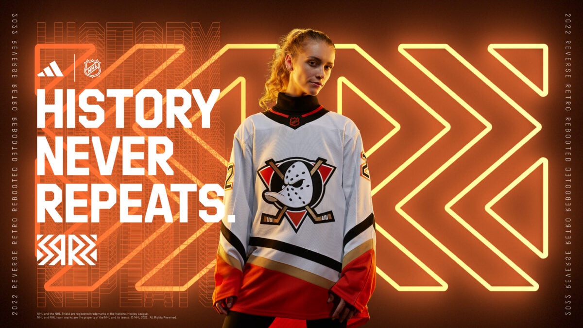
There is plenty of reason to be excited about this jersey. The logo is always great to see, and even though the Ducks’ current third jersey has the logo, it just feels right with this pattern.
The point of a Reverse Retro is to modernize the past. They did that, and maybe I am too stuck on my nostalgia of wanting to see the old colors with this jersey, but I can’t bring myself to have this higher.
#10 – Calgary Flames
The Calgary Flames using the white “C” logo is always a great start. The black and yellow thin outlines make the logo pop even more, and if you look closely, the logo has texture leading into the flames. This jersey just looks so well put together, I am excited to see it on the ice.
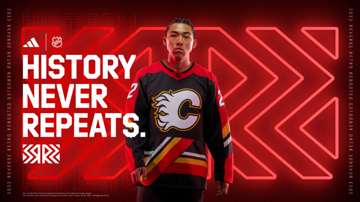
The stripes coming up from the bottom of the torso are such a unique look. The Flames used this style in the late 1990s, and when rumors started coming out that they would be returning to this, a lot of people were not excited, but I love this idea. The stripes look a bit different, and better than they did in the past, but obviously follow the same style.
#9 – Washington Capitals
The Washington Capitals go back to an iconic jersey with the diving eagle from the early 2000s. I don’t know about you, but as soon as I saw this jersey I thought of the goal Alex Ovechkin scored sliding on his back, and that brings pure joy. Using black as the primary jersey color, and changing the sash to blue is a great way to change things up from the classic jersey.

This jersey is quite classic, and with the shoulder patch being another vintage logo, it not only looks great but also brings back some great memories, which is an underrated thing these jerseys can do. This jersey just feels like the right decision.
#8 – New York Rangers
The New York Rangers Lady Liberty jerseys are one of my favorites. The red collar, numbers and sleeves work so well with the red inside the logo, and complement the orange NHL logo very well. The logo itself, which is nothing new, still deserves some praise.

While it isn’t the same jersey style they have used in the past, it is quite similar. The 1990s version didn’t have the red sleeves come up as high, and didn’t have the black band. I think this was a really good decision, and while it does divide the jersey up a bit, it works here.
#7 – Tampa Bay Lightning
This is my hottest take of these rankings. The rain, the waves, the lightning, the spiky numbers. It is too much for one jersey, and I love all of it. Normally, I am not a fan of a jersey that is so busy, but there is just something about this that I love. If you take the logo completely out, it screams “lightning” at you.

Choosing to use the 1990s style logo was the right move (from ‘Lightning’s Reverse Retro jersey a blast from the past’ Tampa Bay Times, Oct. 20, 2022). On top of the business of the design, the jersey uses it’s space very well, with the shoulders colored and not feeling empty, and the waves at the bottom coming up high enough to fill void space. I know a lot of people have this in their bottom five, but to me, it is exactly the kind of creativity and fun these jerseys are supposed to be. As I am writing this, I am almost convincing myself to have it higher.
#6 – Minnesota Wild
This jersey looks a bit familiar. It is the same as their previous Reverse Retro jersey, but a home jersey version, rather than away. This likely would have been higher if they didn’t already do it, but regardless, it is so nice. On top of having one of the best logos in professional sports, this North Stars color scheme works beautifully in the logo, as well as the jersey.

Though they are different franchises, the Wild using the North Stars colors yet again is an easy choice. It worked so well the first time, and while I am not a fan of teams using the same style as their first Reverse Retro, it is hard to have this any lower than sixth. This is such a great jersey.
#5 – Buffalo Sabres
The goat head returns in a beautiful manner (from ‘Sabres New Reverse Retro Jersey Features Goathead Logo With Royal Gold’ Buffalo News, Oct. 20, 2022). With the goat head jersey returning as the Sabres’ third jersey this season, I was a bit worried we wouldn’t get to see this as the Reverse Retro. They pulled this off very well, using their modern colors on an older, but well-loved jersey. This may be my favorite version of the goat head logo, to be honest.
While the shoulders look a bit empty, the rest of the jersey looks very clean and works really well. The stripe patterns on the jersey are very subtle, but that is part of what makes this jersey look so good. The logo is the only part grabbing your attention. The Sabres execution of this jersey is excellent.
#4 – San Jose Sharks
The San Jose Sharks using a throwback to the California Golden Seals and using their colors is such a great look. The teal and yellow coloring fit very well with the Sharks’ general theme. Having the stripes’ colors at the top of the arm and wrists inverted from the bottom of the torso works very well, giving a great balance of these beautiful colors.
While not the same franchise, it is great to see the Sharks honoring the Seals, as both teams were located in the Bay area. There are quite a few ways the Sharks could have gone with their Reverse Retro, but this was the best one they could have chosen to represent the Seals while still technically being a Sharks jersey.
#3 – Montreal Canadiens
Wow. The Montreal Canadiens really impressed me here. There are so many jerseys and logos that are hard to change, as they have so much history and so much similarity throughout the years, and the Canadiens are no exception. After using a blue jersey for their last Reverse Retro, I was curious about what they would do this time.
The usage of the Expos blue was a great touch. The only way I can picture an upgrade would be if they used the Expos’ “Montreal” text on the front, and I don’t even like text-based jerseys. Sitting at third on my list, it is probably higher than a lot of people have it, but to me, you can’t do much better than this, especially when you have such an iconic brand with little-to-no change over the years.
#2 – Los Angeles Kings
The Los Angeles Kings using any kind of jersey style that has gold and purple as the primary colors is certain to have it high on most fans’ lists. Going back to the classic crown logo is another smart move, as many fans have been asking to see it again. Choosing to use a white jersey works really well, as the Kings used purple and yellow jerseys with this logo in the past.
This style of jersey is one of the most iconic looks of the 1970s, and it is hard to do much better than this. I already said it, but the gold and purple color scheme is one of the best you can use on a sports uniform. One thing I haven’t mentioned, that I will point out on this, is that the classic orange NHL logo looks very out of place here, but it is still number two for me.
#1 – Florida Panthers
This might be one of my favorite jerseys of all time. The throwback to the original jersey design with the red, yellow and dark blue colors, as well as the shoulders, sleeves and striping at the bottom, works really well with the modernized center of the jersey. Light blue is a new color to the Florida Panthers’ palette, and the logo has never been used as a primary logo, but that’s kind of the point of this; to modernize an old look, and they nailed this one.
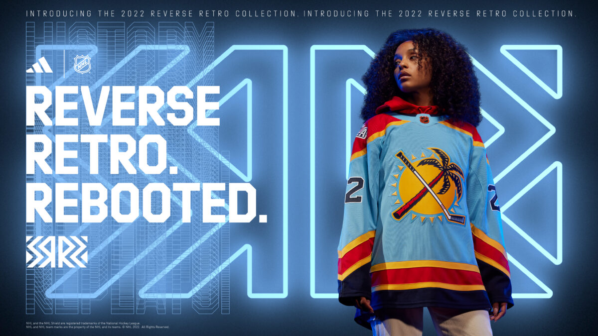
This blue is a brighter, lighter version of what was used in 2009 for the team’s third jersey, and it fits really well with the other colors used, which we haven’t seen combined before. The logo was worn as a shoulder patch in the 1990s and disappeared for a while. But I am very happy to see it back.
The NHL did a great job with this series of Reverse Retro’s. There are a lot of unique jerseys, and an impressive amount of creativity in many of them. I think this series, overall, is better than the last. I will definitely be adding a few of these to my jersey collection, and I cannot wait to see them hit the ice this season.
Let me know your thoughts on these rankings, and feel free to share your list in the comments!
Free Newsletter
Get Editor's Choice coverage delivered to your inbox
In-depth analysis, breaking news, and insider takes - free.
Subscribe Free →