- Carolina Hurricanes Storm Warning
- Carolina Hurricanes at the Reebok Edge of Reason
- Carolina Hurricanes One Step Forward, Two Steps Black
- Carolina Hurricanes Downgraded to Tropical Storm
- Carolina Hurricanes Gaining Strength?
- Hurricanes’ Latest Alternate Technically Terrible
- Hurricanes Call Upon History in Whalers’ Jersey
- Hurricanes Trying a New Road Jersey in 2019-20
- Hurricanes Go Old School With Their Reverse Retro Jersey
- Reverse Retro 2.0 Brings a Twist on the Hurricane’s Current Looks
- Carolina Hurricanes Climate Change?
For people that are supposed to be exceedingly competent businesspeople, National Hockey League owners sure do make some fascinating choices.
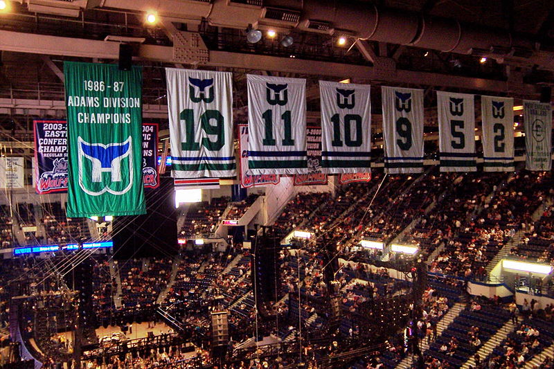
For evidence, look no further than Peter Karmanos Jr., former majority (and current minority) owner of the Carolina Hurricanes. Formerly chief executive officer at Compuware, Karmanos joined the NHL ownership ranks in 1994, as part of the group that purchased the rudderless Hartford Whalers.
Now, an NHL team is a risky investment for anyone (how many of them actually make money, do y’reckon?), but Karmanos had been involved in hockey his entire life. The Whalers were a disappointment on the ice, especially following the boneheaded trade of superstar centre Ron Francis, and struggling mightily off it, due to the small size of the Hartford market and the lack of an NHL-calibre arena. So why, then, would Karmanos buy in?

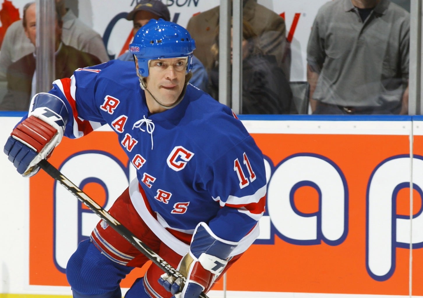
And especially why, three seasons later, would he choose to move the team to Raleigh, North Carolina (renaming them the Carolina Hurricanes), a city far from a slam-dunk for relocation success?
More to the point, Raleigh’s brand-new arena was so new that it wouldn’t even be ready for another two years, forcing the team to play out of nearby Greensboro. And when I say “nearby,” I mean, an hour and a half away. Needless to say, the move didn’t exactly help the team’s attendance.
The Hurricanes have stumbled along ever since, making the playoffs only five times in 21 seasons post-relocation, including missing the dance nine straight times going into 2018-19. Yes, they did manage a Stanley Cup in the free-for-all that was 2005-06, but the ‘Canes have never really had any prolonged period of competitiveness, something even their bumbling predecessors managed.
Carolina Hurricanes Storm Warning
To be fair, the ‘Canes did have a tough act to follow, at least in the uniform department. For all the Whalers’ faults, nearly everyone agrees the team had some truly sweet duds, centred by one of the most artistically brilliant logos to ever grace an NHL jersey.

The Hurricanes, though sticking with the seafaring theme, completely redesigned the team’s look. Gone was the blue, green and silver colour scheme, replaced by red, black and silver. Gone, too was the Whalers crest, replaced instead by a swirling hurricane.
The Hurricanes take a lot of flak for their logo, but I think it looks good; nice and aggressive. The shape reminds me of Sonic the Hedgehog in full flight. Yes, it’s a bit blunt, especially considering the complex brilliance of its predecessor. However, I feel most of the hate comes not on account of its own design, but because it replaced a beloved icon of sports logodom.
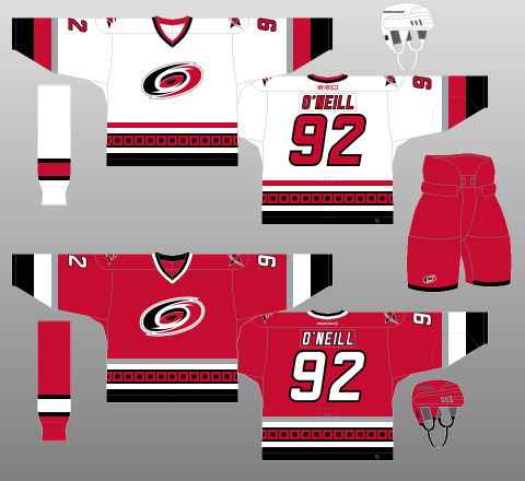
As for the rest of the uniforms, they were reasonably well thought-out, too. After choosing traditional striping patterns for the sleeves and socks, the ‘Canes broke with the blandness of hockey custom and went with a hurricane warning flag motif for a tail stripe. I think it works better on the red jerseys than the whites (it’s left to float about on the latter, while sandwiched and secured nicely on the former), but I love it, nonetheless. The italicised name and number font works well, too, congruent with the impression of movement the primary logo communicates.
Nevertheless, one thing I really take issue with is the lack of consistency. The tail striping utilises a five-stripe pattern, while the sleeves use three stripes, as do the socks (though in a different arrangement), with the collar only getting two. The application of silver is similarly spotty, with the red jerseys getting more of it than the whites, and the socks receiving none at all. I would also have liked to see black pants used for the red kit, for purposes of contrast and aggression.
You may also like:
- Carolina Hurricanes’ 3 Best Contracts for 2026-27
- 3 Carolina Hurricanes Prospects to Watch in 2026-27
- 2025-26 Hurricanes Are Immortalized on the Stanley Cup
- Hurricanes’ Inventive Offer Sheet Approach Creates a New NHL Offseason Headache
- NHL Rumors: Flyers Fallout, Carlsson Speaks, and Hurricanes Cup Controversy
Speaking of ruining a good idea with sloppy execution, take a look at that shoulder patch. The team’s secondary logo also utilises the hurricane warning flag, with a singular flag mounted on a hockey stick, the two straining together against the (hurricane-force, presumably) wind. Not bad, right?
Well, one, the singular flag technically represents “storm warning,” not “hurricane warning,” somewhat lessening its impact. And two, the whole thing is mounted on a black triangle, supposedly symbolising North Carolina’s Research Triangle. ‘Cause yeah, that’s what people want to be reminded of when they put on their jersey.
The Hurricanes had a few good design ideas they then ruined with overengineering. Or maybe they didn’t put enough effort in and underengineered them. Or maybe the engineers just weren’t competent in the first place. Whatever.
The jersey engineering on the Hurricanes’ inaugural kit is intriguing but, ultimately, sub-par.
Carolina Hurricanes at the Reebok Edge of Reason
With the exception of a black outline added to the player names a couple seasons in, the ‘Canes’ kits remained exactly the same for a decade.
However, the 2007-08 rollout of the Reebok Edge uniform system resulted in many a team making unneeded, often detrimental changes to their uniforms. The Hurricanes were no different, further muddling an already flawed design.
As you can see, none of the flaws of either the home or away uniforms were addressed. Instead, you know that vertical piping everyone was adding to their jerseys at the time? Well, the ’Canes turned it into shoulder yokes. Or, rather, the outline of shoulder yokes. Actual shoulder yokes might have looked cool – especially on the white jerseys, but the Hurricanes felt an outline was sufficient.
It’s not. It only serves to further complicate an already confused cacophony of confuddlement.
Carolina Hurricanes One Step Forward, Two Steps Black
In 2013, the Hurricanes debuted a black alternate kit, with the almost-hurricane flag crest front and centre, and the swirling hurricane relegated to shoulder duty.
Interestingly, the ‘Canes chose to go with the wacky, wavy sock striping of Reebok Edge for their alternate uniform, after (wisely) ignoring it in their home and away ensembles. They even changed the amount and order of the sock stripes, though this alteration is at least in line with the changes to the sleeve striping. Unfortunately, this continuity is lost when one looks at the jersey tails, where silver is on top and red on the bottom, contrary to the rest of the kit. The Hurricane stripe is also much thicker than the sleeve stripes, while it’s red trim stripe is much thinner.
The Hurricanes missed another opportunity to make all their striping elements consistent, a decision from which this kit could have benefitted greatly.
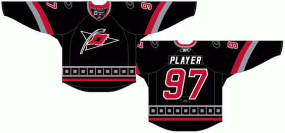
Carolina proceeded to further ruin their attempt at progress with yet another head-scratching decision: greying out the hurricane flag motif and shoulder logos. This tragic overestimation of “silver” (grey) deadens what could have been a staggeringly good black kit – a rarity in the NHL.
Fortunately, the Hurricanes finally decided to switch to black helmets and black pants. Unfortunately, this decision applied to their black jerseys.
To make their outfits even more punchy, they could have used the team’s red helmets and pants with the black jerseys for some added contrast, likewise putting the black helmets and pants to use in the red kit.
Alas, no such luck.
Carolina Hurricanes Downgraded to Tropical Storm
What’s that saying, “Be careful what you wish for?” Hurricanes fans sure must have been thinking that when the team brought out their redesigned kits for the 2013-14 campaign.
The black alternate sweater remained in the rotation, unchanged, but the home reds and road whites were both given complete overhauls.
And not for the better.
The home uniform is thoroughly boring, with two thin, white stripes adorning the tail, sleeves and socks. Consistent, yes, but utterly devoid of any thought, care or artistic merit whatsoever. The most interesting thing about it is the lace-up collar, which is black – the only instance of black colouration on the jersey, save for a thin outline of the typeface.
While we’re on the topic of the typeface, even that manages to be boring; tall, slender lettering that would be more at home on a road sign than an NHL jersey (though the black third jerseys retained the chunky, italicized typeface of the previous uniform set). There’s just nothing about this uniform that communicates any sort of passion or evokes any sort of emotion.
It’s more of the same with the away kit. True, gapped, slim-thick-slim striping can be found on the tail, sleeves and socks, giving the uniform more complexity than its home equivalent. However, the squared-off shoulder yokes look cookie-cutter and robotic, and the V-neck collar looks downright amateurish. Different, yes. But still staggeringly uninteresting.
The Hurricanes’ original uniforms, though irritating in many ways, were undoubtedly interesting and had some excellent design features. Their replacements look as though they were designed by a computer algorithm – or maybe an alien given only the vaguest description of a hockey jersey, rather than by a human being with, you know, eyes. And a heart.
Carolina Hurricanes Gaining Strength?
But, never fear, for Adidas’ ADIZERO programme is upon us, and it has benefitted the Hurricanes’ uniform set greatly.
Well, half of it, anyway. Actually, only a third. Whatever. Shut up.
Yes, the old black alternates were put out to pasture, thanks to Adidas’ 2017-18 moratorium on third jerseys. And yes, the road sweaters stayed the exact same (what, did they run out of money? This is the Hurricanes, after all…).
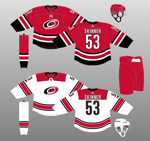
But that red home uniform… Boy, is that ever a sight for sore, uninspired eyes. The same basic two-stripe template has been retained but, this time, the thin white stripes are flanked by black. The top white stripe is joined by a thin black band, while the lower stripe has a thick, chunky black block on its southern border. The addition of more black makes the black collar finally make sense, and the jersey altogether more attractive and aggressive. The hurricane warning pattern returns, too, although it’s somewhat muted and is, sadly, restricted to the tail striping.
This jersey is not without warts. The thin black trim stripe is probably not needed. I’d like to see a full-impact hurricane flag design, rather than the sublimated design they’ve gone with. The hurricane patterning should also be extended to the sleeves and socks. Black helmets and pants would make the kit look much more striking. Oh, and the font still sucks.
But hey, much like the Hurricanes as a team, their uniforms are finally pointing in the right direction.
Hurricanes’ Latest Alternate Technically Terrible
For the 2018-19 campaign, the Hurricanes revealed a new black alternate jersey, intended to address many of the shortcomings of its predecessors in Carolina’s jersey history.
Unfortunately, the ‘Canes paid so much attention to these technicalities they ended up with an utterly horrendous frankenjersey that should be immediately burned on sight.
Starting with the logo. Yes, the Hurricanes’ old secondary crest was, technically, the warning for a storm, rather than a hurricane, but, let’s be honest, who really cares?
Loads of logos aren’t exactly as advertised. The Ottawa Senators’ logo is the head of a Roman centurion, not a senator. True, the positions sometimes overlapped, but the Sens’ crest is much more warrior than politician. Or, how about the crests of the Buffalo Sabres, which have always focussed more on images of buffalo, rather than swords. Some people even contend the original logo of the Los Angeles Kings is actually a queen’s crown.
The point is, a cool logo is a cool logo. If people are looking to hockey sweaters for historical and scientific accuracy, the problem is with them, not the team.
Carolina’s dual-flag design, while technically correct as a hurricane warning, makes for an overly oblong crest that just looks plain weird on the front of the jersey, especially considering it’s not mounted atop anything to help round out the shape.
The old flag design wasn’t perfect, but it’s a darn sight better than this. Or, here’s an idea, why not just plop the regular logo on there? It’d look absolutely fabulous atop a black background.
This new logo does have one neat feature: The space between the two flags forms the outline of North Carolina. It’s a clever touch, for sure, even if it does feel a bit forced and a little too niche. Unlike something like the Whalers’ logo, or even that of the Vegas Golden Knights, this use of negative space isn’t really noticeable through organic observation. Design features are like telling jokes: If you have to explain it, maybe it’s not all that good.
As for the Hurricanes’ primary logo, it’s again relegated to shoulder duty, complemented by the North Carolina state flag on the other side, both of which are greyed out. Notwithstanding the fact putting flags on jerseys is an unnecessary and thoroughly unwelcome design decision, everything’s set atop a “storm grey” shoulder yoke.
In what world is grey ever a good idea as a major feature on a hockey jersey? Did ‘Canes learn nothing from the New York Islanders??
Even worse, the Hurricanes have used grey on top of a black background, making the entire ensemble look absolutely ridiculous.
Even if you’re going to use grey, why wash out the shoulder patches?? On a bland, dreary uniform, that’s exactly where you could do with a splash of colour! And, if grey’s so important, why isn’t it used literally anywhere else in this outfit – or any Carolina outfit, for that matter???
This is basic stuff here, friends.
The striping is a shambles, too, with the neat, textured, “heathered red” motif ruined by its implementation in an asymmetrical package featuring one thick stripe atop a thinner one on the sleeves and socks of the kit, with the tail featuring a single, thick stripe flush against the bottom of the jersey body.
While I applaud Carolina for bringing back black helmets and pants, again, I can’t help feeling they’d be better utilised with the red sweaters, while the red helmets and pants of the home kit would provide badly needed colour and contrast to these alternates.
Speaking of colour and contrast, the names and numbers will be white, trimmed in red. Using white numbers on a black and grey jersey runs the risk of making the sweater look dull and soulless. The ‘Canes used red numbering on their previous black kits, and it looked absolutely fantastic.
The team says the change is to make the numbers “legible and camera-friendly.” If it’s such a big deal, why doesn’t every NHL team have numbers that are either black or white?
All in all, these third jerseys are absolutely horrendous.
Hurricanes Call Upon History in Whalers’ Jersey
After the Hurricanes were purchased by Tom Dundon, he started to lean into their history more, and called to have the Whalers jersey brought back to the ice for the Heritage game against the Boston Bruins.
Seeing these jerseys back on the ice was great, as they still are incredible designs, but it also would have been fun to see the Hurricanes make some new history with their jerseys/
Hurricanes Trying a New Road Jersey in 2019-20
Interestingly, owner Tom Dundon decide to reach out on Twitter, soliciting logo suggestions from fans.
Perhaps due in part to Dundon’s dislike of their most recent road jersey, Carolina entered the 2019-20 season with a new design. This was a very different take, featuring a cleaner white design, a brand new logo with ‘CANES’ displayed front and center, one bold red stripe on each sleeve and the hurricane warning wrapping around the waistline.
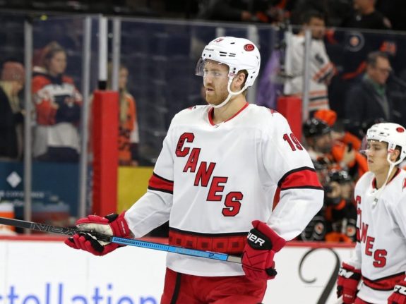
In all, this jersey has been a bit divisive amongst fans. Some appreciate it for its different take on a road jersey, while others see it as a bit bland and dislike the ‘CANES’ scrawled across the front.
However, while it isn’t necessarily the most exciting take on a road jersey, it does the job fine while helping to differentiate itself from their home and third look. Time will tell if it manages to find a permanent place in the Hurricane’s locker room, or if the team will get another new look heading into the 2020-21 season.
Hurricanes Go Old School With Their Reverse Retro Jersey
When it was announced that Adidas would be mixing up the NHL with some new jerseys for the 2020-21 season, the hockey world was intrigued by what could happen with the aptly named Reverse Retro program. It was clear that this was going to harken to the past of each franchise, pulling classic ideas to make a new, unique design.
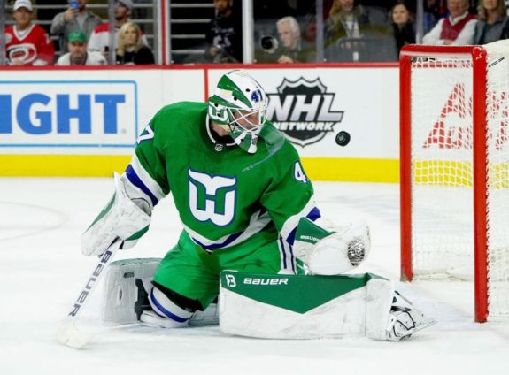
For the Hurricanes, this meant another dip back into the Whalers design philosophy. Their Reverse Retro is an inspired modern take on the classic Hartford jersey, with a steel-gray base and big, green letters highlighted by a blue outline.

While this jersey may call back to the Hurricane’s franchise history, it still would have been fun to see the franchise do something a little less predictable with their Reverse Retro. Yes, they look great on the ice, and Hartford’s logo is an all-time classic, but it has already been used by Carolina in recent years.
However, this is not a complaint about the Hurricane’s Reverse Retro, as it is a solid all-around addition to their already deep closet.
Reverse Retro 2.0 Brings a Twist on the Hurricane’s Current Looks
As the 2022-23 season progressed, it was announced that the NHL would be reviving its Reverse Retro series one more time with a 2.0 edition for each franchise. While some teams took this opportunity to bring back a once hated but now nostalgic design, the Hurricanes played it fairly safe with their jersey. They took the CANES lettering from their away jerseys, and put it across a traditional red and black jersey with the black and gray storm flag circling the waistline.
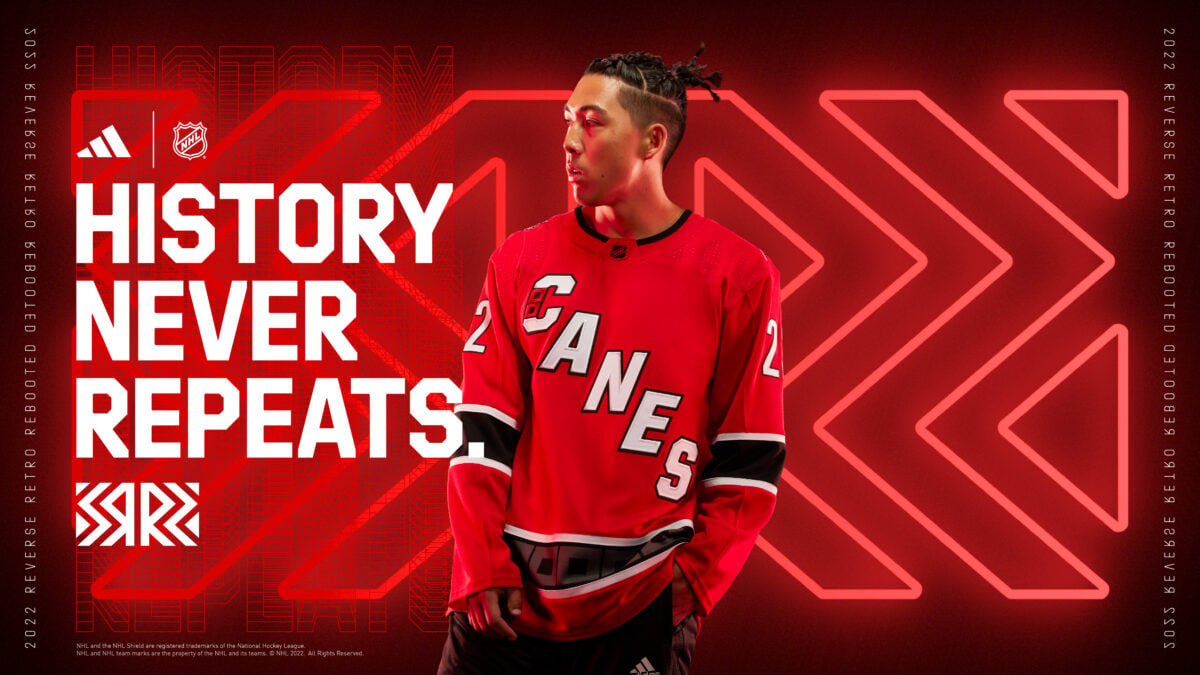
Now, this isn’t a bad design by any means, but it is bland for a Reverse Retro as it is just a reverse of their current away jersey. This points to an issue that the Hurricanes have with their jerseys as they lack any real excitement or interest in their history, outside of the Whalers’ throwbacks.
That’s about all I have to say about this one. It looks nice, but isn’t particularly fun or interesting.
Carolina Hurricanes Climate Change?
In recent years, the Hurricanes have gone from a dialect franchise that seemed destined to be lost in the shuffle to a team that defines the NHL both on and off the ice. The ‘Bunch of Jerks” features a thriving fan base that knows when they show up to a game, they are going to get to see some of the best players in the league take the ice and give them a chance to win it all each season.
However, when it comes to the jerseys you see, well that’s another story. The Hurricanes have a look to them that is mostly good, but they also lack much excitement and history. I’d love to see them take a swing on their next third jersey and get a little bit weird with it, but for now, they will remain with their fairly standard design.
*Originally published October 2017.
**Updated February 2023.
Free Newsletter
Get Hurricanes History coverage delivered to your inbox
In-depth analysis, breaking news, and insider takes - free.
Subscribe Free →