- A Bold Beginning
- Ducks’ Designers Move Away From Cartoons
- Darkness Falls Upon Mighty Ducks
- Darkness Reigns Supreme in Orange County
- Early Returns Promising, Problematic for Ducks’ Migration
- Ducks Double Down on “D”
- Ducks’ Orange Alternate a Crowning Achievement
- The Ducks Fly Outdoors
- Ducks’ Return With the Mighty Ducks Logo
- Wild Wing Makes a Triumphant Return
- 2022-23 Reverse Retro: Original Design, Modern Colors
- Plum, Jade, and Wild Wing Return in 30th Anniversary Sweaters
- While Better Lately, Ducks’ Jerseys Remain a Mixed Bag
*This archive was originally written by Austin Stanovich
The Anaheim Ducks have worn quite a few jerseys during their relatively short history. Some of them have been among the most beloved in the NHL, while some have failed to flatter anyone.
Their jersey history has been a bit more inconsistent than their on-ice performances. With a mixed bag of huge successes and big misses, we’ll take a look at the jerseys this franchise has worn.
A Bold Beginning
The Ducks would start their life as an NHL franchise with a jersey design that can only be described as unique. Jade and eggplant were the dominant colors, strange choices for an NHL team, to be sure. And yet, when combined, they’re rather endearing. The aggressive-looking, disembodied, duck-shaped-goalie-mask-flanked-by-two-sticks logo also isn’t bad and has become a favorite of hockey fans the world over.
This initial jersey design retained enough of the cartoony foundation the franchise was built on but was also the appropriate amount of professionalism for an NHL franchise.

On a more technical note, the jersey’s novel diagonal striping was simple and well done, even if the jersey numbers did overlap with the tail package. So, though the design and color scheme were most definitely unusual, the Mighty Ducks didn’t go overboard with the zaniness; the novelty doesn’t feel forced.
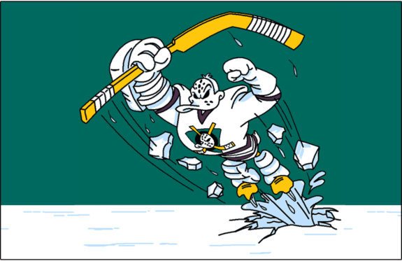
However, during their third season, the infamous “Wild Wing” jersey (guess which one that is) made its debut. This jersey would divide fan opinion, and your opinion on this jersey was likely dependent on your age. Fans of a younger generation, like myself, loved this jersey, a calling to the team’s Disney roots, it’s clear to see why adults would hate these while kids adored them. I’ll remove my bias and admit, these things are ugly, but like a pug, their ugliness gives them a certain appeal that some people love.
As you can see, the diagonal striping of the standard uniform set has been retained for the sleeves but has been made unnecessarily complicated and disjointed by alterations to the spacing and thickness. Adding to the confusion is the lack of continuity between the sleeve striping and that of the tail, which just features a single thick, white block.
Meanwhile, the best part of this sweater – the beautiful jade background – is rudely interrupted by the stark-white, retina-piercing shoulder yokes. While we’re on the topic of the jersey body, we must talk about the nameplates and letters. How anyone thought the Mistral font would look good on a jersey is a mystery to this day. It’s hard to read and unappealing to the eye, a big swing and miss from the designers of this jersey.
But who are we kidding? The worst part of this kit is the “Wild Wing” logo. A complex creation made possible by new printing techniques, the cartoon duck exploding up through the “ice” of the tail striping makes for a ridiculous scene.
The Mighty Ducks already faced an uphill battle for NHL respect, given that they were owned by the Walt Disney Company and named after a minor hockey team from a children’s movie. The release of this sweater only confirmed all the smug dismissiveness of the hockey establishment towards the fledgling Anaheim franchise.
Ducks’ Designers Move Away From Cartoons
That all said, for three glorious seasons, 1997-98 through 1999-00, the Mighty Ducks had alternate jerseys to be proud of.
They aren’t the best-looking kits, to be sure; the jade one only lasted two of the three seasons mentioned. But they aren’t exactly offensive, either. Both feature full-length shoulder yokes made up of four different colors (jade, eggplant, silver, and yellow – a trim color likely added to complement the color of the hockey sticks on the primary crest), along with a different (less generic and overall better, in my opinion) typeface for the names and numbers. Unique socks for these new alternates were rolled out for 1998-99, the year pictured above.
Interestingly, for 1997-98 and 1998-99, the Mighty Ducks switched to black pants and helmets (the latter worn with the dark kits only), a change which looks rather good, lending aggressiveness and grounding the more unusual shades present in the Anaheim color scheme. However, The Mighty Ducks would revert to their original eggplant helmets and pants in 1999-00.
Given there were two separate third jerseys, one white and one dark, it’s reasonable to speculate the Mighty Ducks might have been testing the waters regarding potentially replacing their standard home and away kits. Obviously, the experiment ended in favor of the originals, with the jade alternate eliminated ahead of the 1999-2000 campaign and the white done away with the following year.
And that’s a shame, as the white alternate in particular shows real promise. I’m not a fan of the excessive striping on either sweater (especially the silver – it darkens and dampens an already dim color palette), and the sock pattern is too blocky for my taste, but there’s something there in the overall general design.
As simple, more traditional complements to the Mighty Ducks’ weird and wonderful home and away uniforms, these third jerseys were the right design at the right time and, with some tweaks, would have looked truly magnificent.
Darkness Falls Upon Mighty Ducks
In 2003-04, the Mighty Ducks sought to do away with their cartoonish past by adding a more menacing third jersey to their aesthetic arsenal. Unfortunately, it looked like this:
Now, I’m not totally against the idea of black jerseys, even for teams for whom black is not a component of their color scheme. However, the execution of this example is excruciatingly poor. First, where’s the jade? Black is already a hard-enough color to work with as a jersey base, so keeping the dark eggplant and silver shades and eliminating the brighter jade just makes this kit utterly dull and dreary. Secondly, text-based logos are generally a bad idea for hockey jerseys, but especially so when it comes to Anaheim, a franchise with one of the most recognizable and universally adored logos in sports.
In its place, a handwriting-like script reads “Anaheim” and is topped with a “MIGHTY DUCKS” wordmark. The shoulder patch is even worse, composed of nothing but an overlapping “MD.” Real inspirational. The Mighty Ducks tried to do something fresh, new, and exciting for their third sweater. Instead, they ended up with a kit that is not only depressing but downright boring – the worst possible quality an NHL jersey can have.
Darkness Reigns Supreme in Orange County
In 2005, Susan and Henry Samueli would purchase the franchise from the Walt Disney Company. After this sale, the team would rebrand themselves, dropping the “Mighty” from their name, becoming just the Ducks.
Early Returns Promising, Problematic for Ducks’ Migration
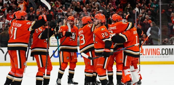
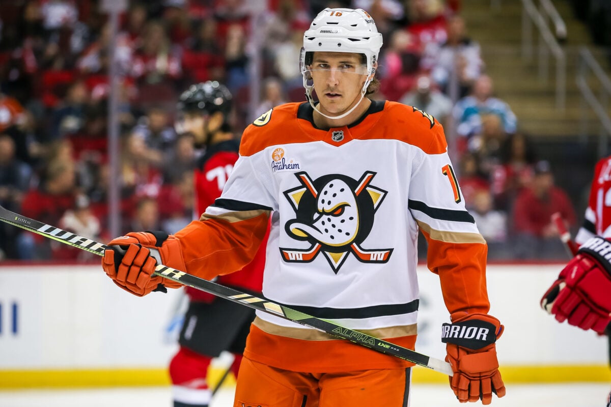
For 2006-07, the Ducks debuted a totally new uniform suite, which featured a heavy emphasis on black, along with gold and orange accents. These uniforms won’t be winning any awards for their aesthetics, but they will forever be remembered in the team’s history. Their greatest achievement came in this jersey, as they hoisted their first Stanley Cup while wearing these sweaters.
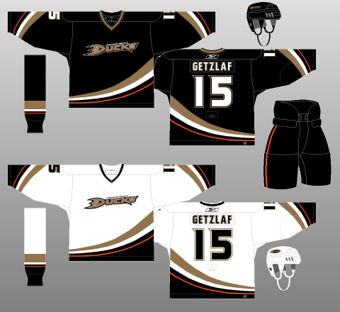
While these kits were a big improvement on the team’s last attempt at black jerseys, they still leave plenty to be desired. They aren’t bad kits by any means, just a bit boring. The swooping, five-component striping that adorns the sleeves and tail of both the home and away uniforms is a modern take (though reversed in orientation) on the Ducks’ historically diagonal striping. That’s a nice touch.
There’s certainly no problem with being taken seriously, either; the heavy use of black in the jerseys, pants, and socks, to go along with the subtly dangerous – yet still duck-like – names and numbers make for an undeniably aggressive look. However, again, the logo is the problem. An “ANAHEIM DUCKS” wordmark, even if the “D” is styled to look like a duck’s foot (or a duck in flight?), just isn’t cutting it. All the snarl and ferocity built up by the color palette and sweater template simply evaporates around this disappointing attempt at a logo.
I also feel they could’ve used other colors besides black and white for the bodies of the numbers to sharpen things up a bit. Or perhaps the gold trim could have been replaced with orange; anything to give these kits a little more punch.
Ducks Double Down on “D”
For 2014-15, the Ducks made the alternate kit they wore from 2010-11 through 2013-14 their full-time home uniform, creating a white edition of said template for the road. They added an orange third jersey in 2015-16.
This time, I have to say, I really think they’ve got it right, at least in the context of the Reebok Edge uniform system. I’ve never been a huge fan of Reebok Edge and the corresponding cacophony of often-ruinous alterations made to team kits, specifically with regards to Edge’s weird, unnatural fascination with vertical striping (Colorado Avalanche, anyone?).
That said, if there’s one jersey set on which it totally works, it’s that of the Ducks. The sweeping, diagonal tail striping used on both their original and Cup-winning jerseys remains but has been turned on its side and bolstered by orange (the sleeve striping remains unaltered).
Obviously, horizontal striping would be preferable but, in the context of what was going on in the NHL at the time, this is as good as it gets. Lots of color, no random piping (though the tracing around the shoulders can probably go), and no perpendicular intersections. Everything flows together to create something that, by and large, works wonderfully.
Perhaps most notably, orange has been used as a major component of the color scheme, rather than just an accent, on both the jerseys and socks. Anaheim’s jerseys were brightened considerably, perfectly balancing the darkness of the rest of the kits. Even the (duck foot? duck in flight? maybe both?) logo is a marked improvement over the rather dull “Ducks” that graced the Cup-winning design (although the shoulder patch features the Ducks’ original logo, so they probably just should have used that). Anaheim stuck with the same typeface for the numbers and lettering, too, which utilizes enough flourishes to be interesting while still retaining legibility and professionalism. Just ducky.
That these complex jerseys are perfectly contrasted with the plain black pants – save for a single, thin orange stripe separating the orange of the sweaters and socks, only strengthens my conviction that Anaheim has one of the more balanced, sharp-looking Reebok Edge uniform sets in the NHL, one which has carried over into the ADIZERO era. My only real qualms are that the main logo would function better as a secondary emblem and that the shoulder patch looks half-baked and thoroughly out of place.
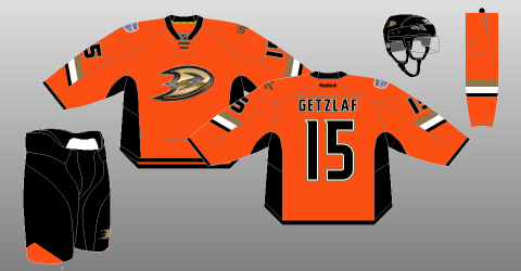
Ducks’ Orange Alternate a Crowning Achievement
This brings me to the Ducks’ short-lived orange alternate jersey, which lasted only two seasons (2015-16 and 2016-17).
The original logo is back in the primary position, this time set upon a gold background to match Anaheim’s present-day color palette. Meanwhile, the ducky “D” logo is on the shoulders, serving admirably in its rightful place as a secondary crest. Combine that with an orange backdrop and traditional, horizontal striping, and it’s impossible not to acknowledge the Ducks, however briefly, wearing one of the finest pieces of sweater craftsmanship in the history of the NHL.
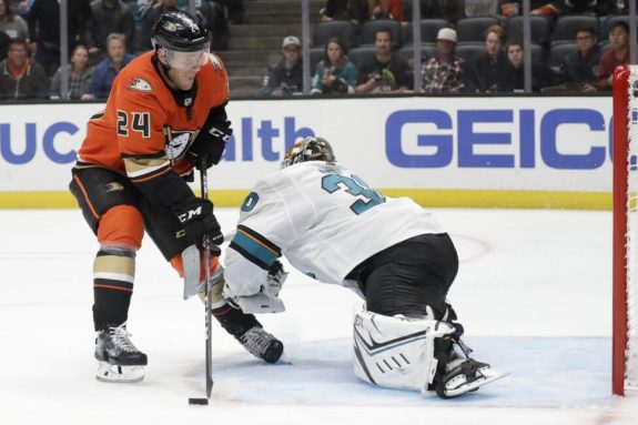
The Ducks’ alternate jersey is simply phenomenal and ranks very high on my list of all-time favorites. It doesn’t have the history of a Montreal or a Chicago but, judged on aesthetic appeal alone, how can you keep it out of the top ten? Come on, just look at it. It’s bright orange and flashy without being sickening. It’s complex without being busy. It’s new-age without being offensive to tradition. What’s not to like?
The Ducks Fly Outdoors
On January 25, 2014, the Ducks would take on crosstown rivals the Los Angeles Kings at Dodgers Stadium as a part of the NHL’s Coors Light Stadium Series. I’ll be honest here; I was not a fan of either team’s jerseys.
The Ducks’ jersey felt overpowering in its use of orange, having only small accents of different colors to catch the eye. Primarily orange jerseys can work, as we saw with the team’s previous alternative jersey, but I think these ones fell flat. My biggest issue with these sweaters is the logo. While the “D’ remained unchanged, the glossy finish did not come out well. The logo looked cheap to me, like they forgot to add them until the last minute and just added a poorly pressed logo. They weren’t all bad though, as I thought the “OC” logo on the shoulders was a nice touch. Still, they were better than the Kings’ jerseys, and that counts for something.
Ducks’ Return With the Mighty Ducks Logo
Unfortunately, Adidas couldn’t figure out how to hockey in time for 2017-18, so the Ducks – and the entire NHL – went without third jerseys for an entire season. Thankfully, they returned for 2018-19, and the franchise opted to go back to the “Mighty Ducks” well. They would bring back the original logo and some of the original color scheme.
It wasn’t a perfect return for alternative jerseys, but it could’ve been worse. The Duck mask logo was still beloved; however, the black base for this jersey left a lot to be desired. Keeping the same base as their home jerseys did little to set their alternates apart and did little to make them unique. In isolation, these jerseys were fine, with the context that they’re slightly disappointing. Still not a terrible sweater by any means, but they could have been executed better.
Wild Wing Makes a Triumphant Return
Before the start of the 2020-21 season, the NHL announced that teams would be debuting “reverse retro” jerseys. With this came a lot of speculation about what direction the Ducks would go in with these jerseys. Ultimately, they would give Wild Wing a surprise return. The team knew not everyone would like this idea, as vice president of marketing and brand management Merit Tully stated:
There’s going to be jerseys that people don’t like. You can’t please everybody. You can’t make everybody happy. But for nostalgia’s sake and just pay homage to the history and the handful of games they actually wore the uniform, hey, go for it. Let’s have fun with it. (From, “Ducks’ Wild Wing jersey is back: Swiping through Anaheim’s past looks” Eric Stephens, The Athletic)
The response to these jerseys would turn out good for the season. Many people enjoyed the nostalgic return of Wild Wing. It’s a fun piece of NHL jersey history to remember.
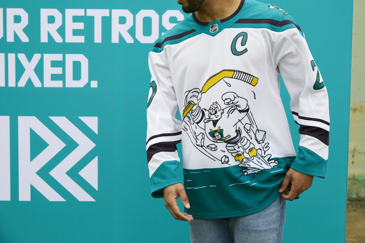
Regardless of fan opinion, the NHL players really enjoyed them. In the recent NHLPA players vote, 4.46% of the surveyed players voted this jersey as their favorite reverse retro uniform, good enough to sit them tied in fifth place.
2022-23 Reverse Retro: Original Design, Modern Colors
Last season saw the return of the Adidas and NHL’s ‘Reverse Retro’ line, where clubs partnered with the uniform outfitter to come up with jersey designs rooted in each franchise’s origins. Whether that be re-adapting an old logo or uniform design with a new color scheme, blending previous iterations of jerseys, or using a team’s community ties to create something truly unique, each club came out with a limited-use but fun set of uniforms that were worn in select games.
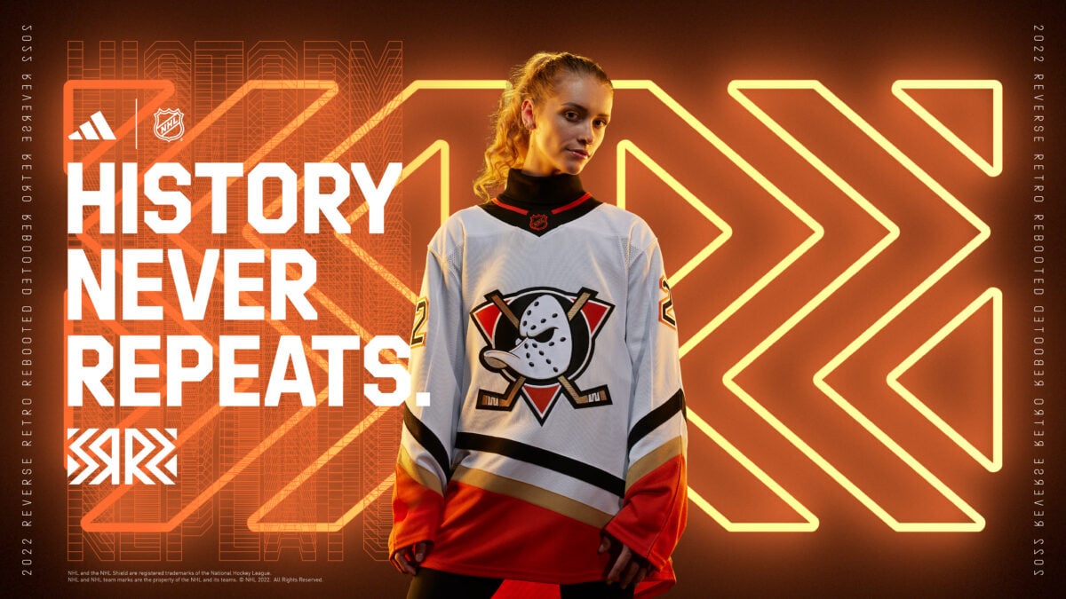
The Ducks took their original uniform and gave it a modern color blast, replacing the plum, green, and silver with white, orange, black, and gold, which have been their primary colors since their 2006 re-branding to the ‘Anaheim Ducks’.
Personally, these were nice, plus I like the introduction of any uniform that causes them to wear their primary home and away uniforms less. Those leave plenty to be desired. To be honest, I wouldn’t mind this serving as the away, with their orange third serving as the home. Both give a nod to Wild Wing, one of the NHL’s most recognizable mascots, but have a modern twist that, relatively speaking, is far more exciting than what they wear for most of the season currently.
Plum, Jade, and Wild Wing Return in 30th Anniversary Sweaters
The long-awaited and overdue return of the Ducks’ original color scheme will finally occur in the form of a 30th anniversary jersey, which will celebrate the team’s upcoming 30th season in the NHL. They will debut this look in their home opener on Oct. 15 against the Carolina Hurricanes, and wear it on other themed nights and select games throughout the campaign.
Overall, it’s pretty good, though I can only imagine that the mindset when creating this jersey was simple: We cannot miss another chance to bring our original colors back. Well, what’s old is now new again, as there shades of and references to their inaugural uniforms abound with this new, special-edition jersey. Let’s take a look.
For starters, the plum and jade color scheme, not to mention the Wild Wing mask, have taken center stage, literally. This is much to the delight of fans, critics, and others who are simply of the mindset that if you are returning to your roots, then how can you not include the original plum and jade?
Wild Wing, encircled in a teal green crest bearing the name Anaheim Ducks, lies at the center of the jersey, with complimentary striping and original name and number-plating, all odes to their initial design that lasted 1993 – 2006.
Merit Tully, Ducks Vice President of Marketing, said in an interview, “This jersey is a symbol of our journey the last 30 years, our successful history and a nod to our origins. It was designed internally in a collaborative effort by organizational departments up to ownership, and we are excited for our players to wear it with honor this upcoming season.”
Sounds like it was an organizational effort. They brought back the original colors and appropriately honored their roots on the eve of a milestone season for the franchise. All things considered, well done. Maybe Fanatics, the uniform partner of the NHL, will work with the Ducks to create a fresh set of uniforms that makes these themes more permanent.
While Better Lately, Ducks’ Jerseys Remain a Mixed Bag
No franchise has hit the ball out of the park with every uniform, the Ducks included. They’ve had great looks and looks that leave us all wanting more. Their current home and away uniforms fall into the latter. They are too plain, lack creativity, and bear minimal resemblance, if any, to the team’s history, original colors, or logo, which were pretty universally enjoyed.
Their 2006 re-brand and most uniform iterations since have them moving away from those original themes in favor of a more plain look. Though, there are reasons for optimism. Certain opportunities such as the Reverse Retro and 30th Anniversary Edition jerseys have given the franchise opportunities to have fun, get creative, and embrace their past with new designs. This should leave us all hopeful that as the Ducks continue their path to playing good on the ice once again, they can also look good in the process.
Free Newsletter
Get Anaheim Ducks coverage delivered to your inbox
In-depth analysis, breaking news, and insider takes - free.
Subscribe Free →