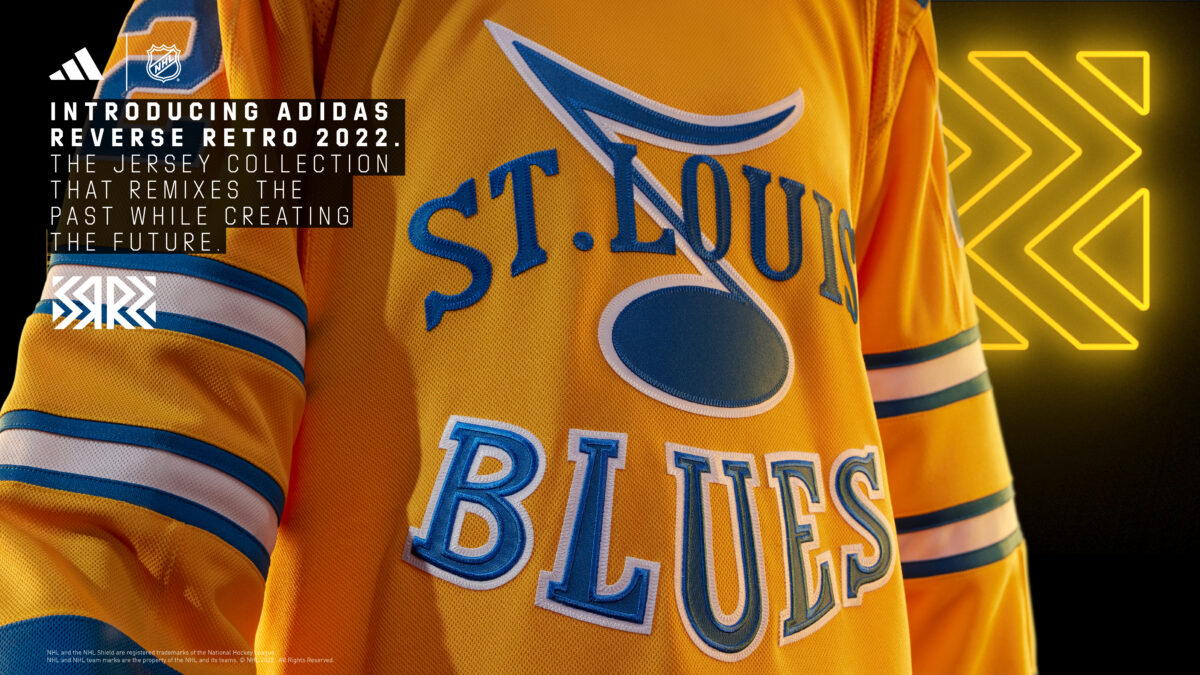
After designs and color schemes have been teased around for weeks, the NHL and Adidas officially unveiled each team’s Reverse Retro 2.0 jerseys for the 2022-23 season. For the St. Louis Blues, the color choice was bold and the logo hearkens back to a time before anyone in a Blues uniform even touched a blade to the ice. It’s an interesting take and surely one that will lend itself to many thoughts and opinions.
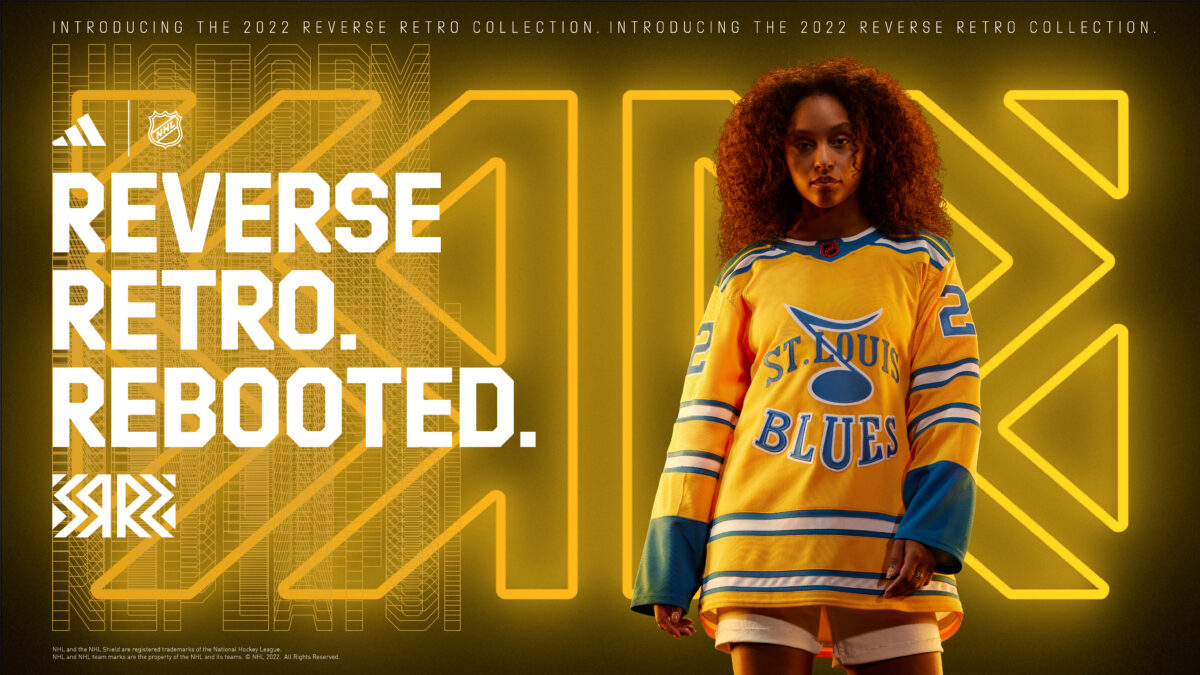
The Blues team of writers here at The Hockey Writers got together to discuss the Reverse Retro 2.0 jerseys, where this one ranks within the Blues’ own recent alternate jersey history, and which team has the best Reverse Retro 2.0 design.
Question 1: What Do You Think of the Blues’ Reverse Retro 2.0 Jersey?
Ethan Carter
I love the fact that they went with a yellow color-base jersey. It felt like a long time coming that they would do this, especially since they did the red Reverse Retro jersey last season. I like them – it’s a fun design that could look interesting on the ice. I’m not sure what other route they could have gone anyway. It’s clear that multiple teams wanted to go the powder blue route, which the Blues likely could have done if they wanted to. Overall, it’s a fun and interesting design that separates itself from many other jerseys in franchise history.
Marcus Ashpaugh
When I first started hearing that it was going to be yellow, I wasn’t sure how I was going to feel about the overall concept. Yellow is a difficult color to pull off in sports and seems to need another bold color and logo to really make it stand out. I think the Blues knocked it out of the park with this design. I could’ve seen them going with a white version of their past two retro designs, but I am much more in favor of this choice. I’m very interested to see what they do next with their helmet, gloves, shorts, and socks.
Mike Meyer
I love the jersey. I know they are getting some flack and people don’t like the yellow, but I think these are beautiful. They’re an amazing callback to the jerseys that never were. For a jersey that could’ve been the franchise’s original, it now becomes the team’s new Reverse Retro. I love the decision and can’t wait to see them in action.
Stephen Ground
I think they’re a home run. I was really surprised when rumors started to leak that yellow would be the base color. But the NHL jersey department, which is on an all-time hot streak, killed it yet again.
Question 2: Where Would You Rank the Reverse Retro 2.0 Within the Blues’ More Recent Alternate Jerseys?
Ethan
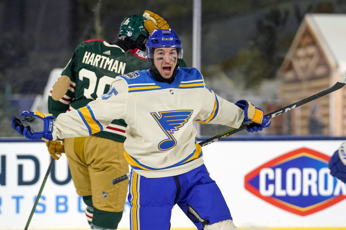
This is a fairly easy question for me to answer at this point. Number one for me is the 2022 Winter Classic jersey – the cream base with the heritage logo is tremendous. Number two is the retro alternate from the 2019-20 season that brought back the classically weird 1990s look. Number three is the Reverse Retro 2.0. I love the yellow base. Number four is the Reverse Retro 1.0 from last season with the 1990s design and the red base. I like all four jerseys, but the gap between number one and the rest is significant for me.
Marcus
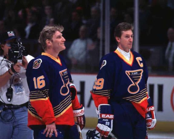
Number one is most definitely the 2022 Winter Classic jersey. To me, that’s an all-time great setup with the cream and powder blue and the heritage logo. It can’t be topped. Number two right now is the Reverse Retro 2.0 jersey. This may just be recency bias, and we don’t know how the full uniform will look when it’s all put together, but I think it’ll look clean on the ice. Number three is the original retro throwback in blue (AKA the “clown jersey”). It reminds me of the 31 wonderful games that Wayne Gretzky was a Blue. Number four is the red Reverse Retro 1.0. It’s not bad, but definitely last on the list.
Mike
- 2022 Winter Classic: It is the best alternate jersey in the NHL by a country mile. There’s no topping it.
- 2022-23 Reverse Retro: For the reasons I listed in the previous question.
- The red Reverse Retro 1.0: The Blues having a red jersey just doesn’t work. They’re fine, but I’m just not a fan.
- Clown jersey: It didn’t work in the 1990s and it doesn’t work now.
Stephen
- 2022 Winter Classic: Just absolutely perfect. So clean, so fresh. I would fully endorse moving to the 2017 Winter Classic jerseys and these as the full-time primary home and away uniforms. So great.
- 2022-23 Reverse Retros: I just think they are so clean. The yellow looks great. I’m excited to see the full kit on the ice.
- Clown Jerseys: I have a soft spot for these. You can’t truly hate a Blues jersey that Brett Hull and Wayne Gretzky wore. But they’re certainly not “good” in the classic sense.
- 2020 Reverse Retros: Terrible. I mean, I love them. But terrible. I really wish they’d done the same thing with the trumpet logo as the chest crest.
Question 3: What Are Your Three Favorite Jerseys From the Reverse Retro 2.0 Release?
Ethan
I’ve always enjoyed the classic “Robo Penguin” logo, so that’s number one for me. Number two overall would be the Florida Panthers’ powder blue jersey with gold, red, and navy stripes. The color scheme doesn’t make much sense, but they look really clean. Number three is a tough call, but I’ll go with the Arizona Coyotes’ bizarre burnt orange jersey with the desert design at the bottom. I like a majority of the Reverse Retro 2.0 designs, so putting together a top three is difficult. But if you want to know which one I think is the worst, it’s the Toronto Maple Leafs. They seemingly didn’t even try.
Marcus
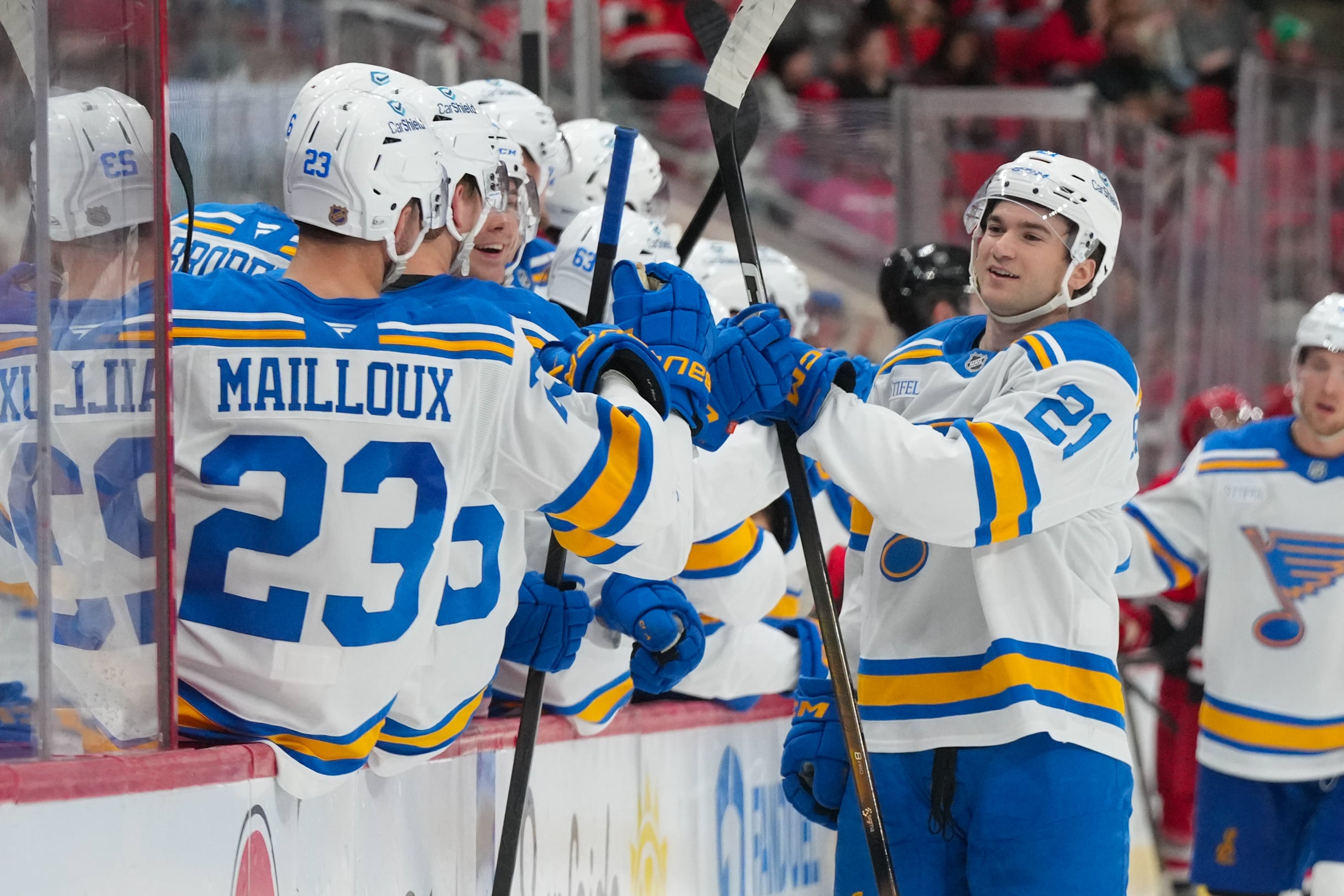
I’m going with the Boston Bruins at number one. Brown and yellow is underrated as a color combo and it looks great with the white base and the “Pooh Bear” logo. Second place for me is the Buffalo Sabres and the much beloved “Goat Head” logo with their current blue and yellow color scheme. My third favorite is the San Jose Sharks and their homage to the California Golden Seals jersey of the past.

Mike
My top three are the Penguins, Colorado Avalanche, and Los Angeles Kings. Honorable mention to the Winnipeg Jets.
Stephen
Counting or not counting the Blues? I’ll give you three non-Blues for fun (although the Blues would be top-three for me).
- Panthers: These are just the best. I’m a recent transplant to Florida, so I’m particularly biased, but it’s the perfect Reverse Retro combo to me: not safe, but not ugly, cool colors, but not garish, very Florida, and using a unique but real old logo in a new way. Just perfect in every way.
- Coyotes: I would fault the Coyotes for doing something so close to their old Reverse Retro, but man, it looks so good! The dust orange is a really unique color. I wish a better team got to wear these, though.
- Montreal Canadiens: So pretty. Both of their Reverse Retros have been fantastic. They’re not messing with the tradition, but they’re doing enough to make them unique, fresh, and interesting (contrast with the Maple Leafs and Philadelphia Flyers, who are so safe, it’s a total failure). The nod to the former Montreal Expos baseball team is especially fun.
The Blues will be wearing their Reverse Retro 2.0 jerseys seven times during the 2022-23 regular season:
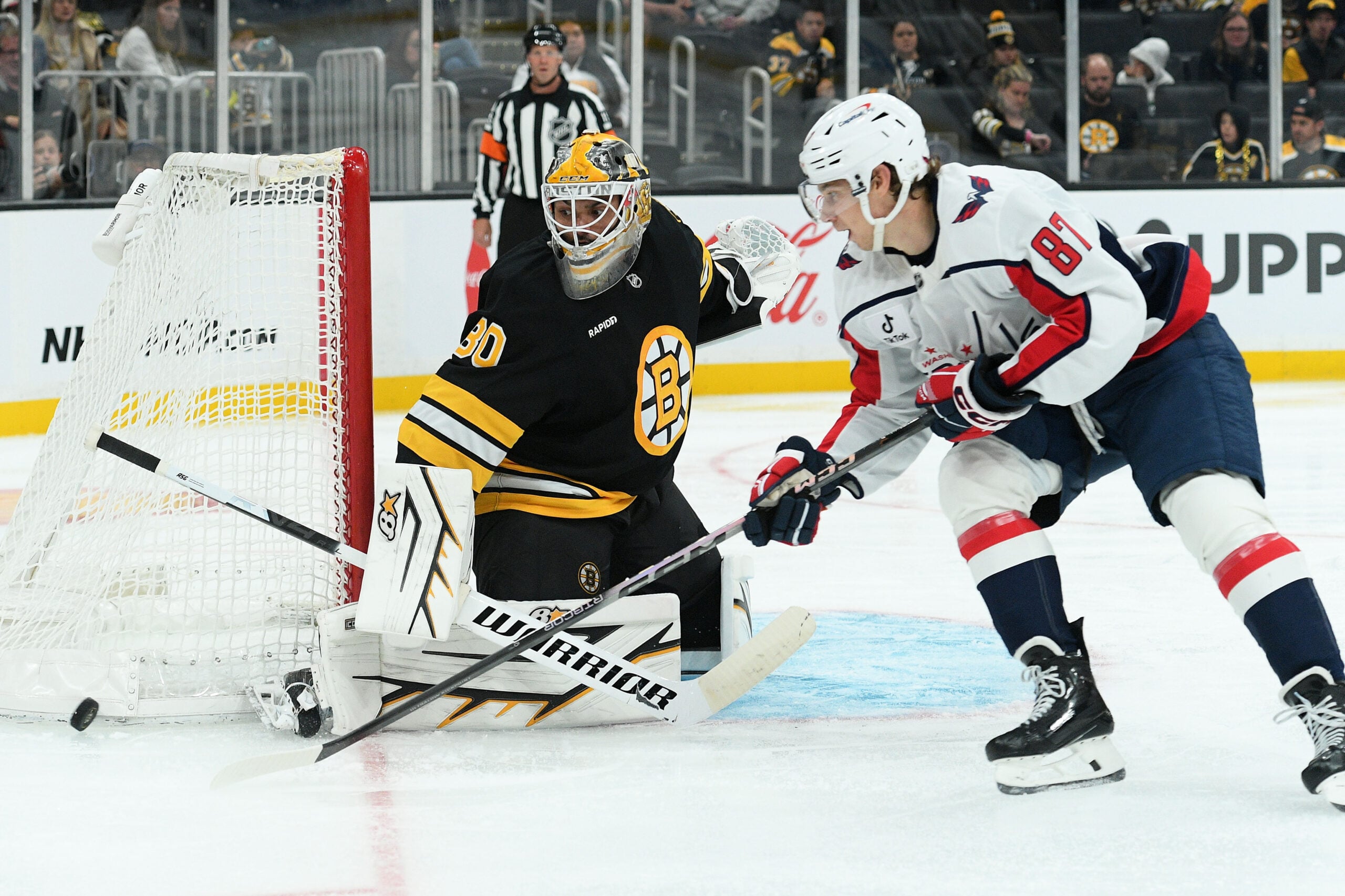
- Nov. 17 vs. Washington Capitals
- Nov. 21 vs. Anaheim Ducks
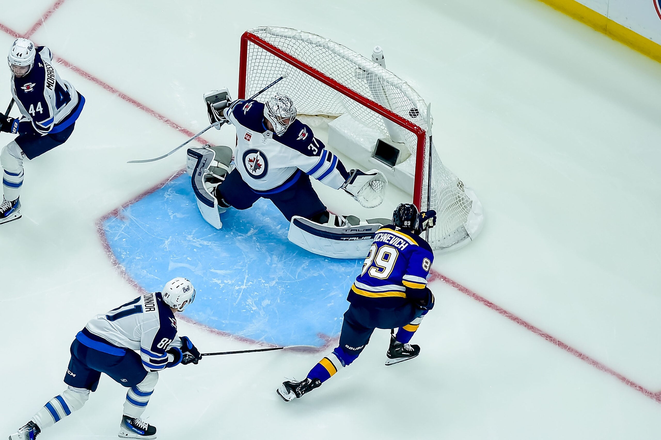
- Dec. 8 vs. Winnipeg Jets
- Dec. 11 vs. Colorado Avalanche
- Dec. 29 vs. Chicago Blackhawks
- Jan. 10 vs. Calgary Flames
- Jan. 24 vs. Buffalo Sabres
In all, the four of us seem to be in agreement that the Blues’ Reverse Retro 2.0 jerseys were very well done and we can’t wait to see what they look like out on the ice. The NHL and Adidas did a great job on the release and the jersey designs as a whole for the rest of the league. It’s always a lot of fun for fans when new looks drop, and this was no exception.
Free Newsletter
Get St Louis Blues coverage delivered to your inbox
In-depth analysis, breaking news, and insider takes - free.
Subscribe Free →