- A Well-Rounded Black Hawk
- Black Hawk History
- Black Hawk Roundel
- Black Hawk Roundel: Version 2.0 (This Time, in Colour!)
- Black Hawk Roundel: Version 3.0 (the Deer in the Headlights)
- Black Hawk Roundel: Version 4.0 (the Old Man)
- The Tomahawk Cross
- The Tomahawk Cross: Version 2.0
- Headstrong Black Hawk
- Black Hawk Headshot (the Fat Man)
- Black Hawk Headshot: Version 2.0
- Chicago Blackhawks Current Primary Logo
- Black Hawk Head Shot: Version 3.0
- Chicago Blackhawks Current Secondary Logos
- The Tomahawk Cross: Version 3.0
- The Tomahawk Cross: Version 4.0
- Is the Chicago Blackhawks’ Logo Racist?
- Logo Debates Have Shades of Grey
- Atlanta Braves
- Chicago Blackhawks Get It Right
- Reasonable Accommodation Available
- Blackhawks Win Hearts, If Not Minds
Let’s face it, we’re all a little tired of the Chicago Blackhawks. Given how often they’re on national television, how many of them were named to the National Hockey League’s Top 100 (despite questionable qualifications) and, of course, the league’s insistence on sending them to every single outdoor game ever, the NHL seems to view the Blackhawks as their only marketable team. Though that probably says more about the league’s marketing prowess than anything else, it cannot be denied the ‘Hawks have left their mark, particularly in recent years.
Chicago went from second-last in attendance in 2006-07 to packing the cavernous United Center every single night. Between 2010 and 2015, they won three Stanley Cups in six years – a modern-day dynasty. Not only are they on TV all the time, the atmosphere and game operations are also top-notch, from the spine-tingling national anthem to the annoying goal horn (which came off a yacht, just to make it extra obnoxious) to the insufferable “Chelsea Dagger” goal song. (from ‘The history behind the NHL’s ubiquitous sound for scoring: the goal horn,’ NY Daily News, 04/25/2016)
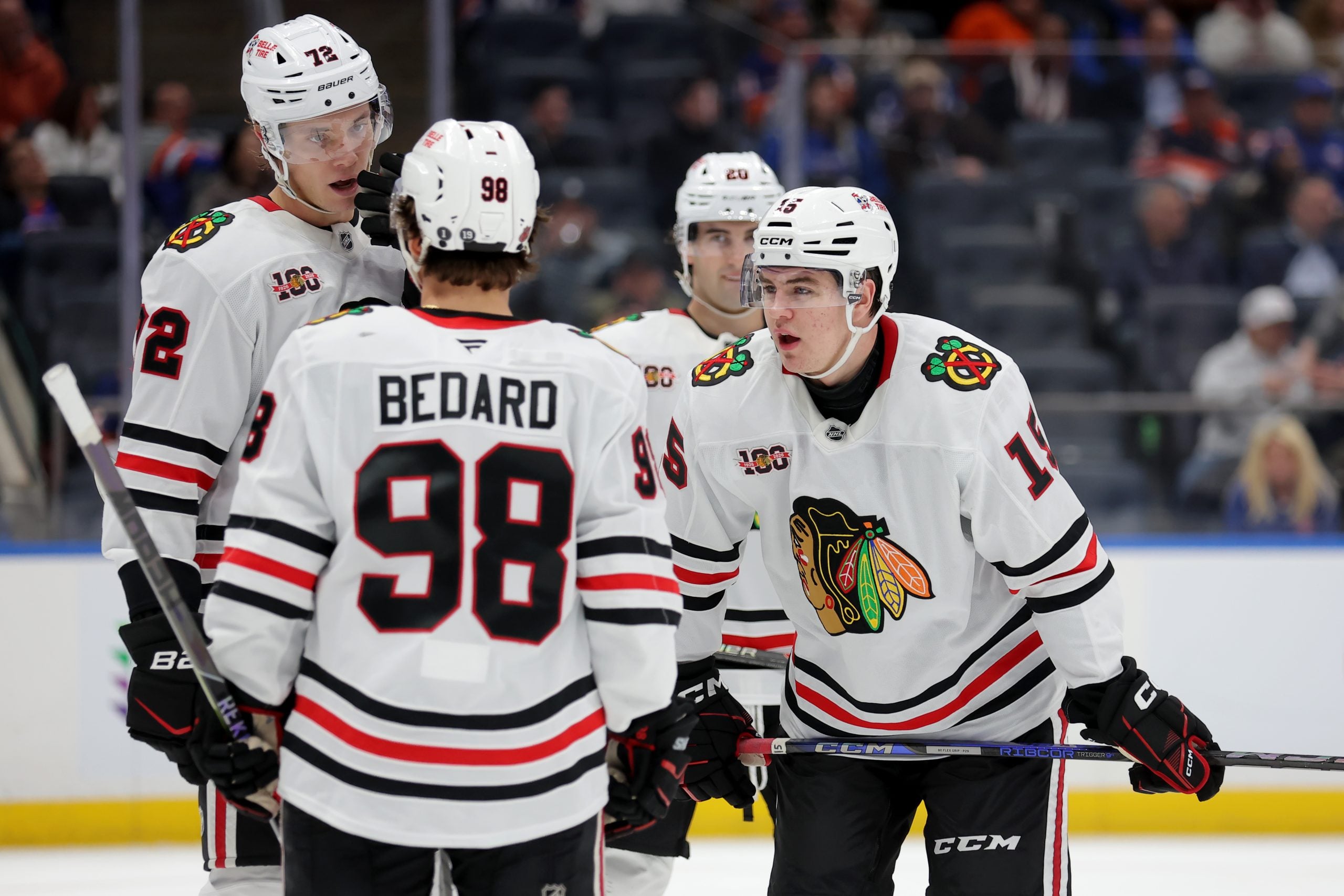
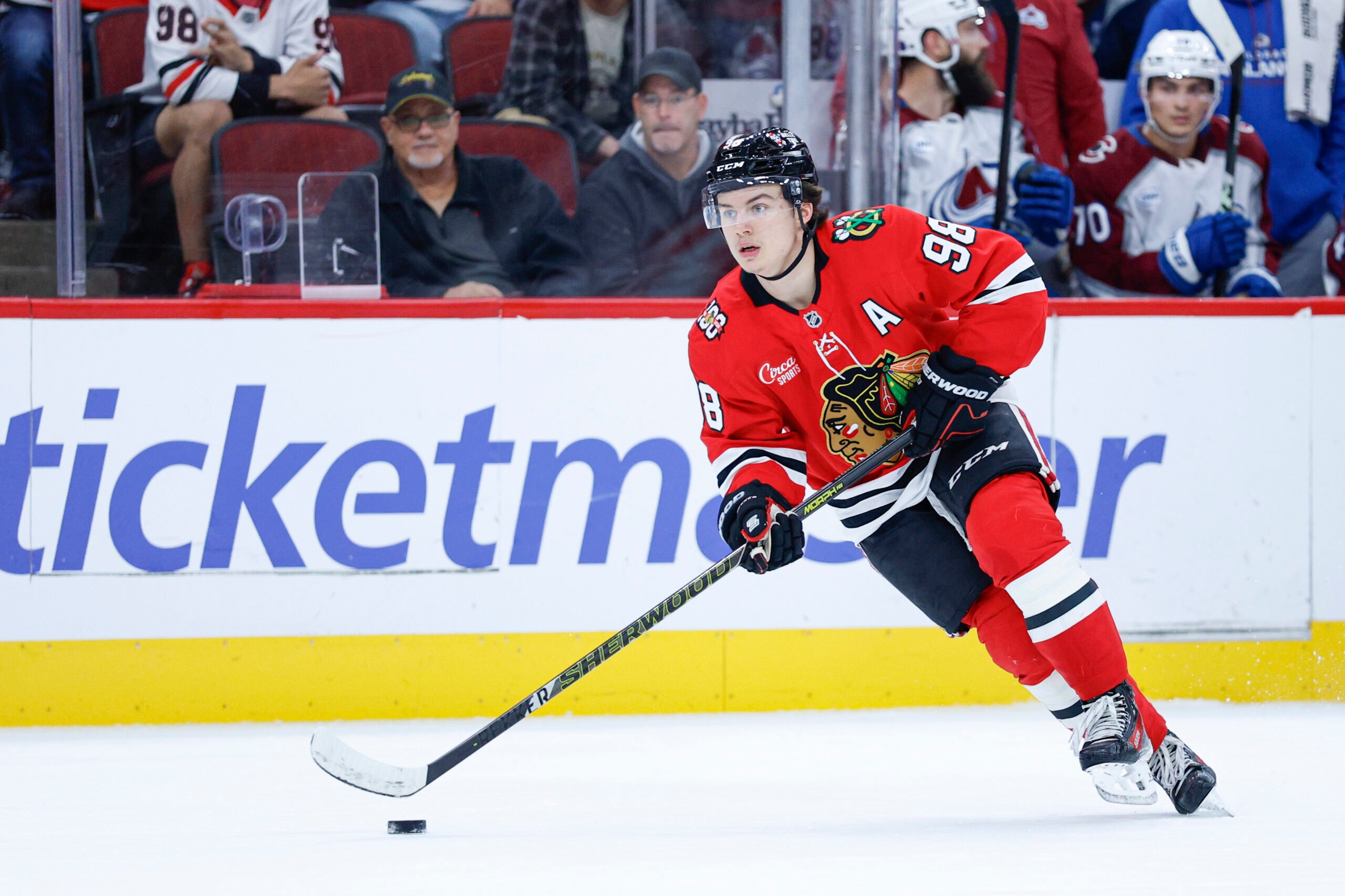
And they’ve done it all playing in one of the most iconic uniforms in the sporting world. The Blackhawks’ kit, which has remained largely the same since 1955, is one of hockey’s all-time favorites.
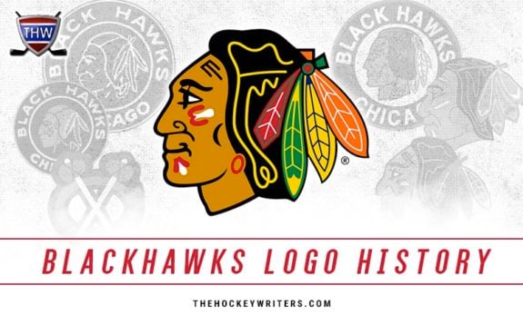
At the centerpiece of this magnificence? One of the most polarising logos in sports.
A Well-Rounded Black Hawk
We’ll get to the controversy later. First, some history.
Black Hawk History
Major Frederic McLaughlin, founder of the franchise, named his team the “Blackhawks” after the US Army unit he served in during World War One, the 86th Infantry Division, also known as the Black Hawk Division. The unit was named after Black Hawk, the Sauk leader of the eponymous Black Hawk War of 1832.
Black Hawk Roundel
Irene Castle, McLaughlin’s wife, is credited with the original design of the logo, a side profile of an Aboriginal American, presumably Black Hawk, inside a roundel featuring the team name.
At first glance, this first attempt looks rather crude and rushed. However, I’ve really come around to this logo, especially when it’s viewed in isolation from the horrendous barber pole jerseys they adorned. The sparing use of lines and corresponding brilliant use of negative space result in a burdened, pensive Black Hawk (if the logo indeed depicts him), exactly what one would expect on the face of a veteran military leader who’s spent his life fighting for his people.
The best art can evoke emotion. This crest, and the gravity of what it represents, is really rather chilling.
Black Hawk Roundel: Version 2.0 (This Time, in Colour!)
Aaaand it’s gone. The Blackhawks, like many teams in the early years of the NHL (see: Bruins, Boston), were constantly fiddling with their jerseys and logos. For 1935-36, Chicago colourized their logo, a year after finally adding color to their jerseys.
The addition of tan to the uniforms was accompanied by the tan coloring of the roundel’s lettering, as well as the coloring of Black Hawk’s head.
A couple years later, the portrait’s backdrop was changed from black to white, Black Hawk’s hair was colored black and his feathers were made a single color.
Neither of these two iterations of Chicago’s roundel logo is particularly good. Gone is all the subtly and thought-provocation of the original design, replaced by ham-fisted modernizations. The addition of colors to the uniform kits is fine, but the coloring of the logo completely destroys its appeal.
Even though the head’s features did not markedly change, the addition of skin coloration, in the reddish color Aboriginal Americans are stereotyped (incorrectly, while we’re on the topic) as having, approaches Washington Redskins levels of poor taste. To their credit, the Blackhawks didn’t include that particular tone in their uniforms.
On a more artistic note, I prefer the black background of the portrait over the white. I find the white much too harsh, and ruinous of all the aforementioned mystique the crest has to offer.
Black Hawk Roundel: Version 3.0 (the Deer in the Headlights)
For the 1941-42 season, the image of Black Hawk’s head was completely overhauled. Gone was the mysterious, pensive portrait, replaced by a stark, detailed headshot with a deer-in-the-headlights look.
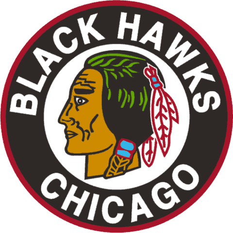
Seriously. I can feel the eyes following me around the room.
More detailed it may be but, unlike the previous design of the head (which bore at least a passing resemblance to historical images of Black Hawk), this attempt seems to be just an attempt at a stereotypical Aboriginal American.
Black Hawk Roundel: Version 4.0 (the Old Man)
The final iteration of the Blackhawks’ roundel logo features a more accurate (again, based on the limited images available) headshot of Black Hawk, and the first one that begins to resemble the modern Chicago crest.
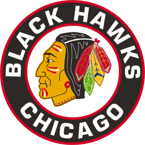
The head, hair and attached feathers are crisply and strikingly detailed, with painted markings on the face which have been retained to this day. However, the expression looks somewhat tired and beaten down, a disservice to such a prominent figure in American history.
The Tomahawk Cross
In 1955-56, the Blackhawks introduced a new secondary logo (two, actually), consisting of two tomahawks crossing in an X atop a stylized C. The crest varied in color, depending on the jersey used.
For the red uniforms, the C and the tomahawk heads were red, while the shafts of the tomahawks were black. The whole thing was bordered by white,
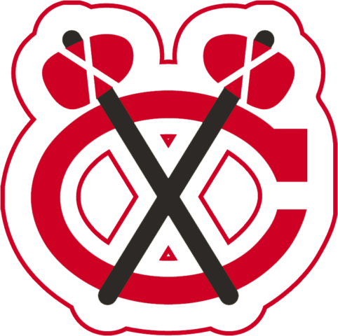
On the whites, the border and shaft colors were reversed.
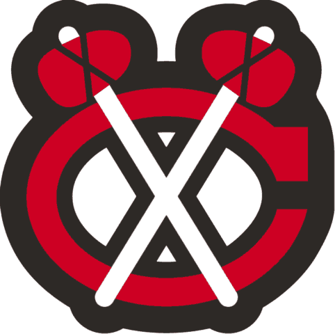
The Tomahawk Cross is a perfect example of what a secondary logo should be. It’s not going to challenge the Black Hawk crest for primacy anytime soon, but it still serves a purpose in representing the team and is iconic in its own right. Perhaps most importantly, it’s not superfluous and is legitimately beneficial to the Chicago jerseys, improving upon the blank space between the collar and the sleeve numbers, where otherwise there would be nothing.
The Tomahawk Cross: Version 2.0
Changes to the secondary patches came the following season, with the C changing to yellow (with red and white tomahawks) on the red jerseys…
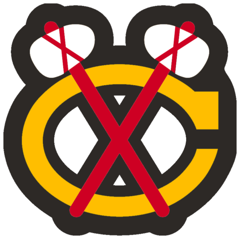
…while remaining red (albeit with white and yellow tomahawks) on the whites.

The addition of yellow (joined, in 1959-60, by green) seems, at first glance, curious for a team with a colour scheme of red, black and white. However, somehow, the sprinkling of color in this secondary patch really helps the rest of the uniform pop.
Headstrong Black Hawk
Starting in 1957-58, the roundel was removed from the Chicago logo, leaving an enlarged rendition of Black Hawk’s head to serve as the team crest.
Black Hawk Headshot (the Fat Man)
The first attempt at letting Black Hawk go it alone is…less than satisfying.
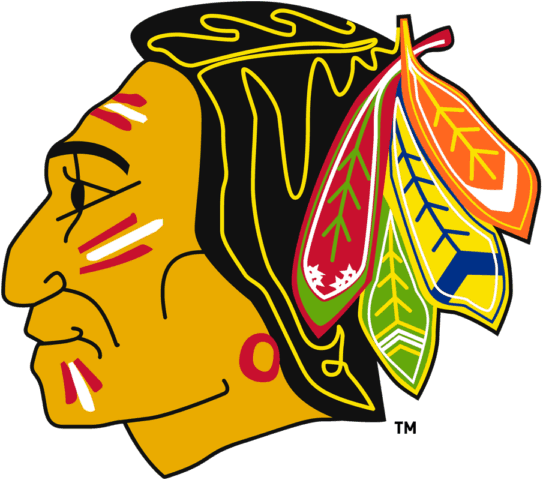
The tiredness of the previous headshot has been rectified, but the face now looks like something out of an ancient Egyptian hieroglyph (check out those eyes! While we’re talking eyes, they’re not even white…). Not to mention the fact the head has become inexplicably bulbous all of a sudden.
Thankfully, this edition of the Blackhawks’ primary crest only lasted two seasons.
Black Hawk Headshot: Version 2.0
1959-60 brought yet more changes to Black Hawk’s head, but these ones would endure for nearly three decades, right up until the end of the 1988-89 campaign.

As you can see, the lines are bolder and simpler, the head is now a normal shape and, for once in its life, the portrait has a neutral expression.
Chicago won the Stanley Cup in 1961, so perhaps they took this as a good omen and stuck with the logo that won it. I also feel as though the fine lines and overly intricate detailing of the Old Man crest would have been excessively difficult (and therefore expensive) to produce. Hell, even with modern technology, the Florida Panthers had to change their logo to accommodate the limitations of the textile industry.
Chicago Blackhawks Current Primary Logo
Black Hawk Head Shot: Version 3.0
In 1989-90, the Blackhawks initiated yet another logo redesign which, save for some variations in outlines and shading, brings us to the present day.
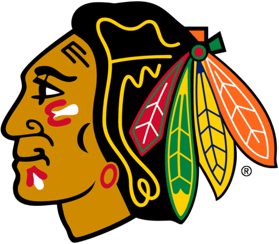
As you can see, the many elements of the always-complicated Chicago crest, such as the features of the face and the outline of the feathers, have been nicely cleaned up, producing a more standardized, appealing side profile of Black Hawk. The neutral expression has been retained and, with the softened features of the face, Black Hawk (again, assuming the logo is supposed to represent him) has a look that is stoic, and yet almost…kind.
Yeah. Tell that to their opponents.
Chicago Blackhawks Current Secondary Logos
You think the primary logo has gone through a lot of iterations? You’d best not even look at all the (ever so slightly) different secondary crests.
The Tomahawk Cross: Version 3.0
Thankfully, I’ve done the work for you and can tell you that, since 1959-60, for all their different iterations, the secondary logos of the Blackhawks have stayed largely the same, the many, many changes really only concerning the shades of the various elements.
On their red jerseys, the Blackhawks sport a Tomahawk Cross crest that has a yellow C, overlaid with two tomahawks with green handles and white heads.
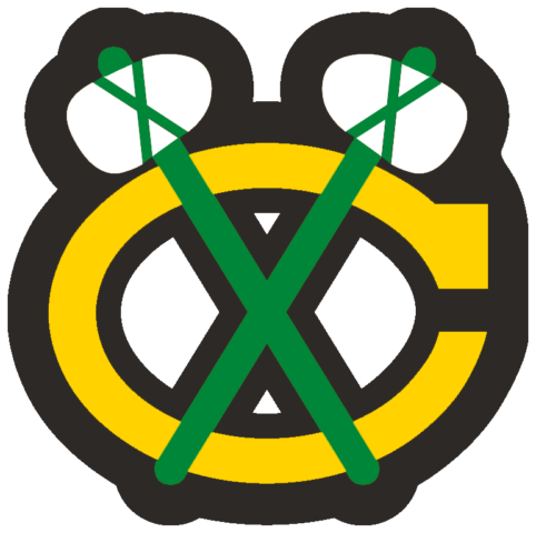
On their white jerseys, the Tomahawk Cross has a yellow C, with the two tomahawks having red handles and green heads.
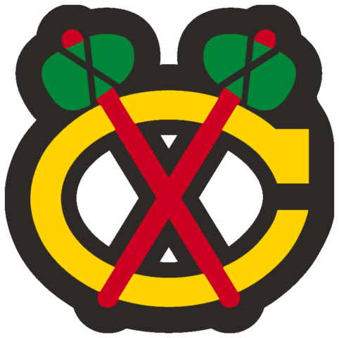
Much like the seemingly out-of-place colors on the primary logo, the yellow of the stylized C and the green of the tomahawk heads, as mentioned, do not seem to fit with Chicago’s color palette. However, these colors, especially in the sparing quantities in which they’re used, work well with the red, black and white of the uniforms and, in the case of these shoulder patches, provide a welcome splash of color in the absence of any shoulder yokes on the jerseys.
Think about it. Imagine the original red, black and white patch on the shoulders of those glorious red, black and white jerseys. A bit bland, a bit boring; washed-out, if you will.
You may also like:
- Blackhawks Locker Cleanout Part 2: Appreciating Teammates, Summer Plans, Playoff Expectations & More
- Blackhawks’ Worst Trades of All-Time
- Reaction to Blackhawks’ Locker Cleanout: Notes From Davidson, Blashill, Bedard & Vlasic
- What Extending Kyle Davidson Means for the Blackhawks
- Every NHL Team’s Most Underrated Prospect
Or, imagine if there was nothing at all on the shoulders. It’d be a bit plain; a bit…safe.
The Tomahawk Cross: Version 4.0
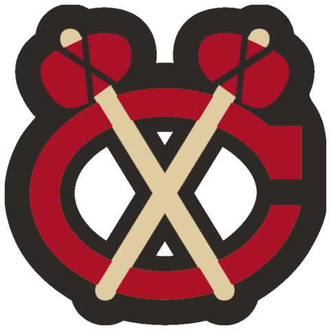
From 2009-2011, the Blackhawks wore their jerseys from the 2009 Winter Classic as their alternate kits. The Tomahawk Cross patch they selected harkened back to one of the very first iterations of the crest, save for the substitution of tan for white on the shafts of the tomahawks, in accordance with the rest of the jersey.
Is the Chicago Blackhawks’ Logo Racist?
Many sporting teams make use of Aboriginal names and iconography, and most, if not all, are under scrutiny for it. There is increasing willingness amongst governments, individuals and other concerned groups to delve into the tumultuous, often shameful historical relations with Aboriginal communities. Thus, conditions are ripe for a discussion over what we want our sports teams to represent.
Logo Debates Have Shades of Grey
Let’s pause on that word for a moment: “discussion”. It seems as though any representation of Aboriginals within the context of sports is increasingly seen as automatically offensive. But there are other teams that style themselves after specific ethnic groups, without being subjected to controversy. Teams that use “Vikings” as their moniker come to mind as an example.
Related: Logo History Collection
We should be wary of painting things with too broad a brush. At the same time, we should not refuse to acknowledge that such a brush exists at all. Therefore, I don’t feel it’s unreasonable to say the problem is not necessarily with the idea, but instead with the execution.
Atlanta Braves
A franchise straddling the line of good taste is the Atlanta Braves. A brave is a warrior of an Aboriginal American group. The current logo is a tomahawk, a traditional tool and weapon of such groups. Though the past iterations of the logo are bad enough to make even the most iron-stomached among us nauseous, there seems to be nothing explicitly wrong with the team’s current brand.
But you might wanna knock it off with the Tomahawk Chop (yes, I know, Atlanta isn’t the only team that does it). Seriously. We get that your logo is a tomahawk, but the music takes an already borderline tradition and drives it full speed into Wrong-Side-of-History Gorge.
So, for the Braves, the branding itself is fine, but the game ops could sure use some work.
Chicago Blackhawks Get It Right
How about the Blackhawks? Well, if there’s ever a way to do it right, this is it.
Black Hawk led a small group against the US Army in the ultimately unsuccessful Black Hawk War, in protest of the American Government’s shady dealings with regards to Aboriginal lands. In an age where the definition of hero is often split down partisan lines, Black Hawk stands as a shining example of freedom and resistance in the face of government overreach. What could be more American than that?
The logos themselves are stylized and make use of stereotypes, yes (the feathers and the paint on the face, for example). But I don’t think anyone can say these embellishments reflect badly on Aboriginal Americans; the primary logo is a depiction of a hero of Aboriginal – and American – history.
I don’t think it’s unreasonable to expect claims of racism to be supported by some evidence of prejudice or discrimination. Chief Wahoo, for instance, quite obviously fits that definition, as does calling a team the “Redskins.” But I just don’t feel it’s right to lump the Blackhawks in with the obviously offensive.
Reasonable Accommodation Available
I am not Aboriginal, nor am I of Aboriginal descent. However, I do bring an outsider’s perspective to the issue, a perspective influenced neither by cultural history nor team fandom.
It’s simply not reasonable to deem automatically offensive any and all references to Aboriginal culture. These conversations are undoubtedly uncomfortable – and rightly so. But that’s no reason to abandon reason. Each individual situation must be individually analyzed with thought, care, and attention to detail.
Having done so with the Chicago Blackhawks’ logos, I simply don’t think it’s warranted to require them to change.
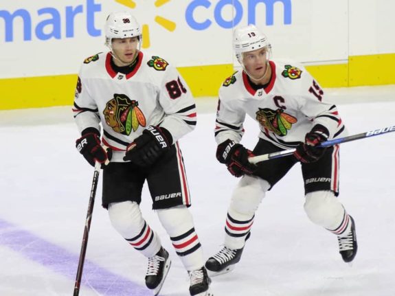
One reasonable move would be to revert to the original spelling of the team name, “Black Hawks (Chicago switched to “Blackhawks” in 1986),” thereby clarifying the team is named after a person, and emphasizing the team’s historical basis for the moniker and logo.
Blackhawks Win Hearts, If Not Minds
Whatever your opinion, no one can deny that Chicago Blackhawks logos are some of the most iconic in the NHL, if not the entirety of professional sports. Consistently rating at or near the top of logo rankings, Black Hawk’s head is not only great on its own, but is also the centerpiece for one of the best jerseys in hockey. The Tomahawk Cross is similarly iconic in its secondary role. Both logos are laid atop a red, black and white color scheme, and yet, it is precisely their lack of red, black and white that allows them to function so well artistically. The fact they bring a historical element is doubly impressive.
Whatever the future holds for the logos of the Chicago Blackhawks, I feel it’s reasonable to conclude that, ultimately, the controversial crests come from a place of reverence, just as the crests themselves are revered today.
Free Newsletter
Get Chicago Blackhawks coverage delivered to your inbox
In-depth analysis, breaking news, and insider takes - free.
Subscribe Free →
