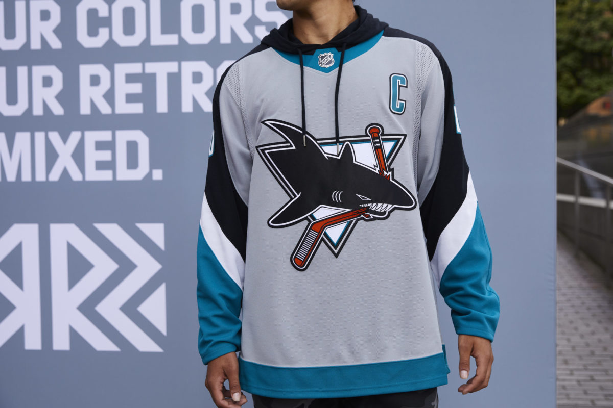
The San Jose Sharks have recently been victims of a jersey concept leak. Sheng Peng, in a post on San Jose Hockey Now, explained that the team is looking towards a new jersey design that would either launch in 2022-23 or 2023-24. While initially unconfirmed, the rumor has since been confirmed by icethetics, who stated that the Sharks might look to use their new designs next year due to shipping delays and other factors.
For many fans, the idea of changing the Sharks’ iconic look is shocking. Due to their simplistic yet lovable design, their jerseys have been praised to no end. However, this is far from the first time the Sharks have undergone a jersey swap. In fact, the decision to change their look may be the beginning of a new era in San Jose.
The Sharks’ Jersey Changes Throughout the Years
While the Sharks have rocked many different jersey designs throughout their franchise’s history, it all began with their 1991-92 inaugural season design. This jersey was later revived in 2015-16 and 2020-21 as a special jersey to celebrate the 25th and 30th anniversary of the team in San Jose. While it was loveable, it failed to reach the near iconic status that their next design earned.

In 1997, the Sharks introduced a jersey that immediately became associated with the Patrick Marleau and Joe Thornton era. The sleek look became an instant classic, as the team cemented its place in hockey history. However, despite the club’s success, they never found their way to the Stanley Cup, prompting a complete rebrand that included changing the Shark logo ever so slightly.
Though the Sharks switched their look a few more times, their design stayed relatively consistent. A teal base accompanied by some orange and black stripes on the sleeves made up their basic concept from 2007 until the current day. However, while the jerseys remained the same, the team’s performance did not. As a result, it appears there will be another new design ready to launch shortly.
Sharks’ New Jersey Looks to Change the Formula
The proposed look for the new Sharks jersey has been reinvented quite a bit. While the new, “all teal” look is not too outside the beaten path, the new helmets, pants, and gloves are what really tie the knot. The design is fully teal, down to the very last bit of the design. Some black stripes still remain, but the old orange color is noticeably absent.
The change to the new jersey design is very representative of the direction the Sharks are heading in their new era. Old faces like Marleau, Thornton, Pavelski, and Burns have left the team, and the management core has been rebuilt from the ground up. The league also looks a lot different now than it did when the Sharks were consistent Cup contenders. Now, at best, the team is running purely off of hope.
It appears that new general manager Mike Grier and the higher-ups in the system are beginning to look toward the future instead of back at the past. For a team that was always so close to a championship, that can be hard to do. Coming to terms with the fact that the team just is not the same anymore is sad, but it is a necessary change for real progress to occur.
Related: San Jose Sharks 2022-23 Season Preview
When these jerseys finally see the ice, how the team wearing them performs will likely indicate how long they stick around. They could fully embrace the change, or it could crash and burn. However, even if they don’t stay forever, seeing the Sharks make a slight change after so long is refreshing. Perhaps it will even help the team find a new identity. We’ll find out for sure when the season opens against the Nashville Predators on Friday, Oct. 7.